
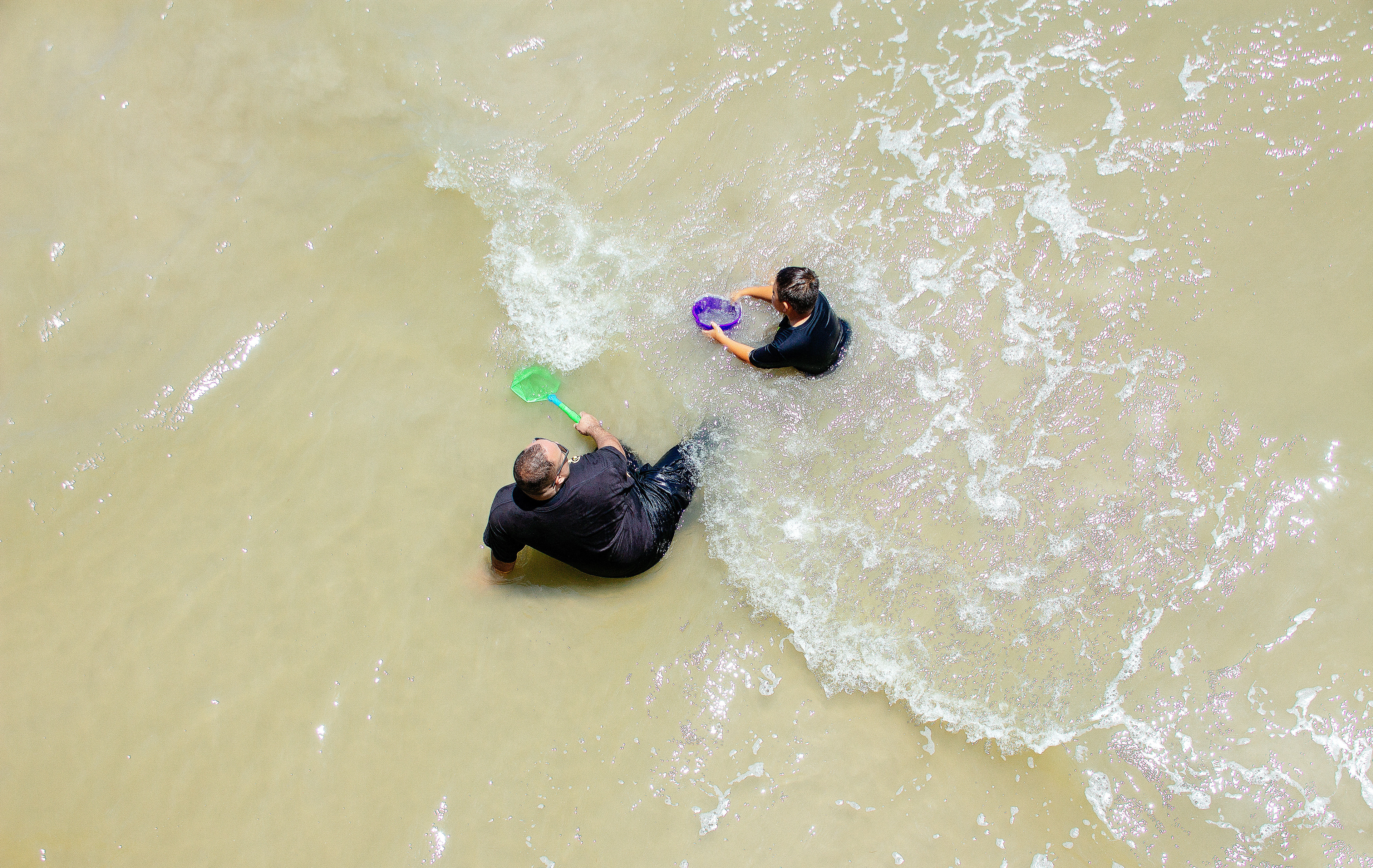
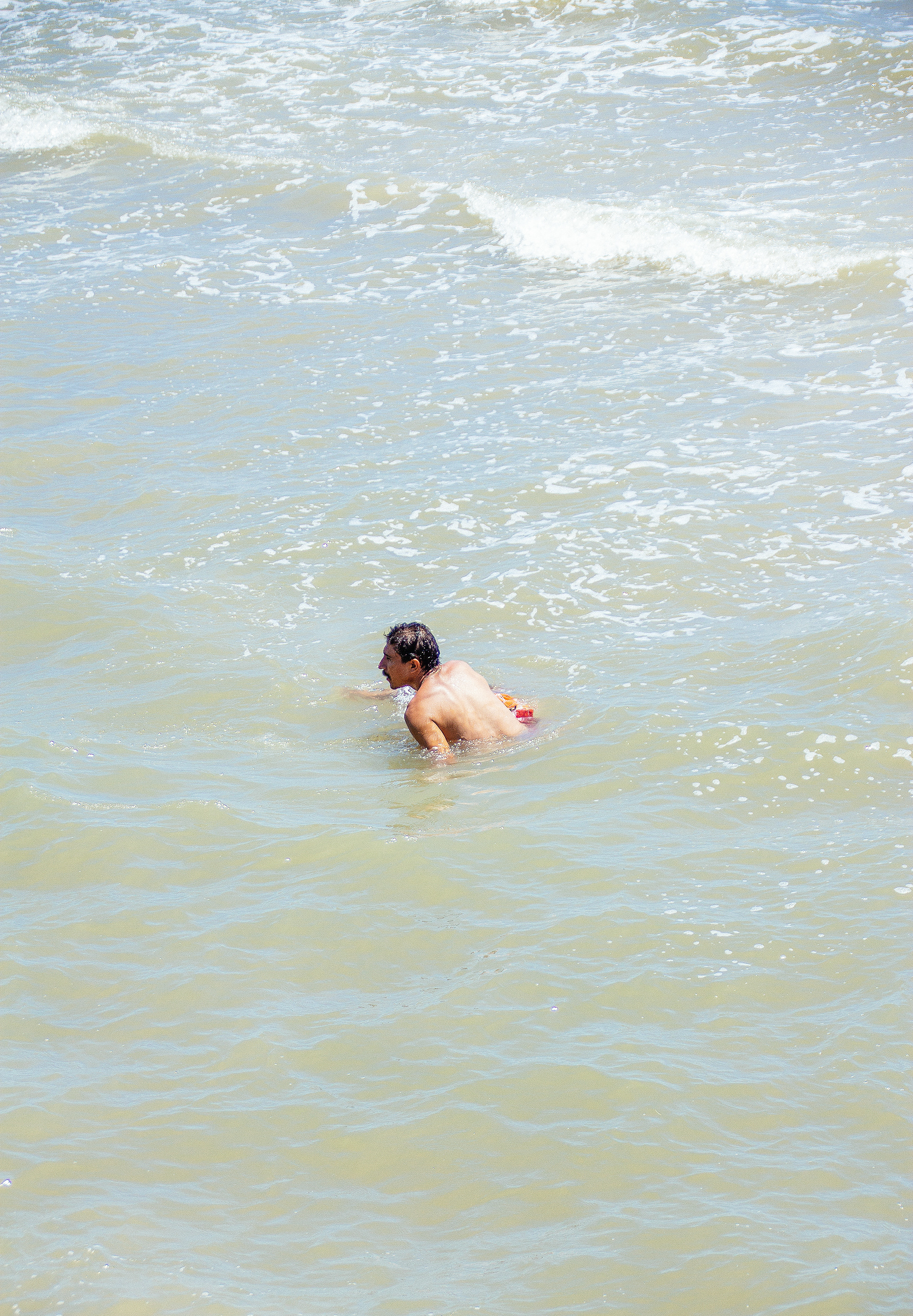
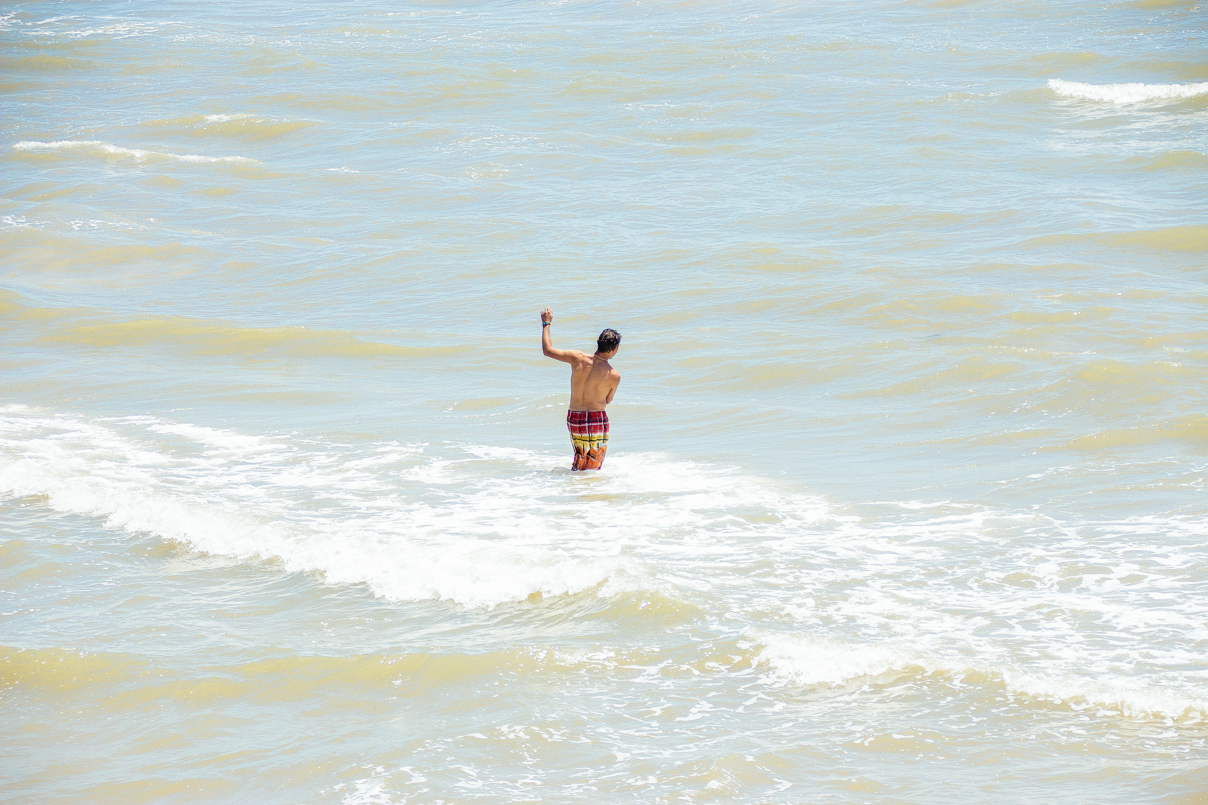
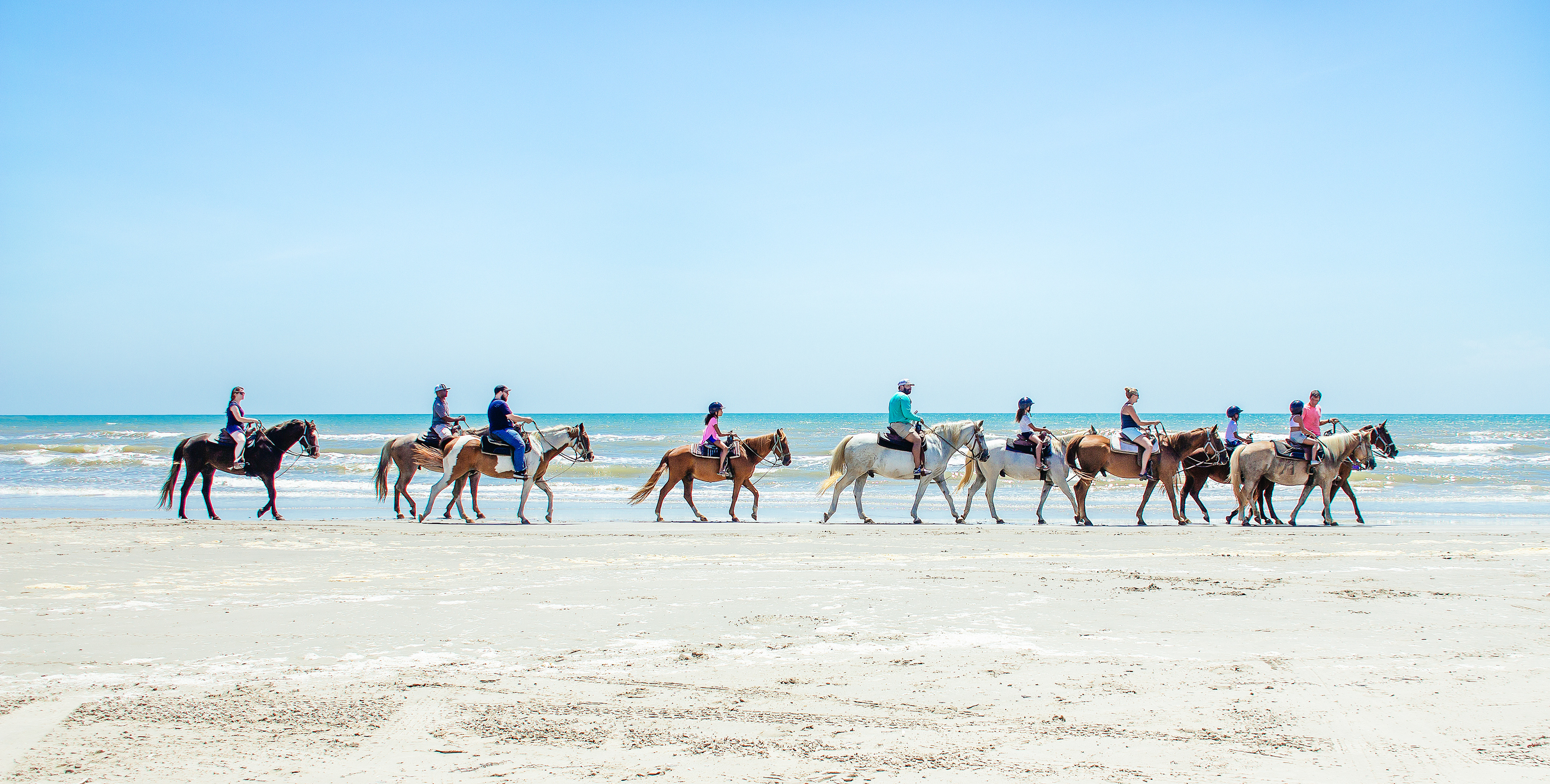
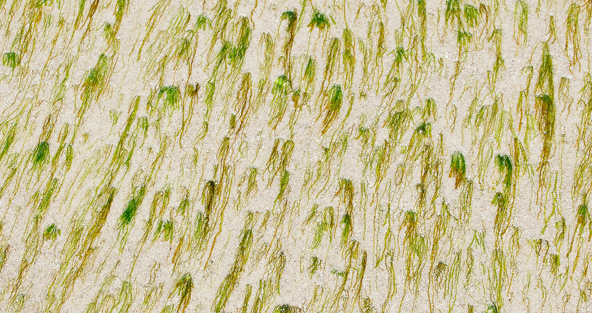
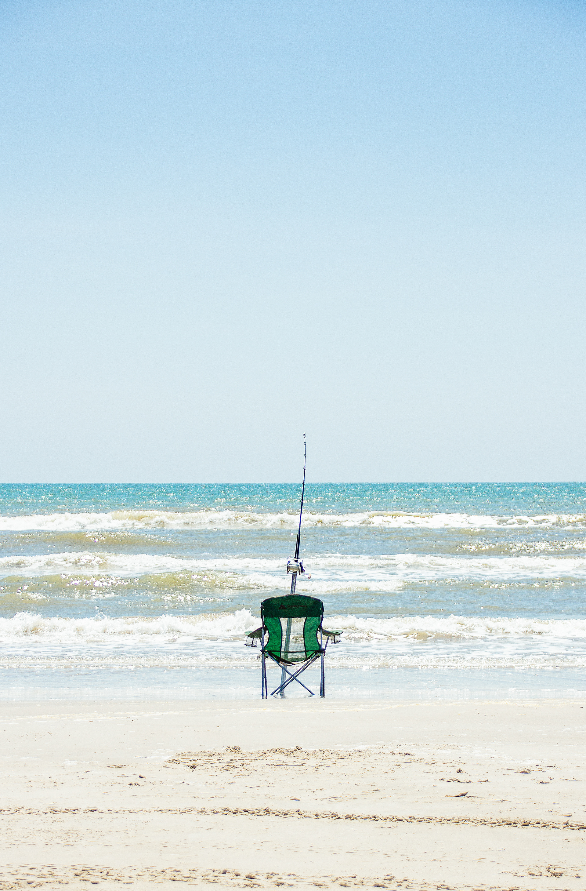
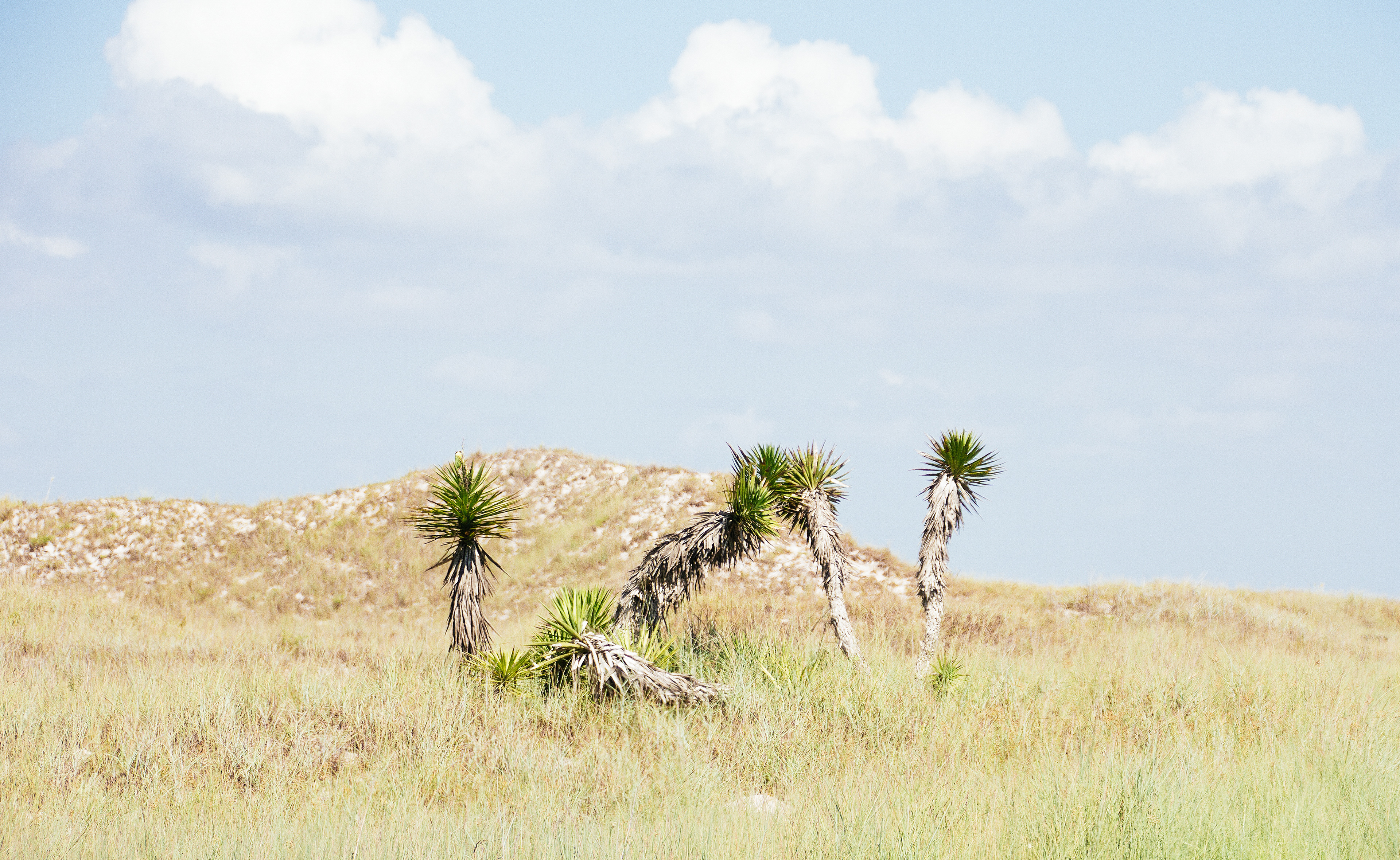
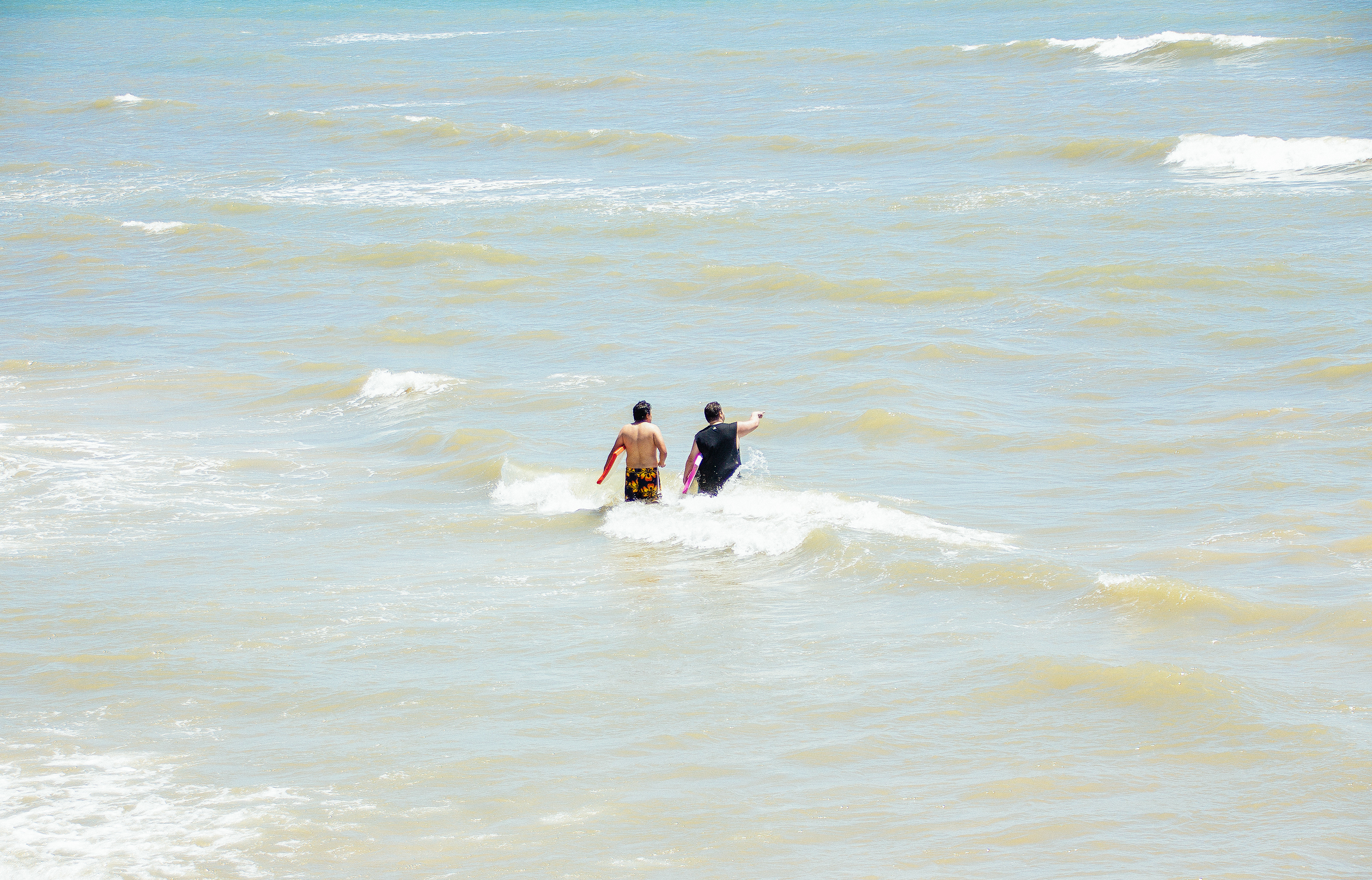
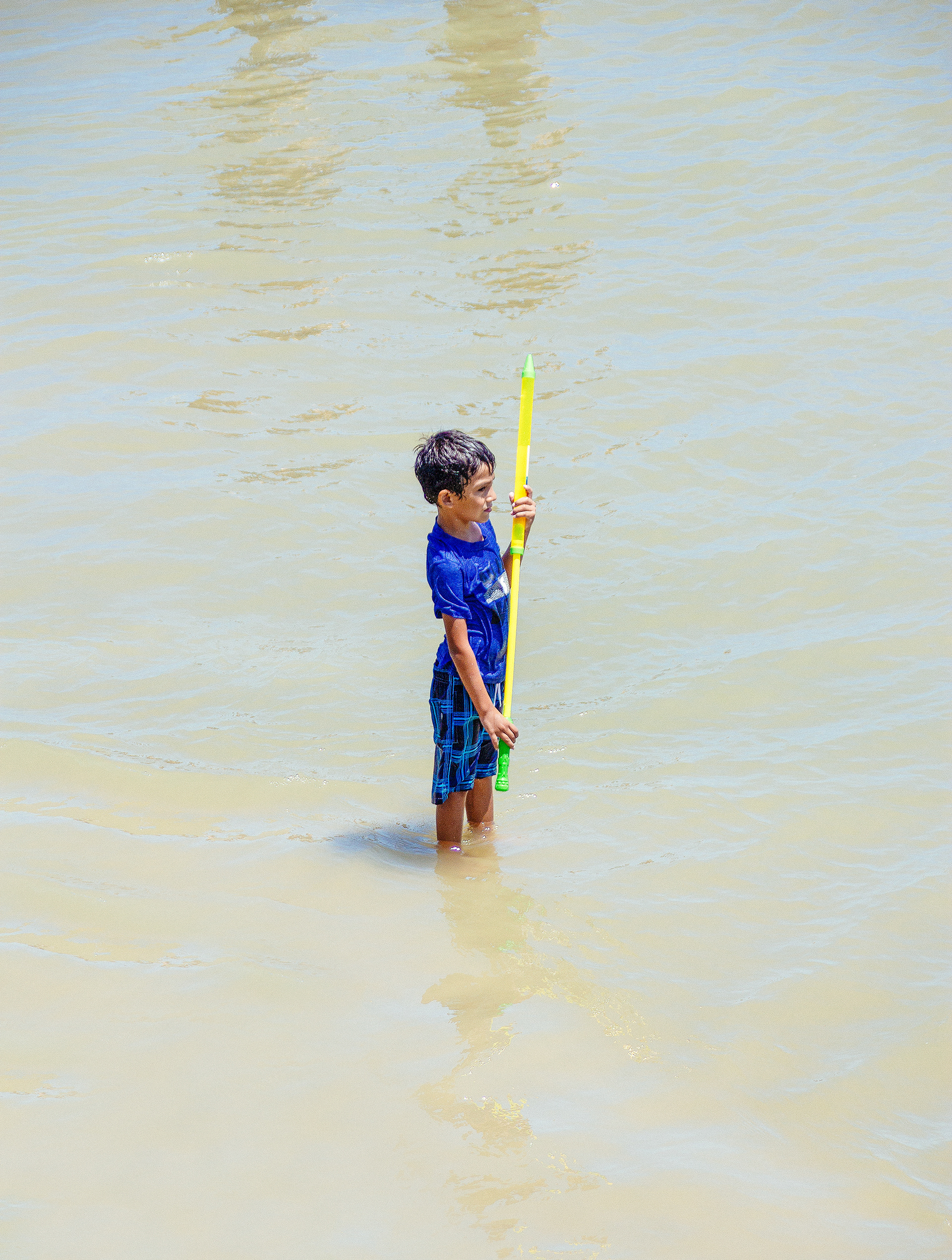
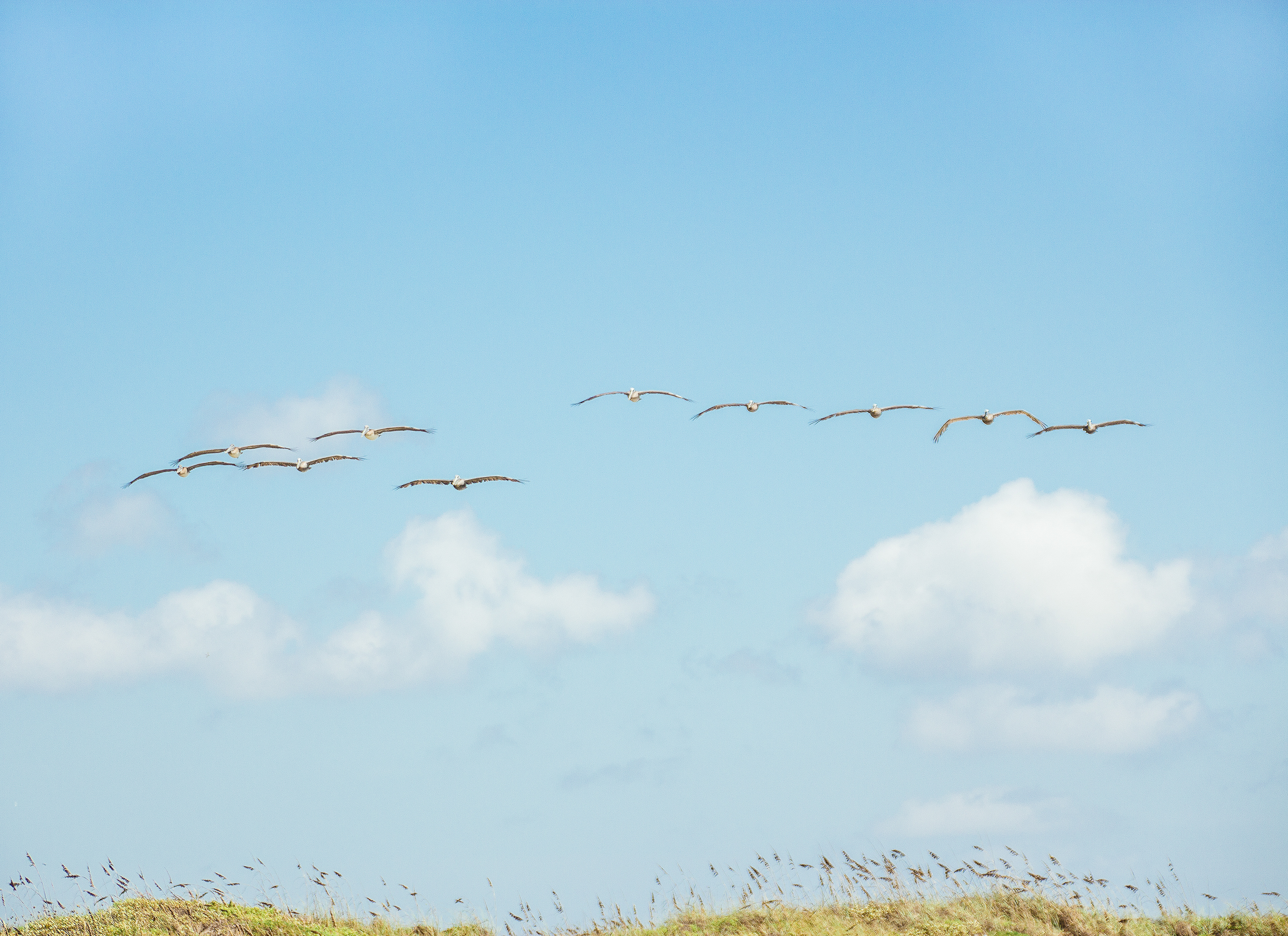
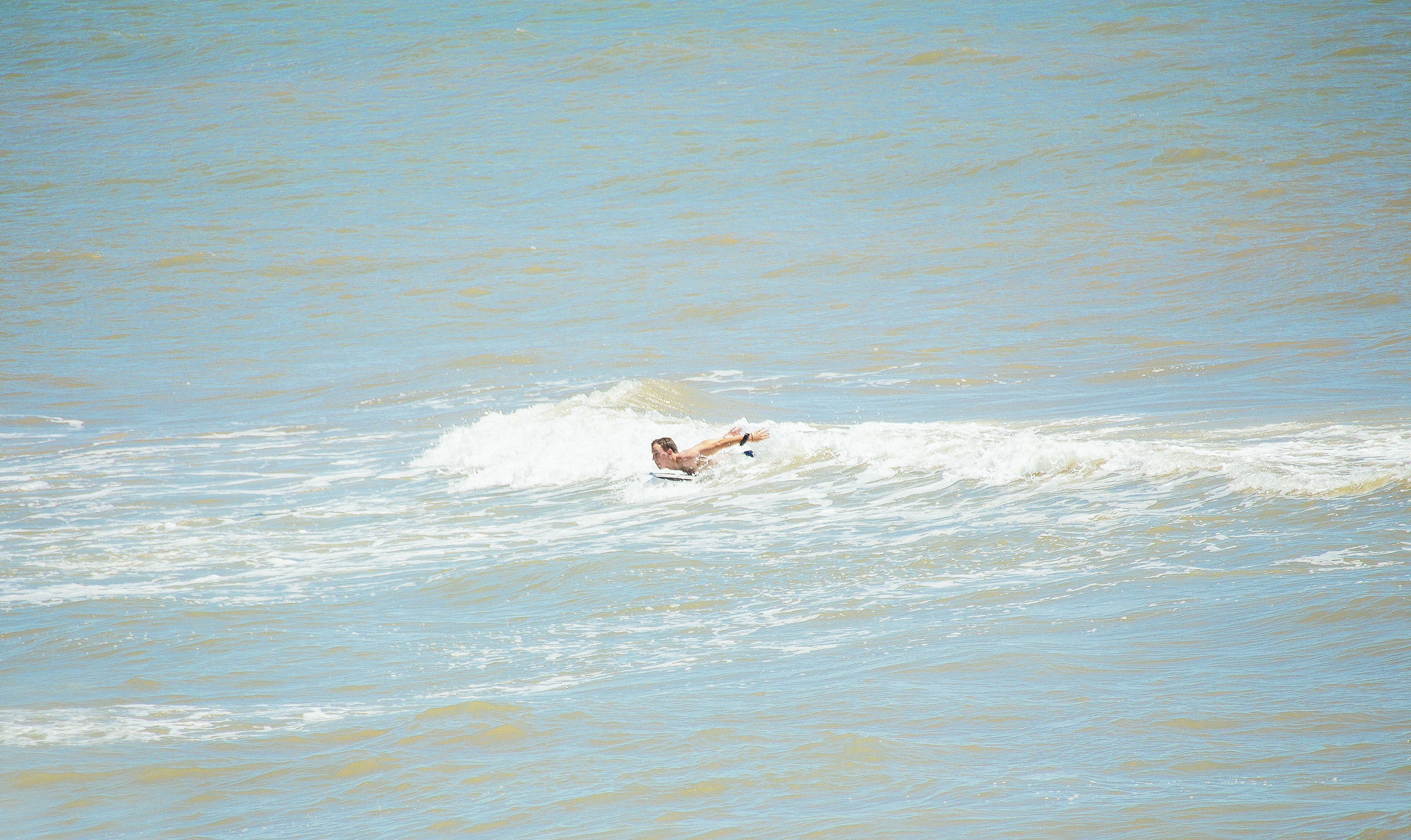
Objective
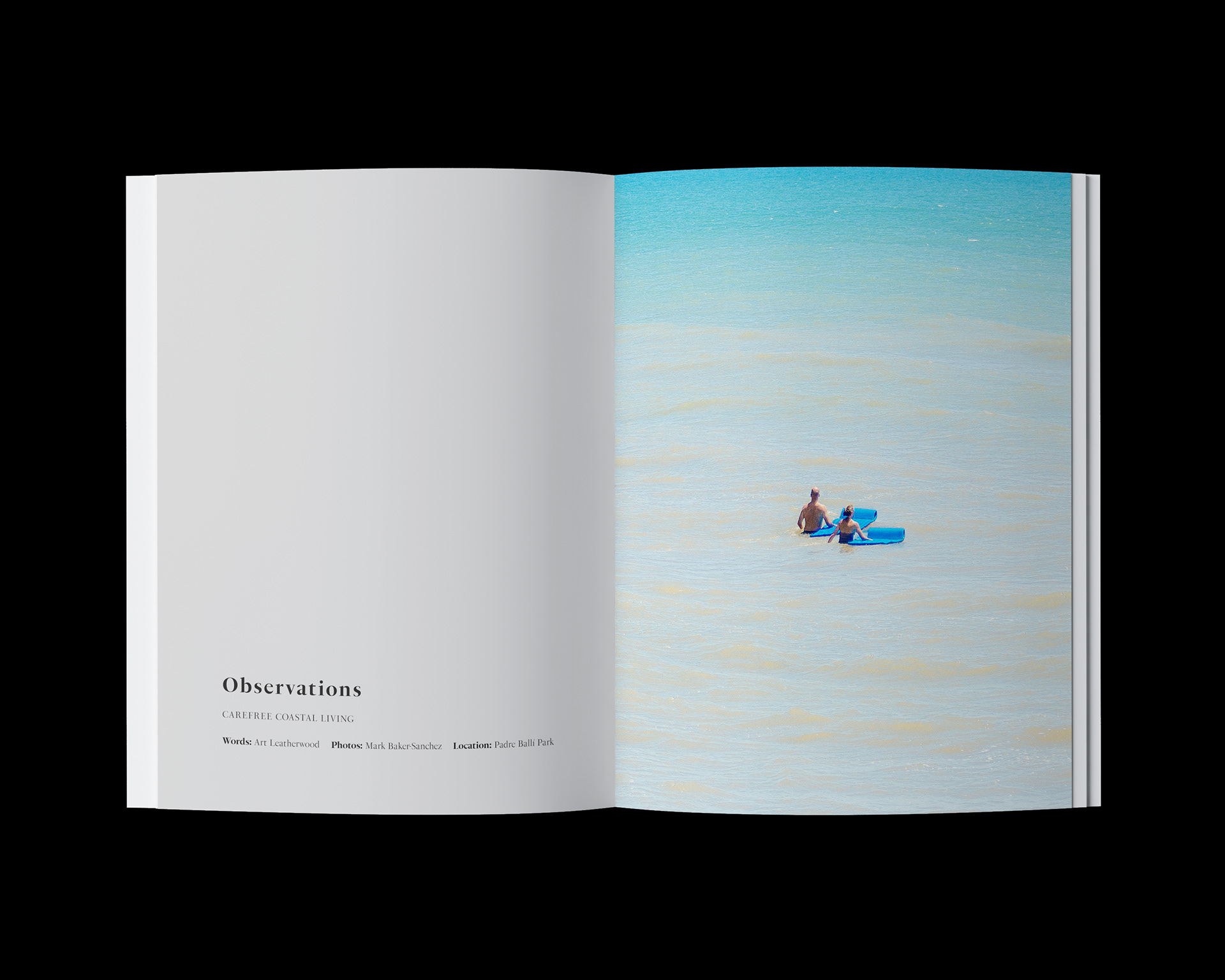
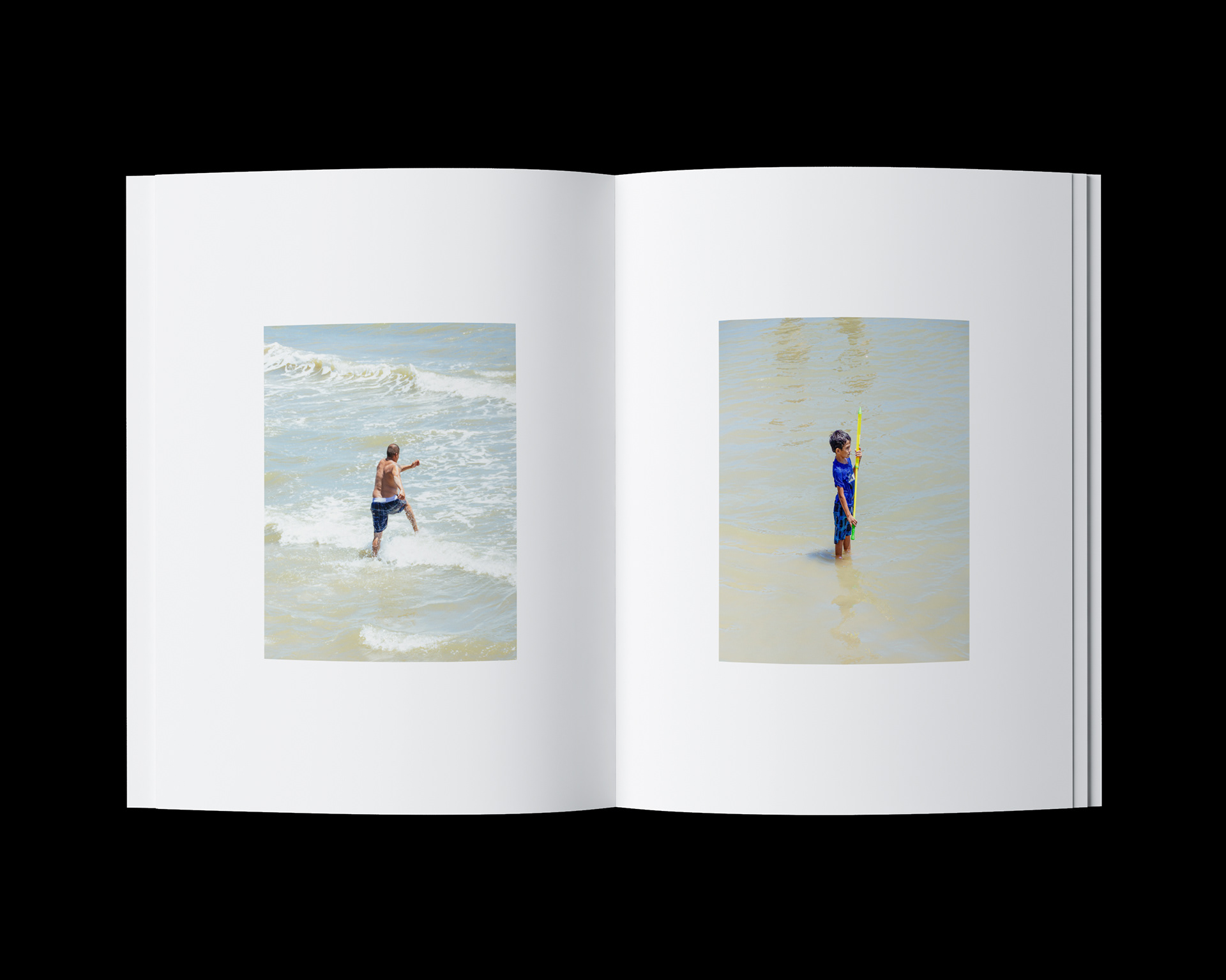
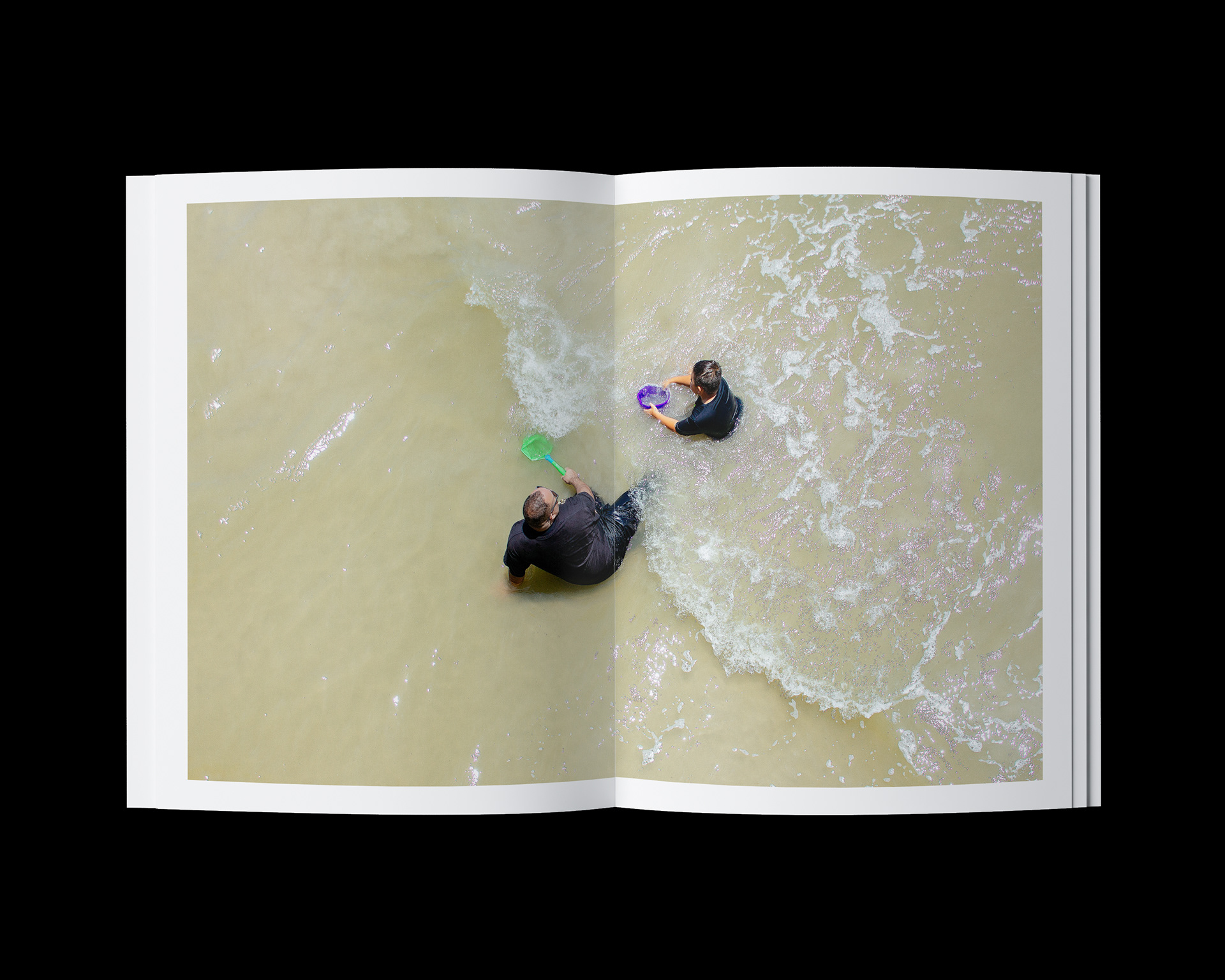
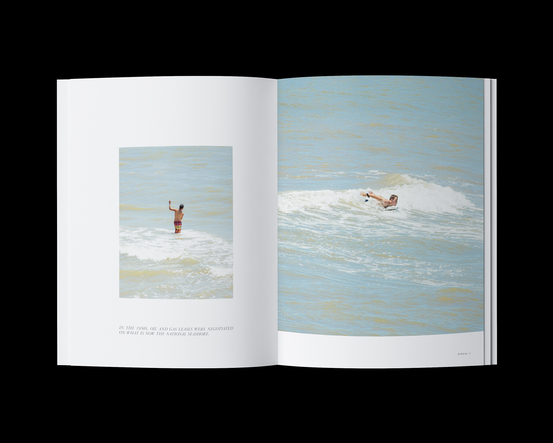
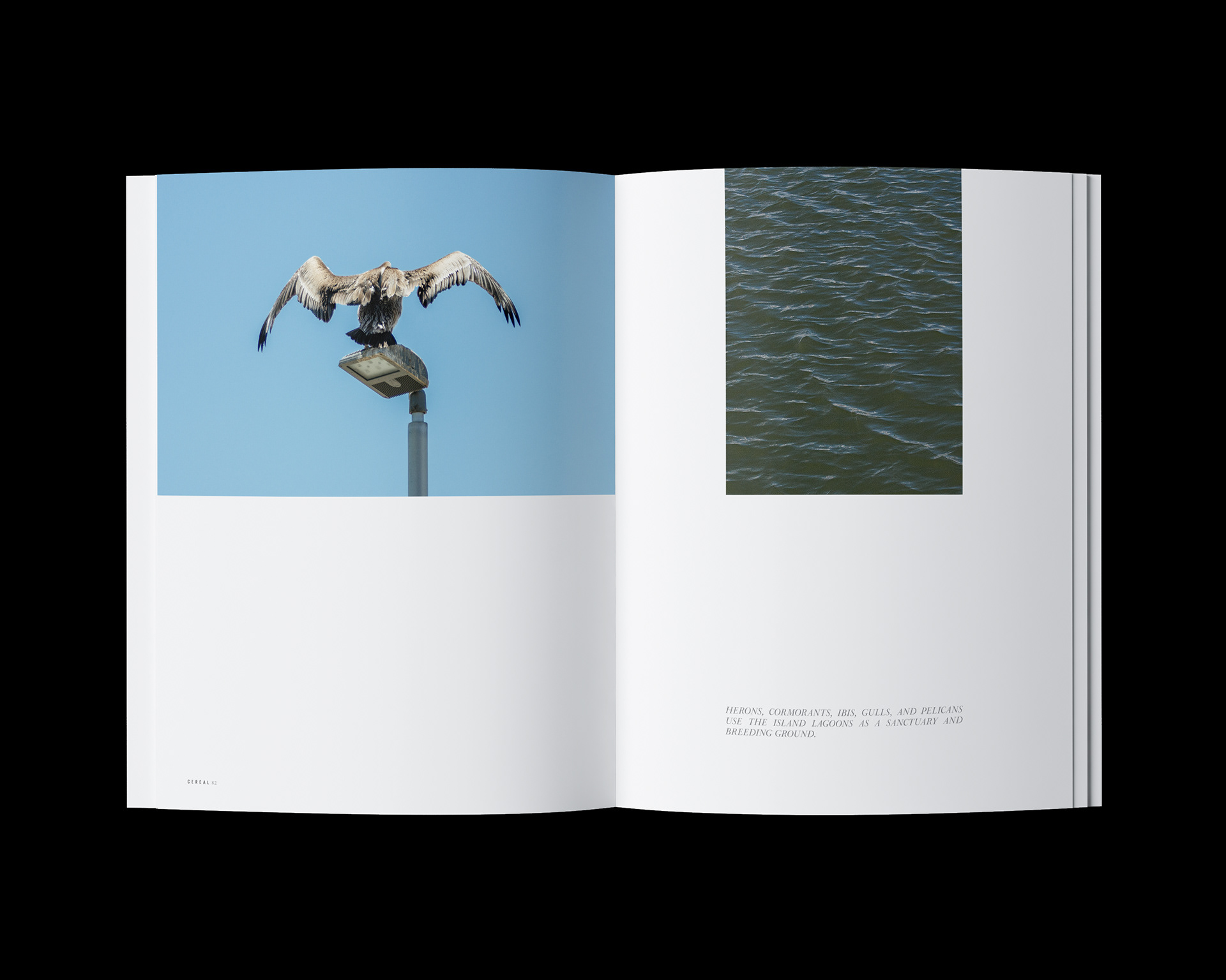
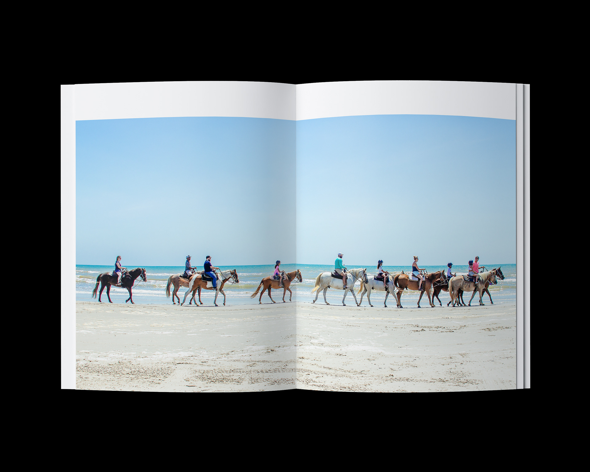
Observing the carefree nature of coastal living through candid shots that are simplistic and nostalgic.


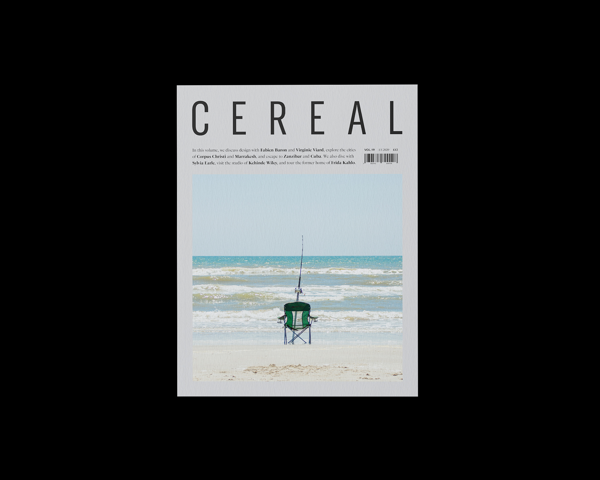
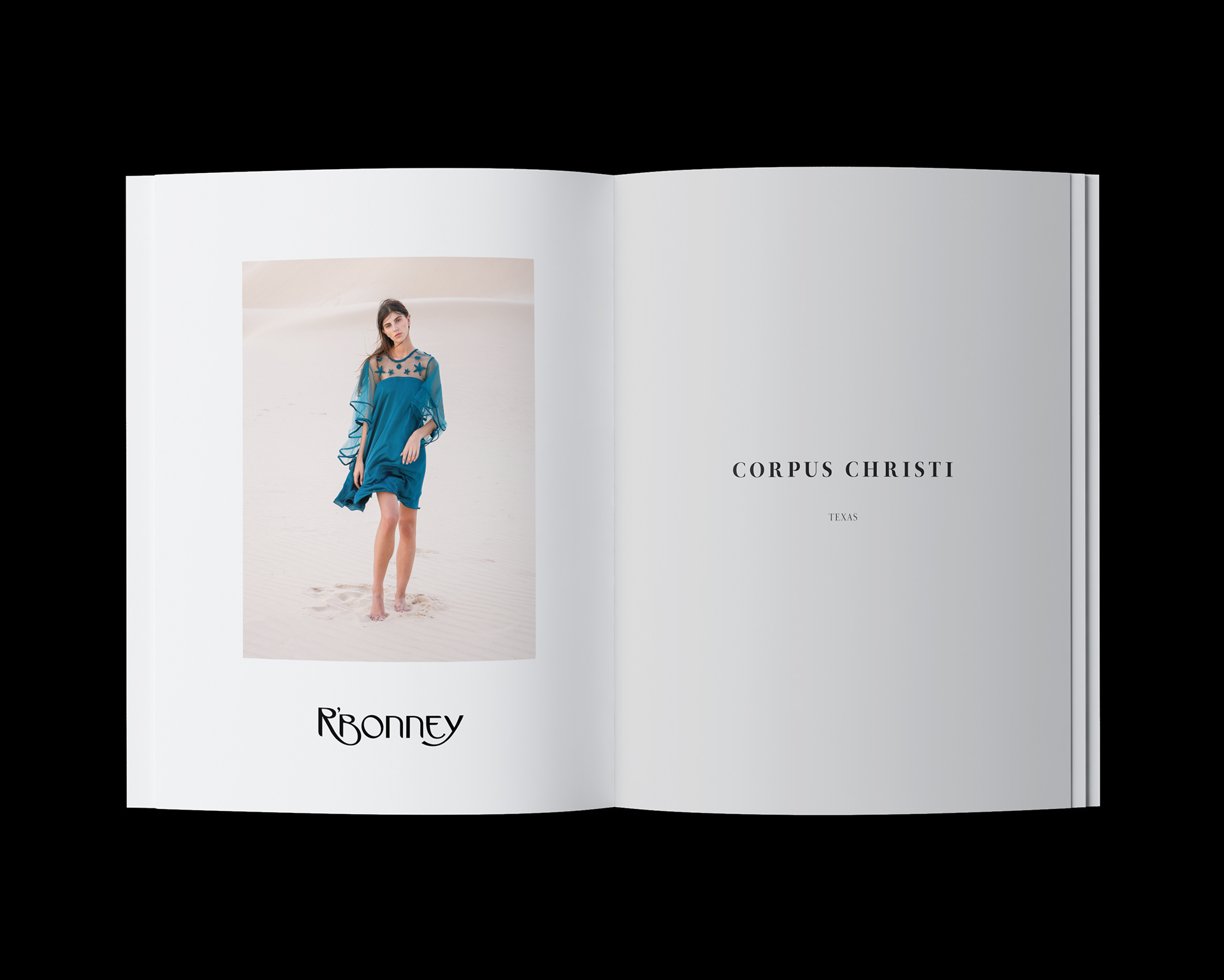
Photos In Use — Spec/Mockup Work
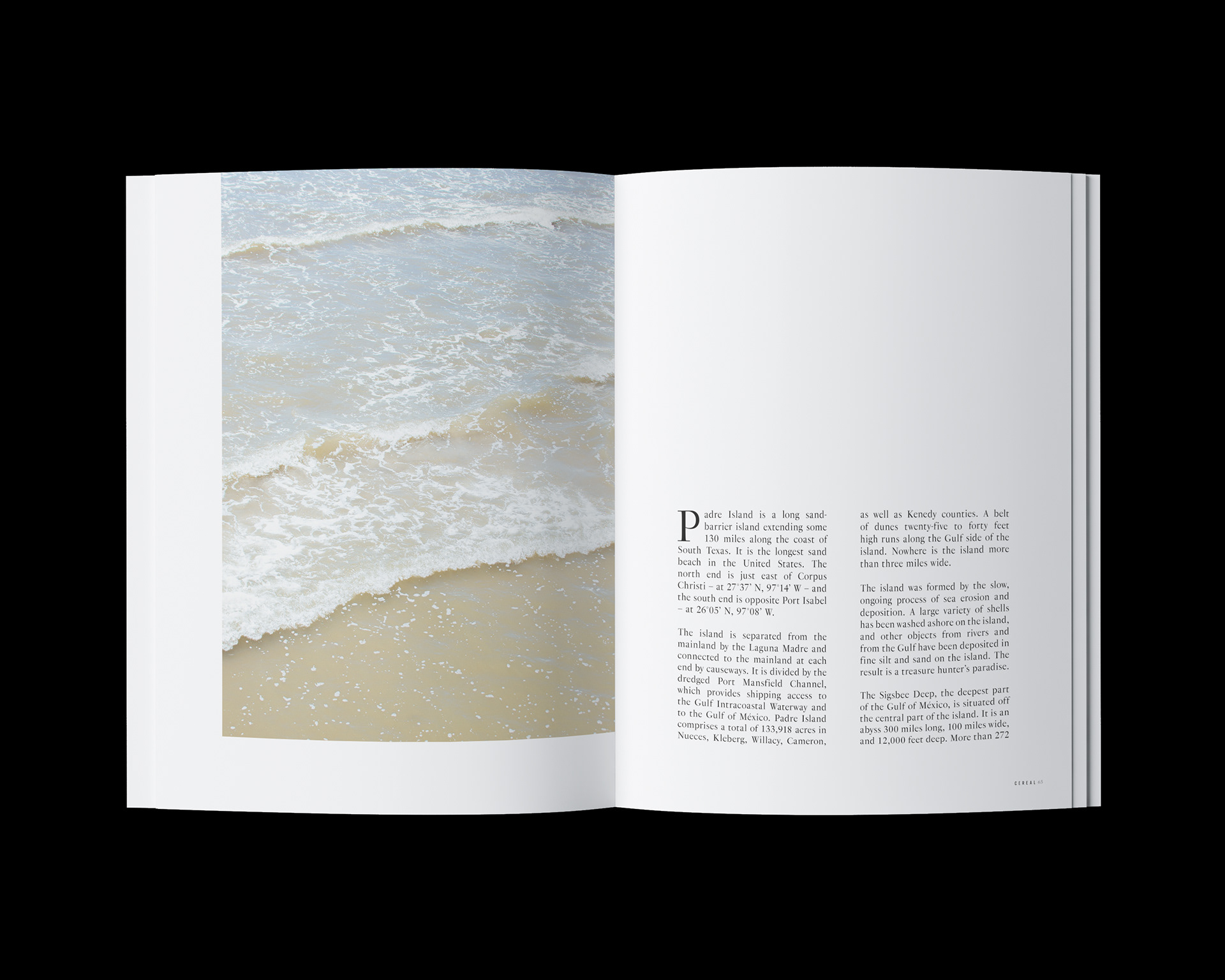
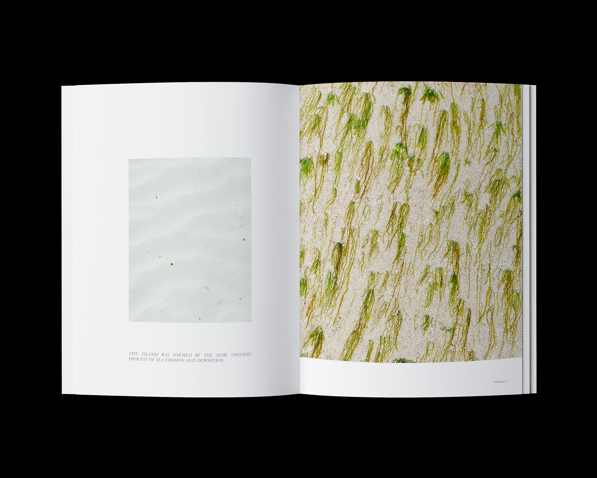
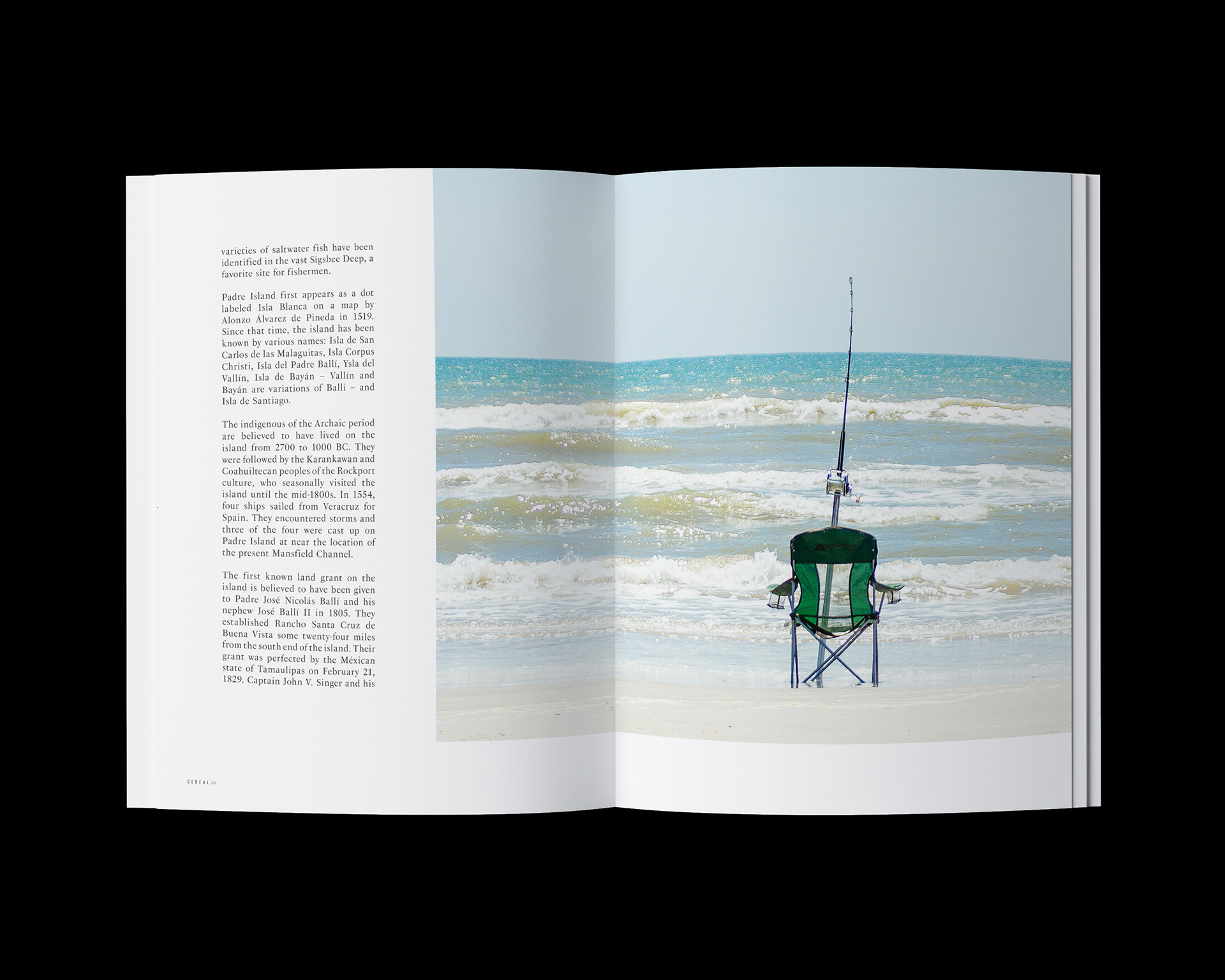
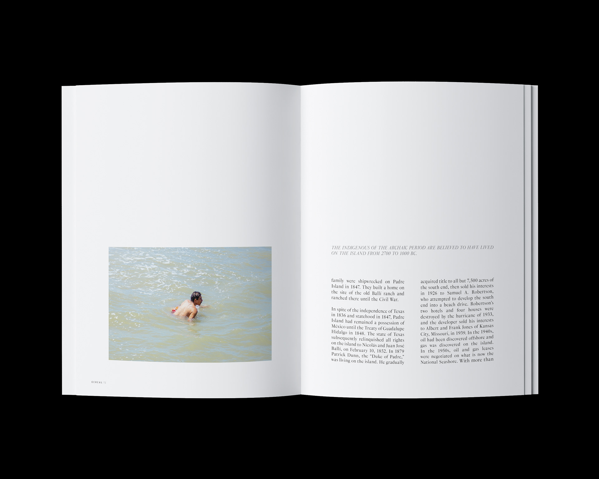
For this series, I wanted to explore how the images could live within a publication. The interaction with copywriting and typography on the page gives the opportunity for heightened storytelling—that being the serenity of coastal living in Corpus Christi. Cereal was chosen as a hypothetical platform as the publication is known for its documentation of unique travel destinations and laidback lifestyle.
Credits
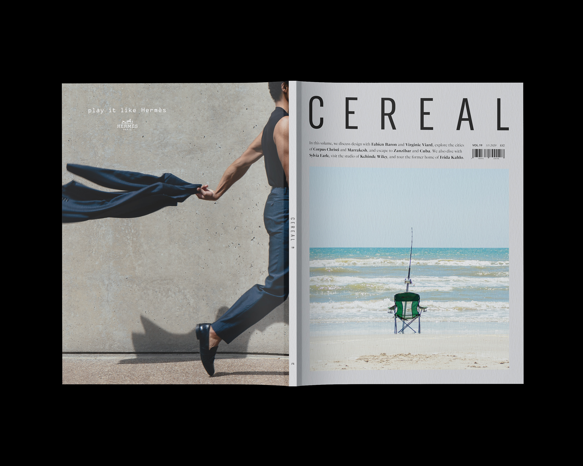
Cereal is a biannual, travel, and style magazine based in the United Kingdom. Each issue focuses on a select number of destinations alongside engaging interviews as well as stories on unique design, art, and fashion. All elements used throughout these spreads including the Cereal lettermark are copyrighted by Cereal. The layouts are inspired by the publication's redesign by Studio Faculty. The Hermès mark and tagline "Play it like Hermès" are copyrighted by Hermès. Copywriting courtesy of Art Leatherwood, Texas State Historical Association. The typefaces used are GT America by Grilli Type and PS Fournier by Stephane Elbaz.