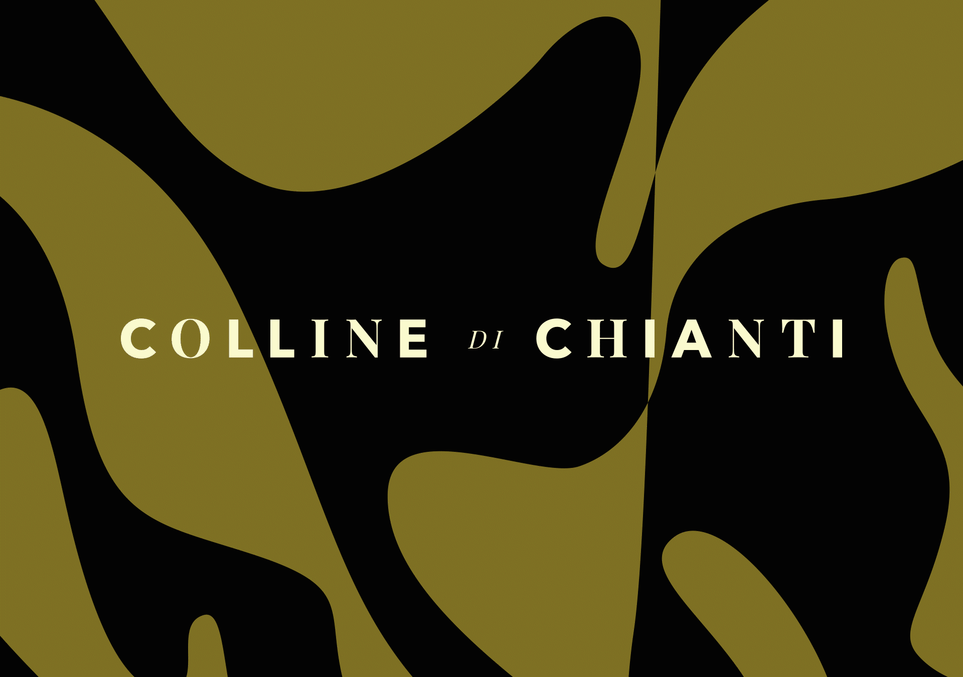
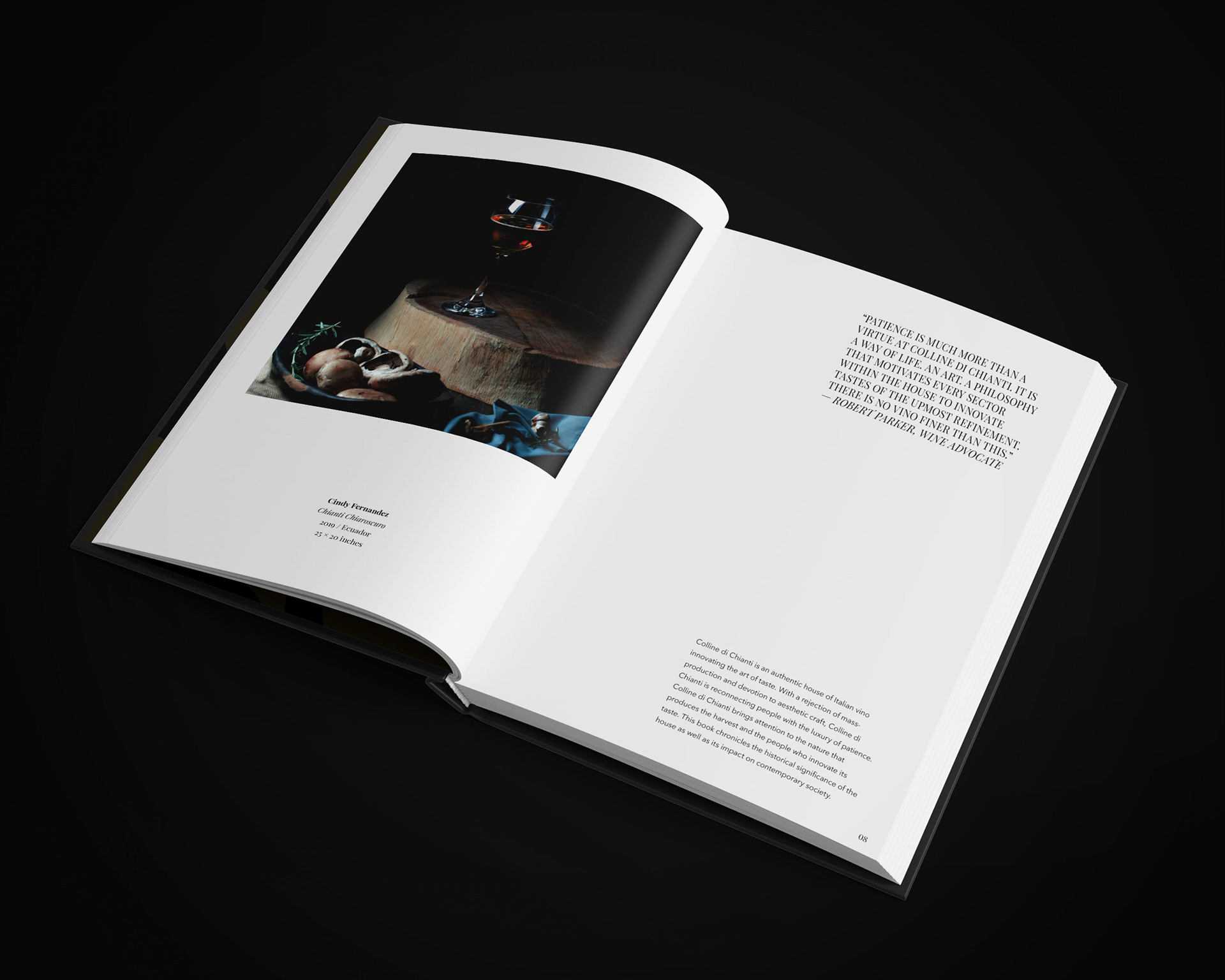
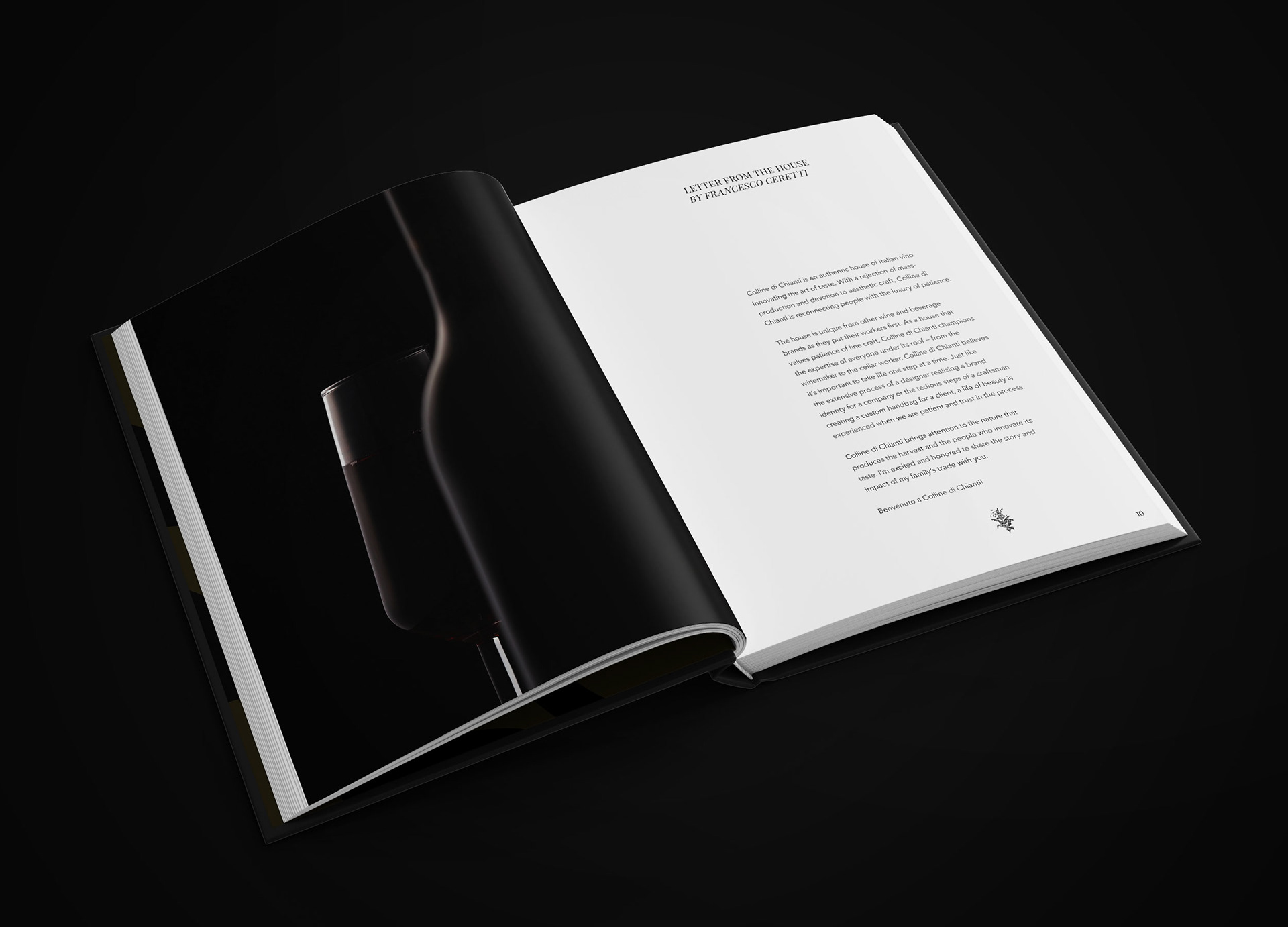
Colline di Chianti is an authentic house of Italian vino innovating the art of taste. With a rejection of mass-production and devotion to aesthetic craft, Colline di Chianti is reconnecting people with the art of patience.
Why & What Was Involved
Being at home due to the COVID-19 pandemic has allowed me to dive deep into personal initiatives I didn’t have much time for in the past. Aside from working on my social justice magazine @donethemagazine, I executed this holistic branding project for a concept wine house in Chianti Classico, Tuscany, Italy. Originally, I wanted to redesign a wine label I created in community college but wanted to push the project beyond just that.
Feel free to take a look at the creative brief that was developed for seeing the project through from conception to execution. With the onset of the COVID-19 pandemic, the timeline was altered from ~1.5 months to 3 months for completion.
The Problem & Solution
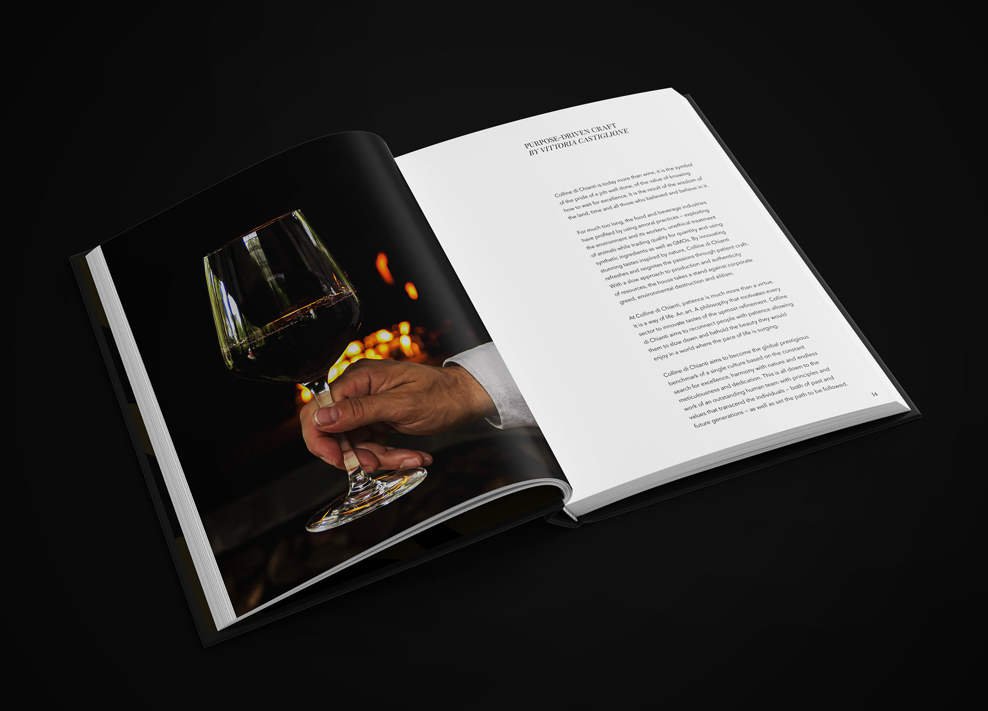
For much too long, the food and beverage industries have profited by using amoral practices — exploiting the environment and its workers, unethical treatment of animals while trading quality for quantity and using synthetic ingredients as well as GMOs.
By innovating stunning tastes inspired by nature, Colline di Chianti refreshes and reignites the passions through patient craft. With a slow approach to production and authenticity of resources, the house takes a stand against corporate greed, environmental destruction and elitism.
Brand Essence
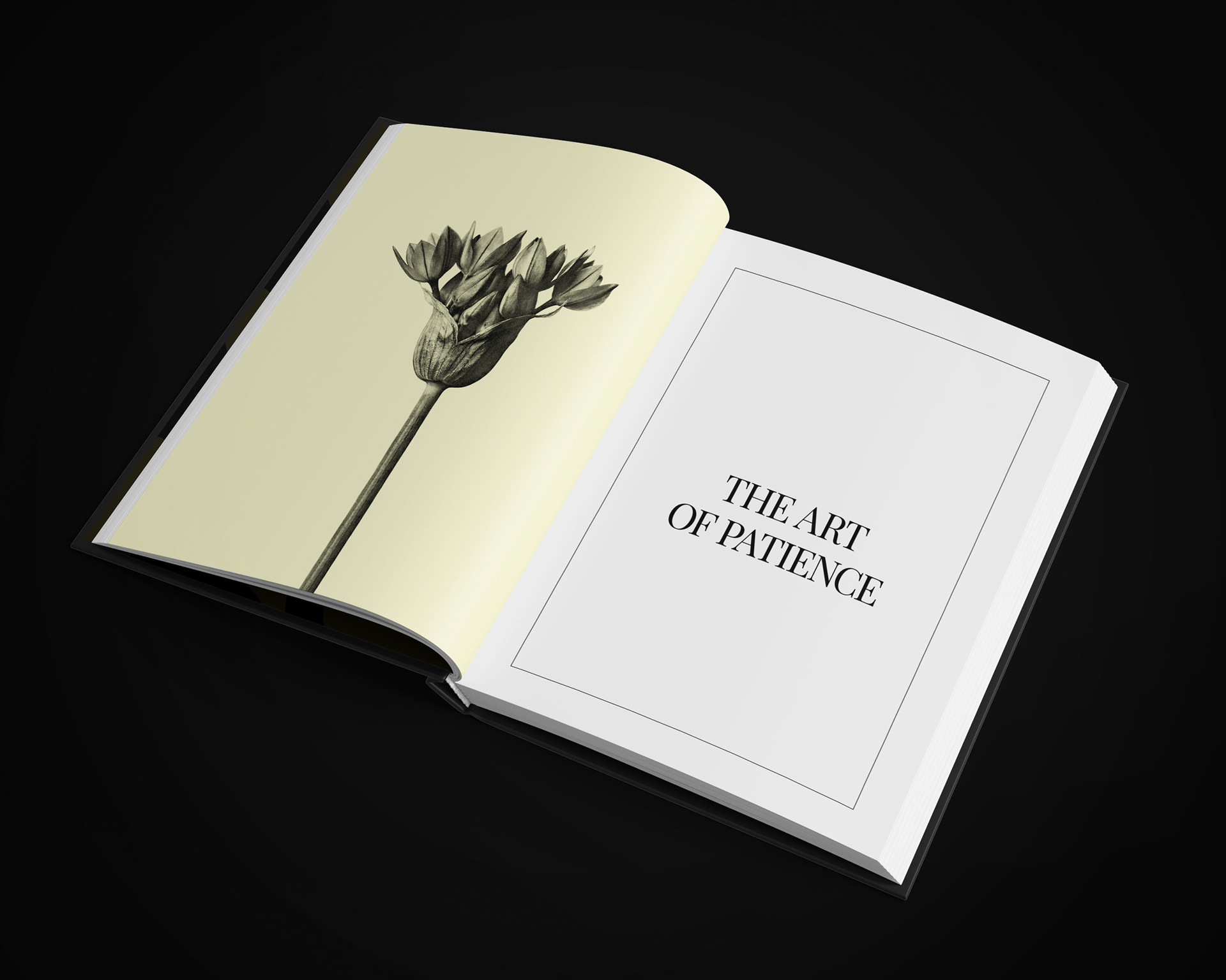
Colline di Chianti believes it’s important to take life one step at a time. Just like the extensive process of a communication designer realizing a brand identity for a company or the tedious steps of a craftsman creating a custom handbag for a client, a life of beauty is experienced when we are patient and trust in the process. Colline di Chianti aims to reconnect people with patience allowing them to slow down and behold the beauty they would enjoy in a world where the pace of life is surging.
At Colline di Chianti, patience is much more than a virtue. It is a way of life. An art. A philosophy that motivates every sector to innovate tastes of the upmost refinement.
The Objective
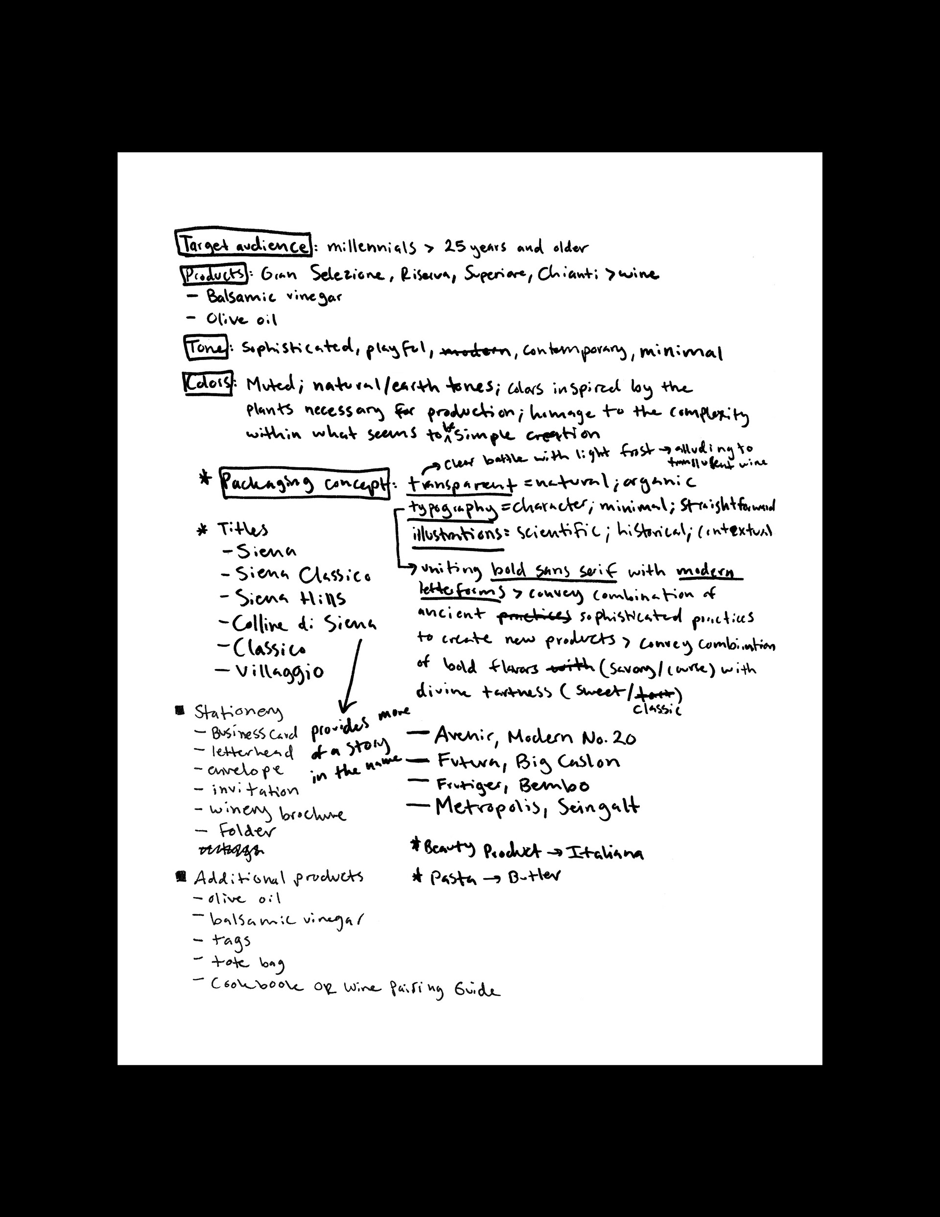
To strategize and execute the brand identity and web presence for Colline di Chianti to position the brand favorably with wine aficionados as well as young adults. Through refined visual communication, the house will stand out from other companies as innovators of taste and patient craft.
A Flavorful Identity
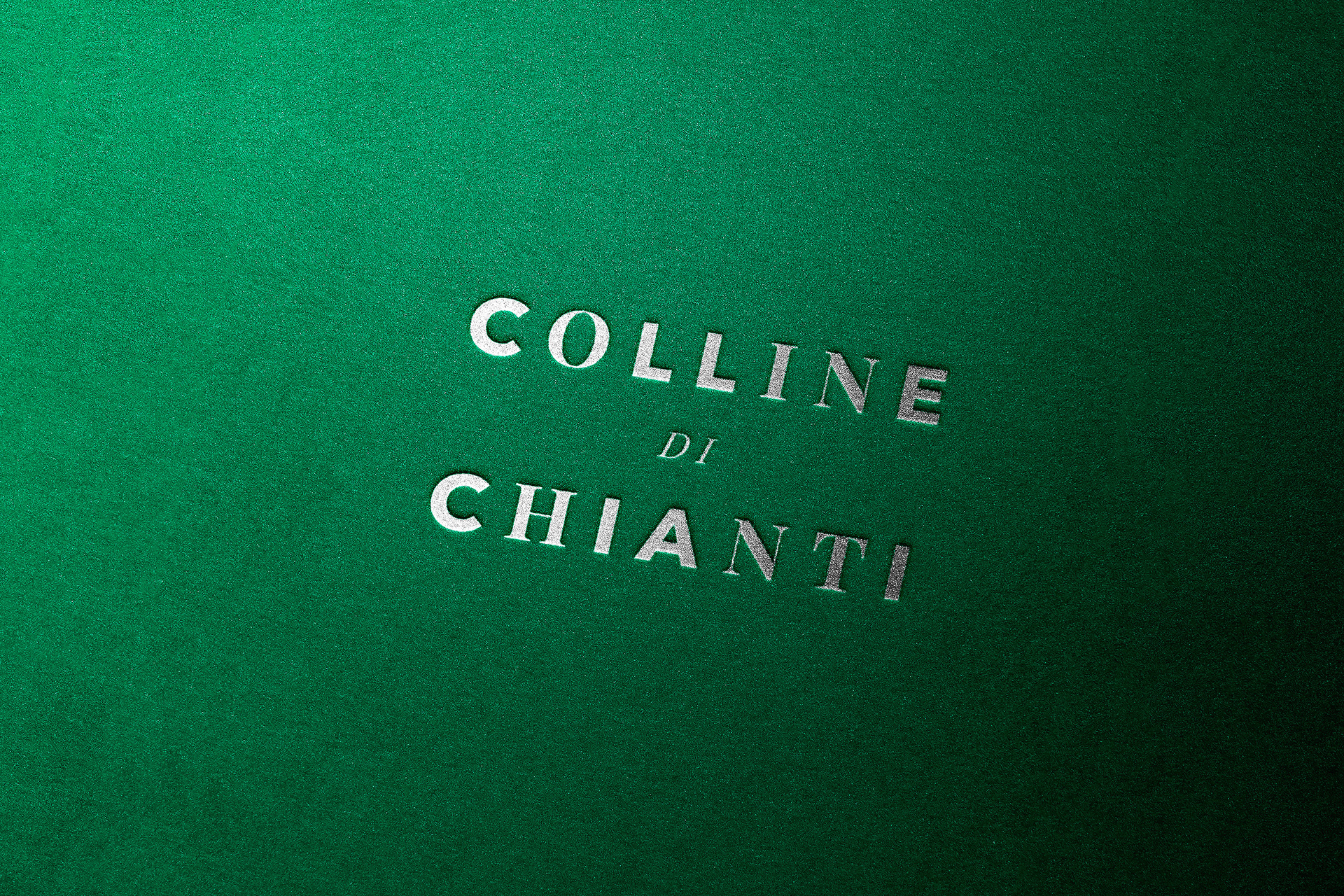
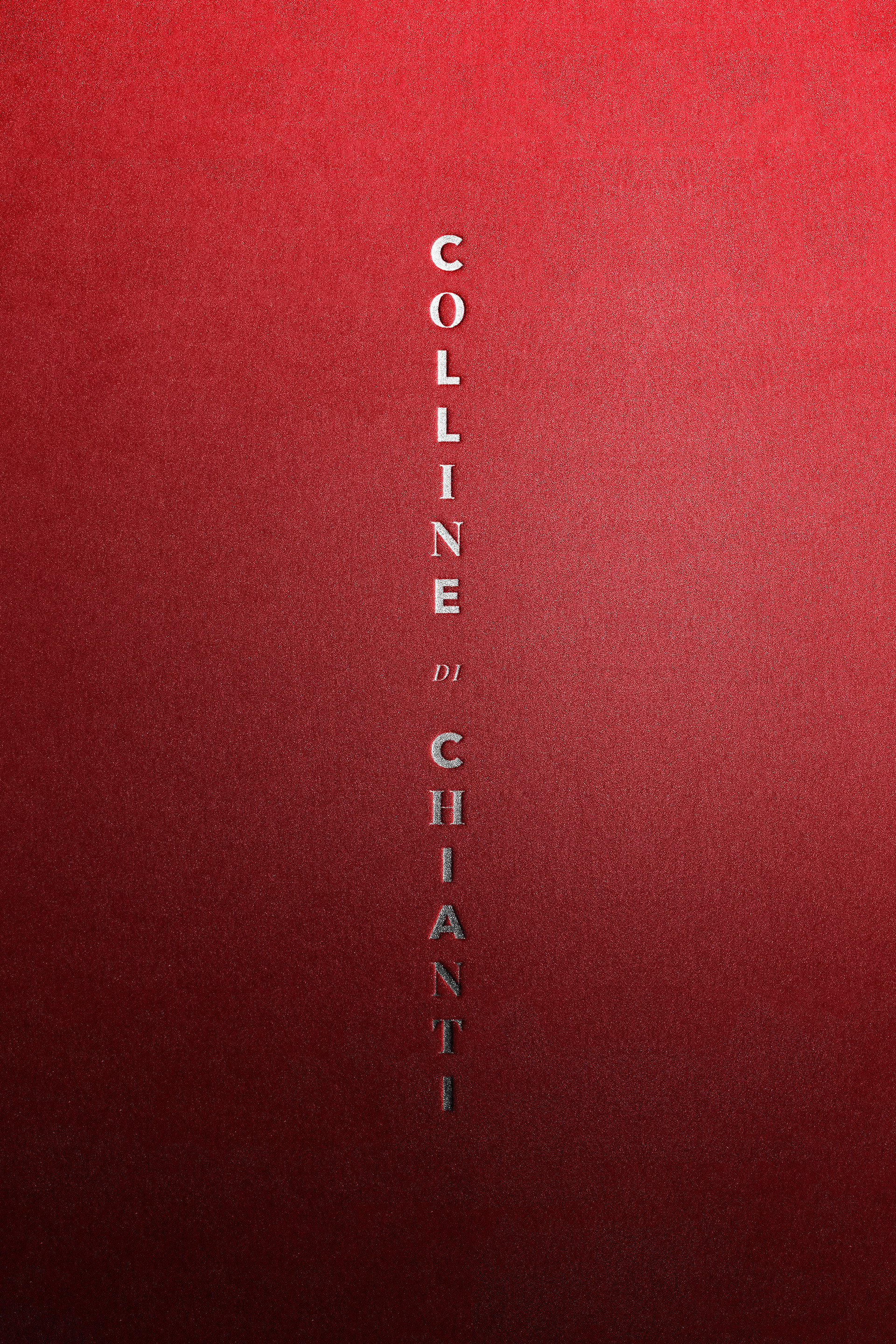
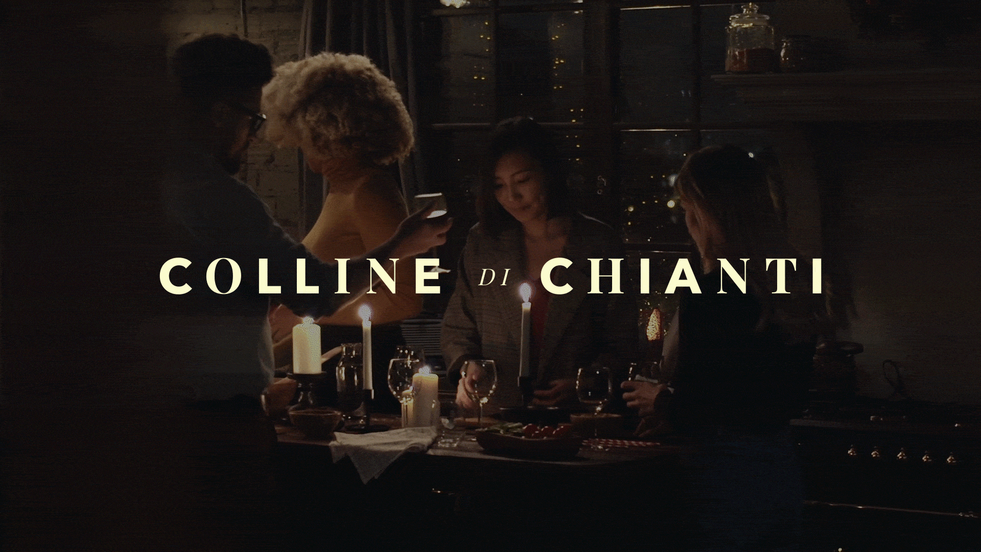
The name Colline di Chianti — which translates to "Chianti Hills" — brings attention to the nature that produces the harvest and the people who innovate its taste.
Just like how a symphony is comprised of multiple musicians or a song of many notes, Chianti wine produces a multitude of flavors that harmonize and delight. With this in mind, the Colline di Chianti logotype mixes both serif and sans serif — a celebration of subtle and bold notes as well as tradition and innovation.
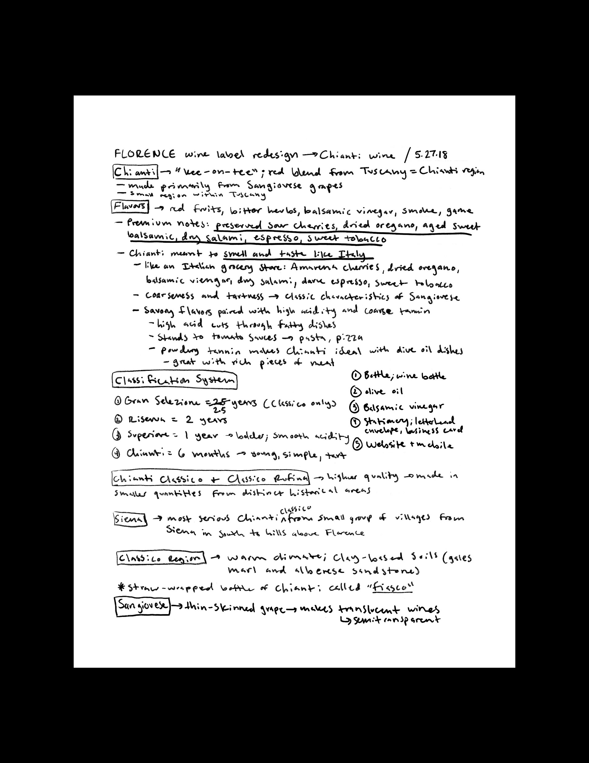
Research & Concepting
This project was originally started two years ago and much research was done to learn about the significance of Chianti wine as well as the history of the Chianti Classico region. Since wine isn't that popular of a topic amongst young adults, I really wanted to position the brand in a way that isn't snobby or elitist but embodies vibrance and sustainability in a playful yet classy manner. Colline di Chianti is geared towards coming of age millennials and GenXers who care where and how their food is made. The brand is aligned as a house of vino innovation and a patron of refinement to further the appreciation of time as well as artistic craft.
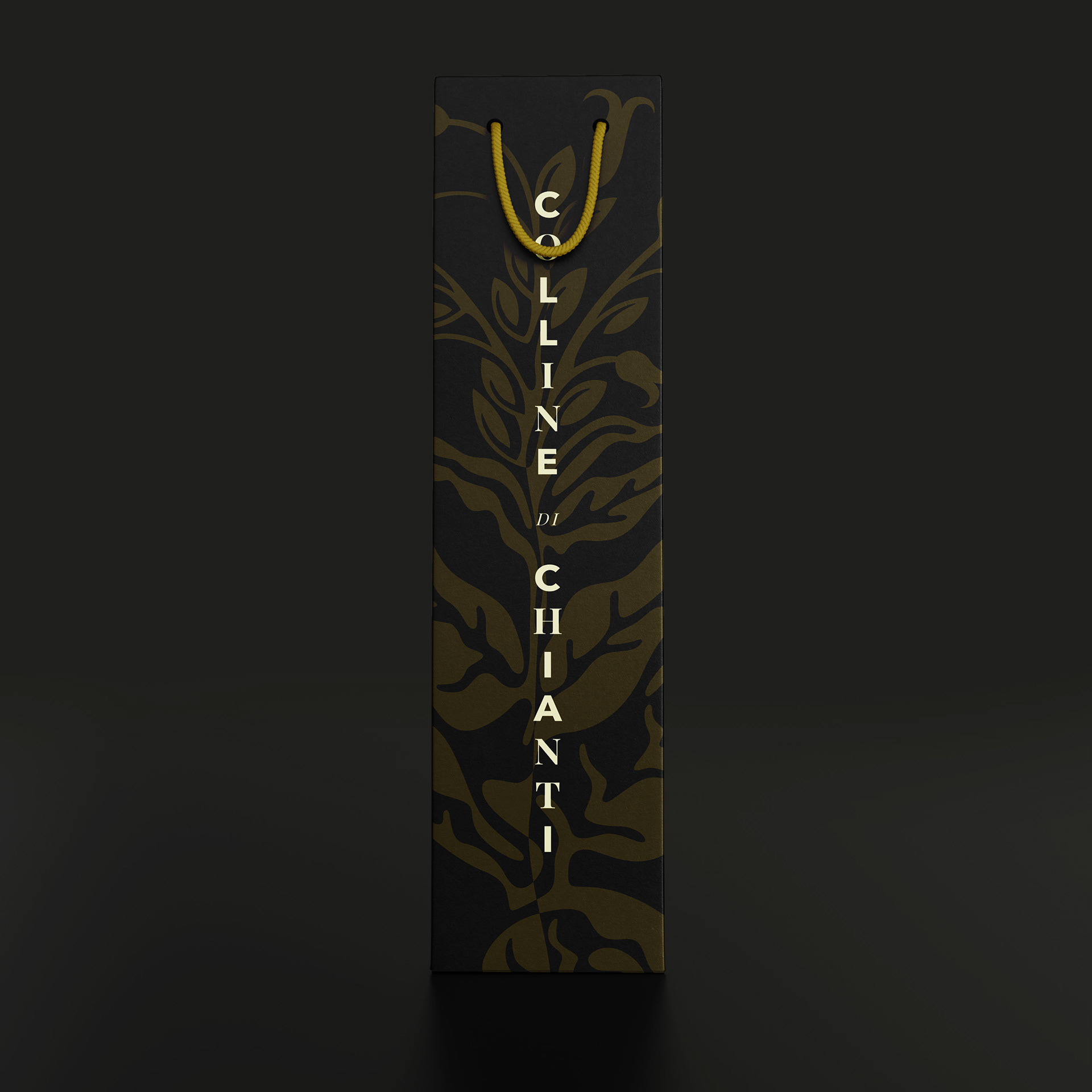
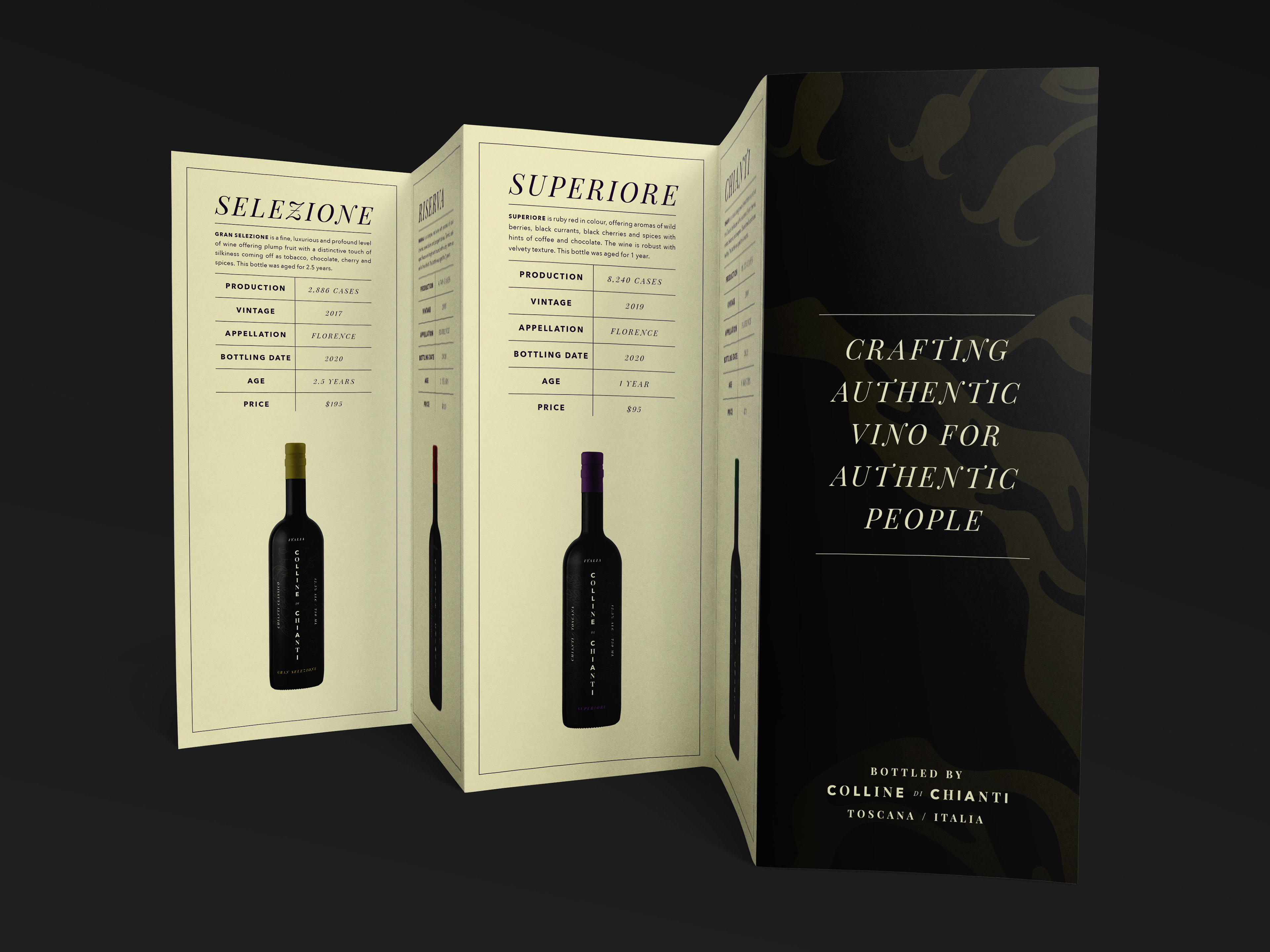
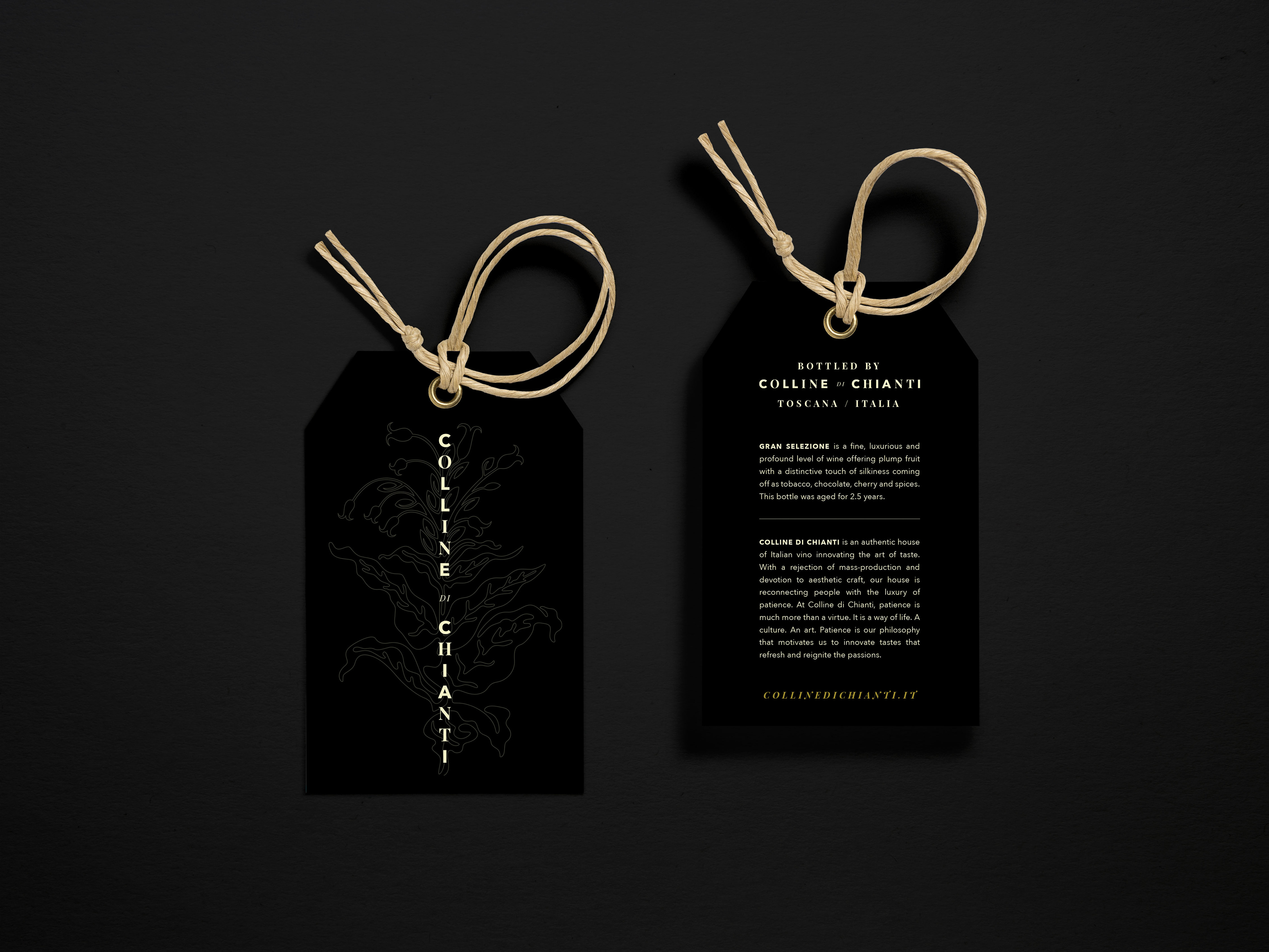
Labels & Packaging
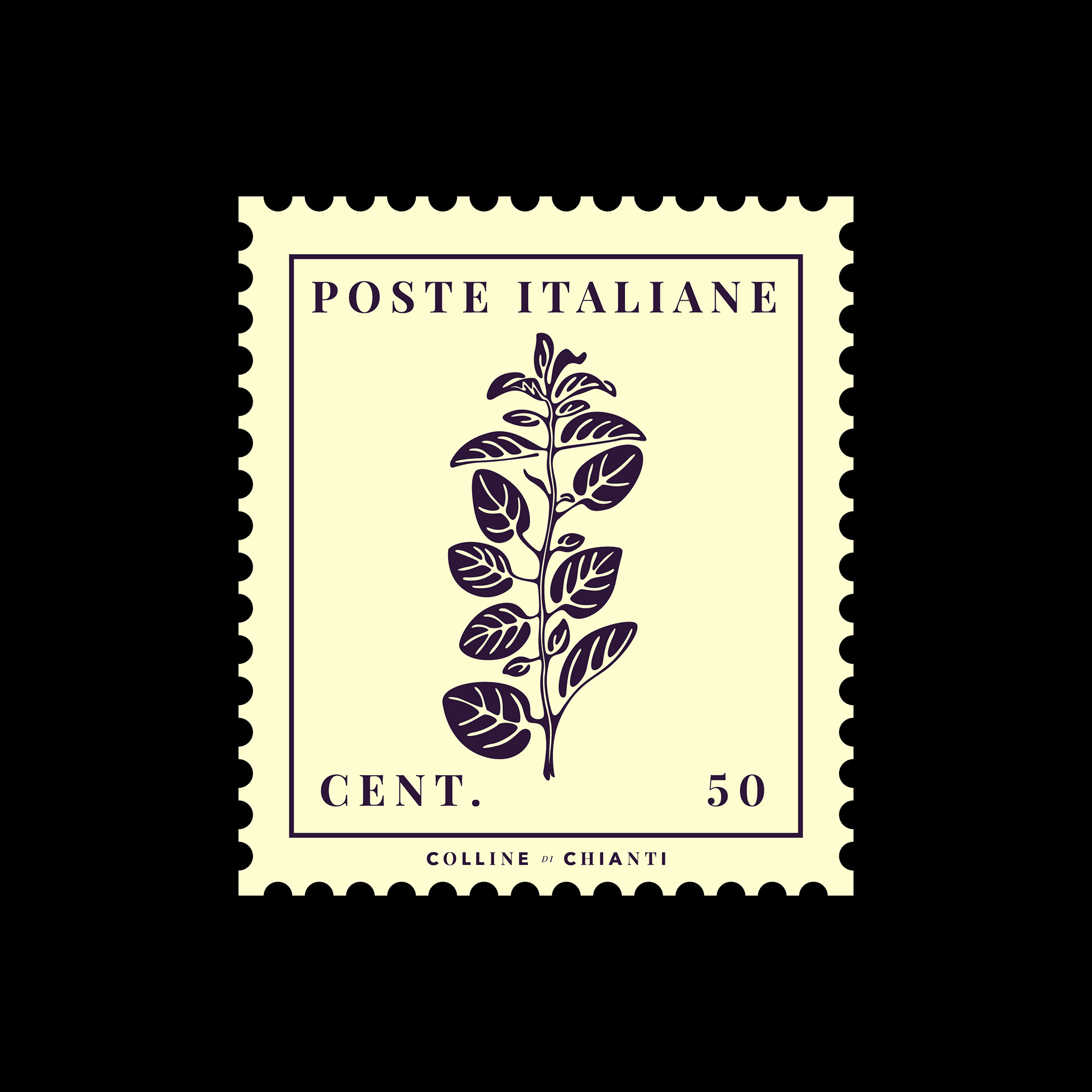
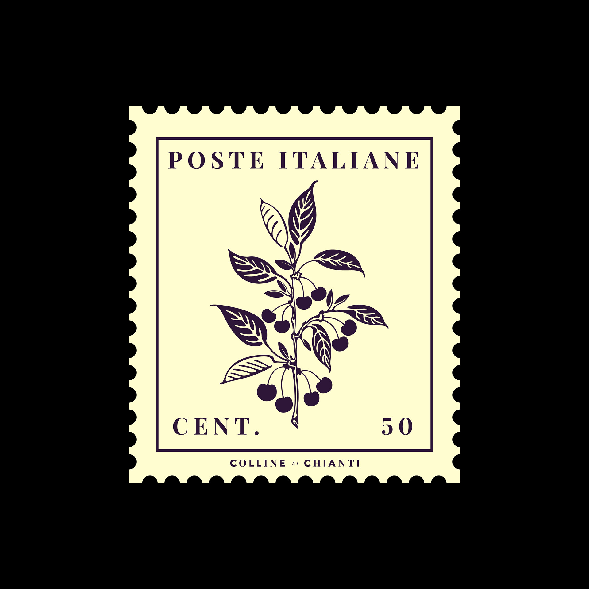
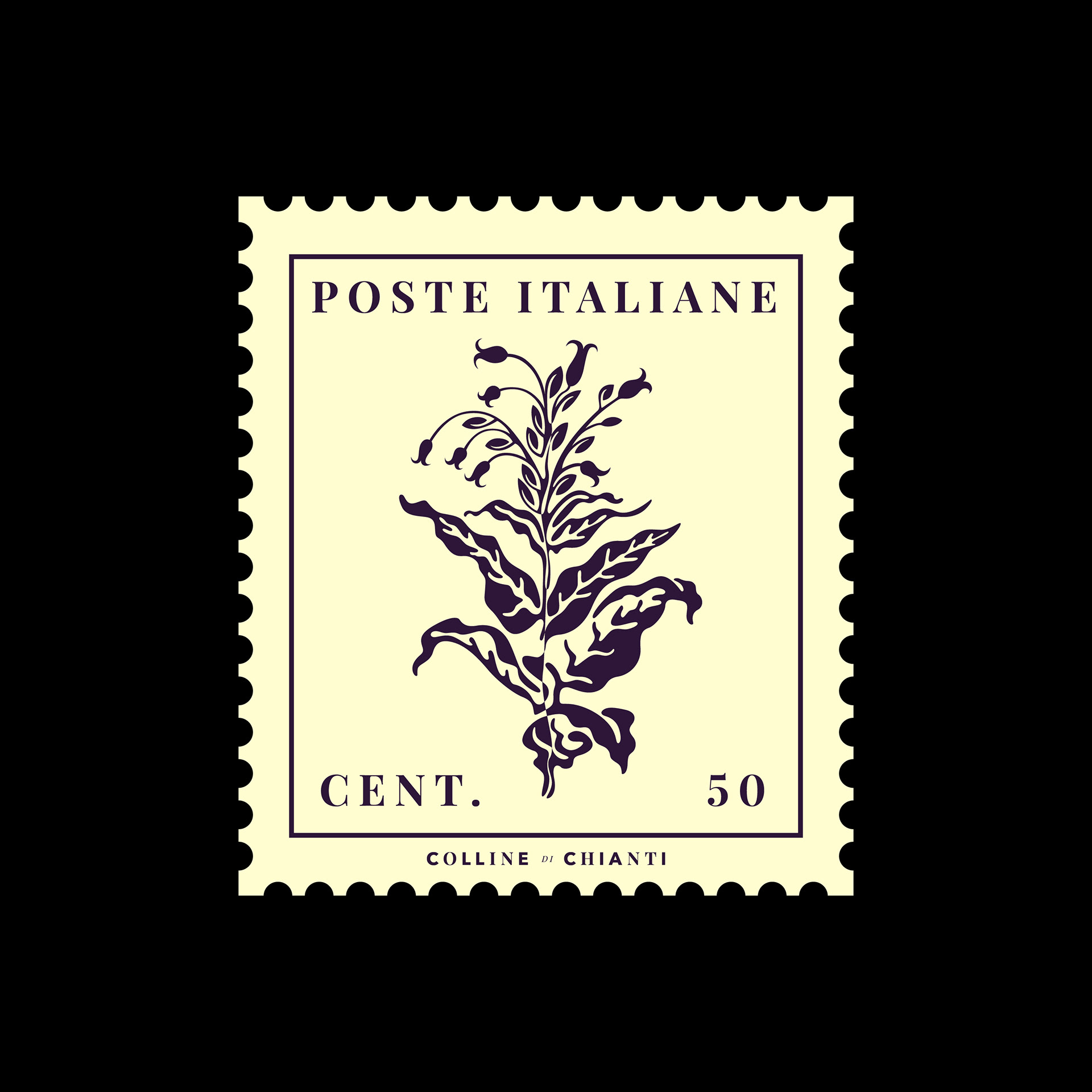
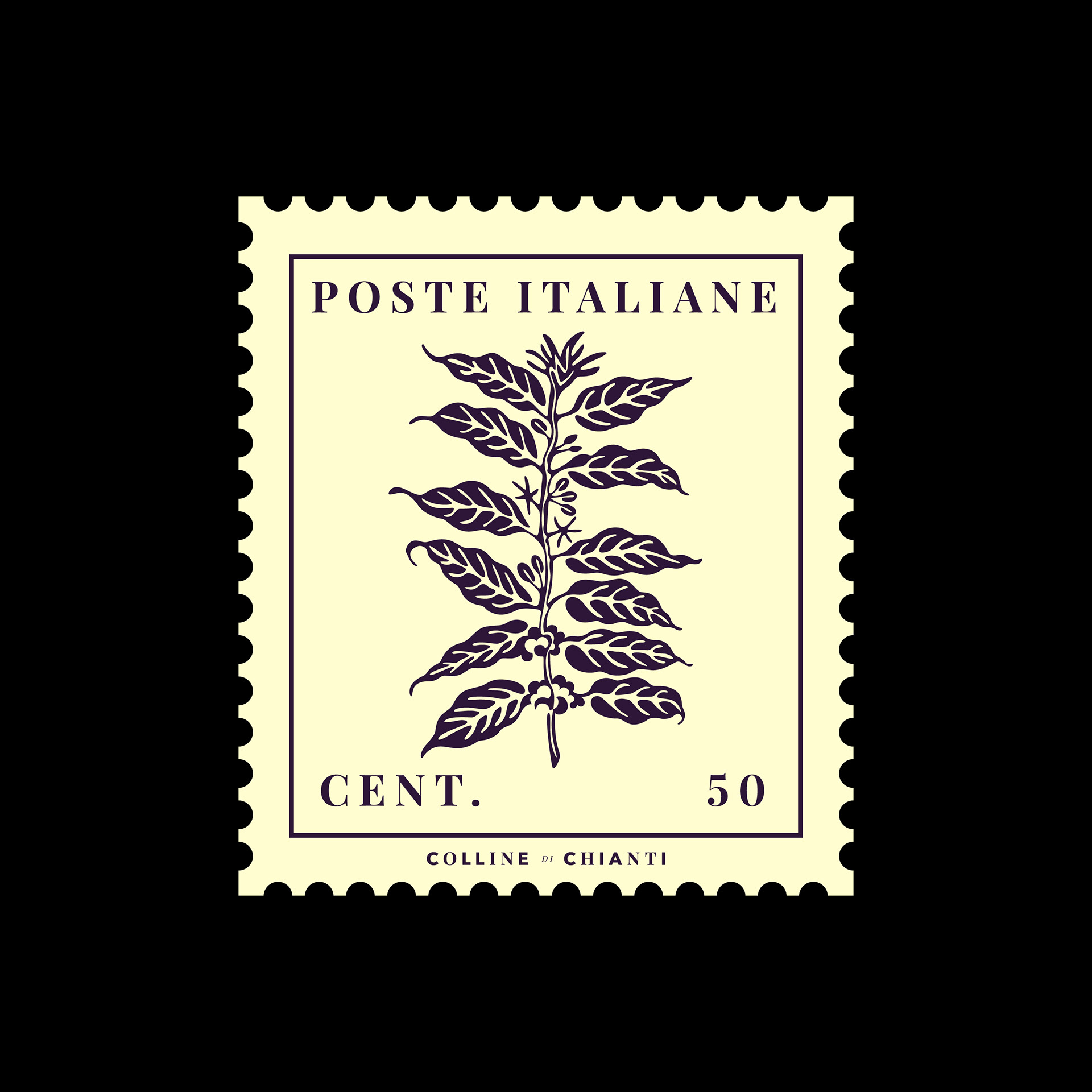
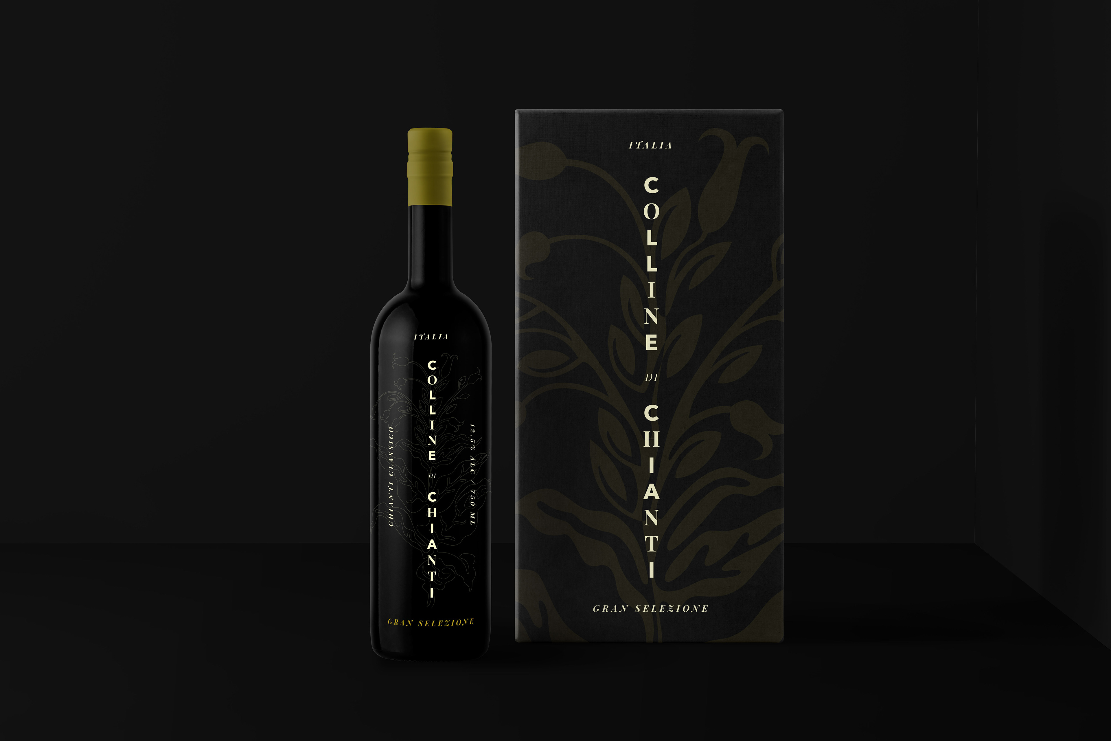
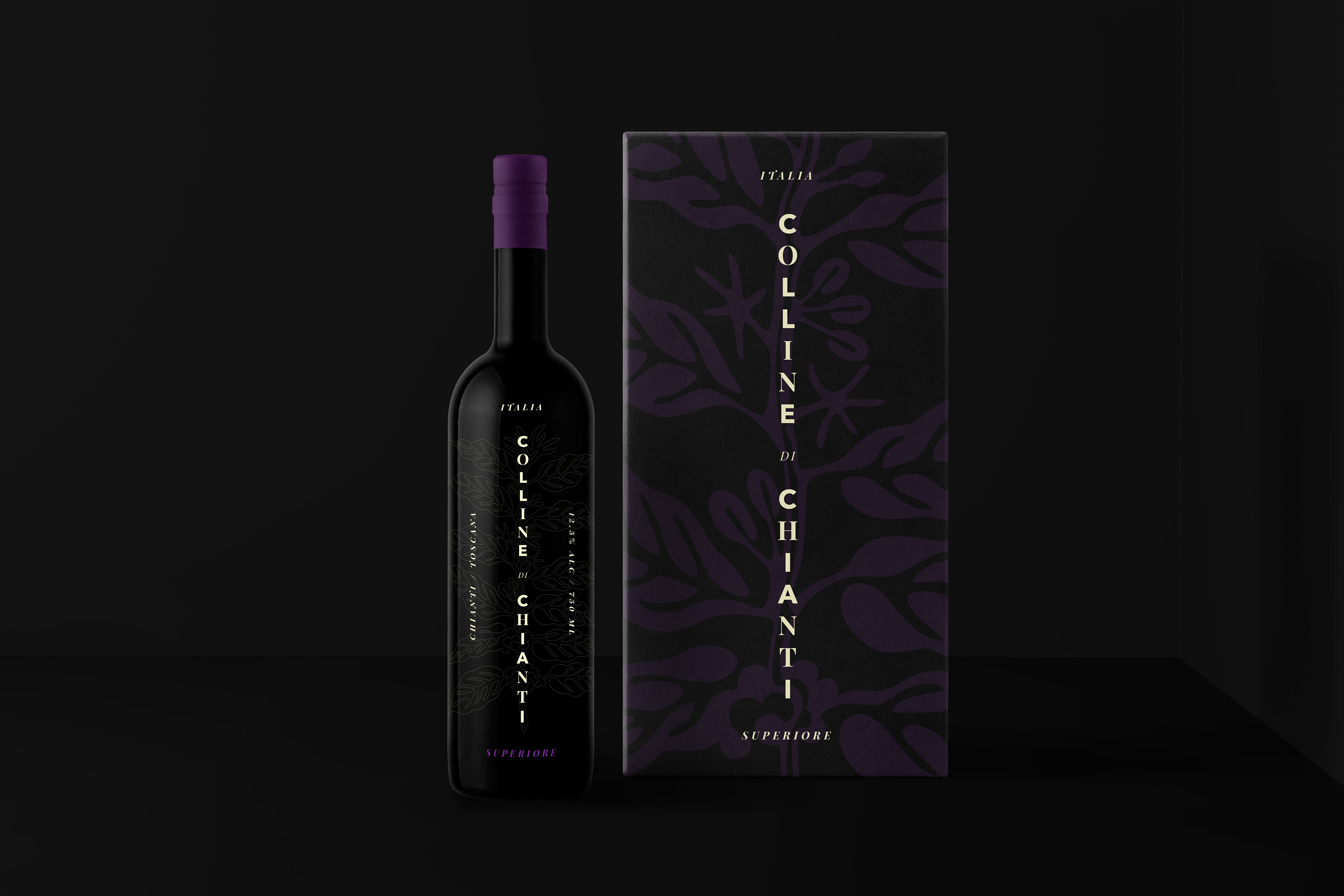
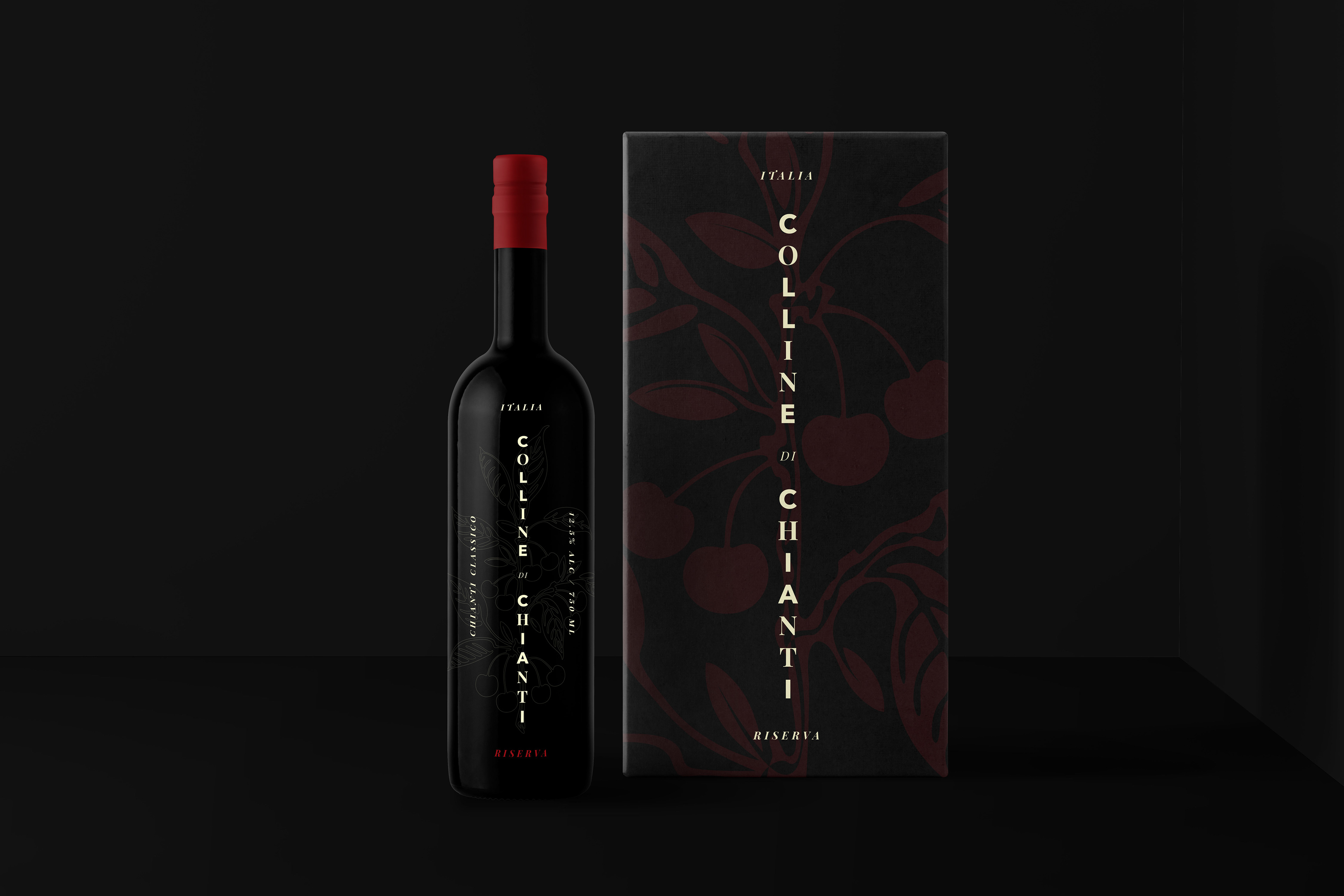
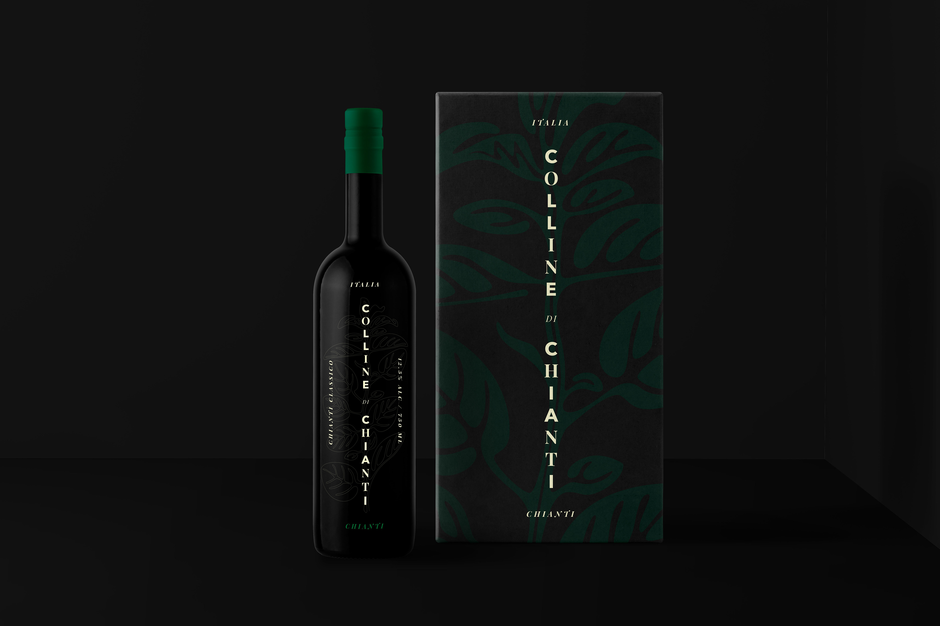
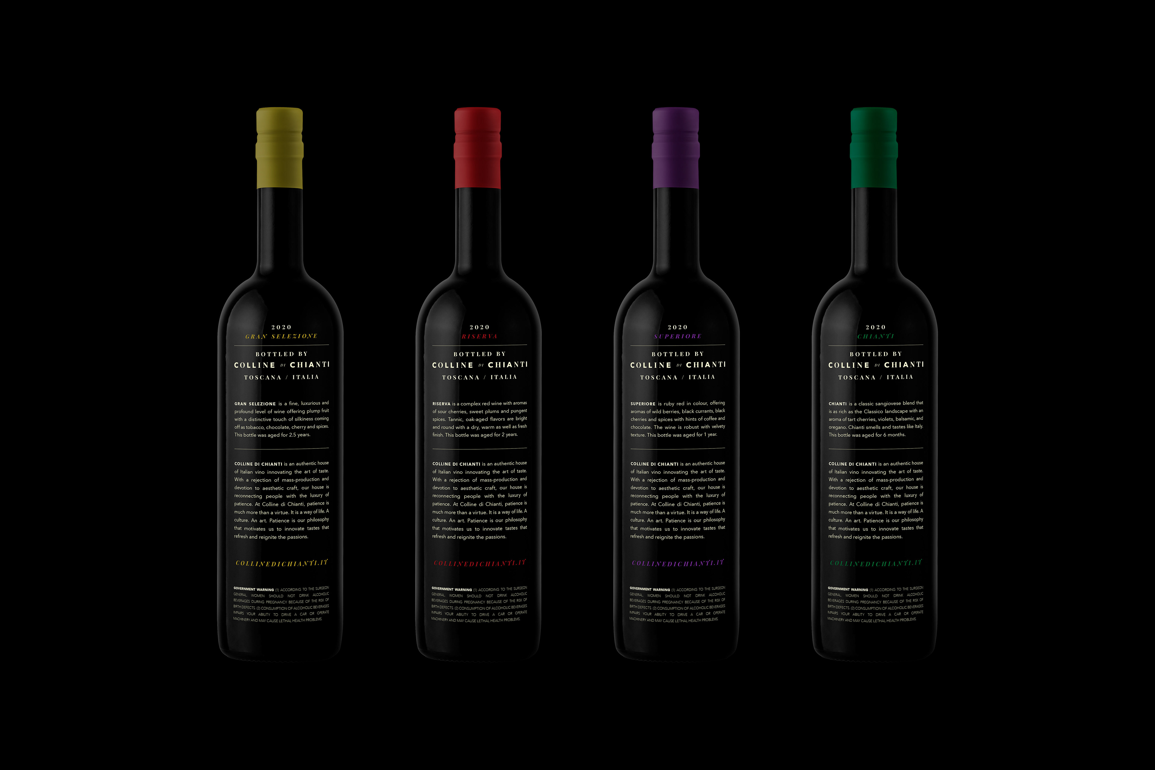
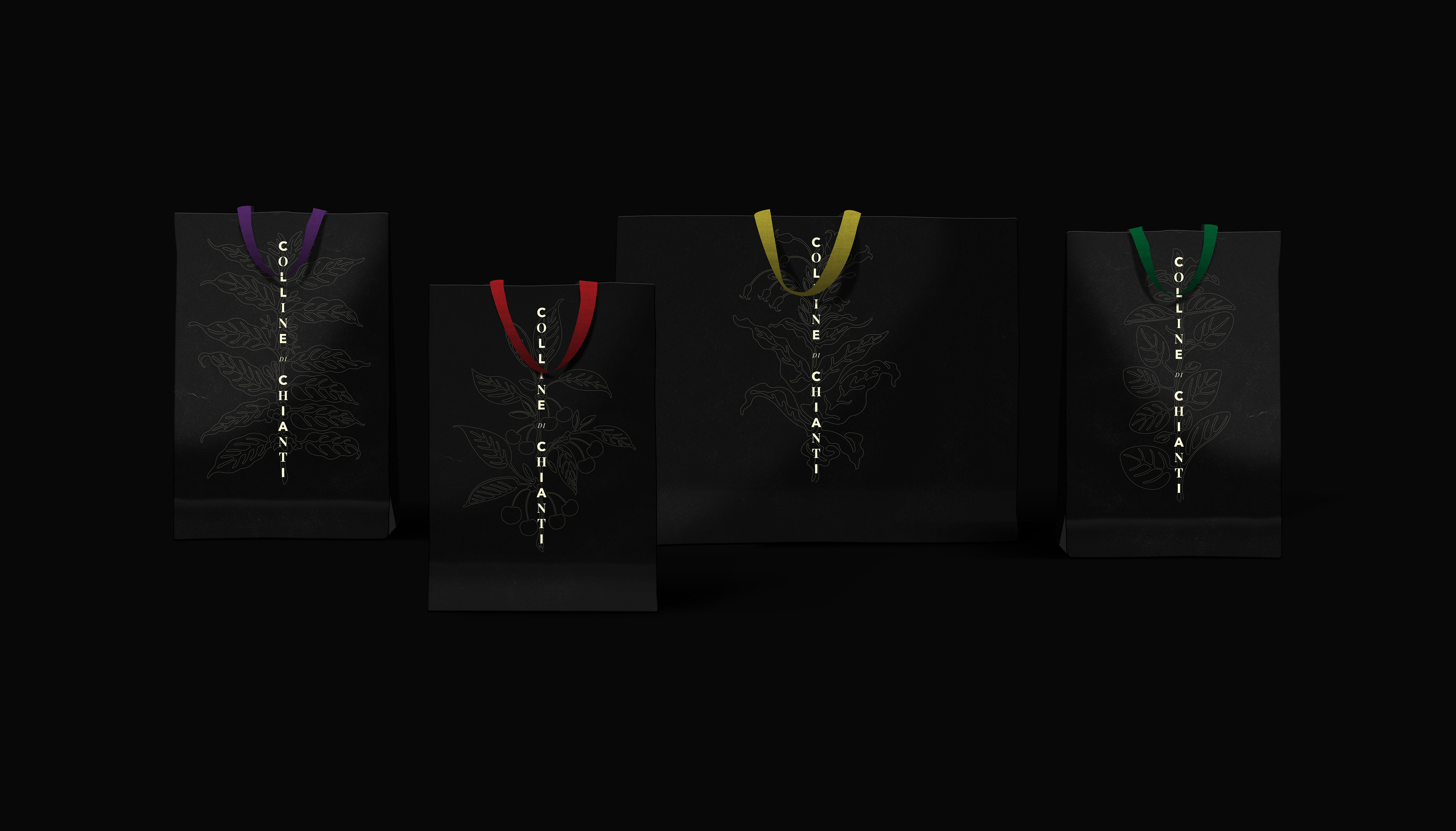
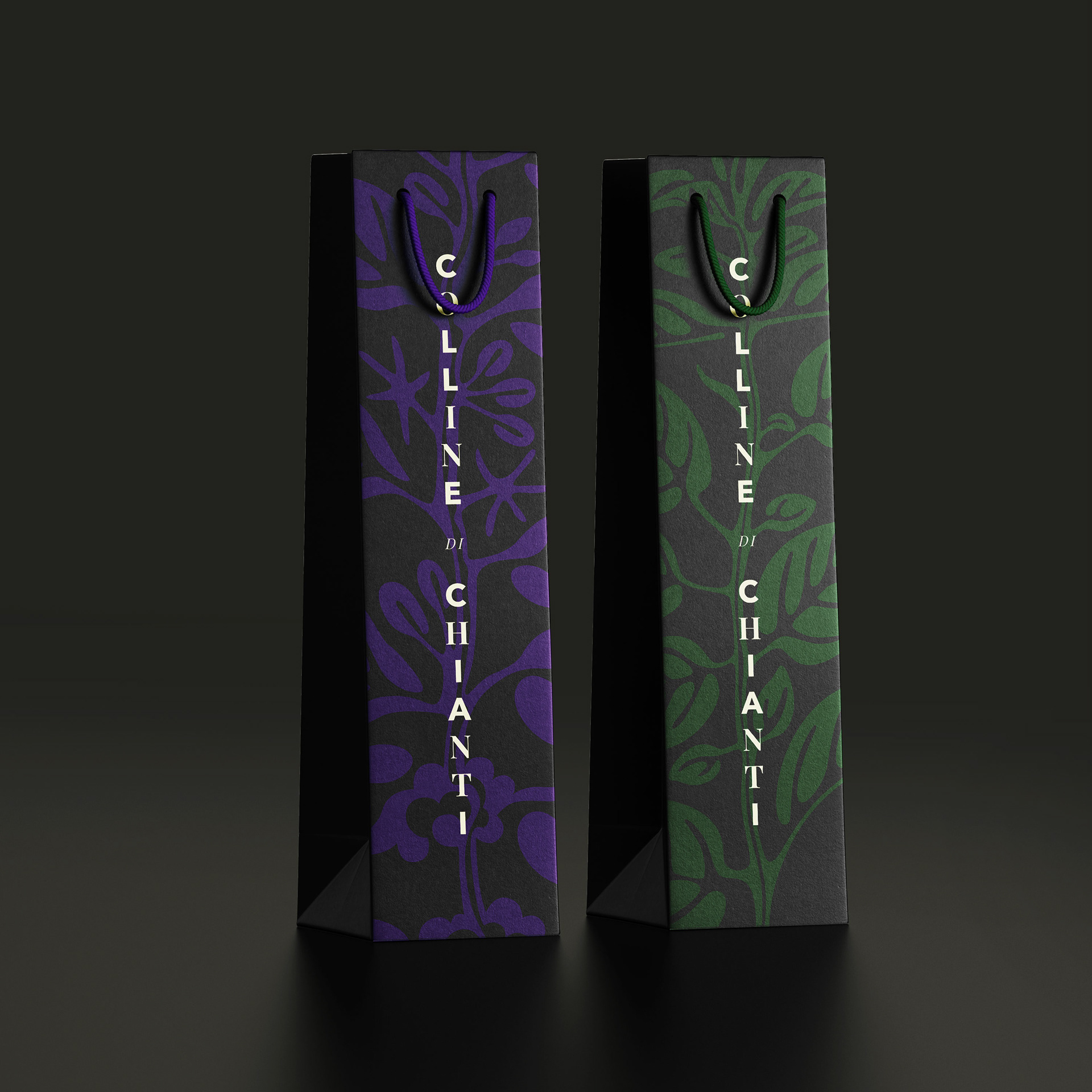
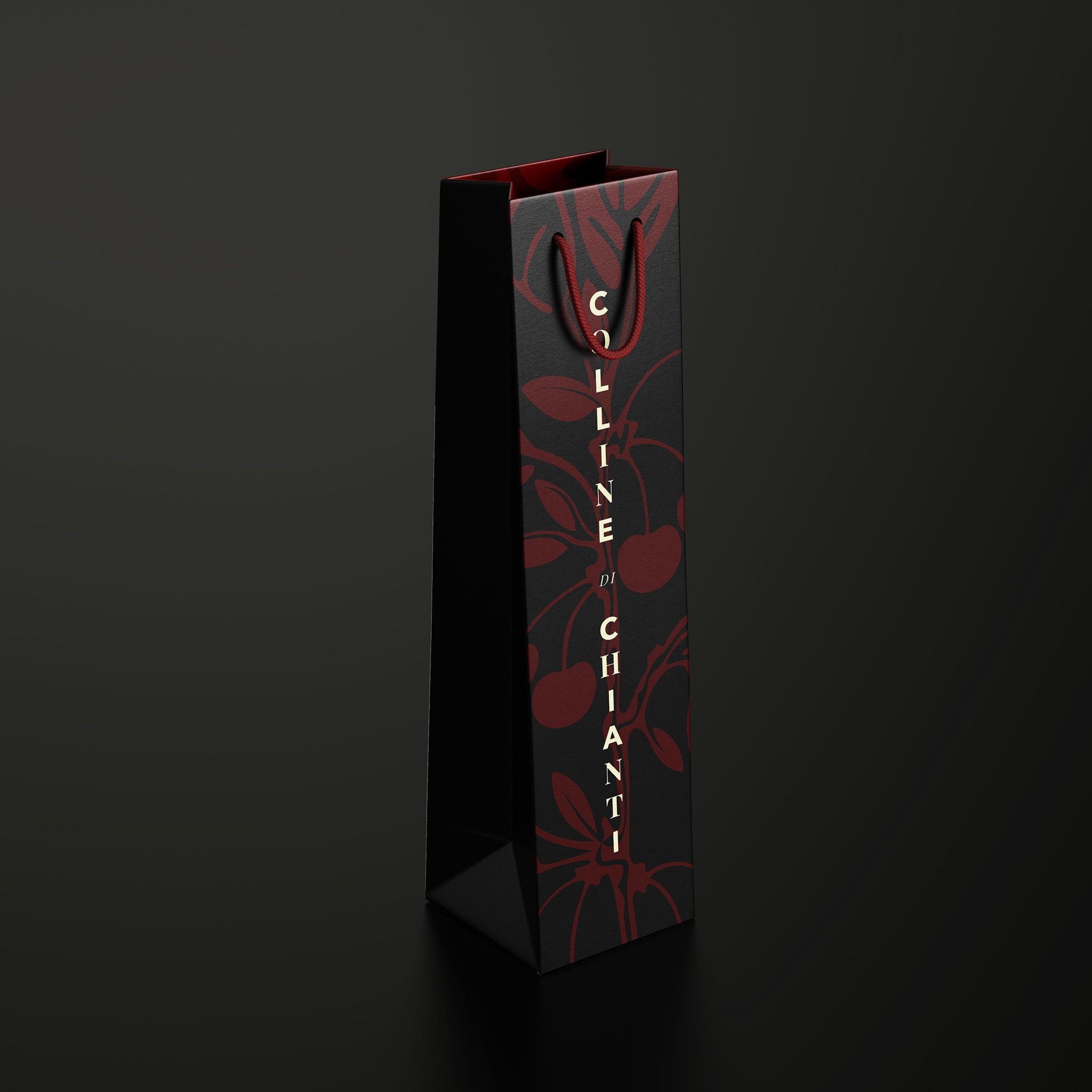
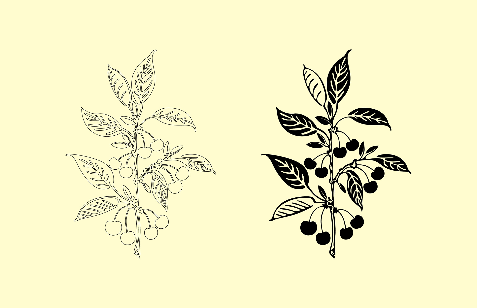
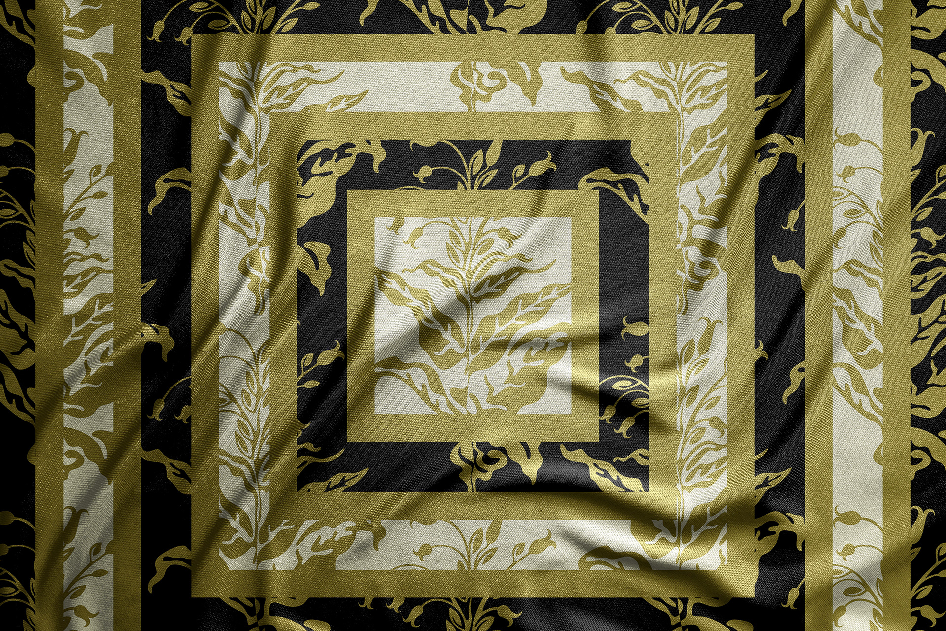
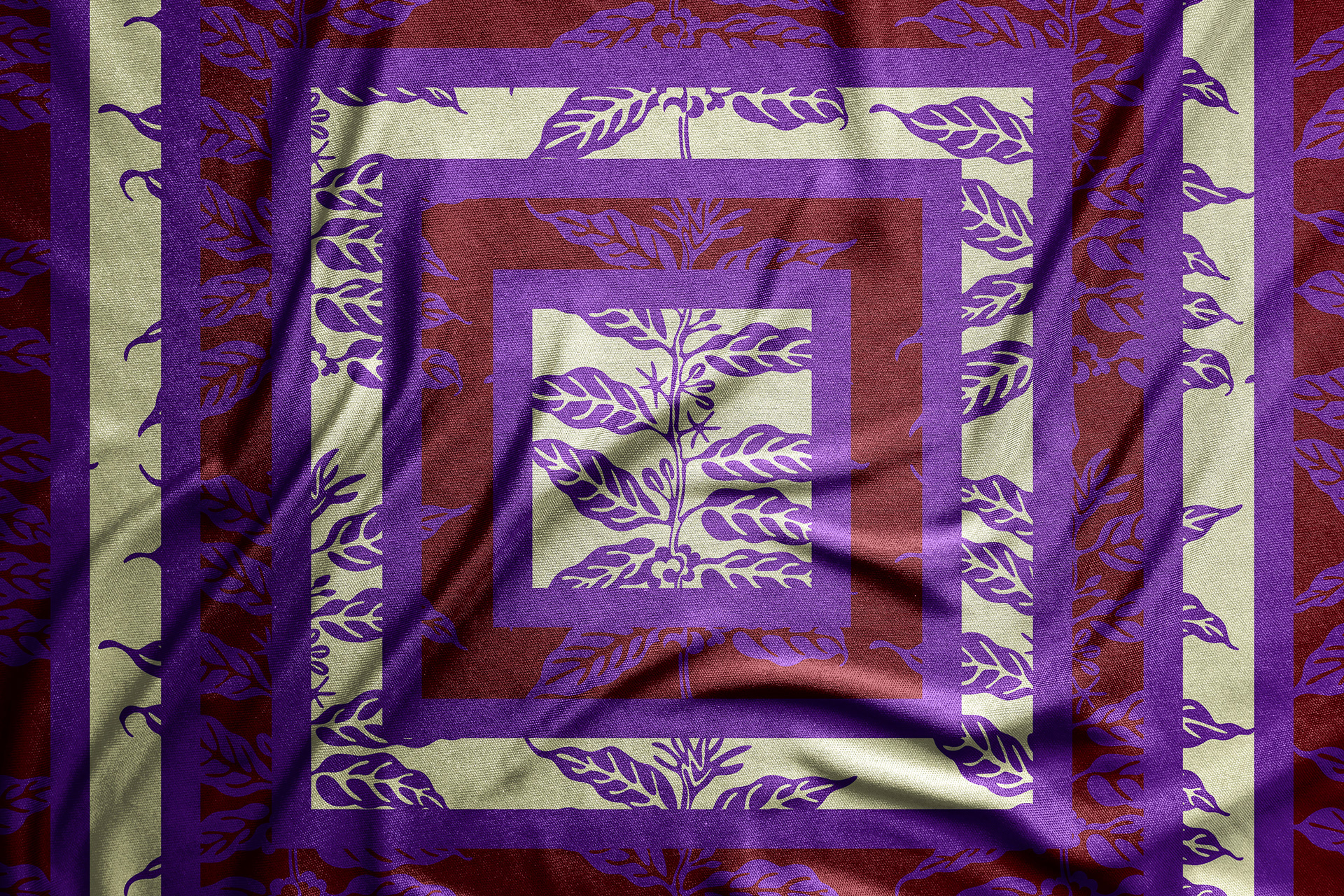
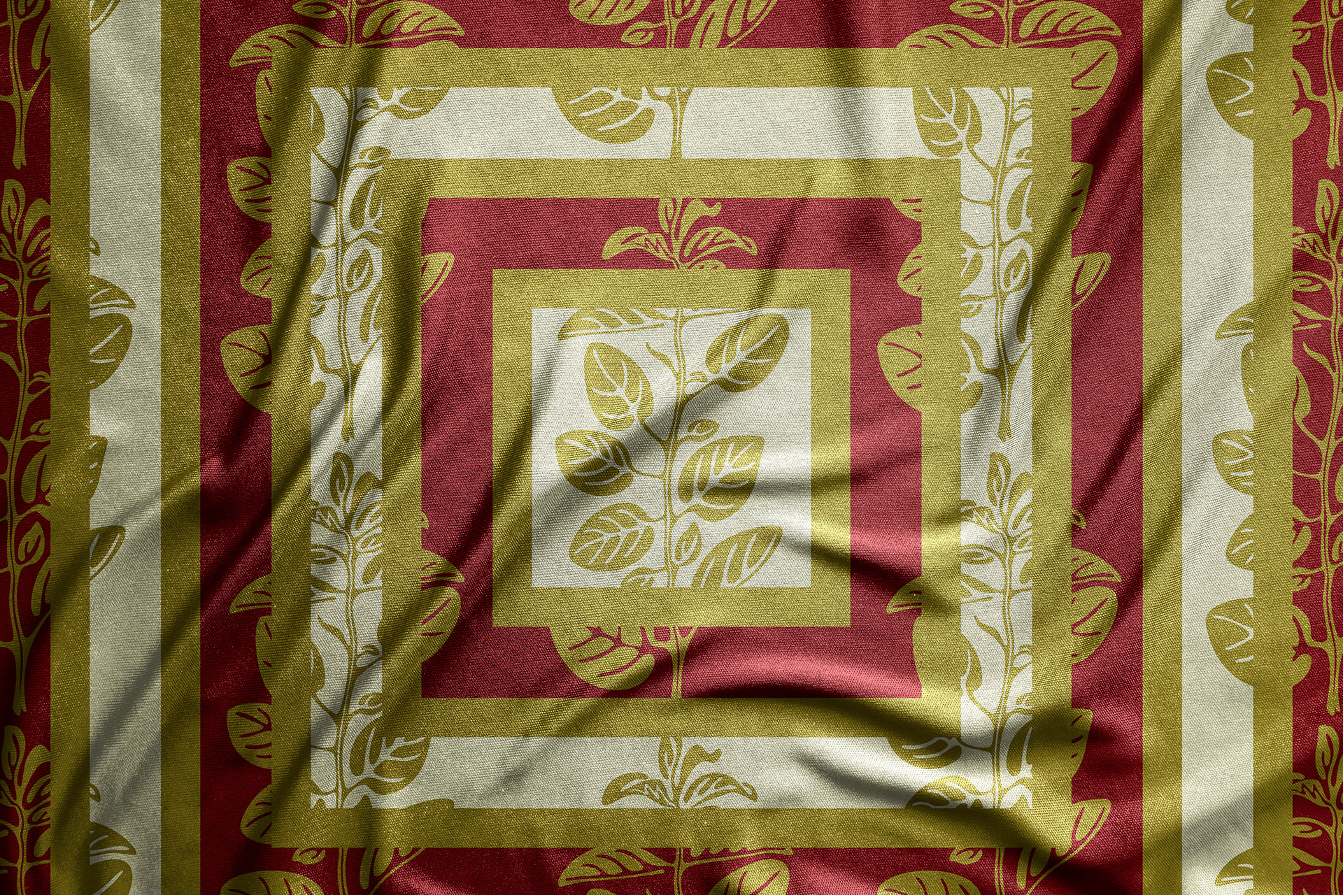
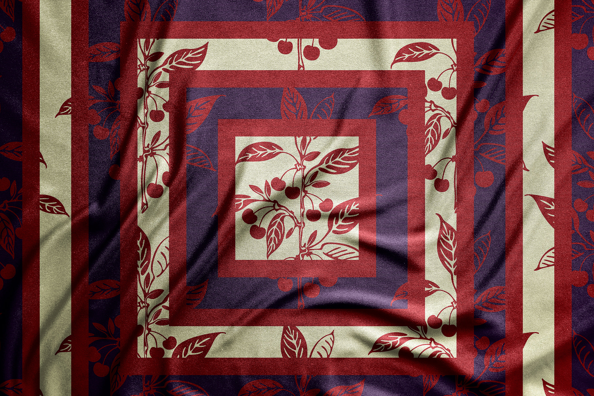
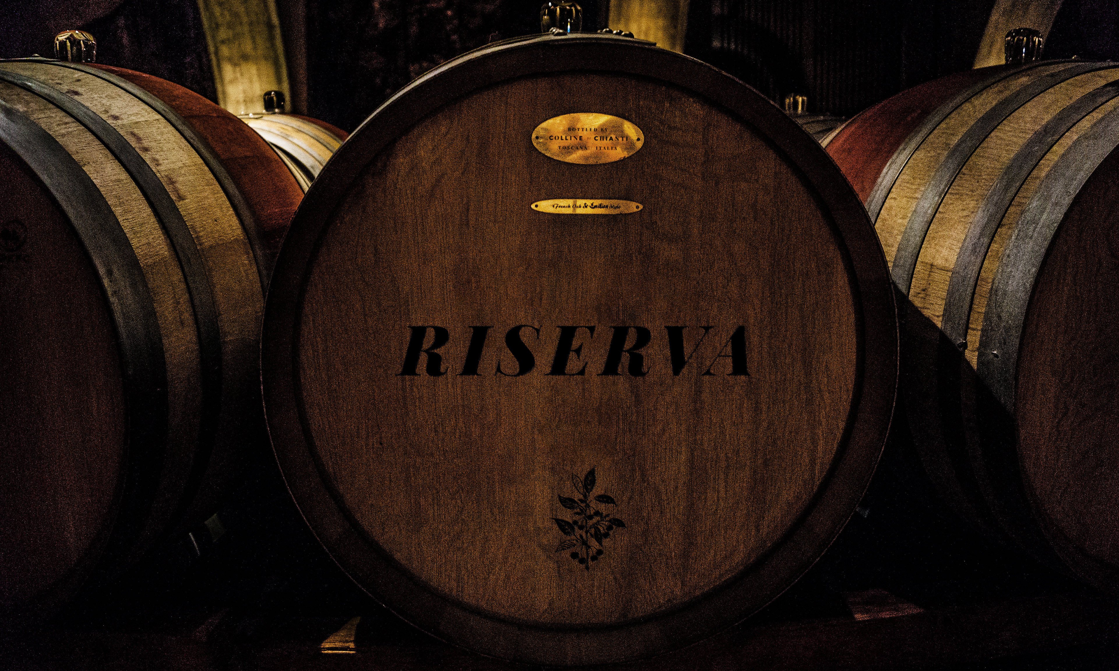
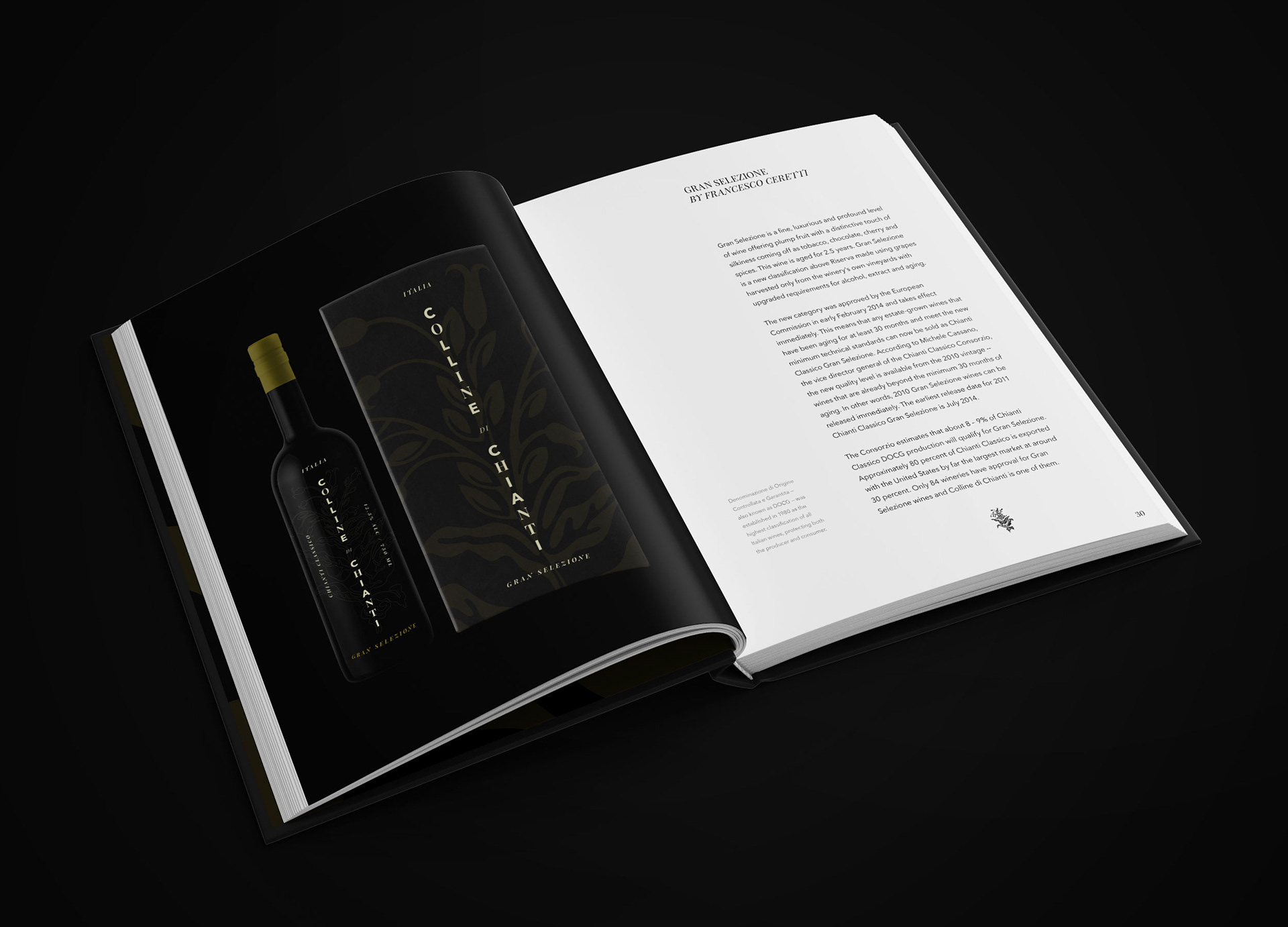
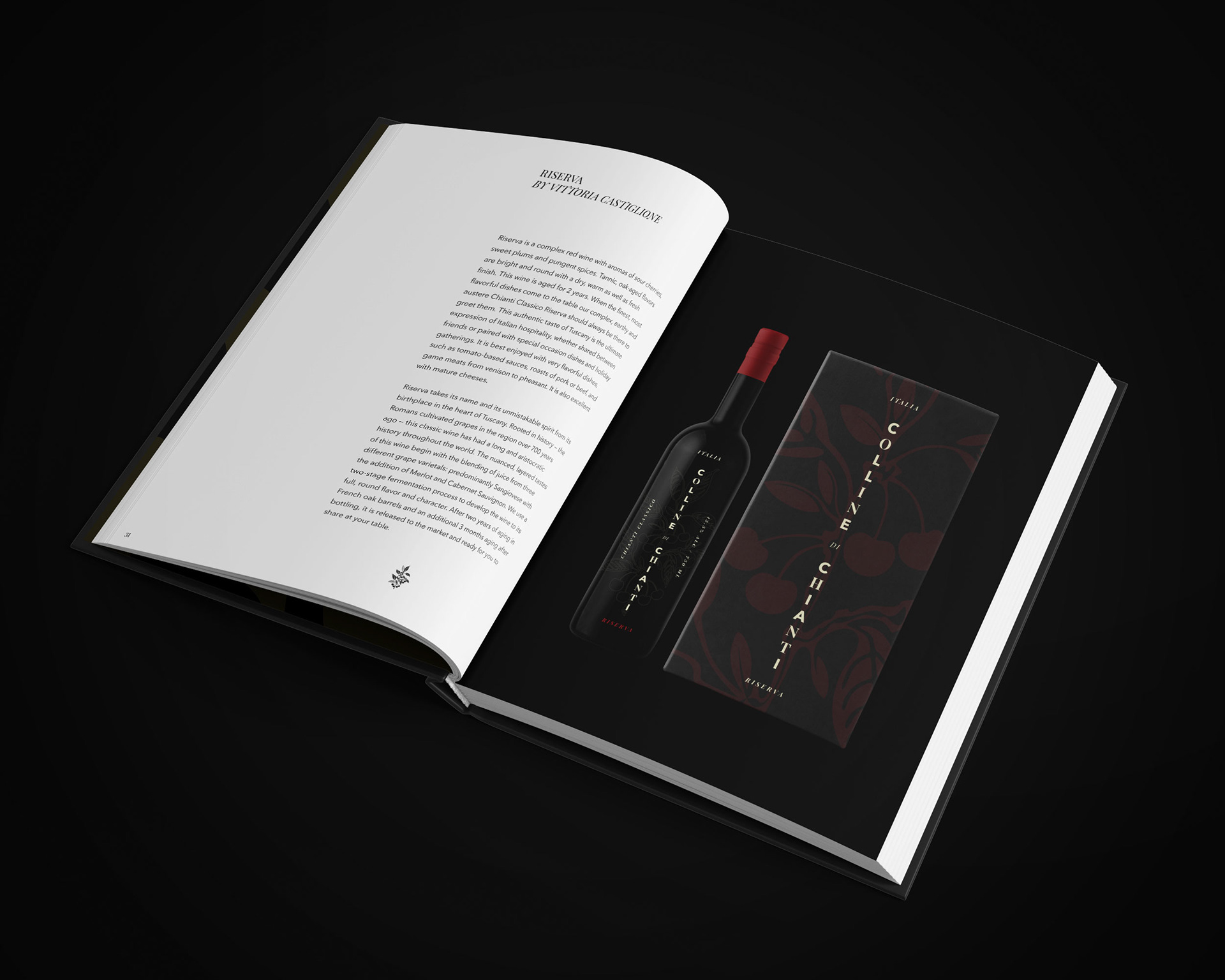
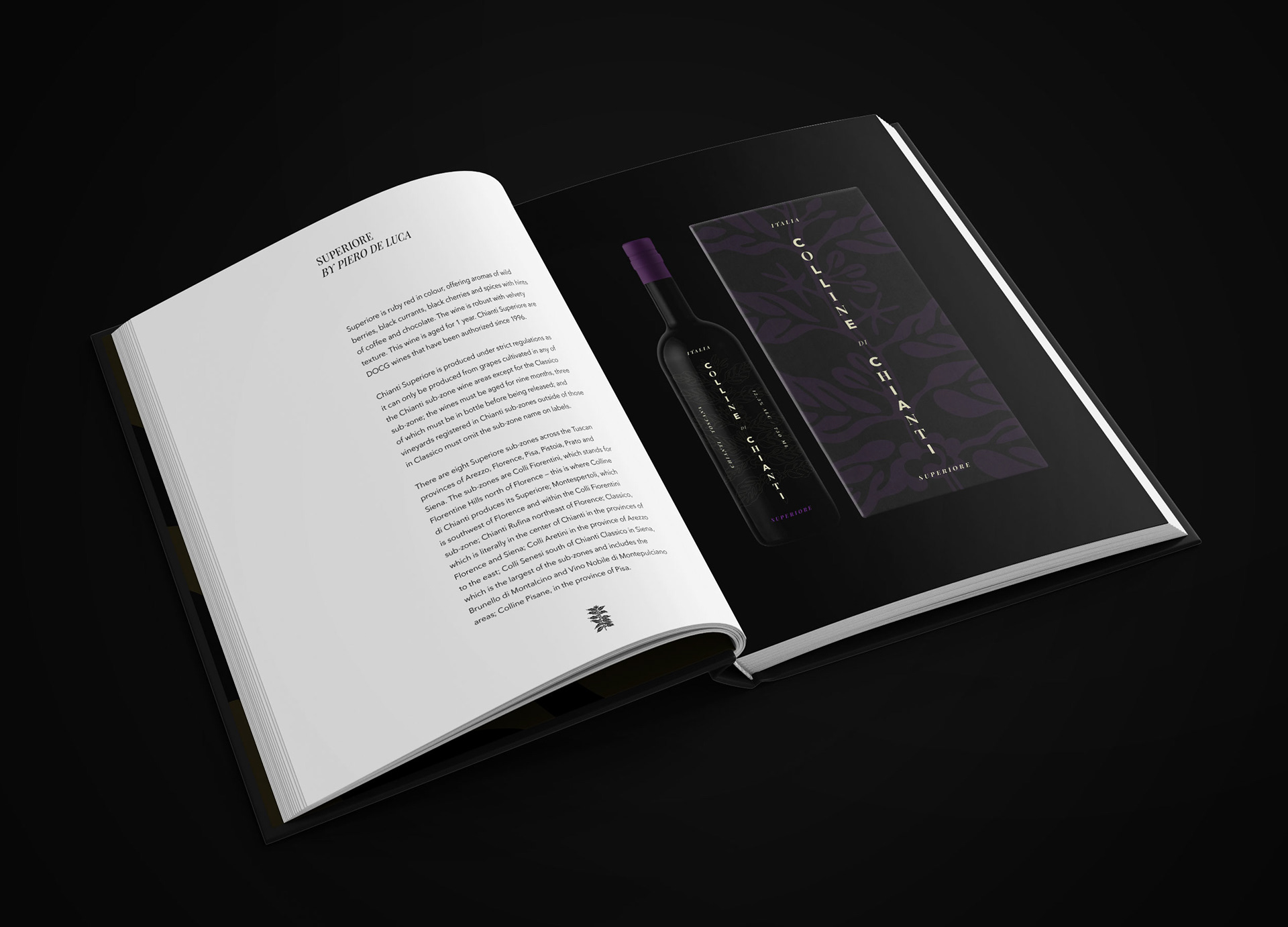
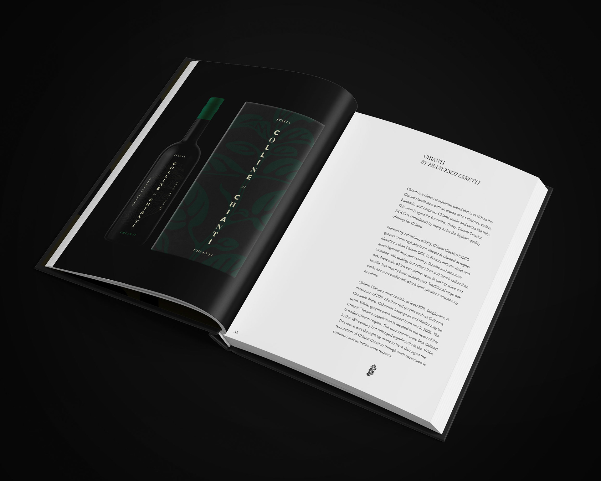
A sleek and understated design with an intricately playful illustration separates the Colline di Chianti bottle from the mannered or boring labels seen on shelves around the world. Each bottle bears its own color and ghosted single-line illustration that brings attention to the main note of each wine — Gran Selezione is a smoky tobacco and an earthy green olive; Riserva is a sweet cherry and tangy crimson; Superiore is a tannic coffee and silky purple; and Chianti is a strong oregano and an intense green. The boxes exhibit a filled version of each illustration in the color corresponding with the main flavor.
NOTE: The Superiore label does not share the "Chianti Classico" title because this particular wine cannot made in the Classico region. Instead, it bears "Chianti / Toscana" because it can be produced in the surrounding regions.

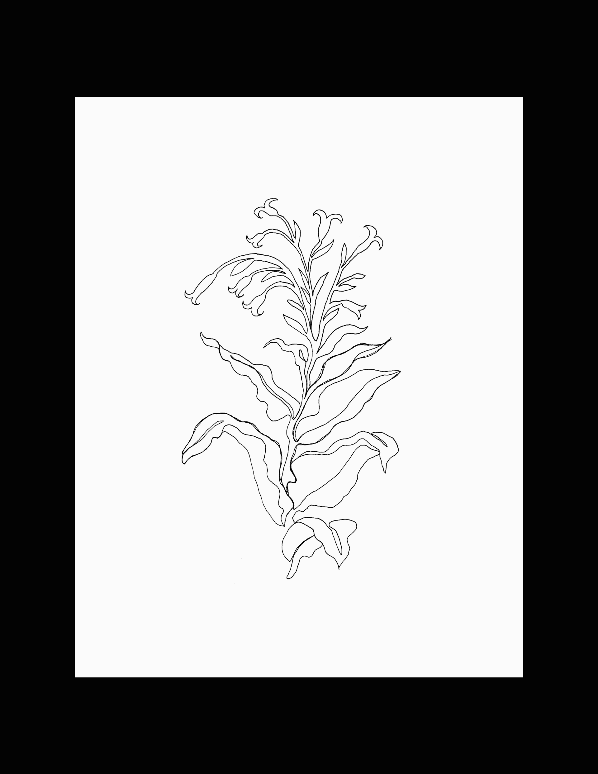
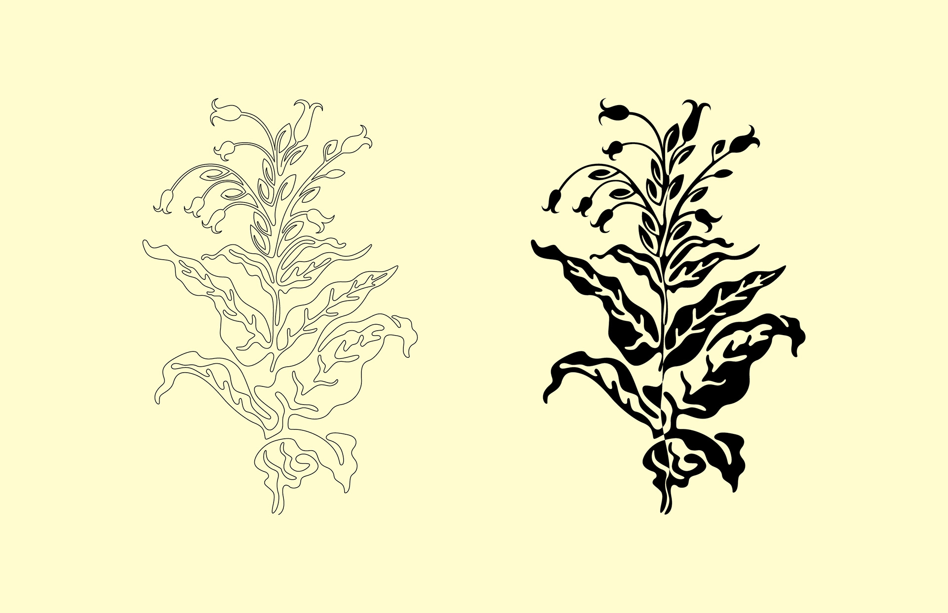
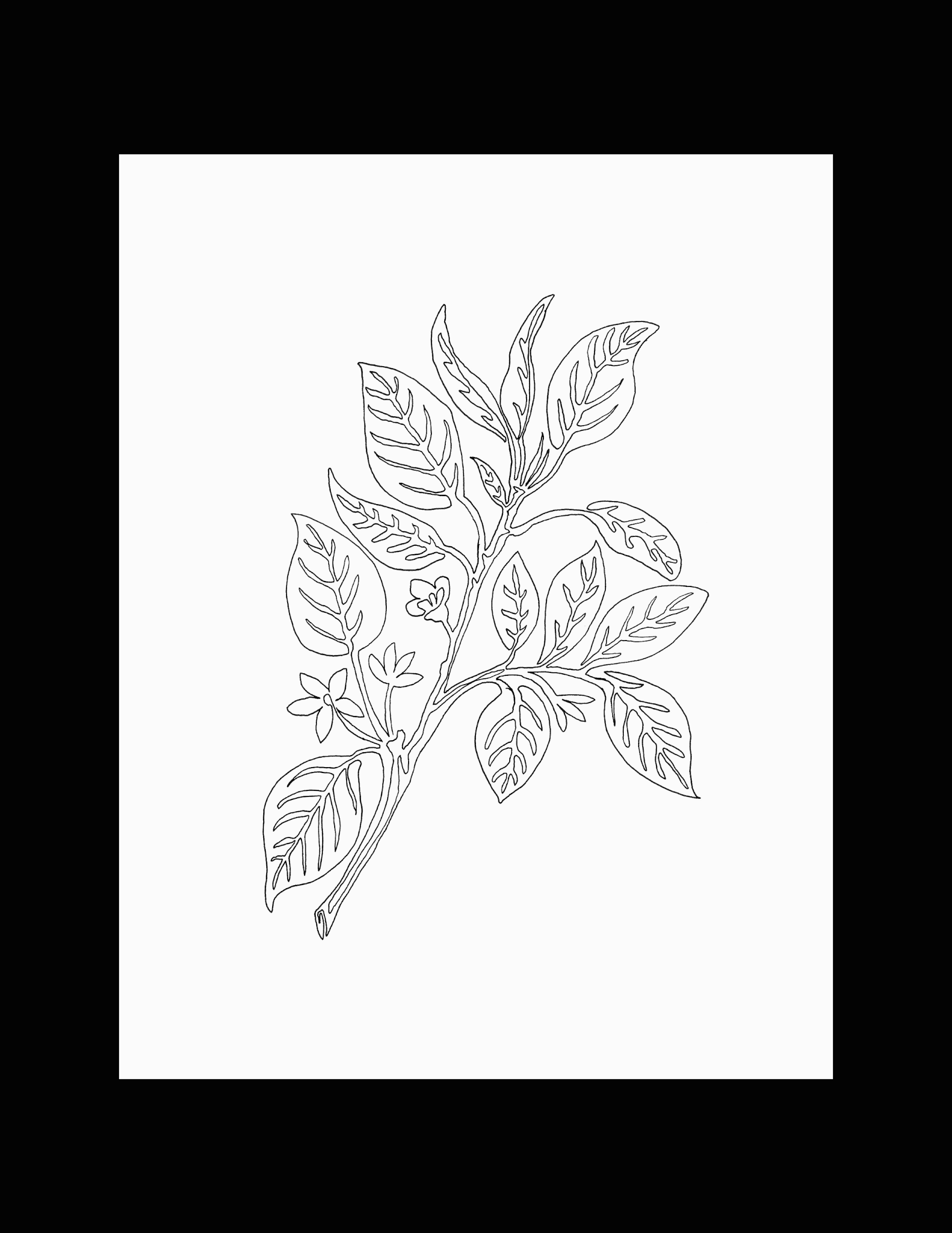
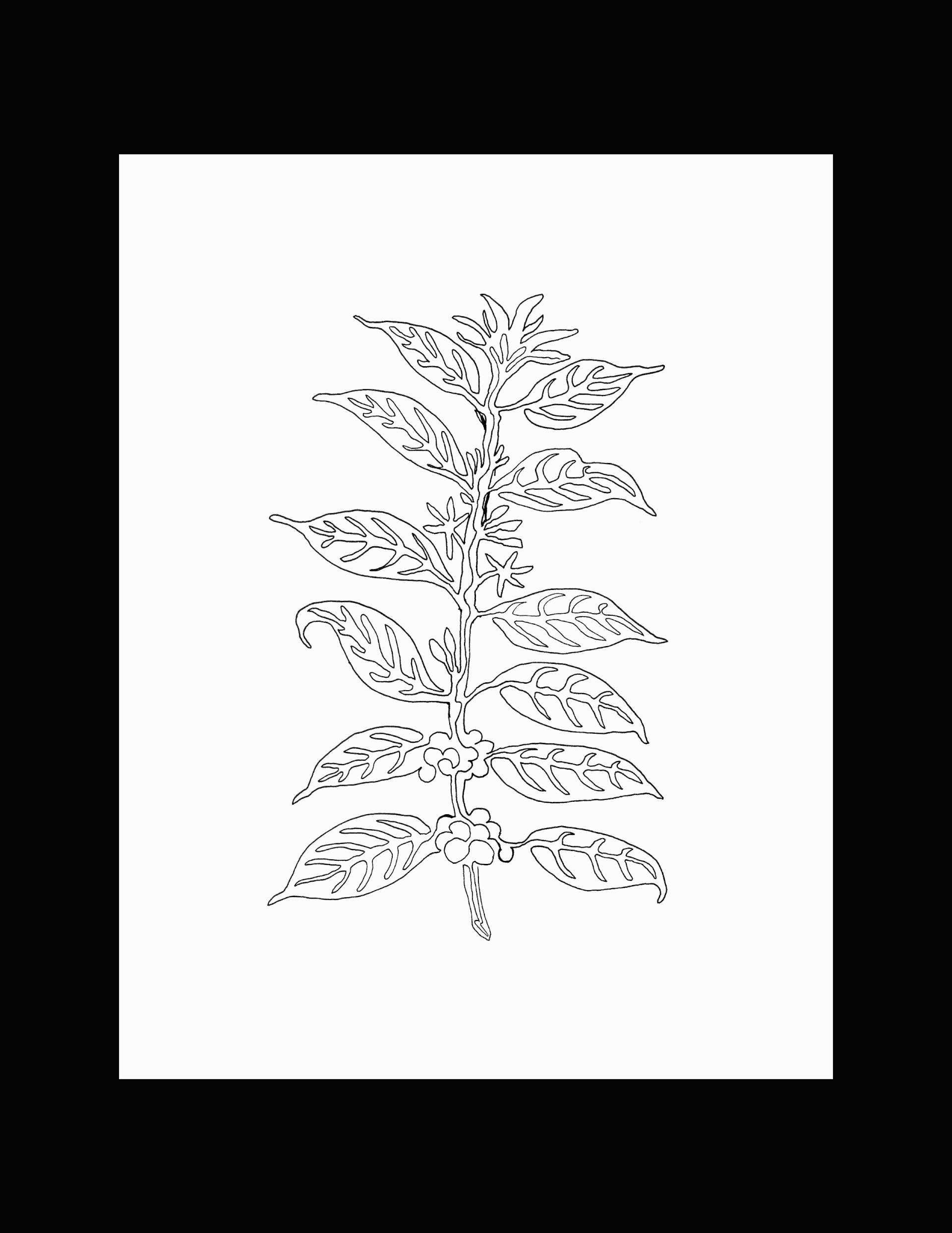
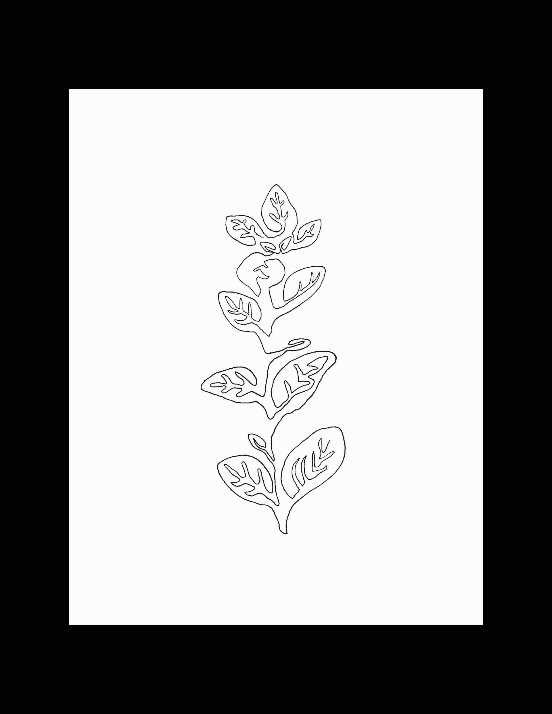
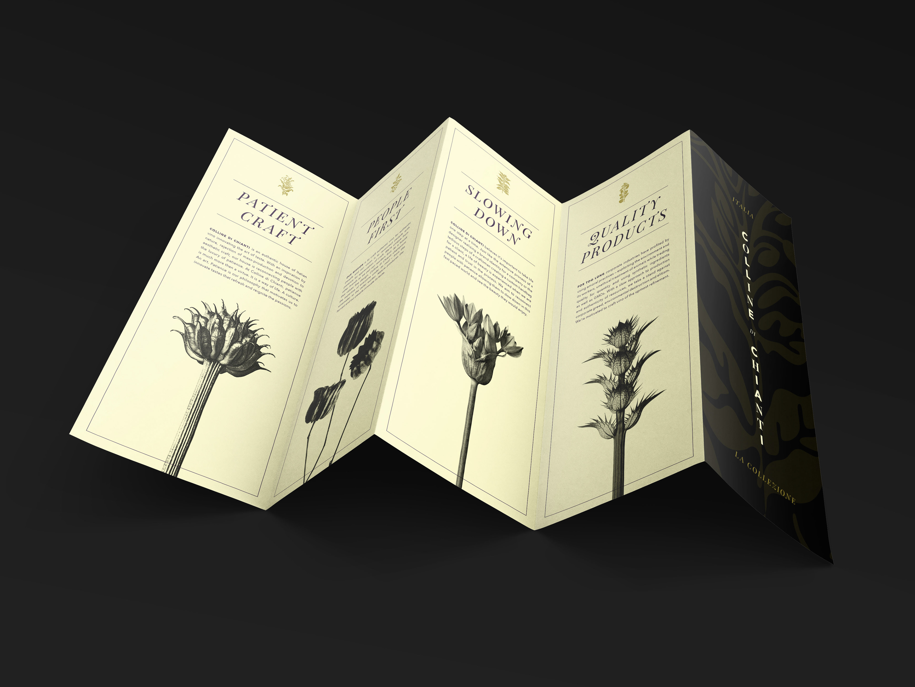
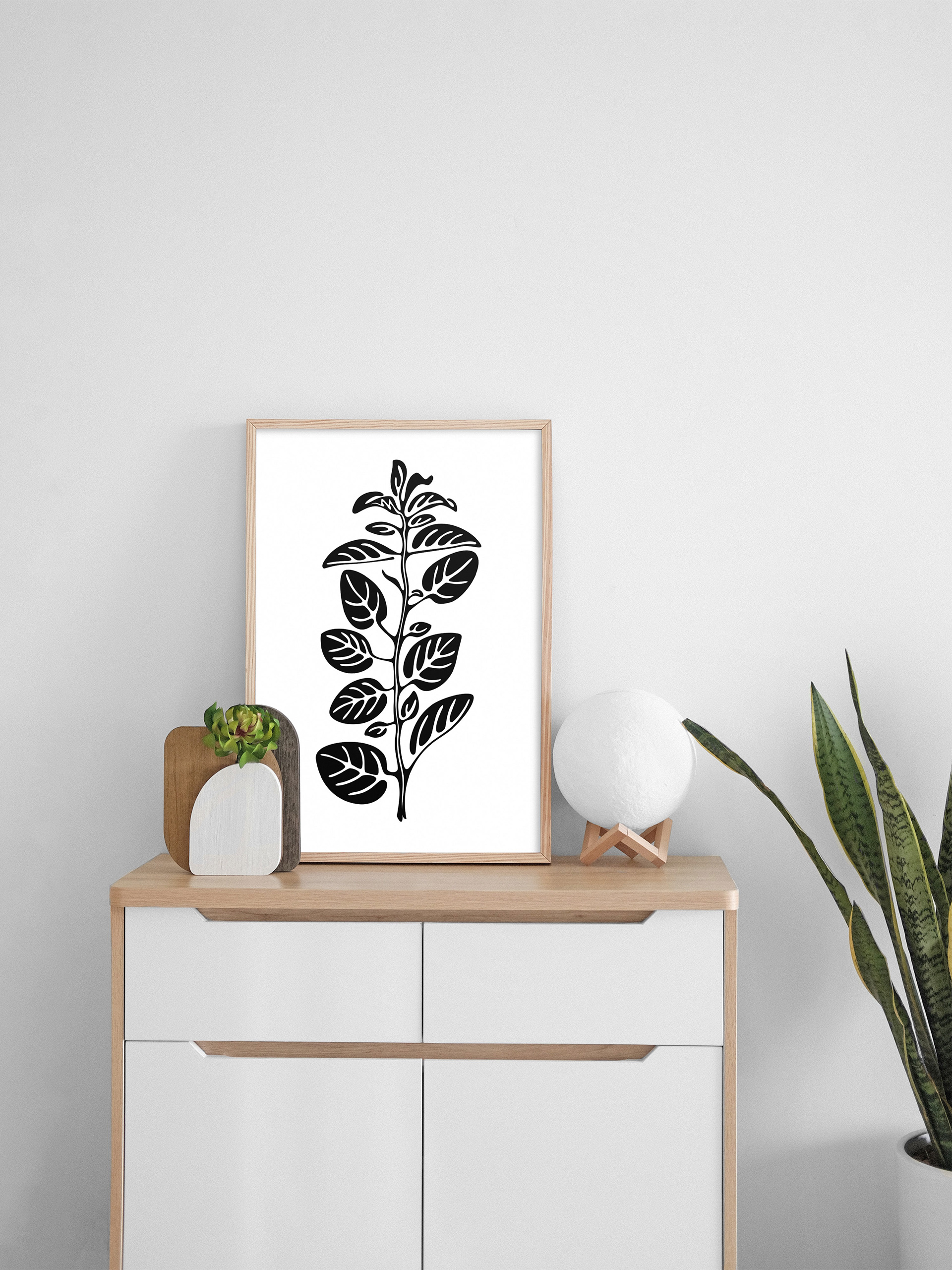
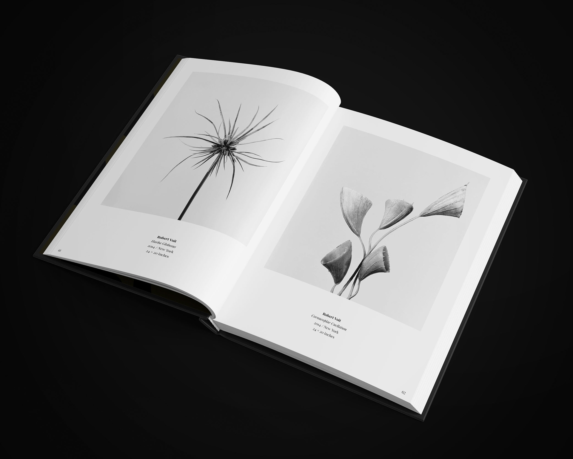
Botanical Illustrations
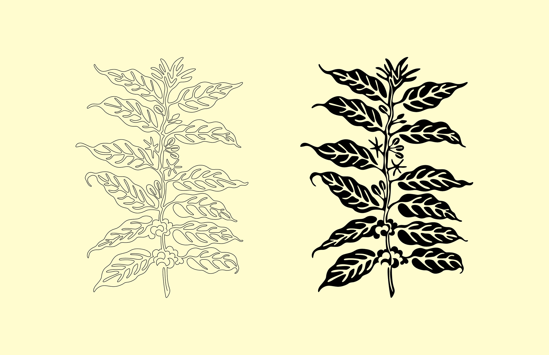
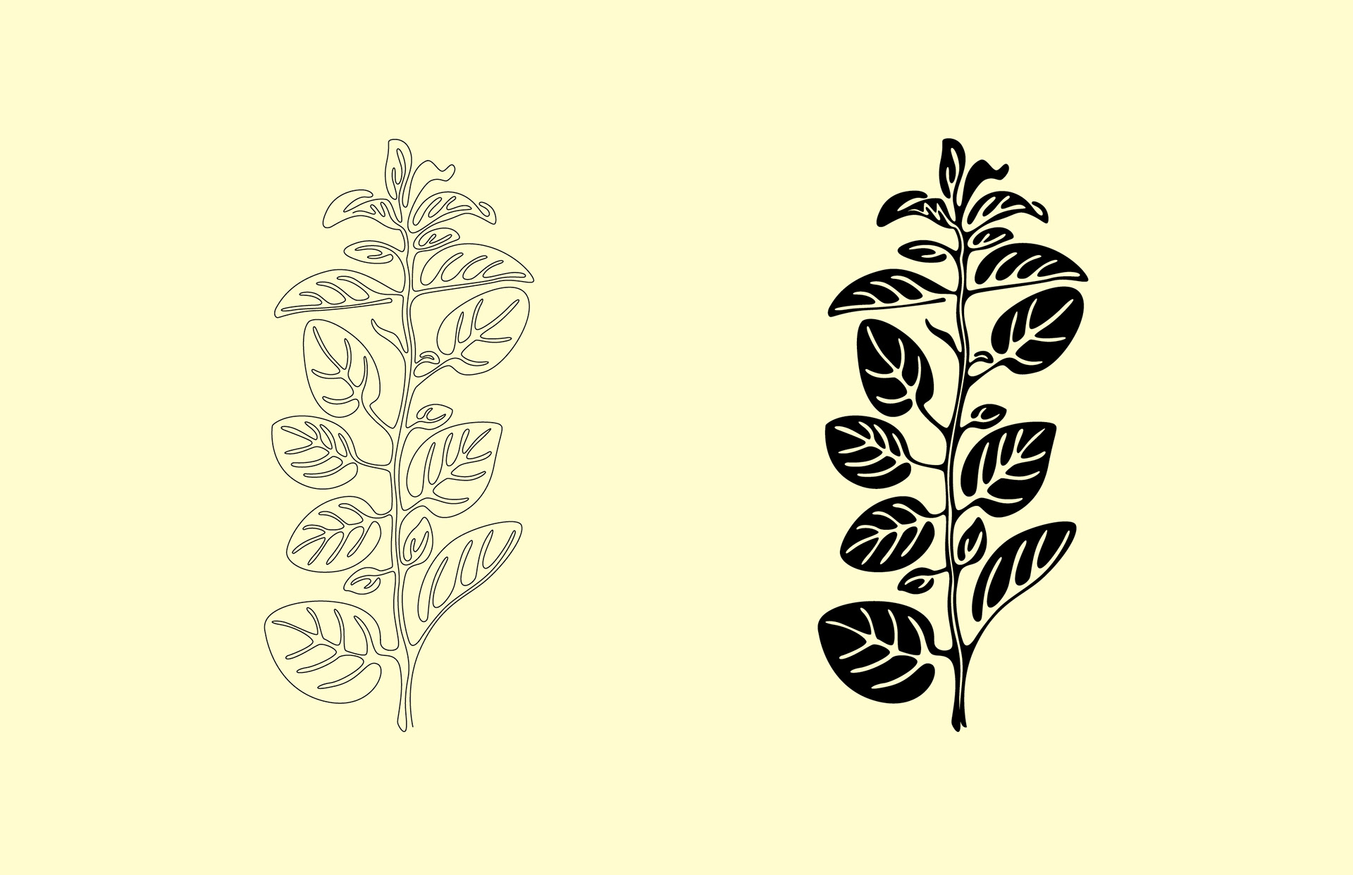
A series of botanical illustrations were made for each wine depending on their main note — Tobacco for Gran Selezione being the main brand illustration; Cherry for Riserva; Coffee for Superiore; and Oregano for Chianti. Single-line illustrations were created first and are used for any primary applications including the bottles and company stationery. Filled versions for each were also created and are used for any secondary applications including packaging, collateral as well as publication end markers. The process and iterations for each illustration is exhibited below.
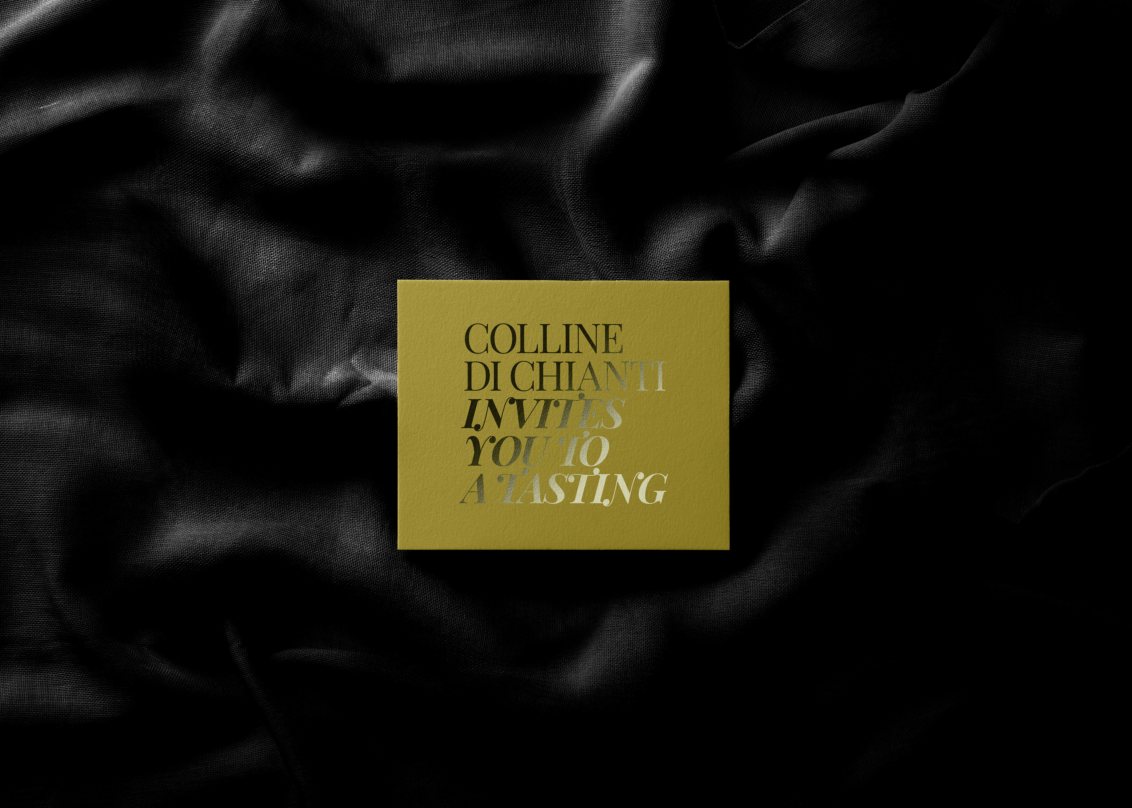
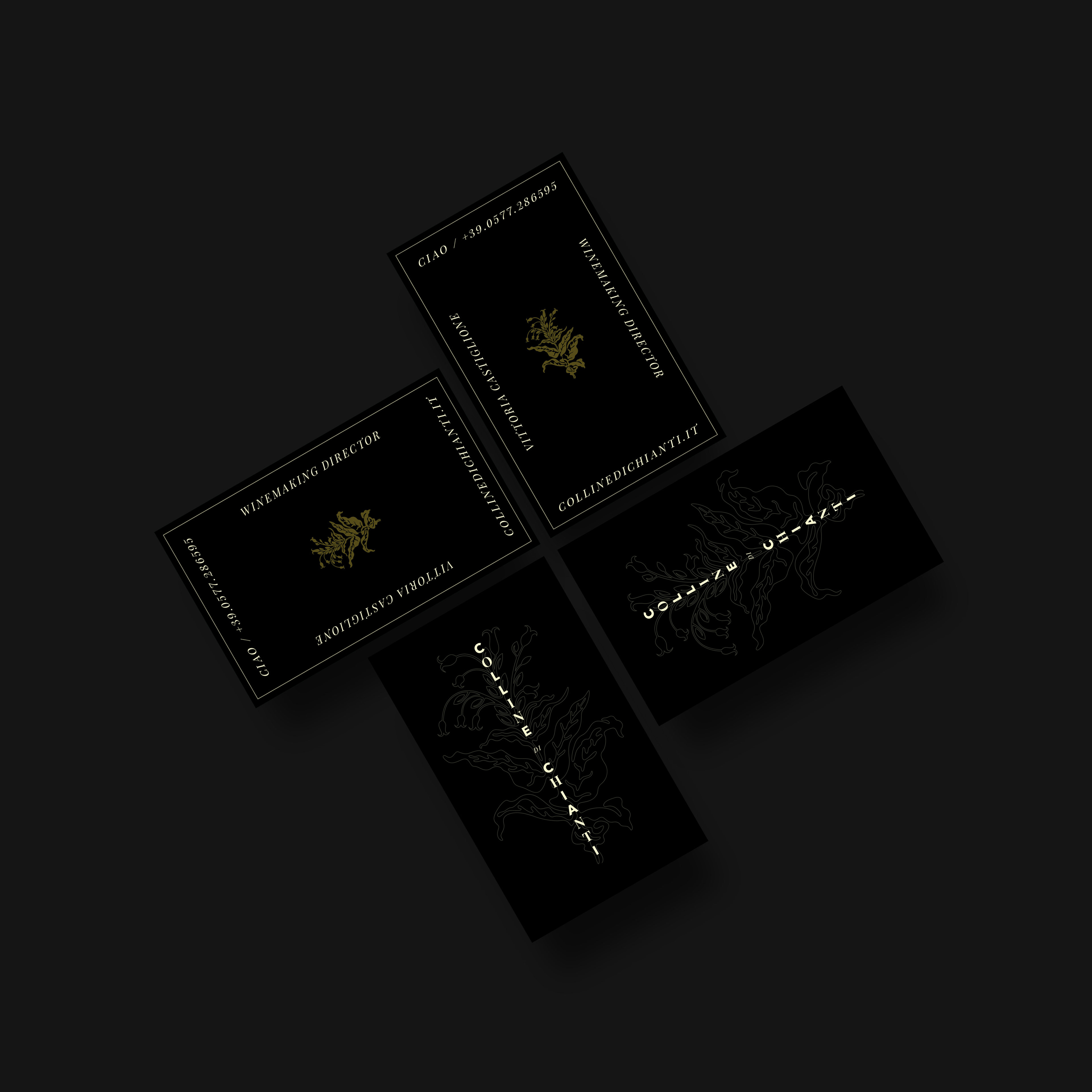
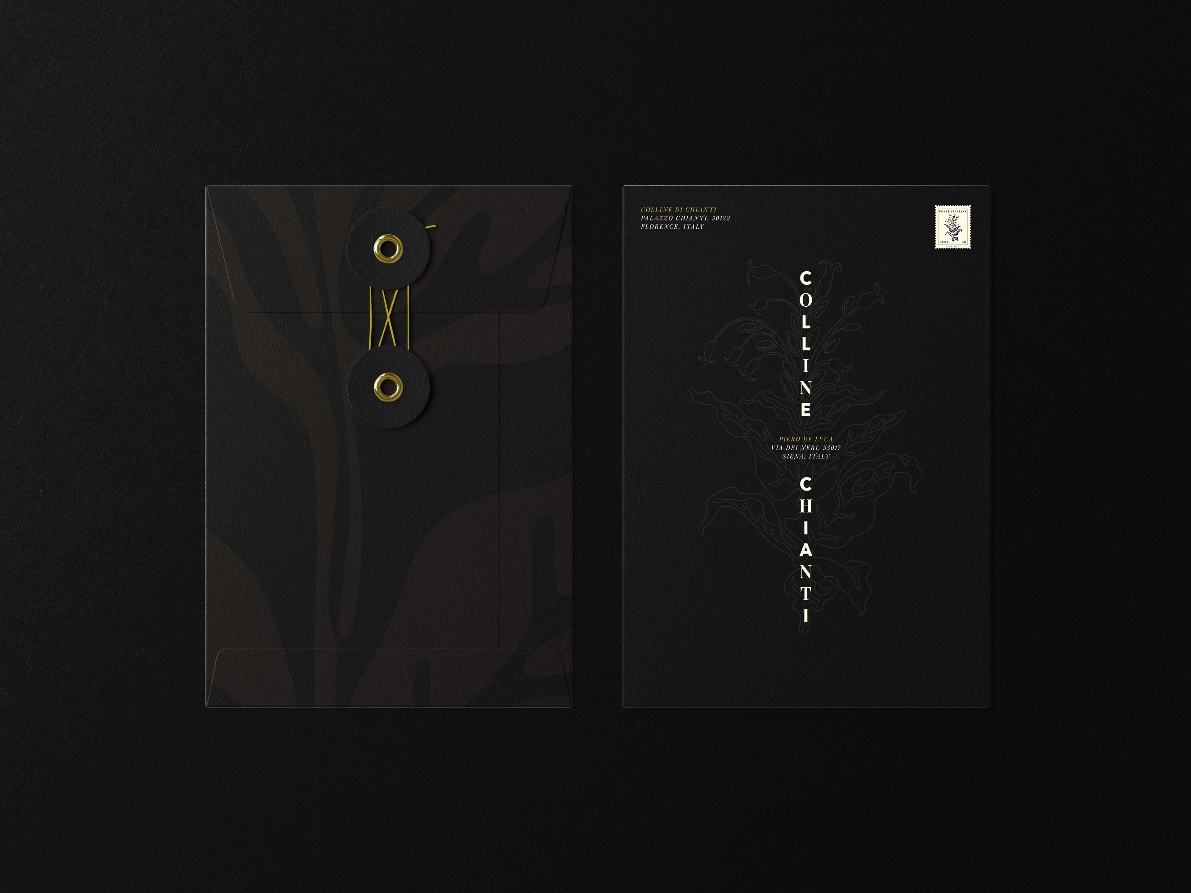
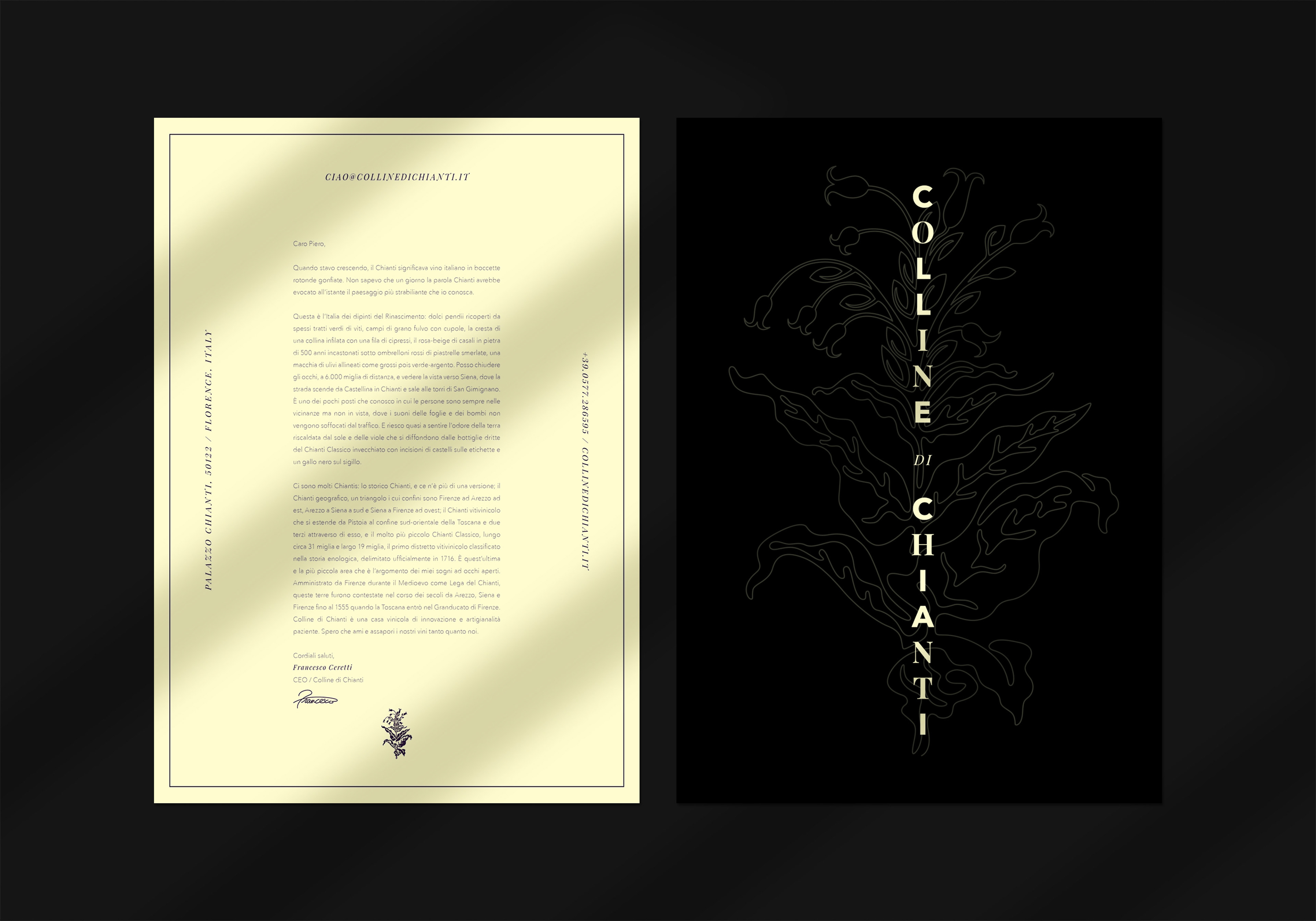
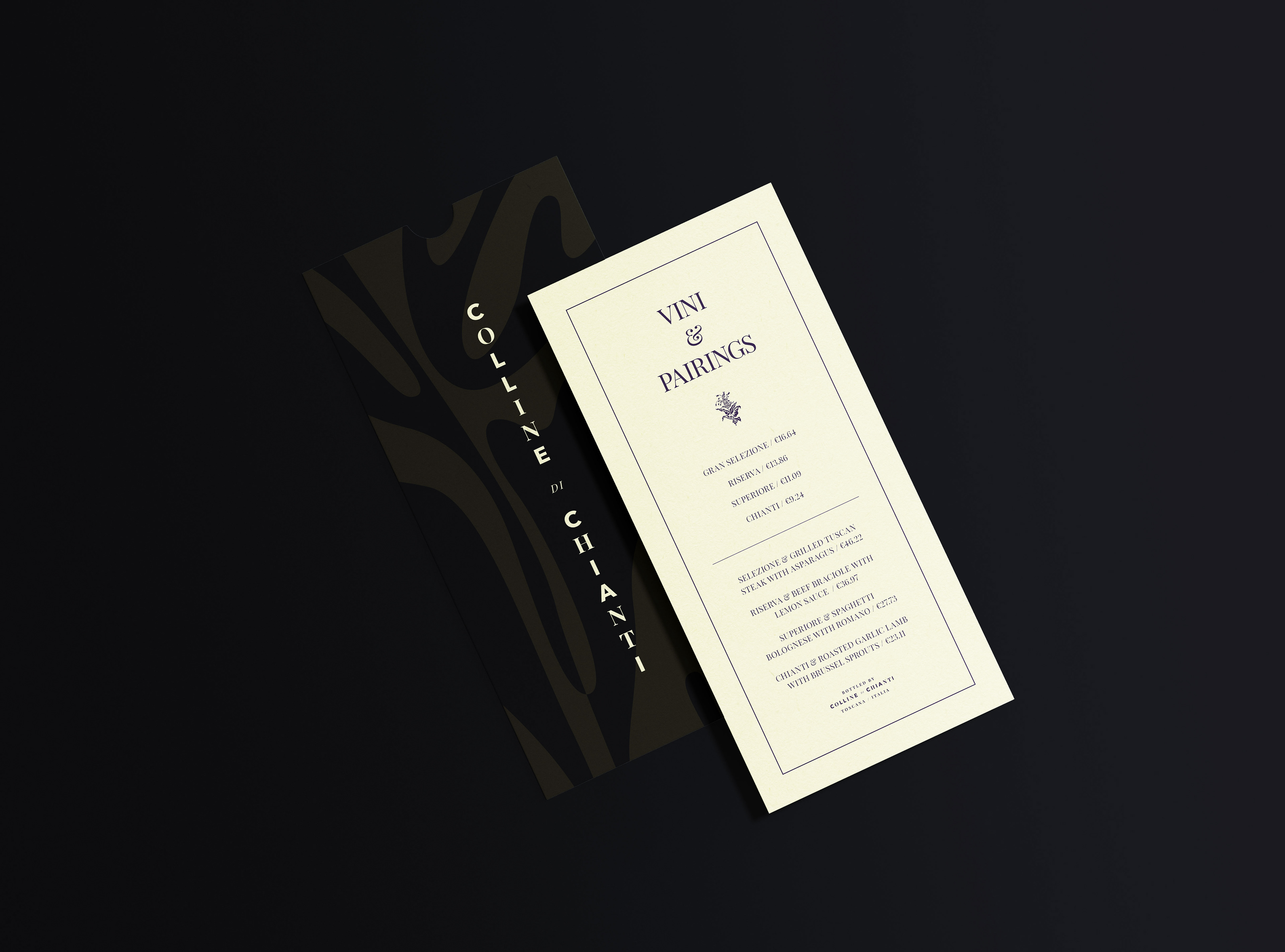
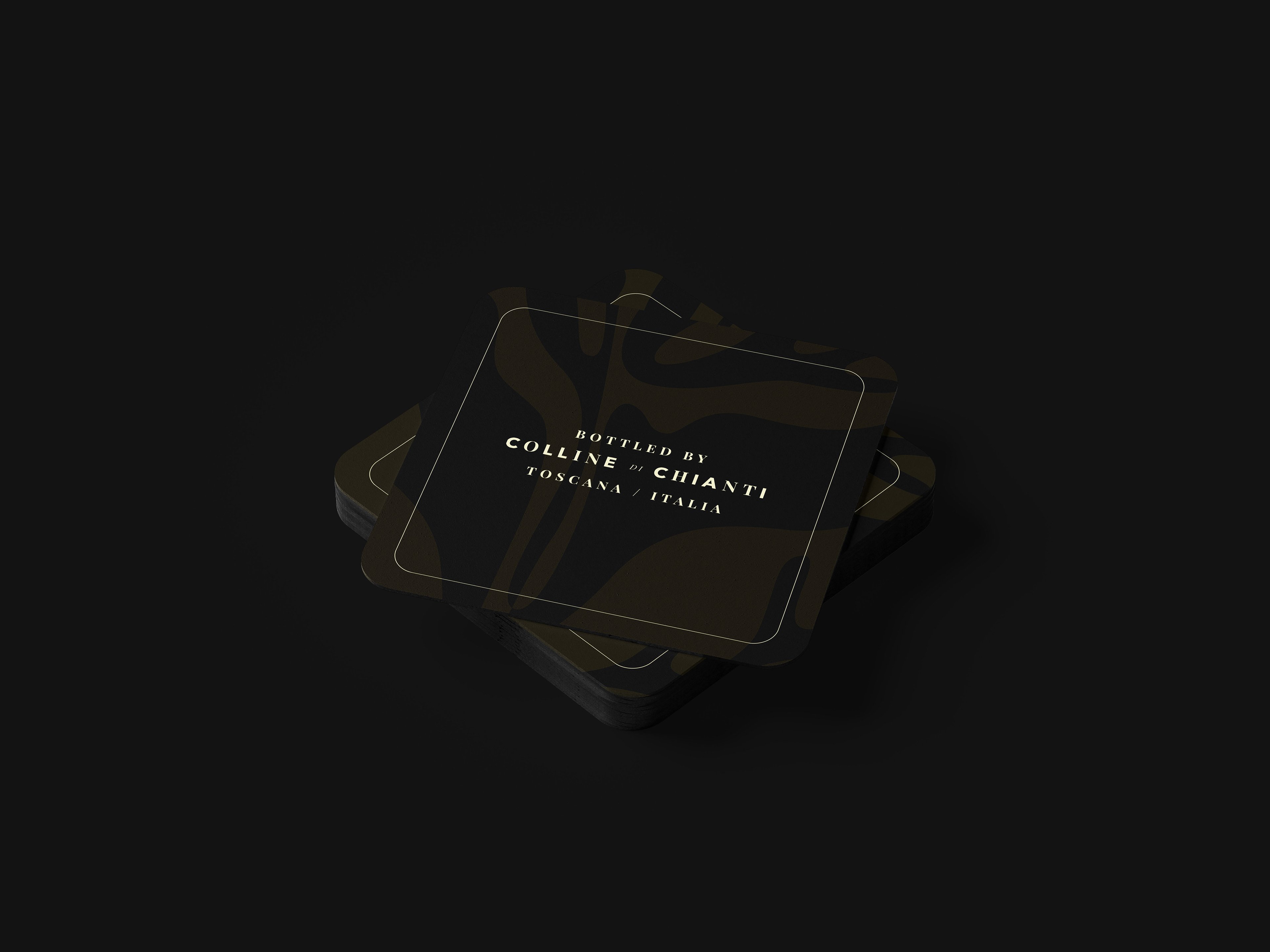
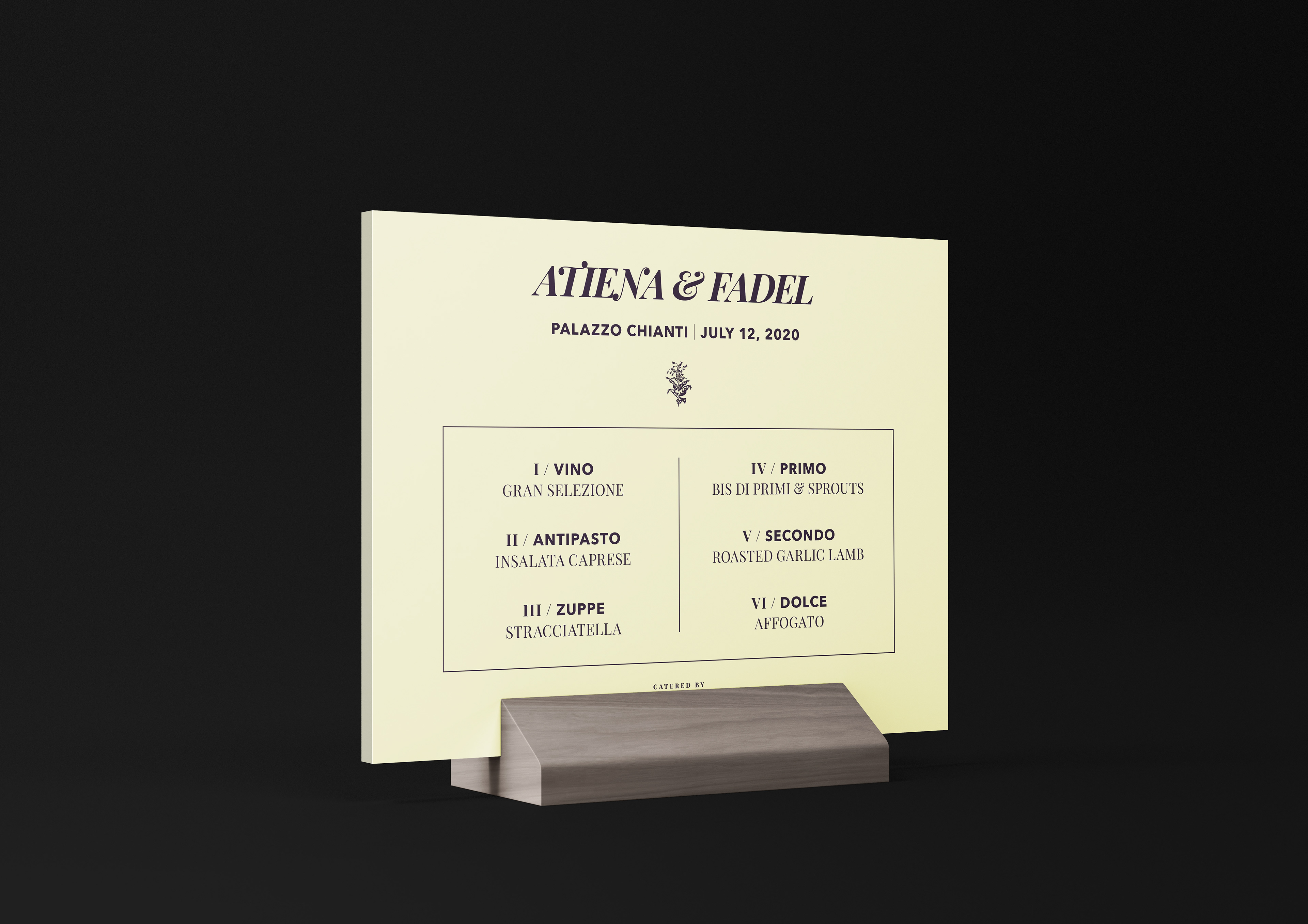
Stationery & Print Collateral
The stationery maintains a classically bold aesthetic that follows the design of the wine bottles. Minimalism was combined with the detail of the main tobacco illustration and color. This was done to form collateral that was alluring, timeless and invited recipients to appreciate the individual craft of each piece as art in and of themselves.
Merchandise & Décor
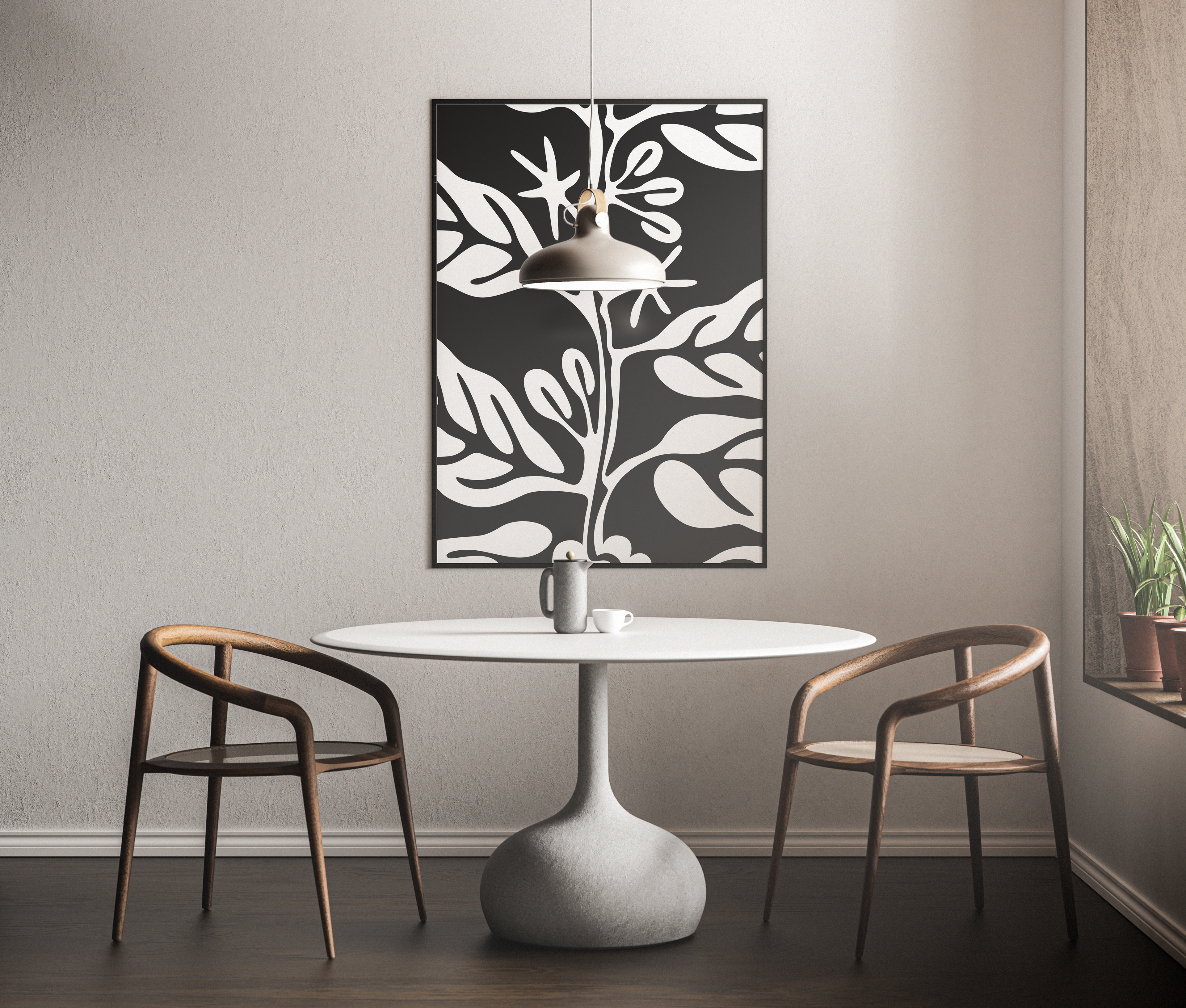
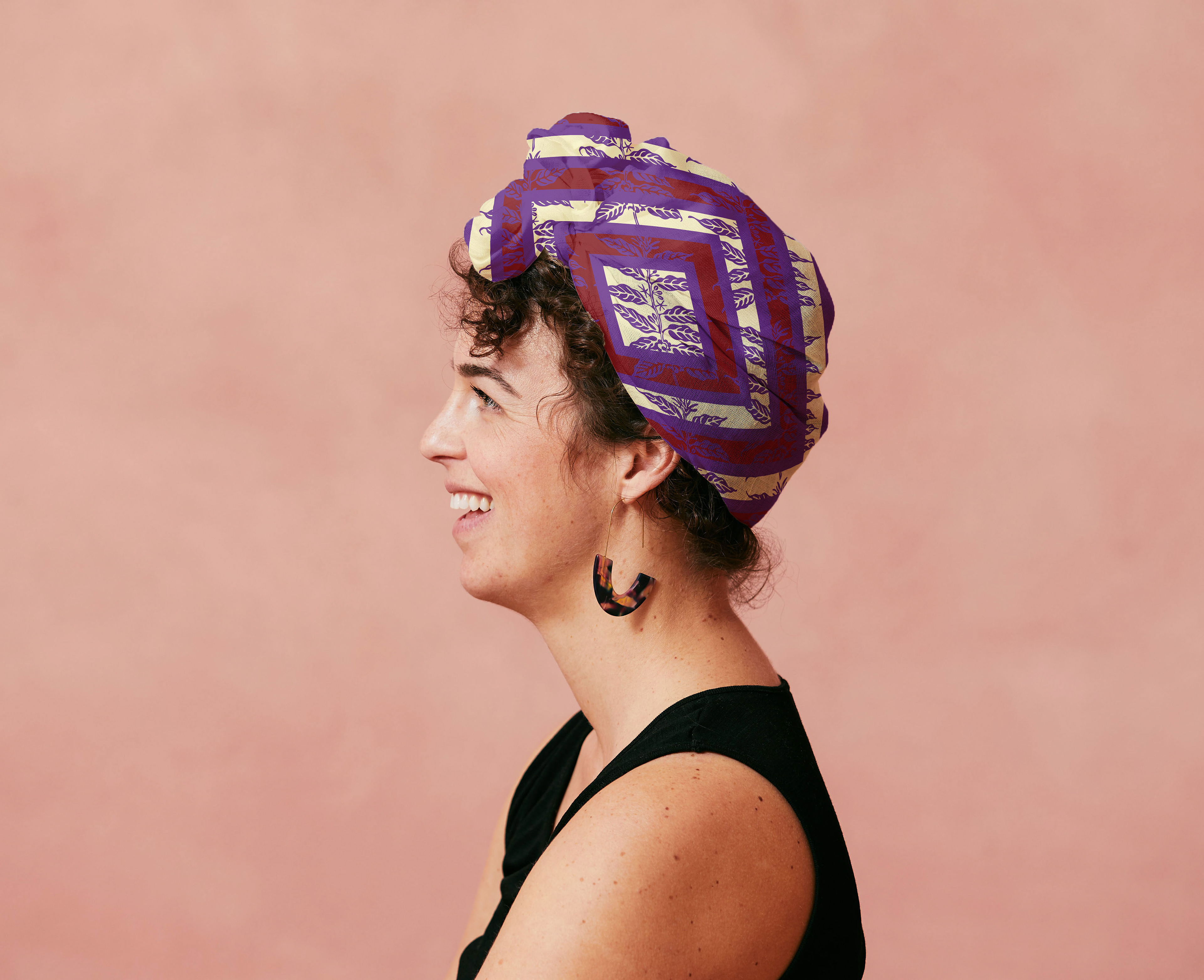
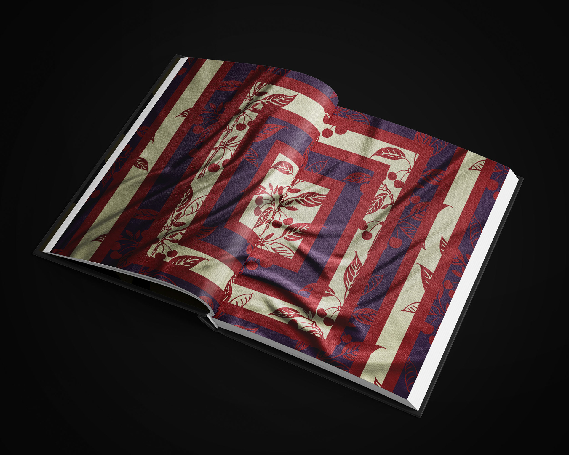
Although Colline di Chianti specializes in the production of fine wine, I wanted to expand it more into that of a lifestyle. Becoming a lifestyle brand would allow the house to be multifaceted; opening more opportunities to have a broader impact and product range available to the audience. The botanical illustrations are visualized as prints for one's home and on colorful, luxurious scarves.
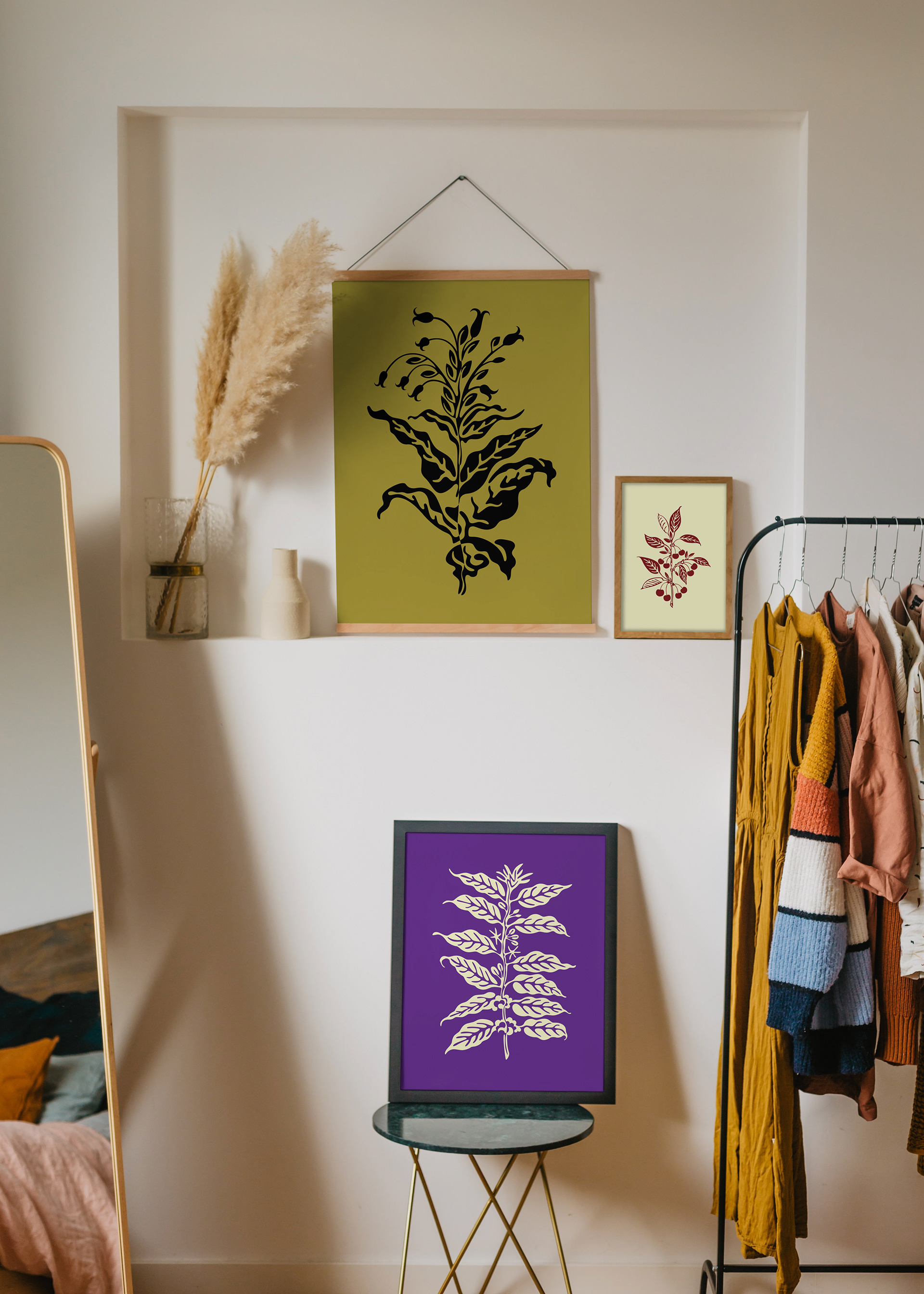
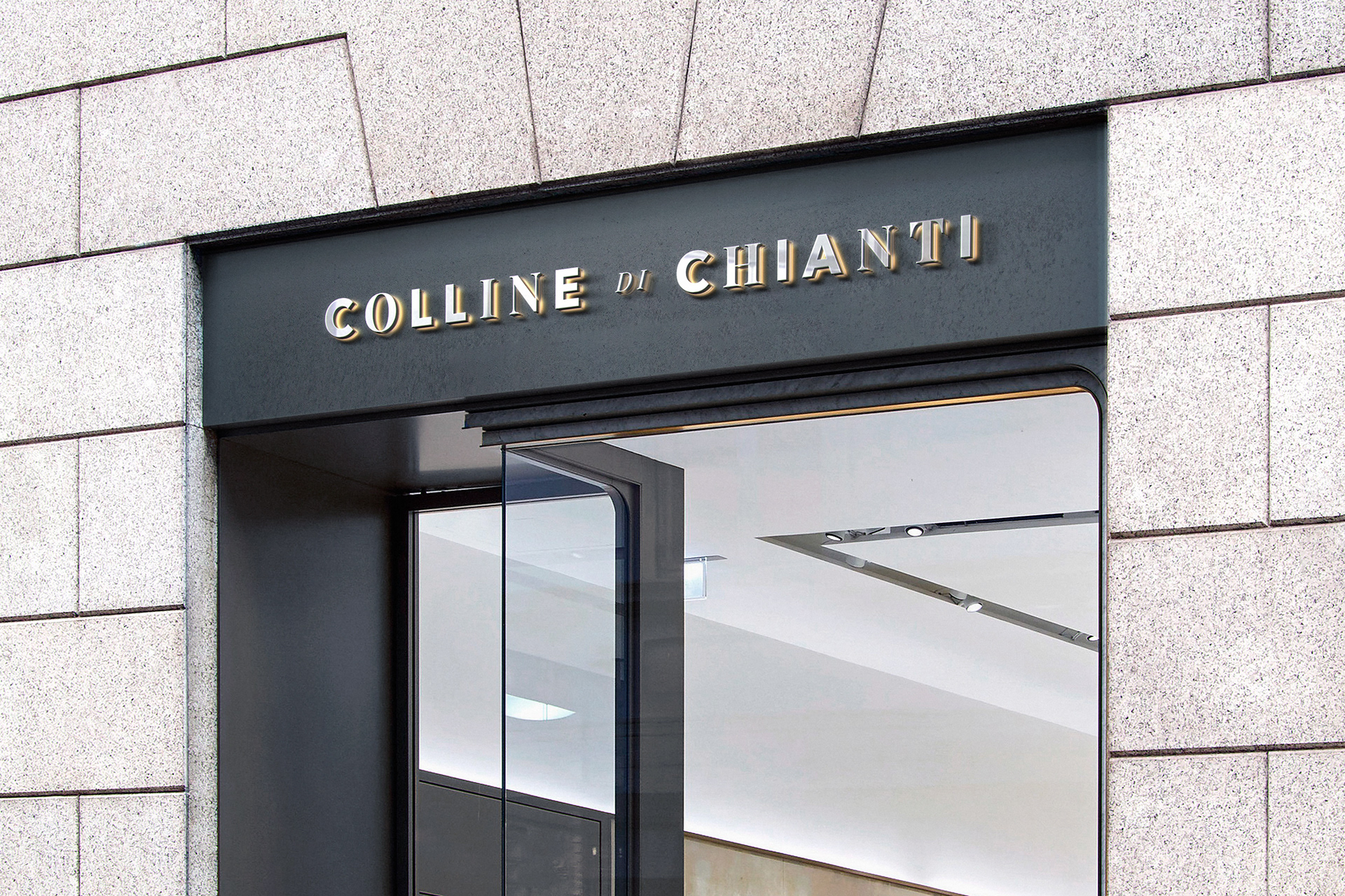
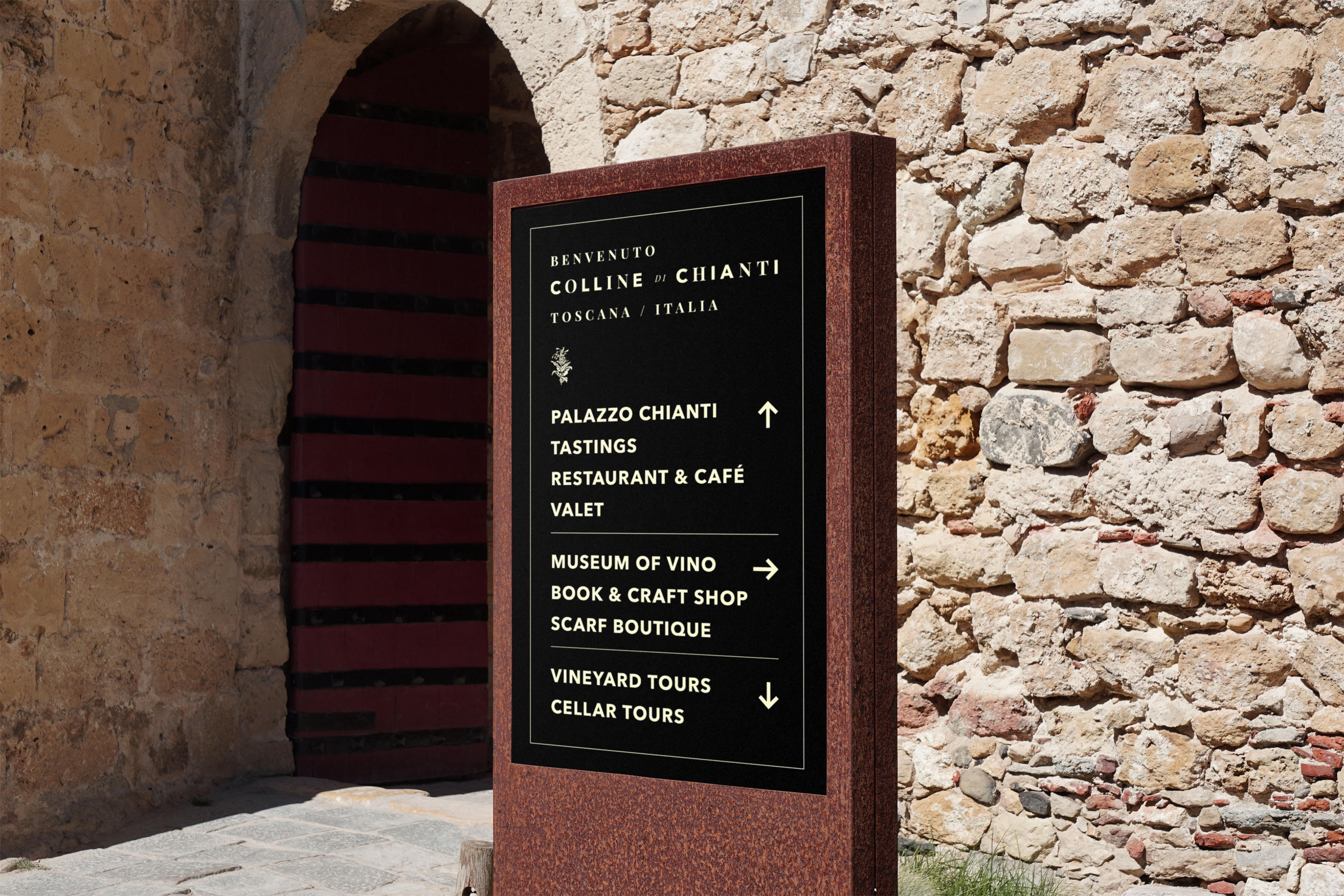
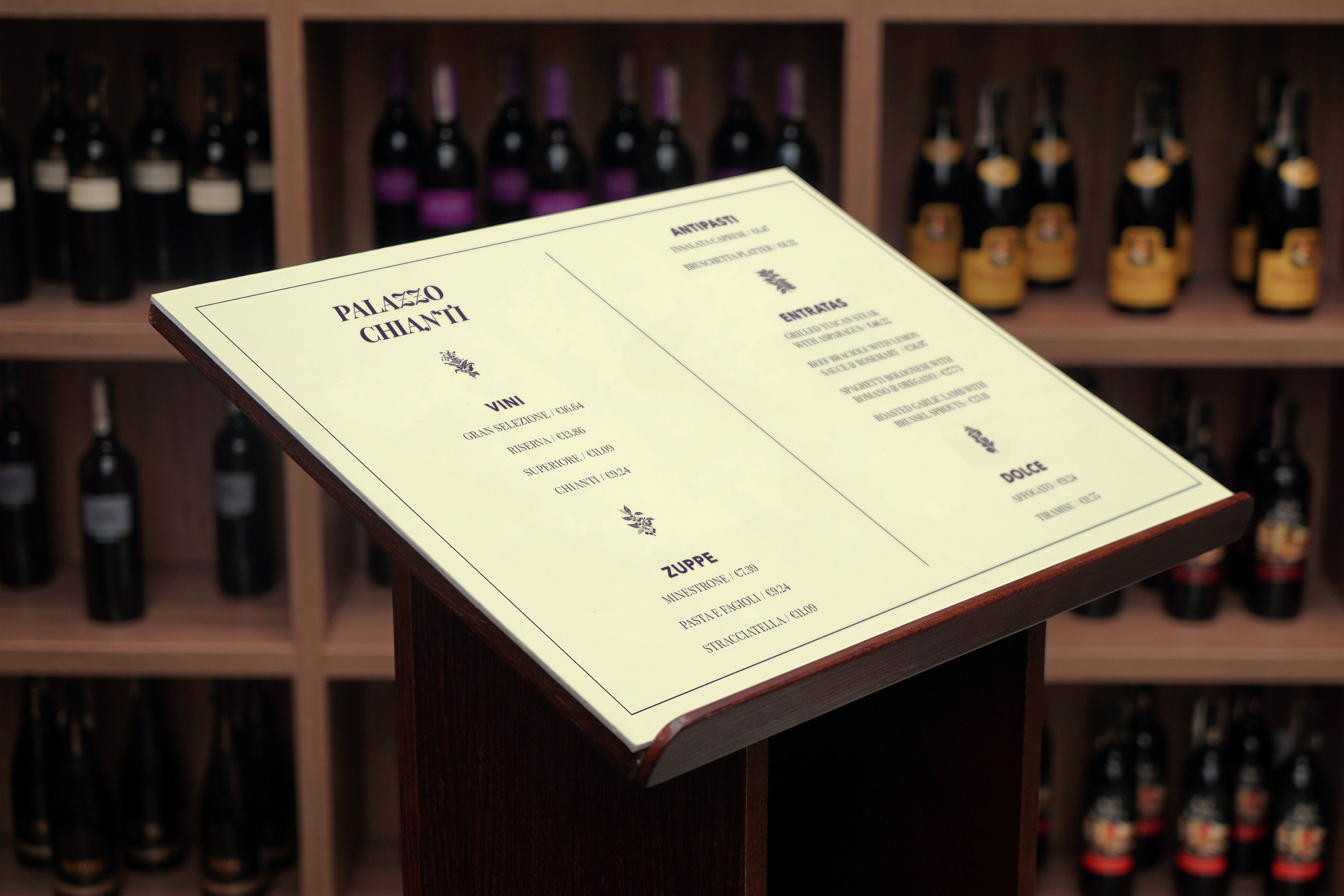
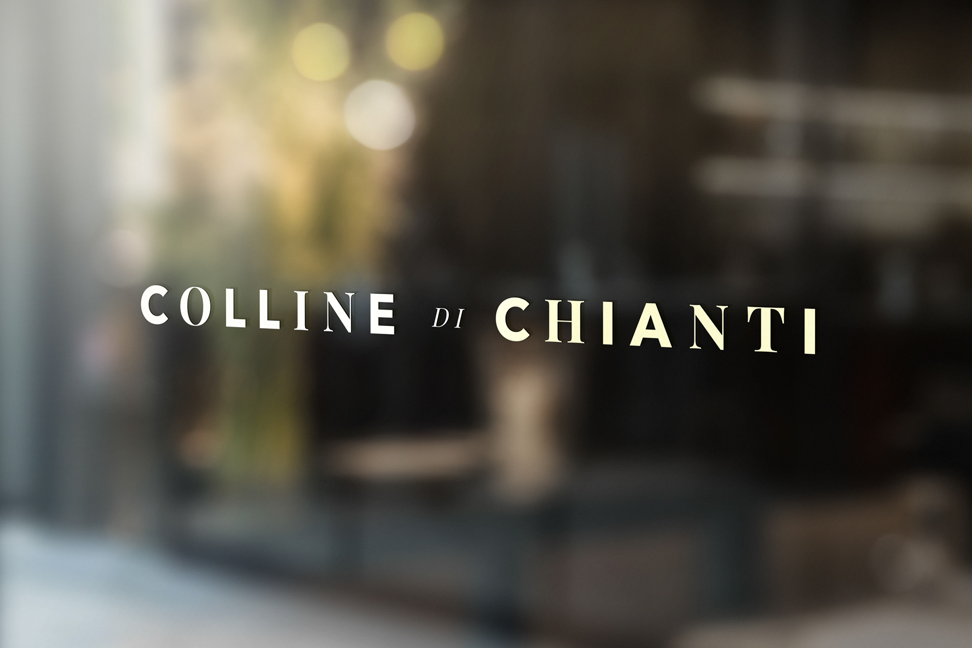
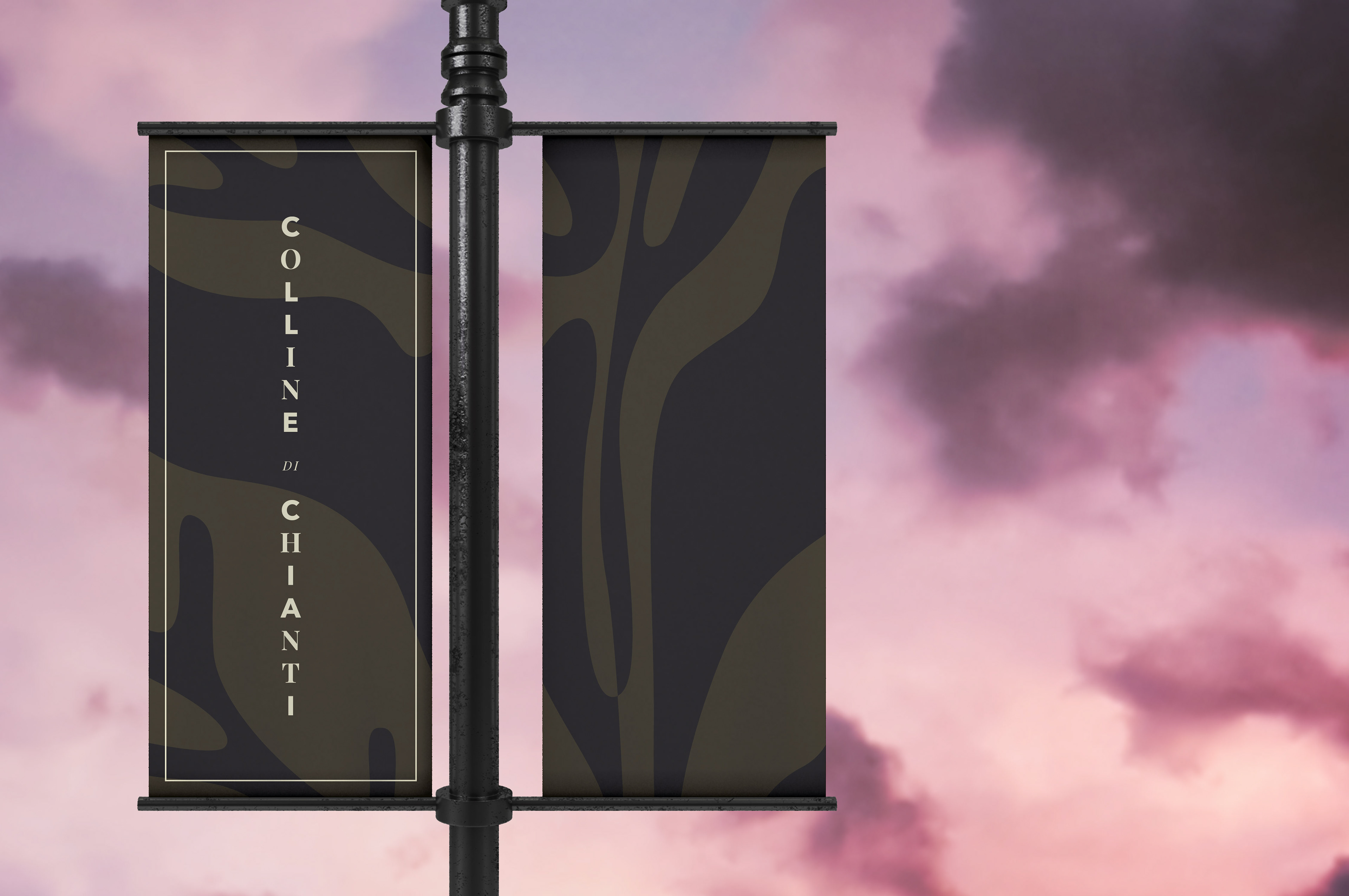
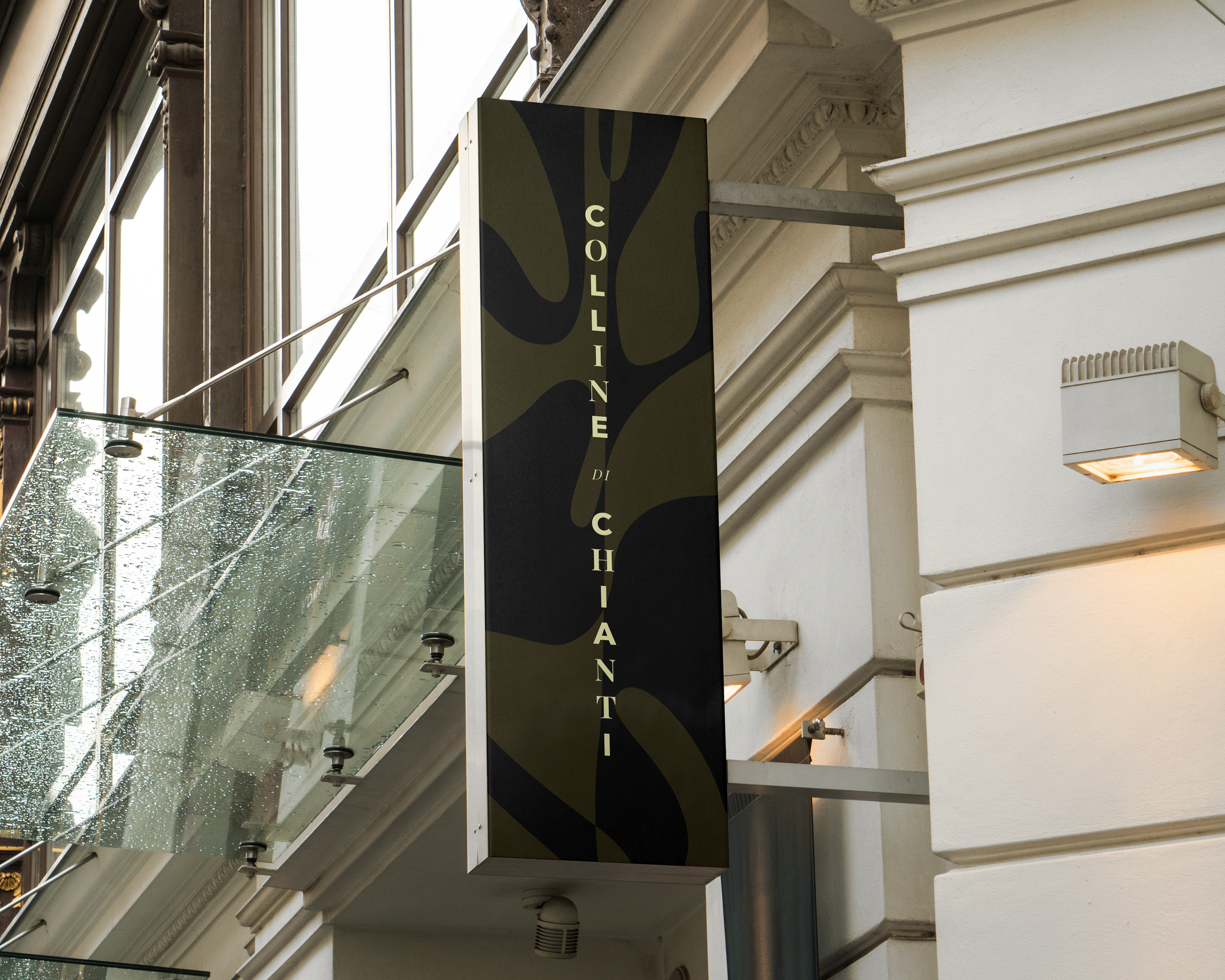
Signage & Interior
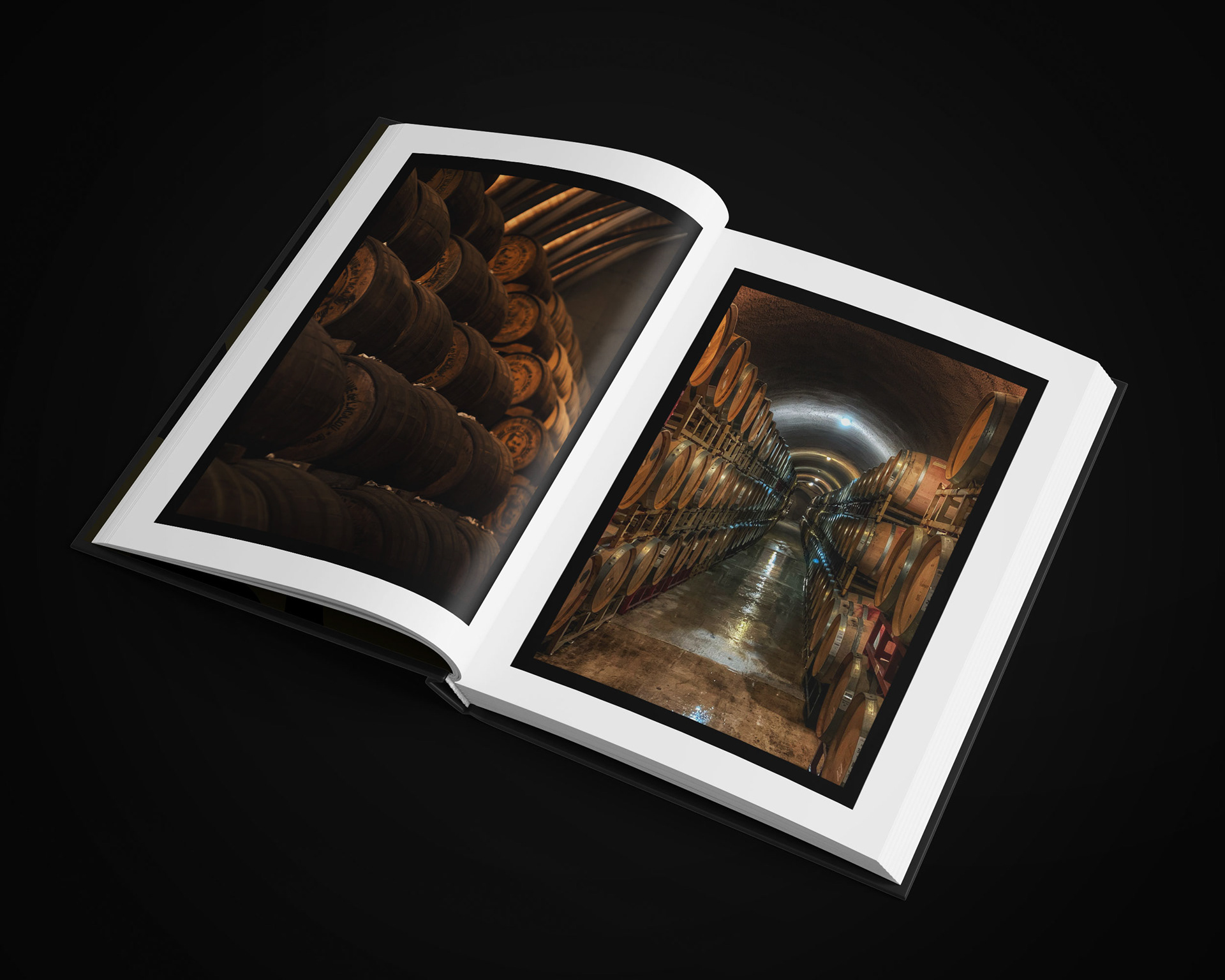
Each of these environments exhibits how the brand identity and visual communication is translated to sophisticated outdoor signage, interior scenes as well as even in the cellar.
ATTERRAGGIO E CASA / Landing & Home Pages
Mobile-First Website
The website was designed in Sketch with a mobile-first approach to appeal to an audience who's first impressions of brands mostly happen on their mobile devices. A simple and spacious design was paired with playful illustrations in the background as well as moving imagery for opening screens. The result is a beautiful and engaging Online experience.
MENÙ E AZIENDA / Hamburger Menu & Company Page
COLLEZIONE DI VINI / Wine Collection Page
ARTE / Art & Merchandise Page
VISITARE / Visit Page
CONTATTO / Contact Page
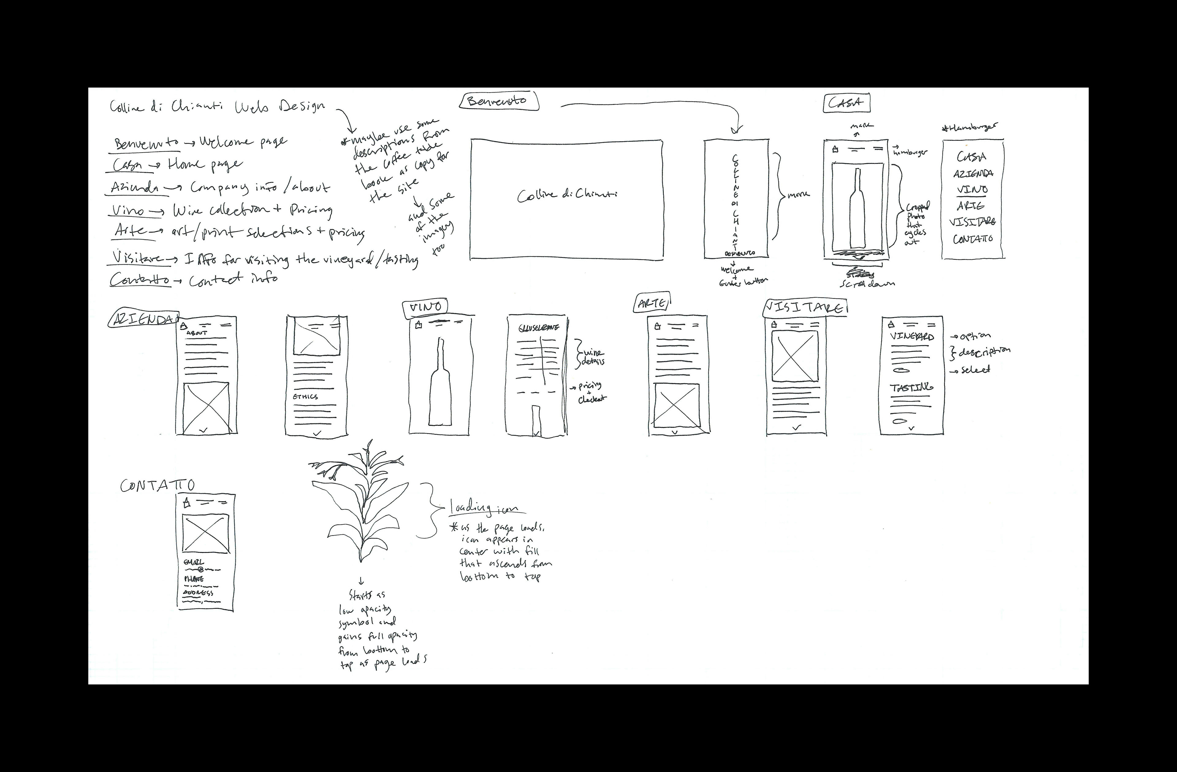
Wireframes
Prior to designing the website, wireframes were created with detailed notes explaining the intended UI/UX as well as other elements. The goal was to create a visually minimal yet alluring design.
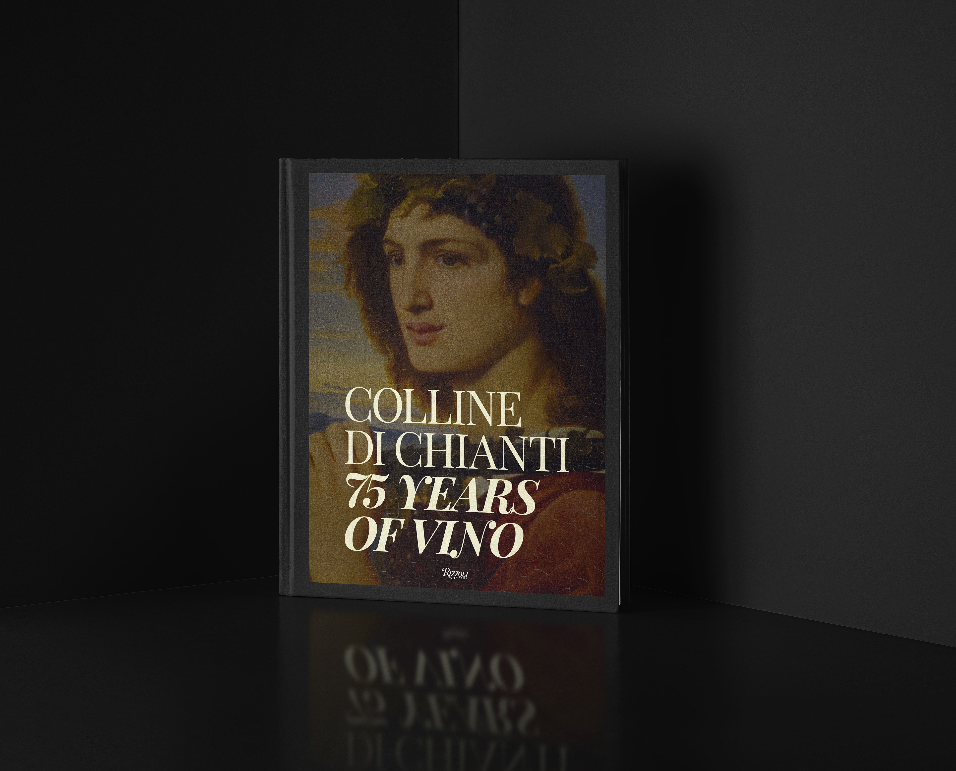
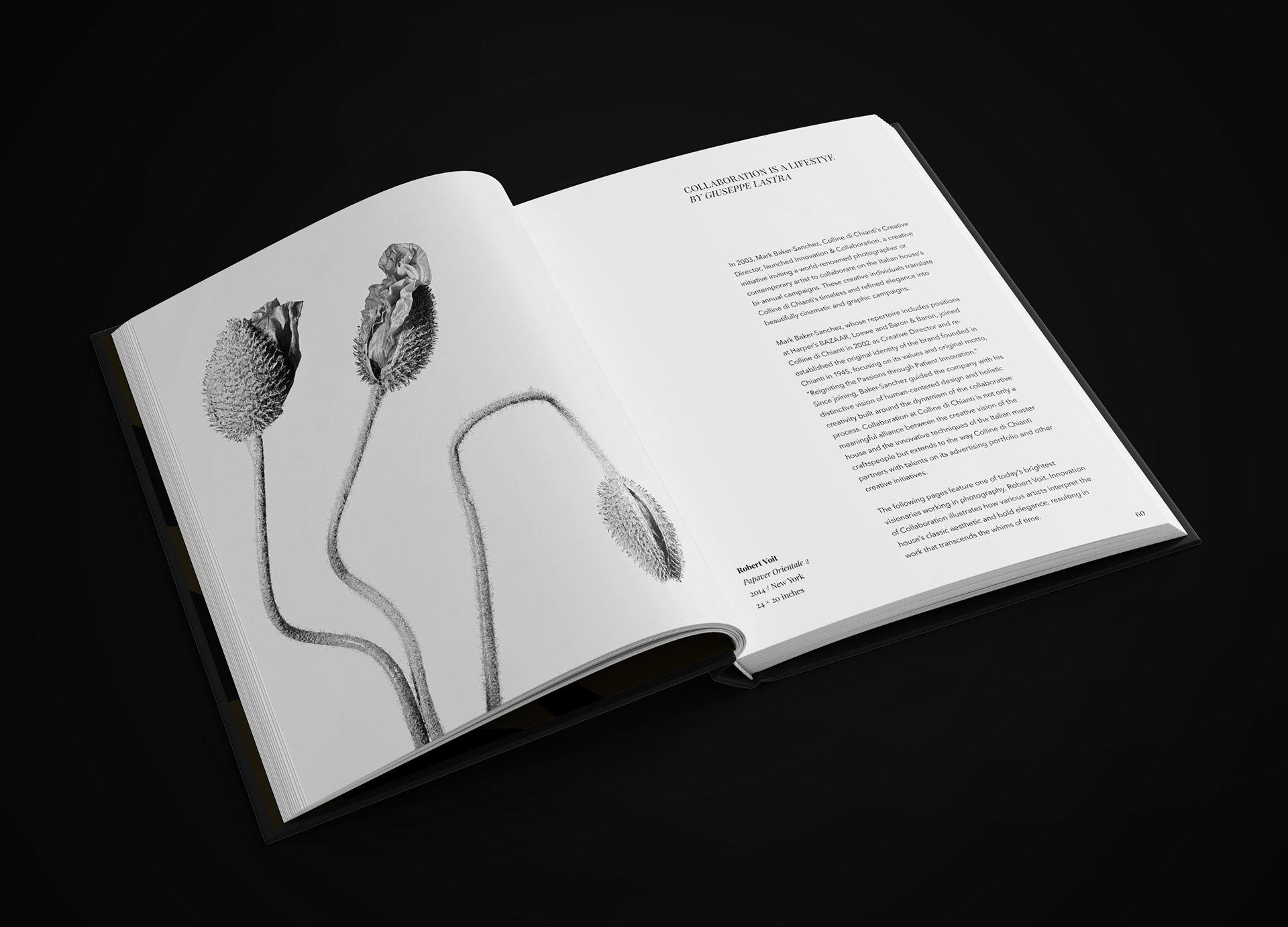
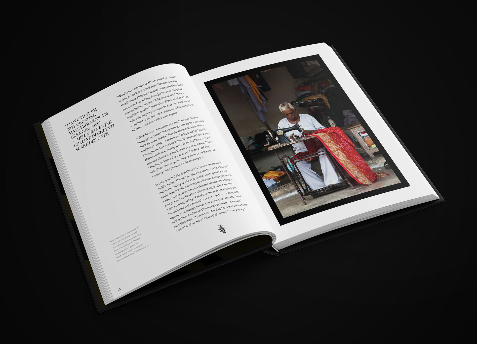
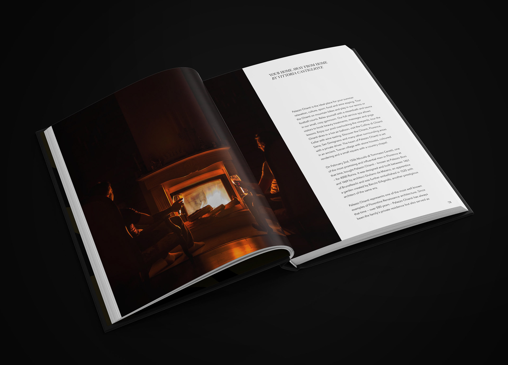
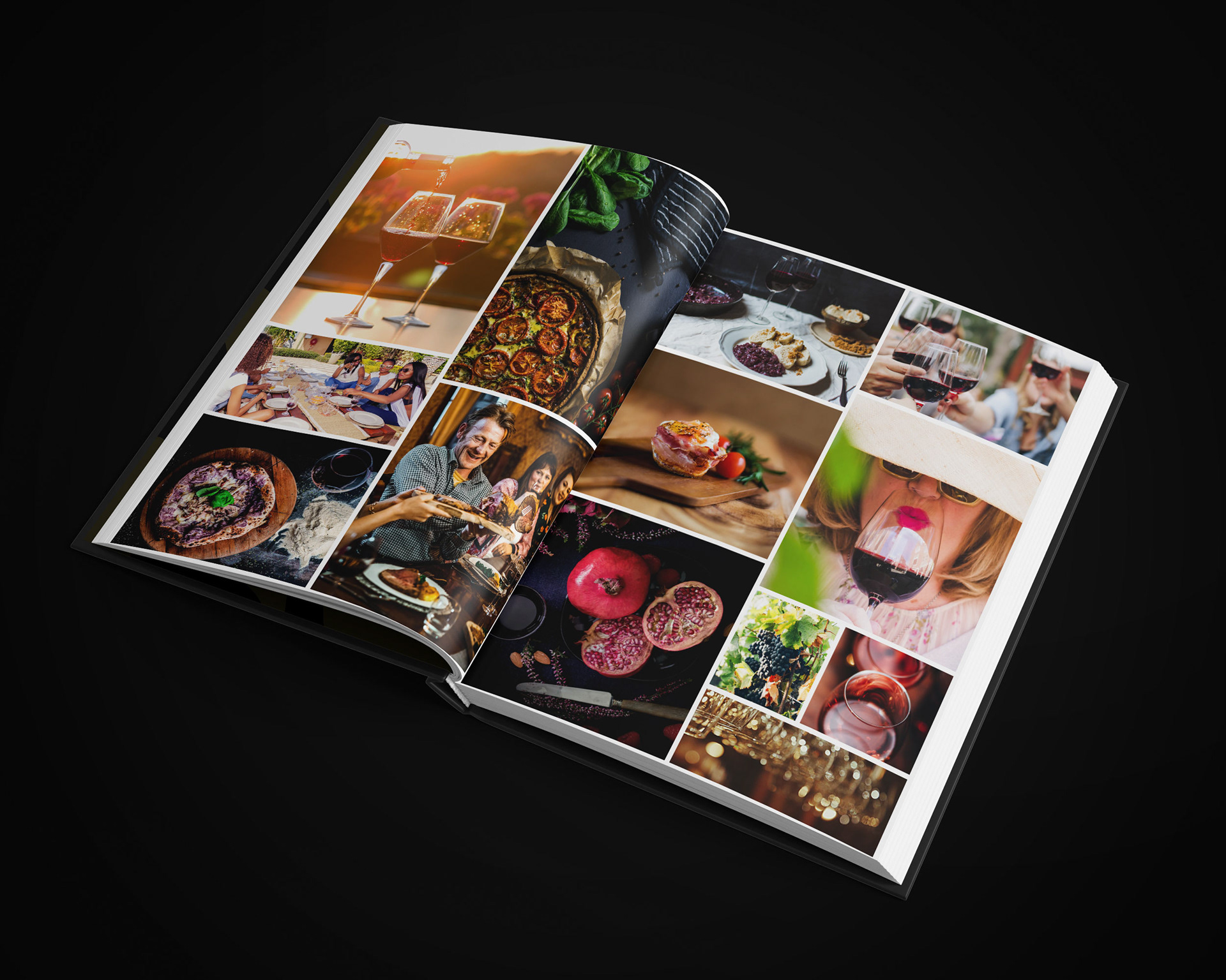
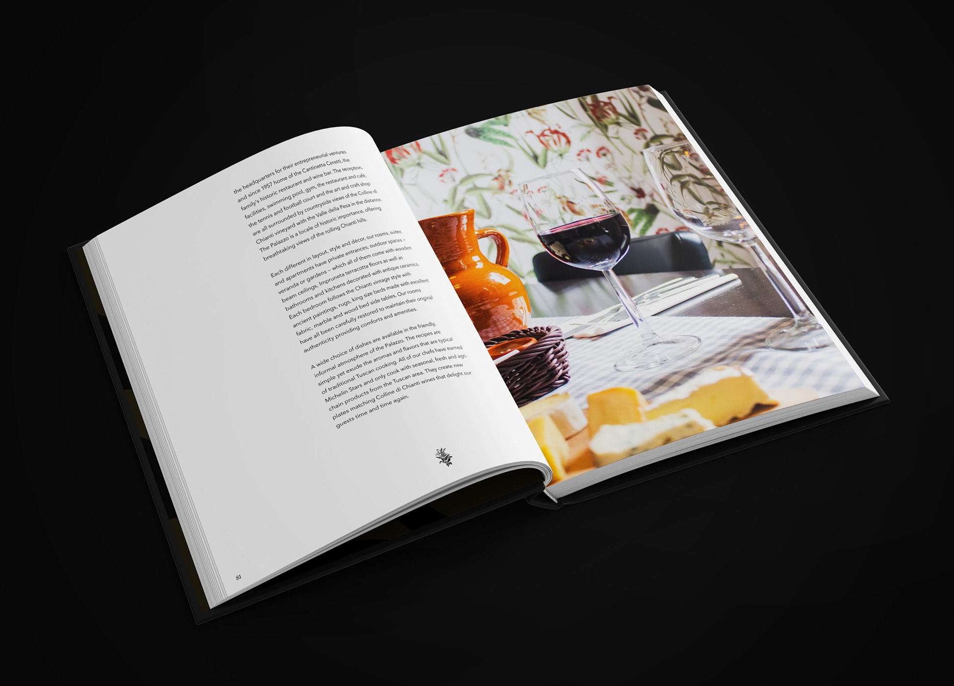
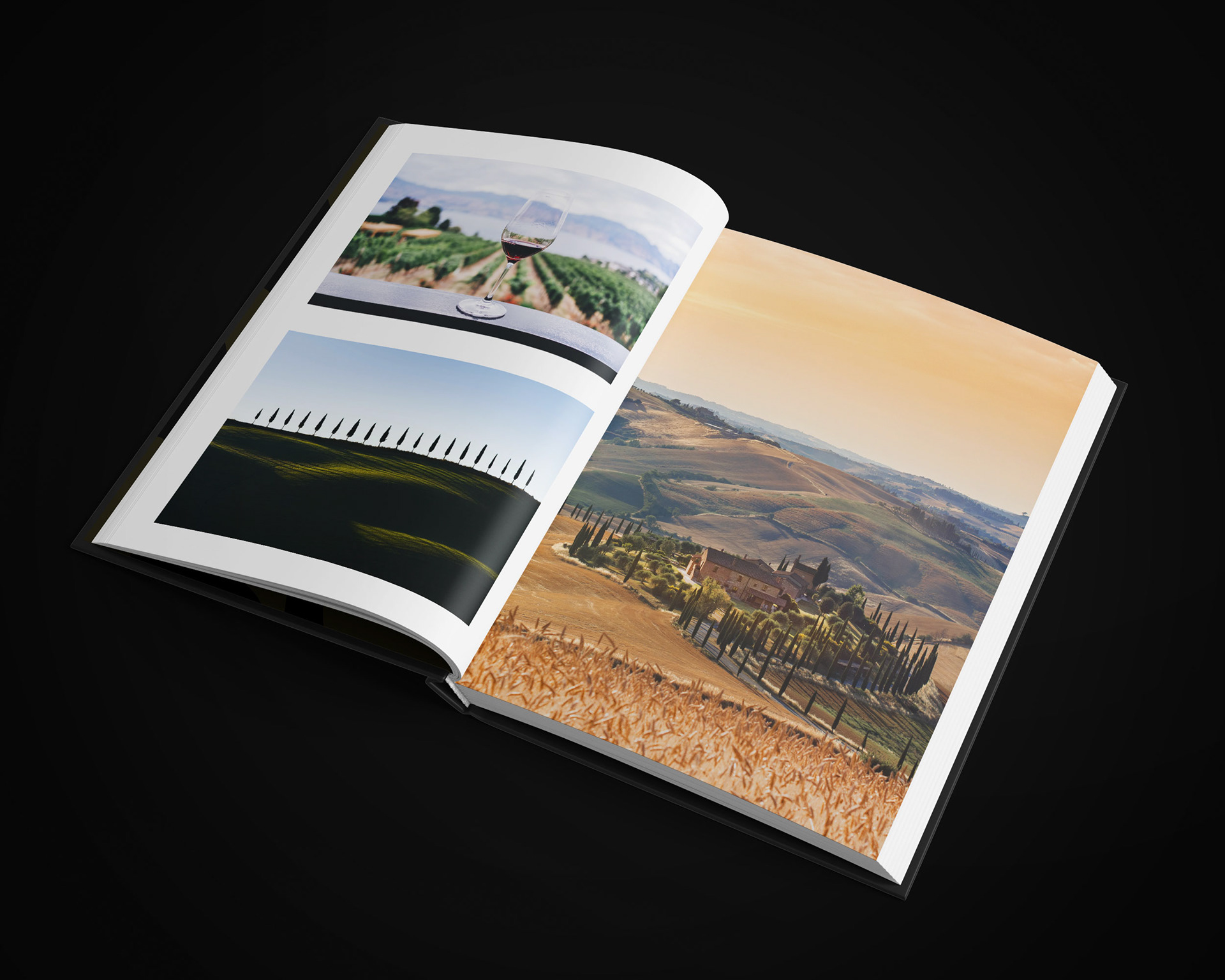
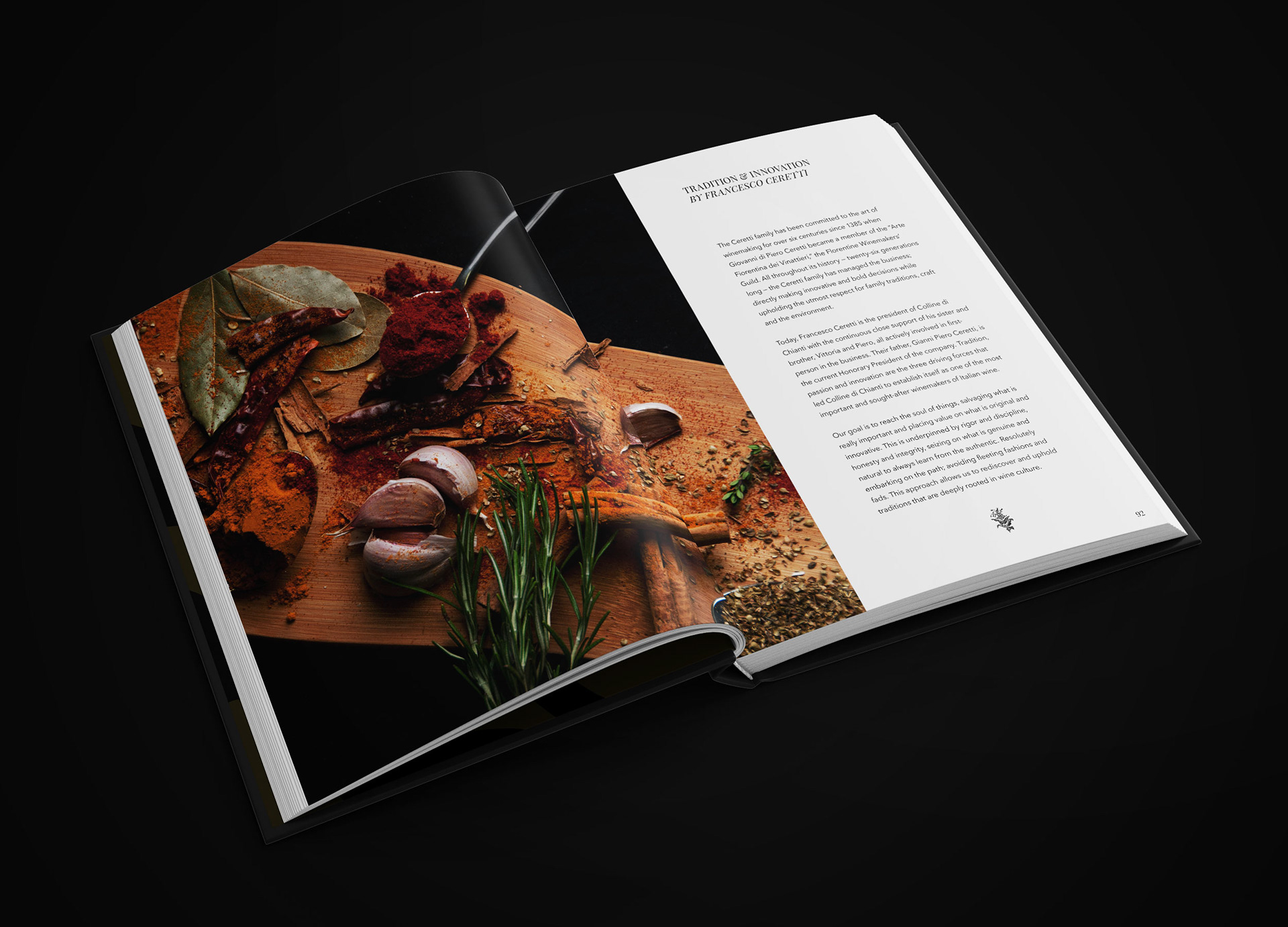
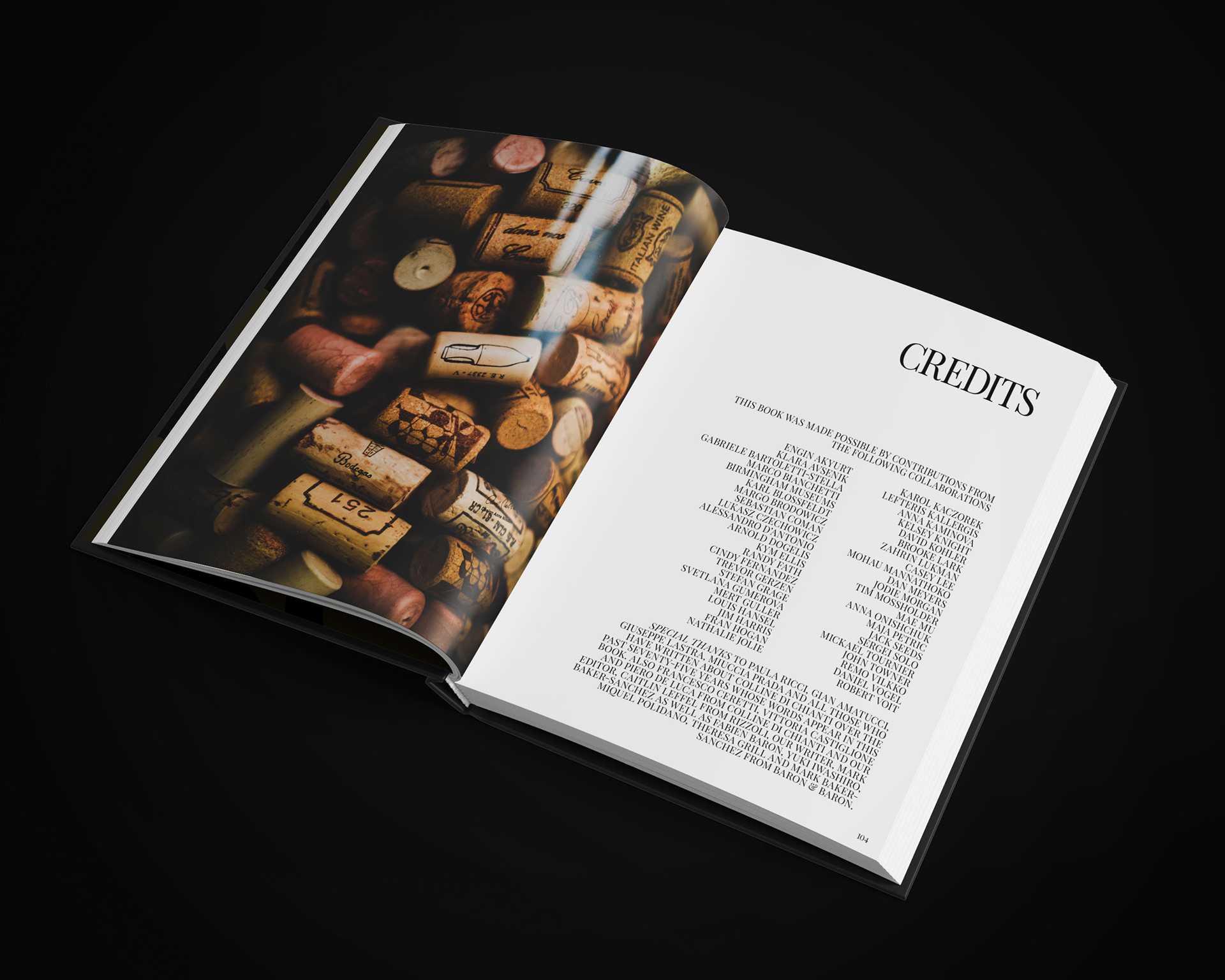
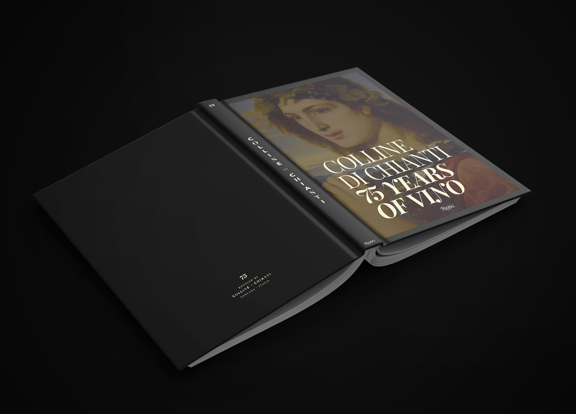
75 Years of Vino — Anniversary Coffee Table Book
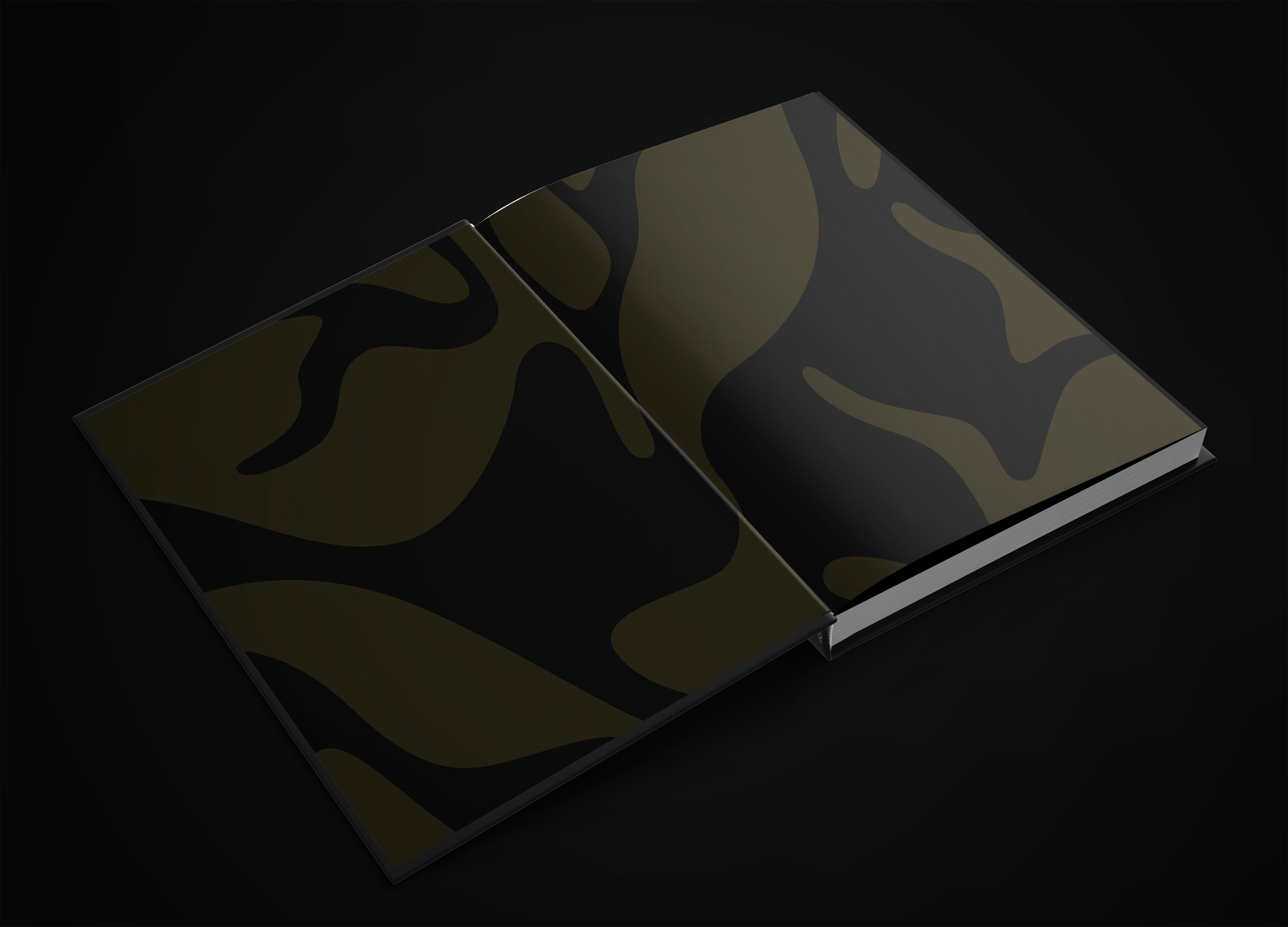
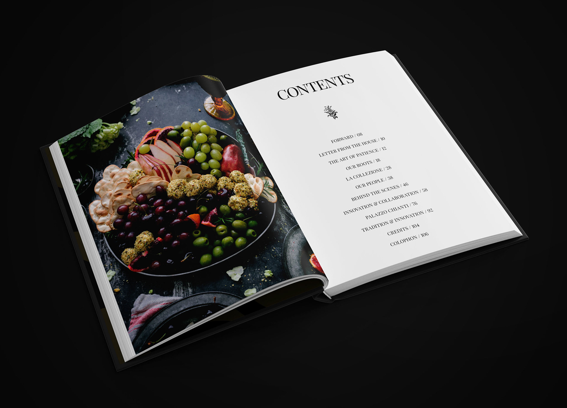
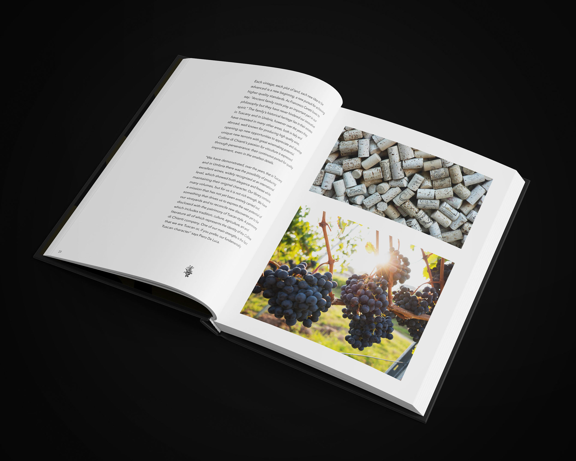
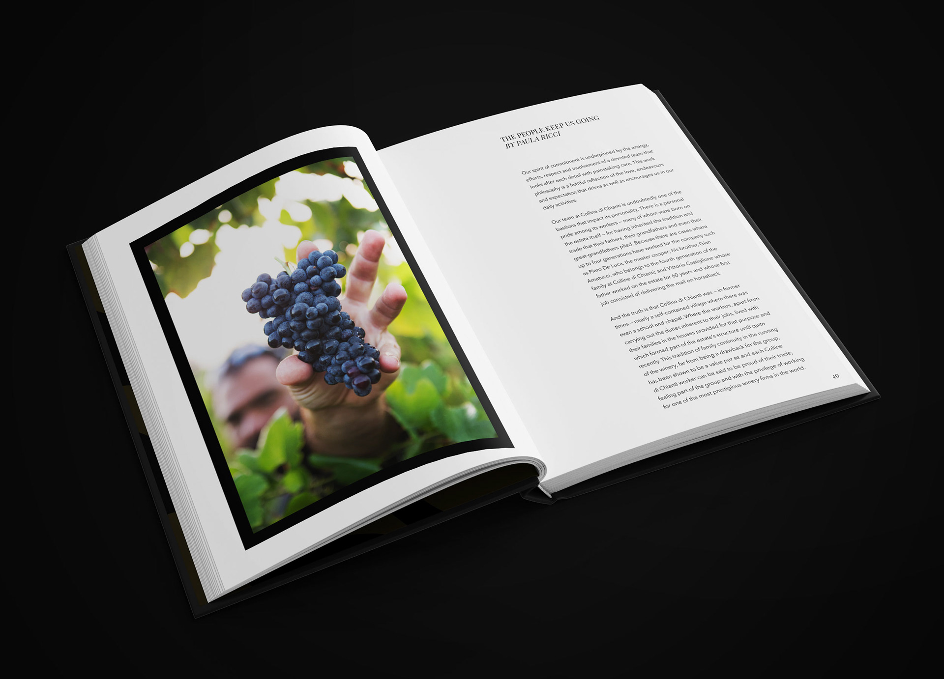
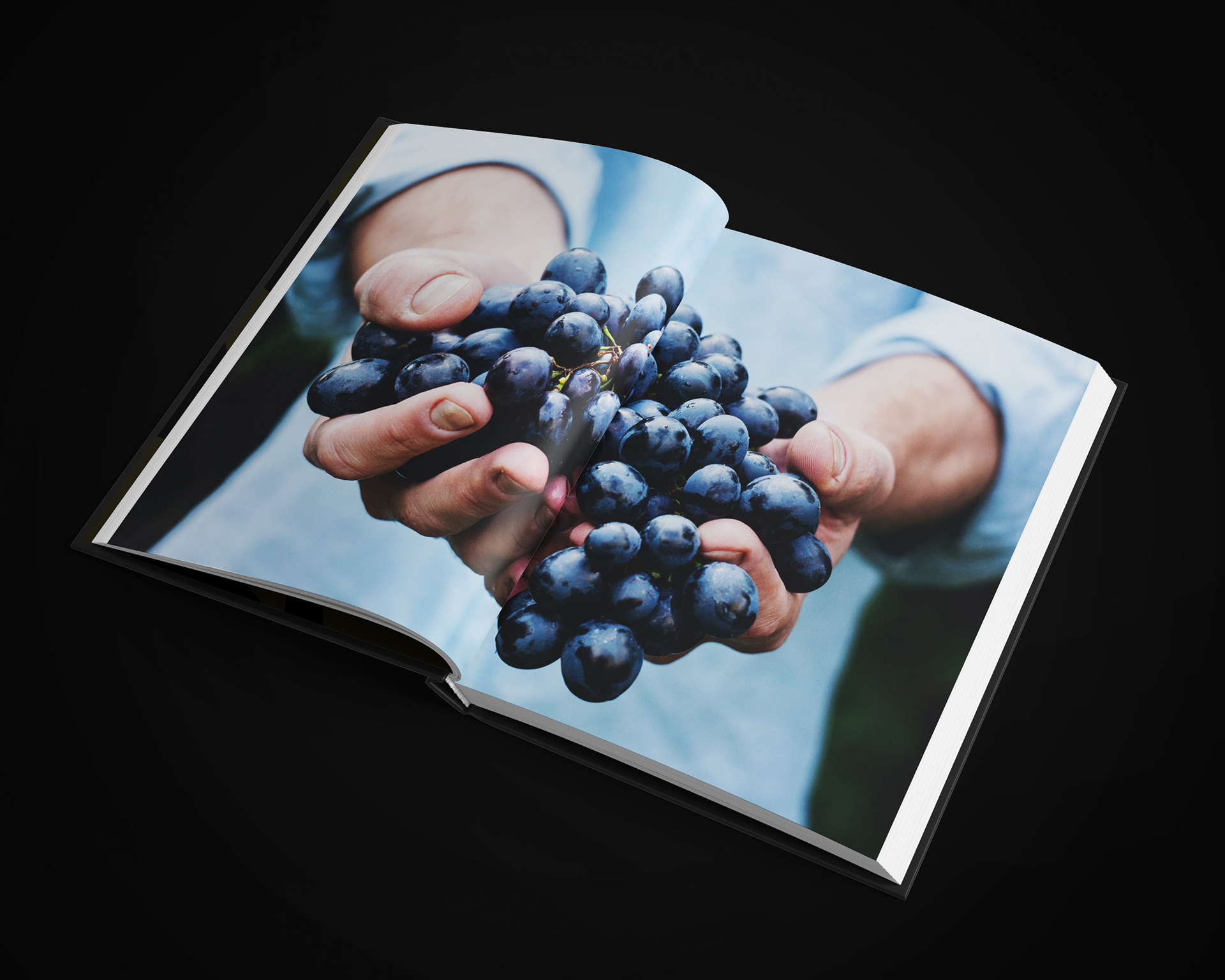
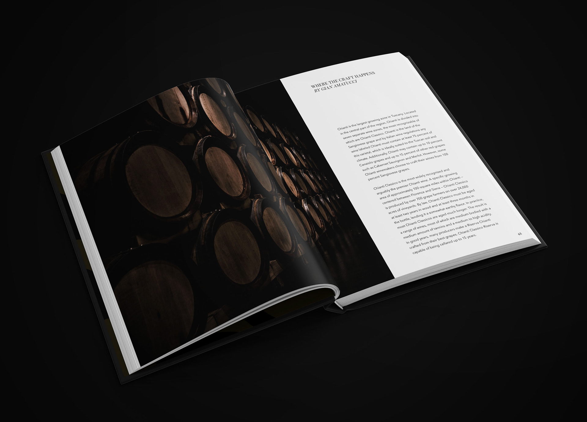
Imagining Colline di Chianti as a successful namesake came with the consideration of a coffee table book commemorating the brand's historical and contemporary success. Although the wine house is a concept brand, I wanted to push myself in terms of storytelling. Rizzoli was chosen as a hypothetical platform since the publishing house is renowned for its high-quality, illustrated books in literature, photography, architecture, interior design, culinary as well as the fine and applied arts. Using the brand typefaces, I pieced together this 75th Anniversary book complete with imagery and full text to further solidify the idea of Colline di Chianti.
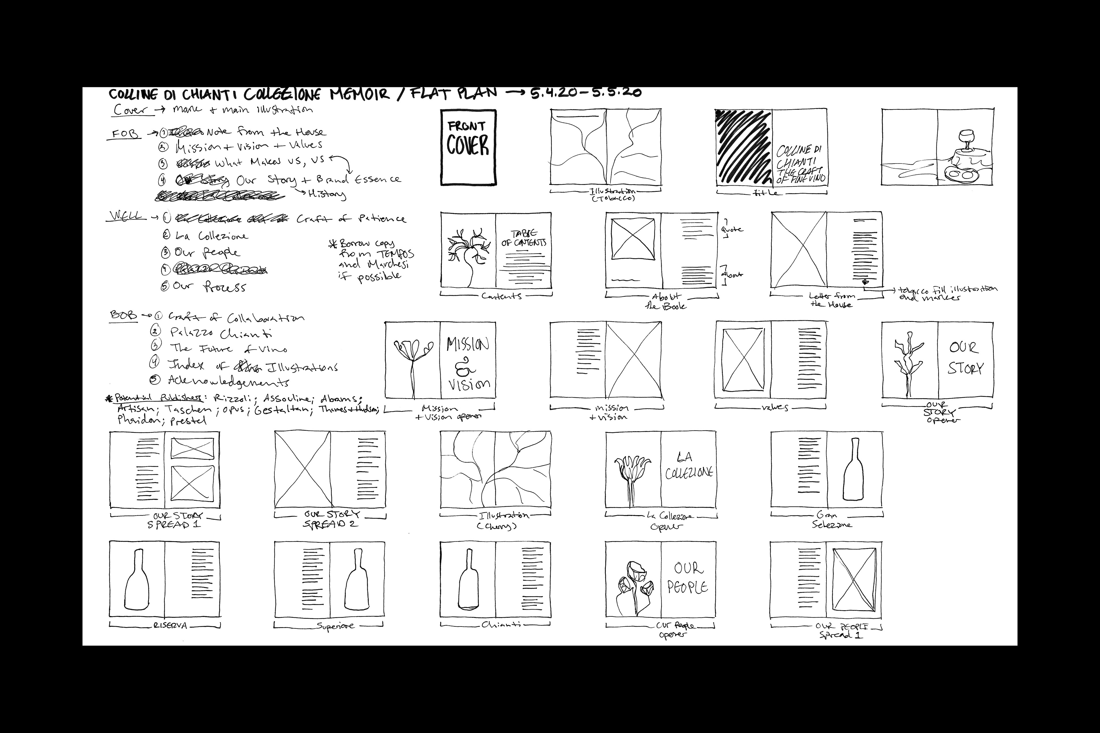
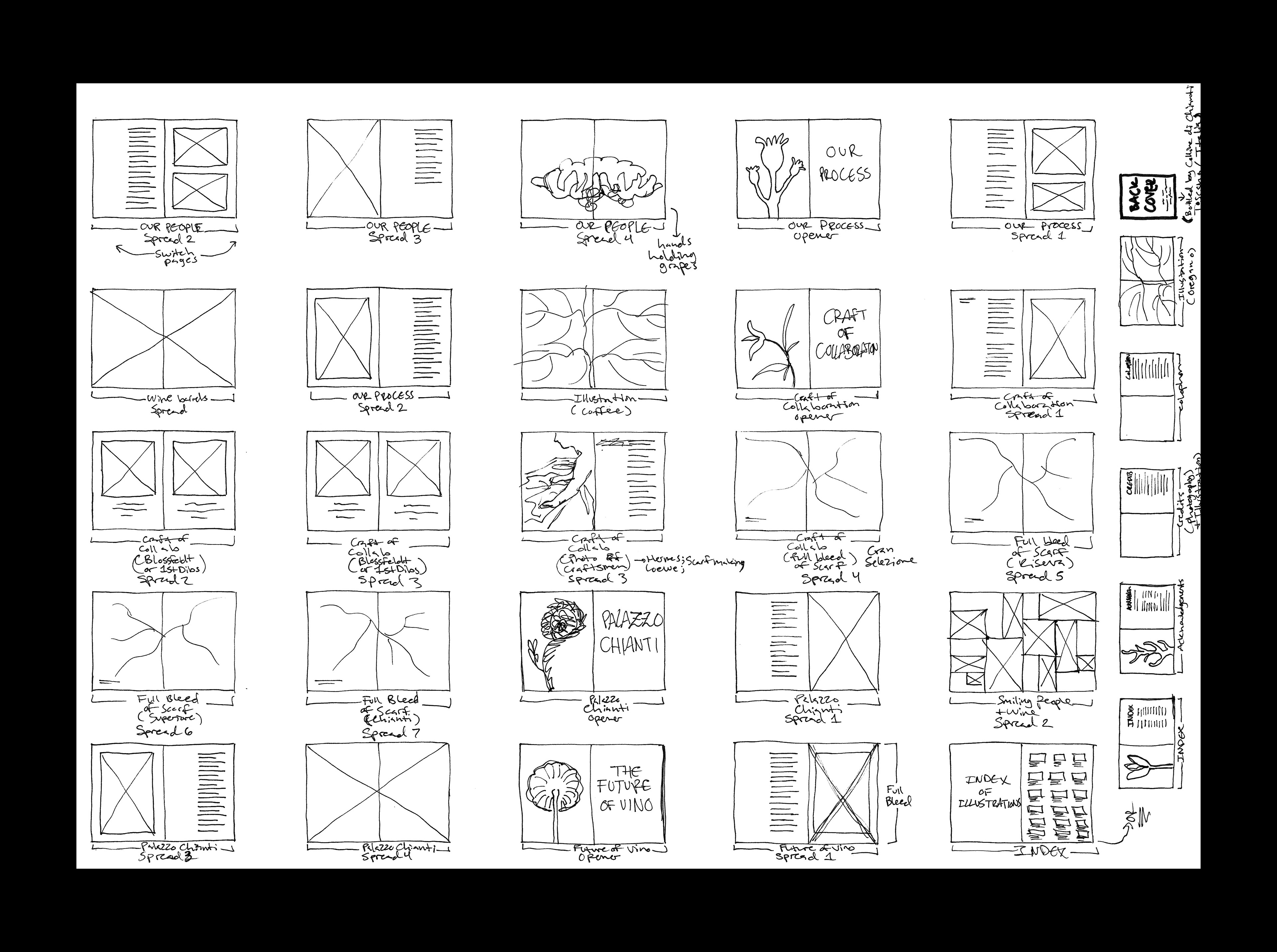
Flat Planning
The creation of the 75th Anniversary coffee table book involved heavy research, writing as well as flat planning. The flat plans above showcase the organization of the book from start to finish. This includes detailed notes on each section, hypothetical publishers and thumbnails of each spread.
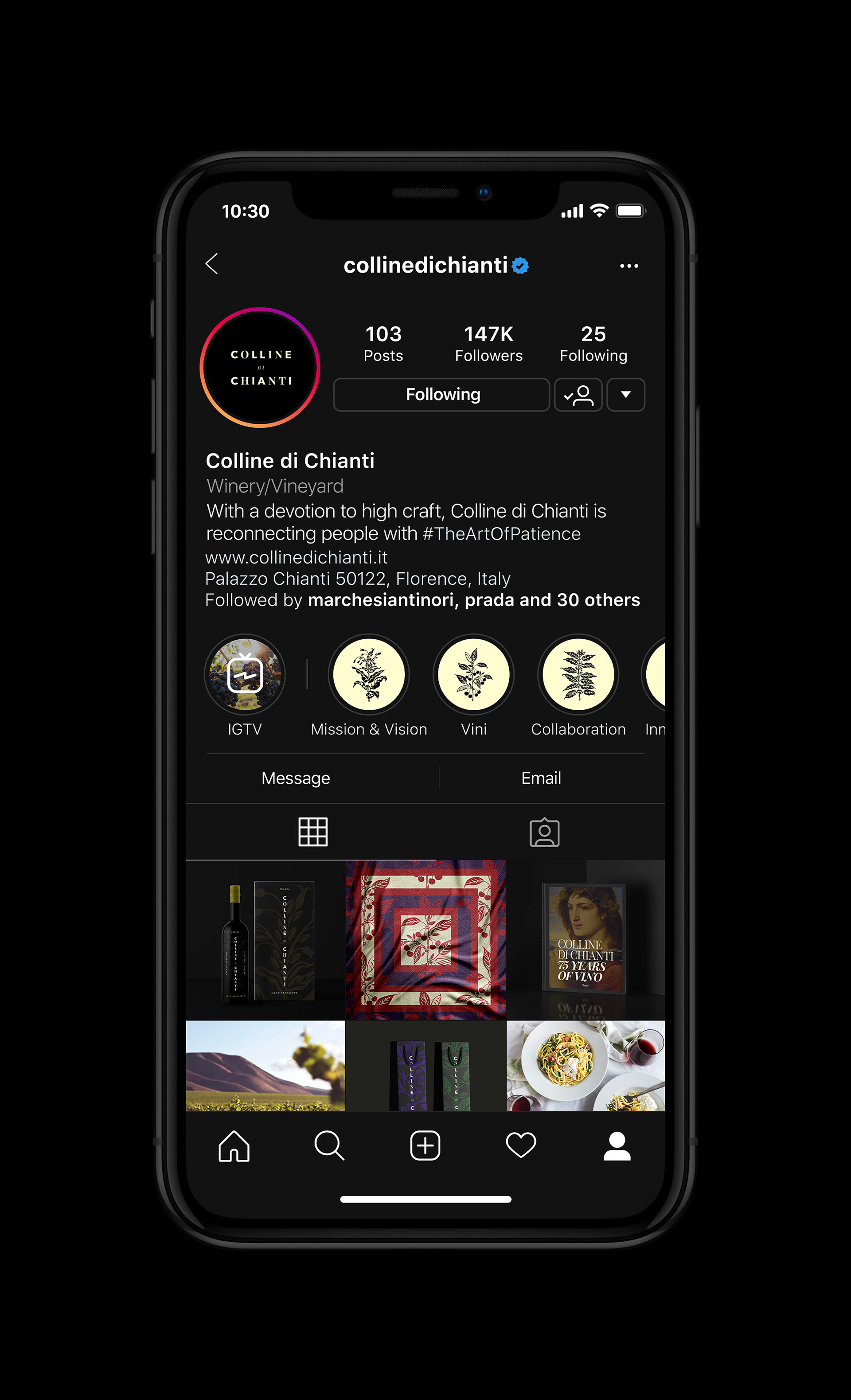
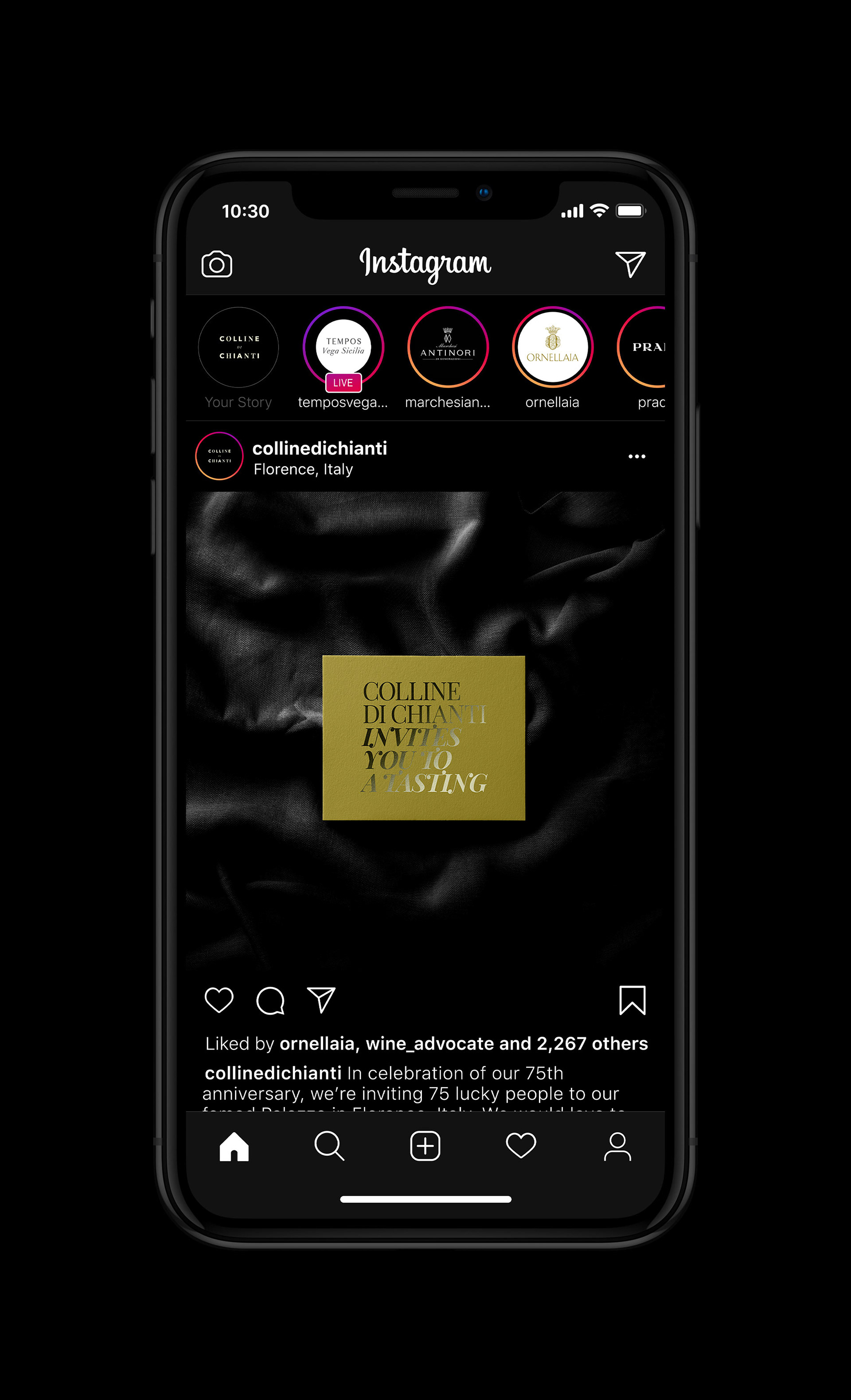
Social Media
A presence on social media — specifically Instagram where a majority of the target audience engages with brands — is important not only for strategy but for continued storytelling and community engagement of the Colline di Chianti brand.
Personal Project as Professional Development
When I started this project, I thought, "what if this were a real project commissioned by a real-world client?" So, I chose to treat it as such and that drove me to think deeper. This also gave me an opportunity to place myself in the shoes of a business-owner — a startup even — and figure out how to position this beverage product to be successful and stand out among competitors not only design-wise but brand-wise. In the process, I learned a lot about label design and the laws surrounding how information must be presented on a label for an alcoholic beverage. Indeed, there was much about Chianti wine I learned including its history that is undeniably rooted and characteristic of Tuscany.
Credits
Researcher/Strategist/Director/Designer/Illustrator: Mark Baker-Sanchez
Some imagery used throughout the wine collection pamphlet, coffee table book and website are courtesy of Karl Blossfeldt, Pexels, Robert Voit, & Unsplash.