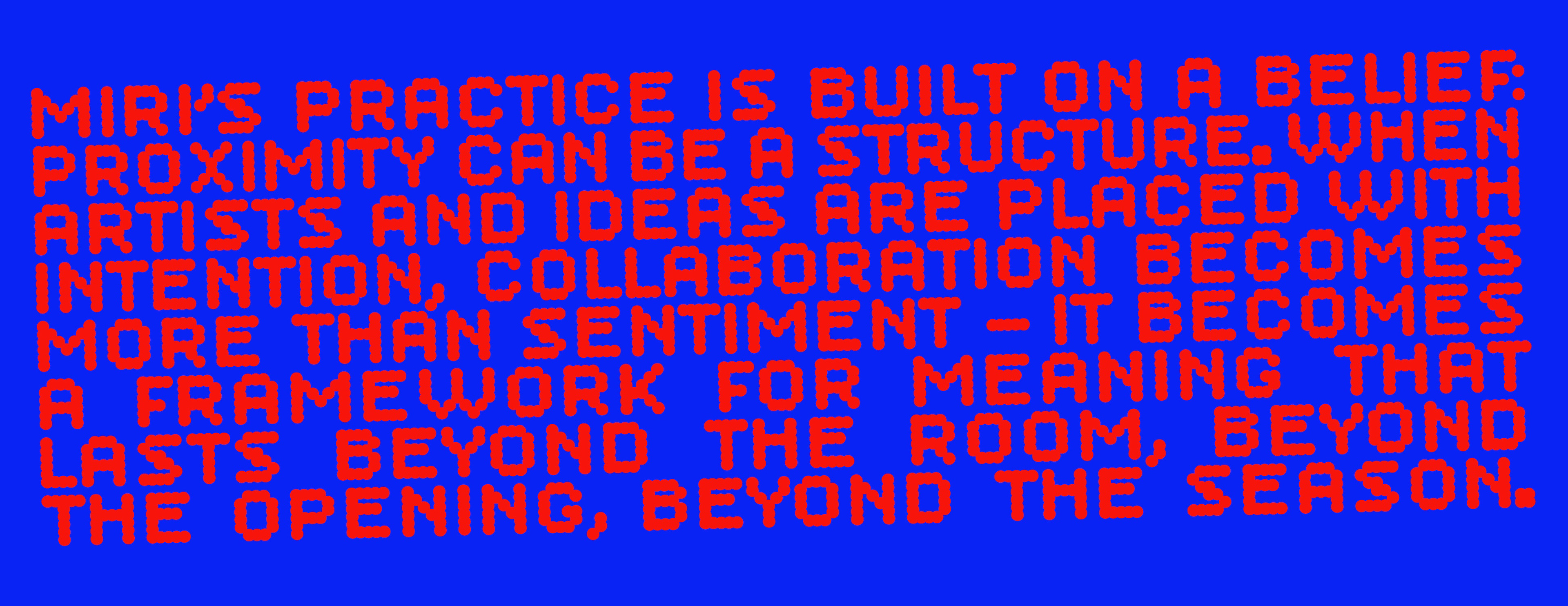
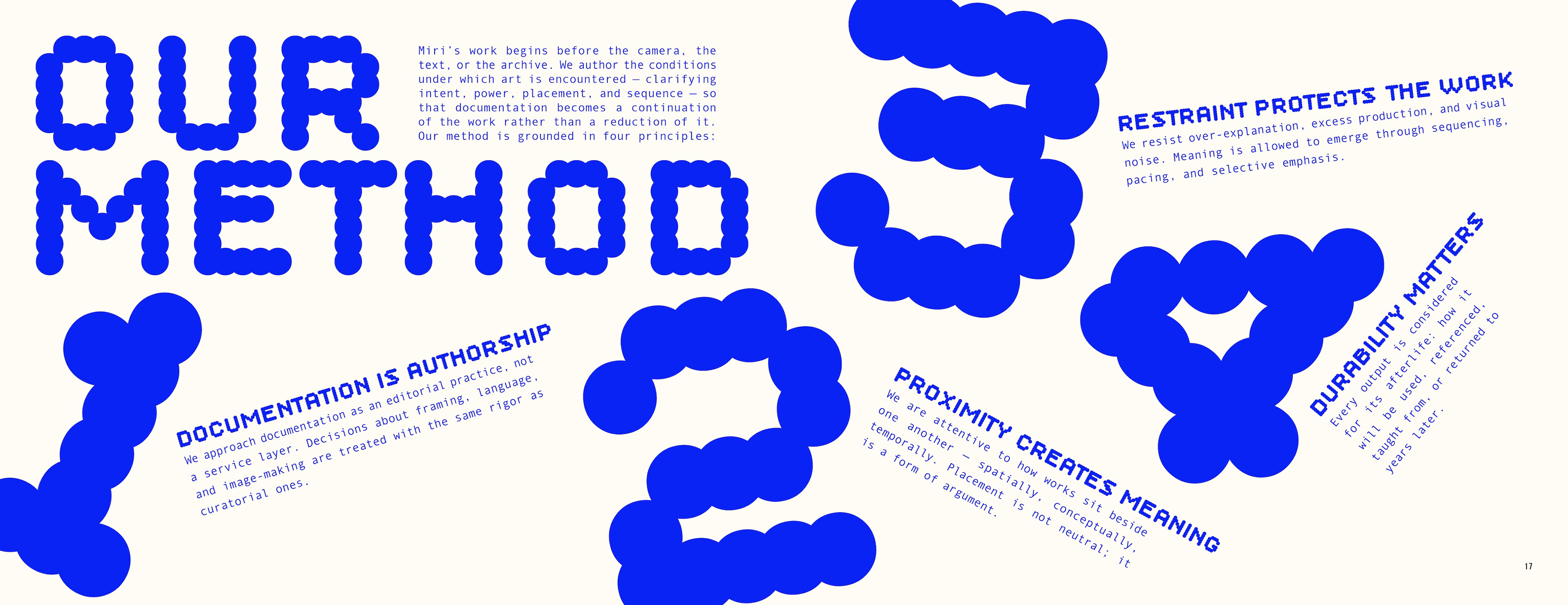
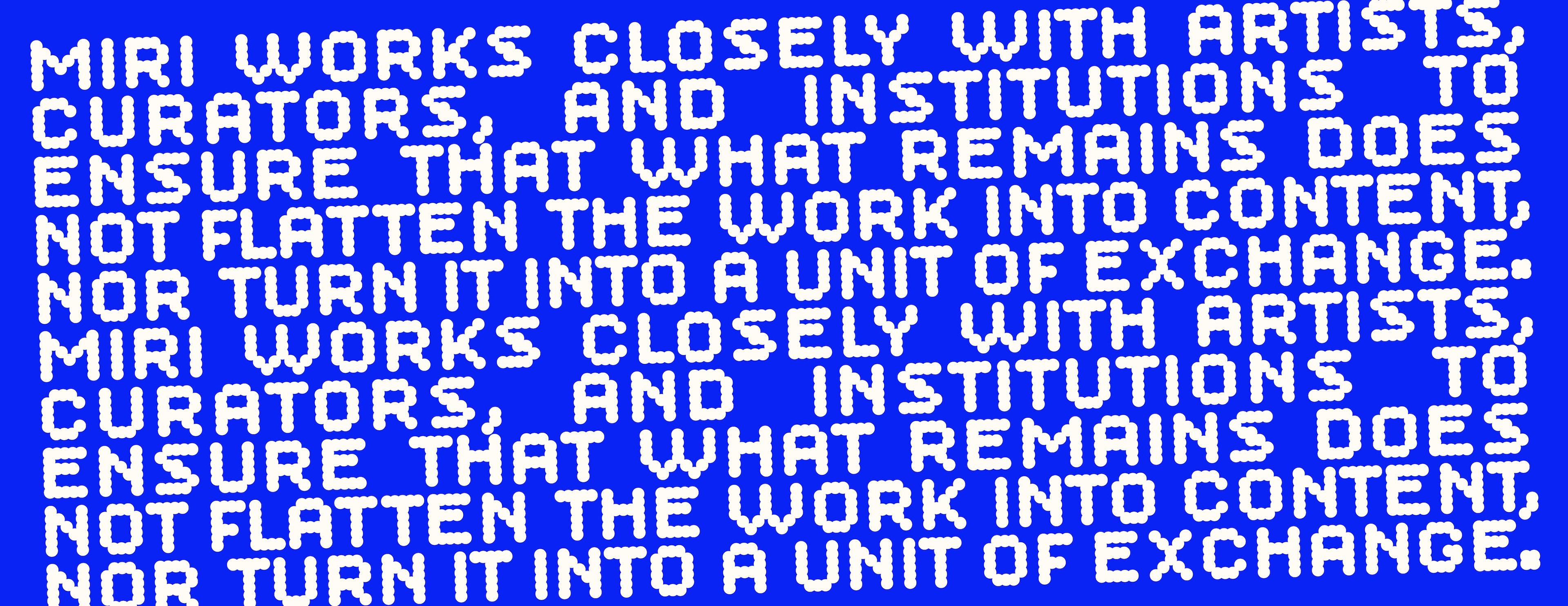
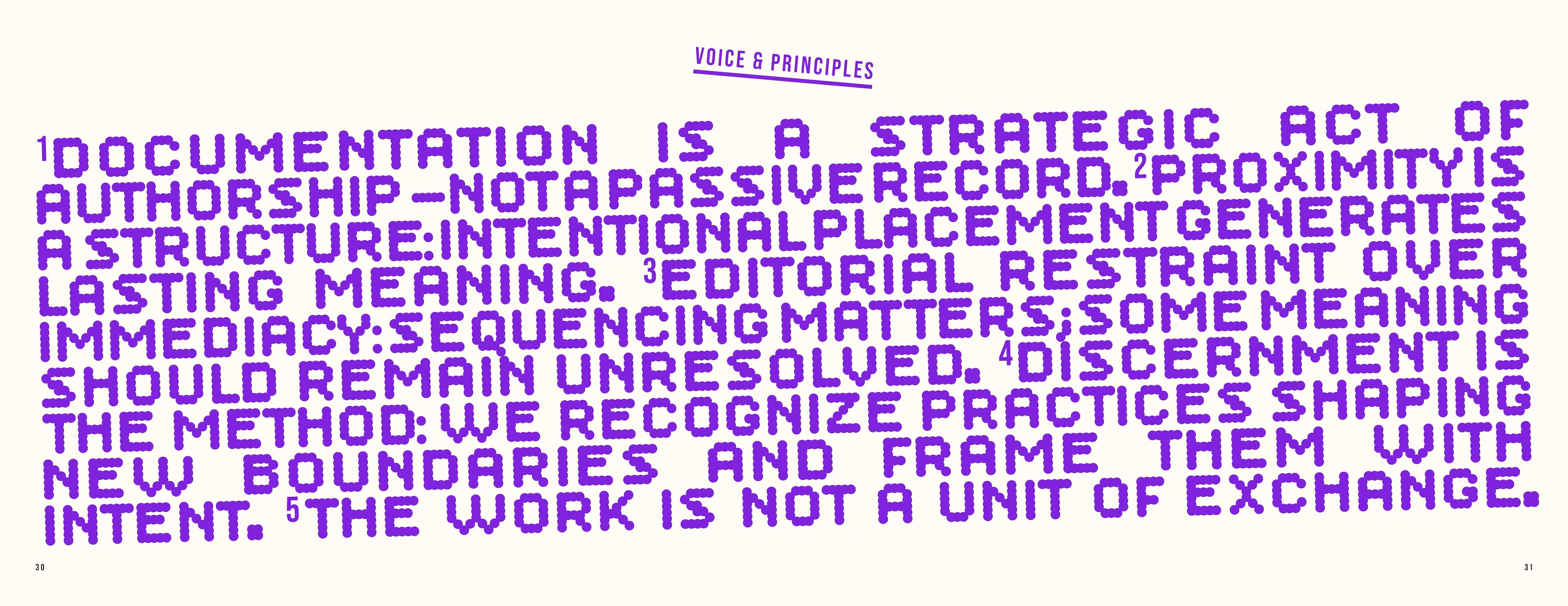
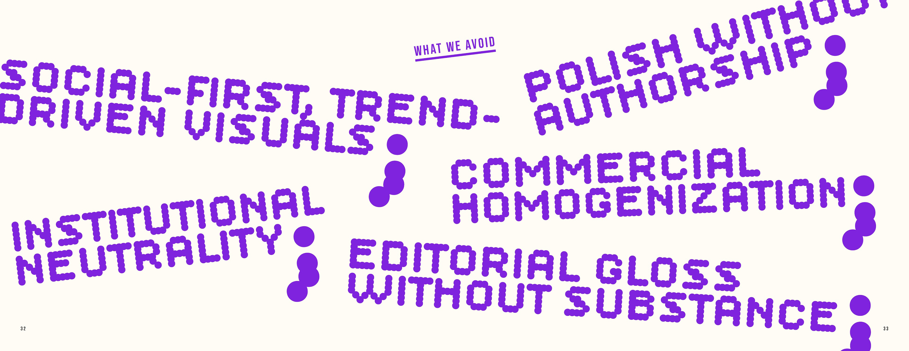
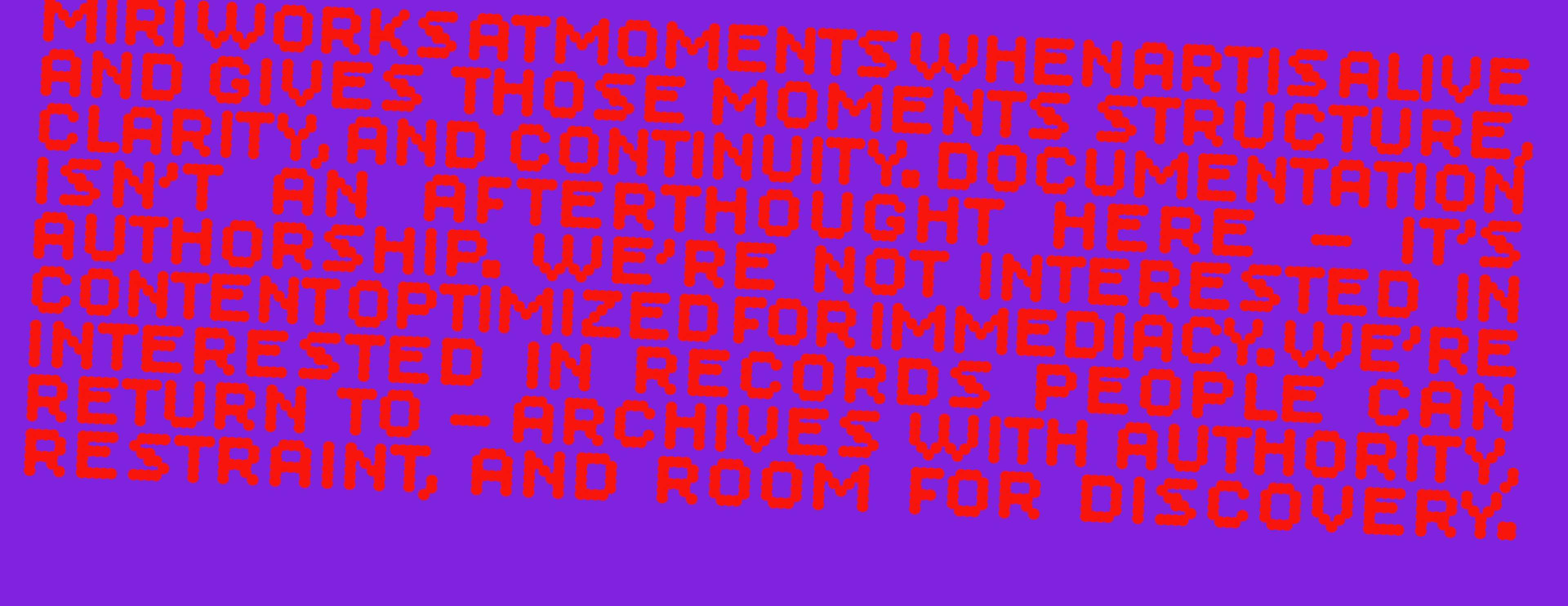
Miri’s practice is built on a belief: Proximity can be a structure. When artists and ideas are placed with intention, collaboration becomes more than sentiment — it becomes a framework for meaning that lasts beyond the room, beyond the opening, beyond the season. Working closely with artists, curators, and institutions, Miri ensures that what remains does not flatten the work into content, nor turn it into a unit of exchange.
I was commissioned by Mirka Serrato to create two brand identities for her alternative arts practice: the parent company, Miri; and Neighbors, the art fair event that would fall under the Miri corporation. This began by developing a comprehensive questionnaire that aided in gathering more of the backstory as well as the why, what, and how of Miri. This information was used to craft the storyline, which then influenced all brand design decisions.
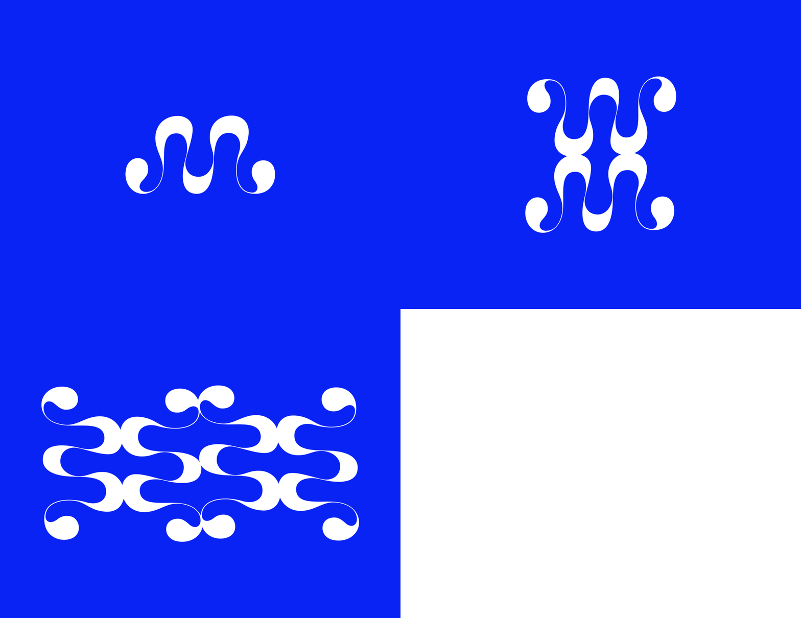
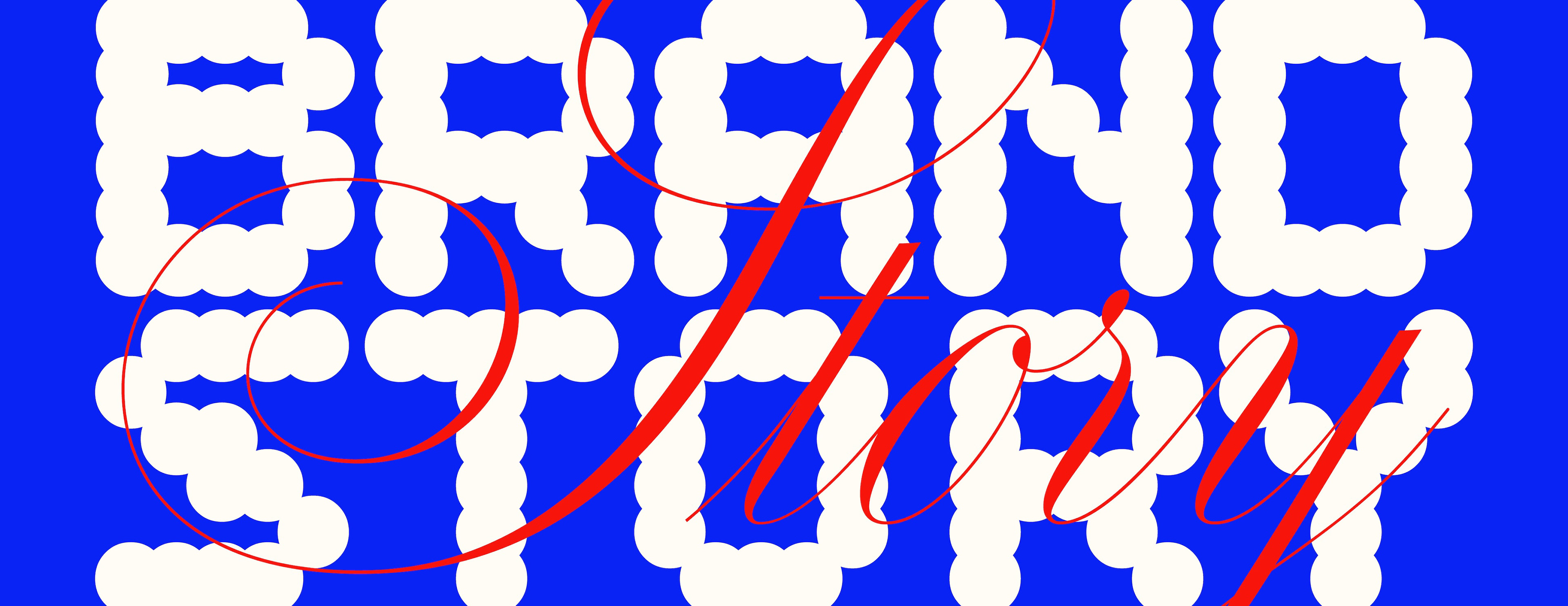
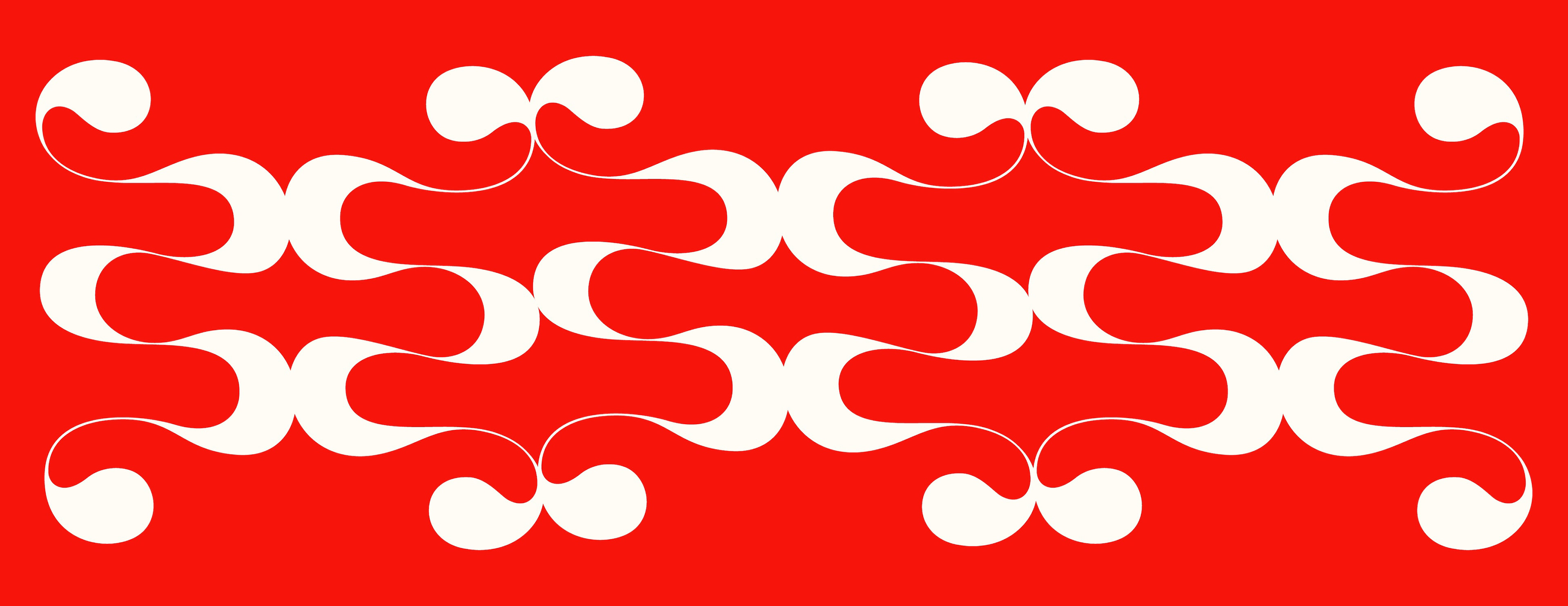
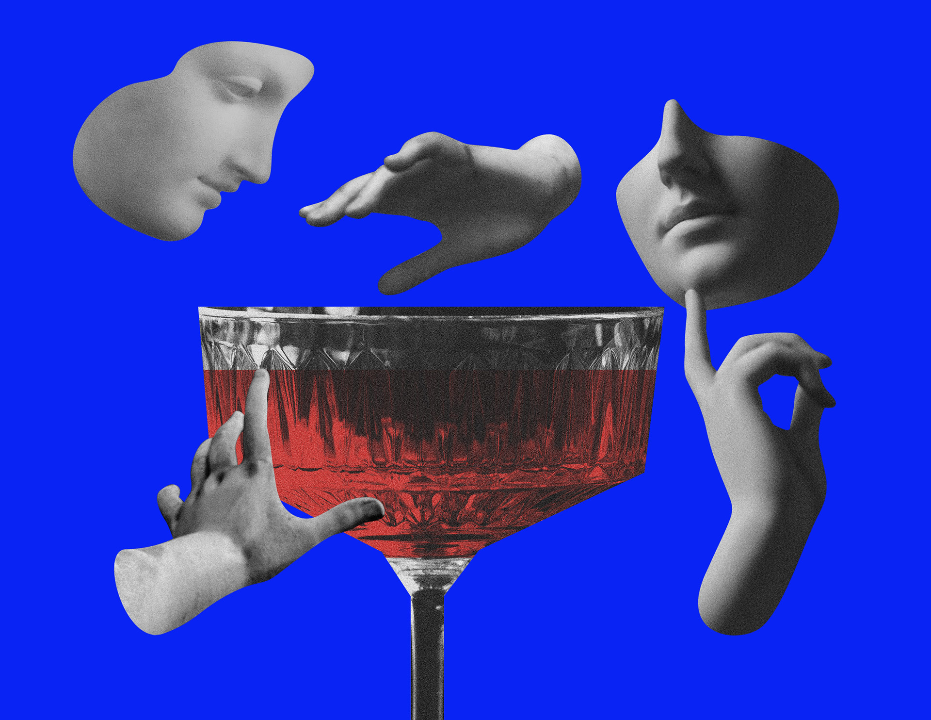
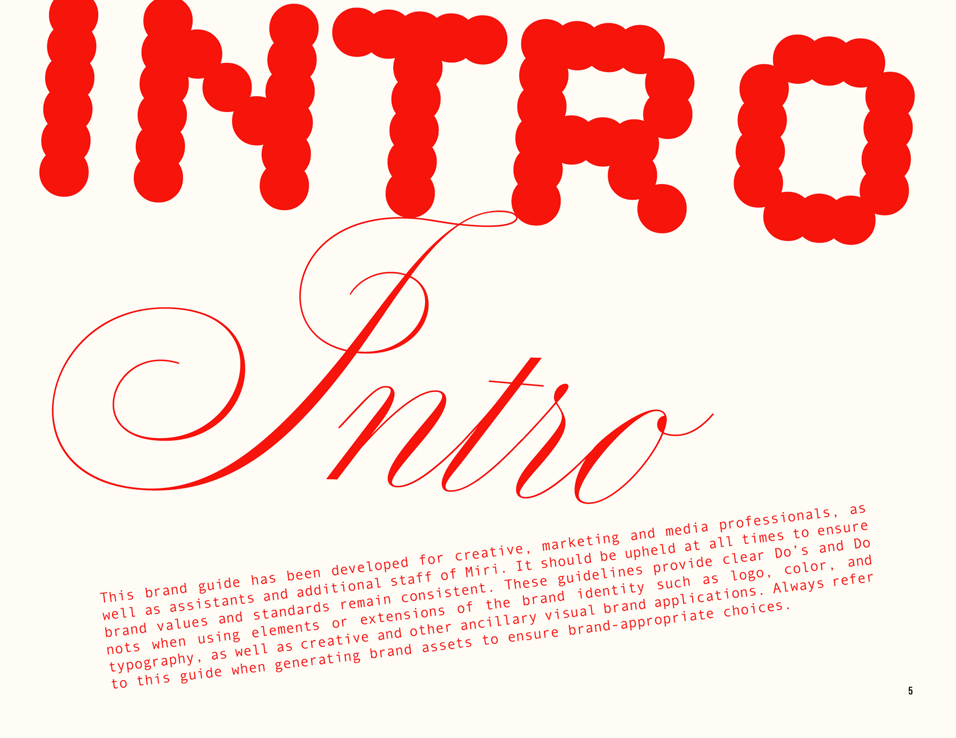
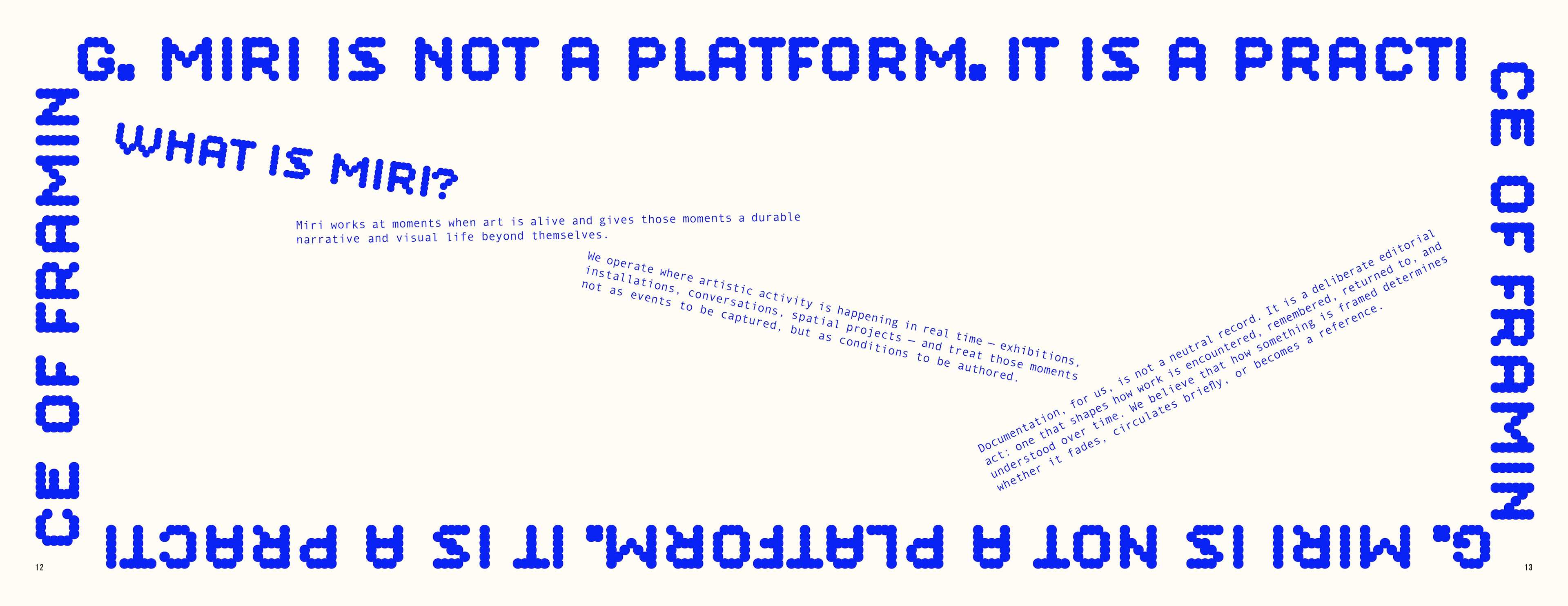
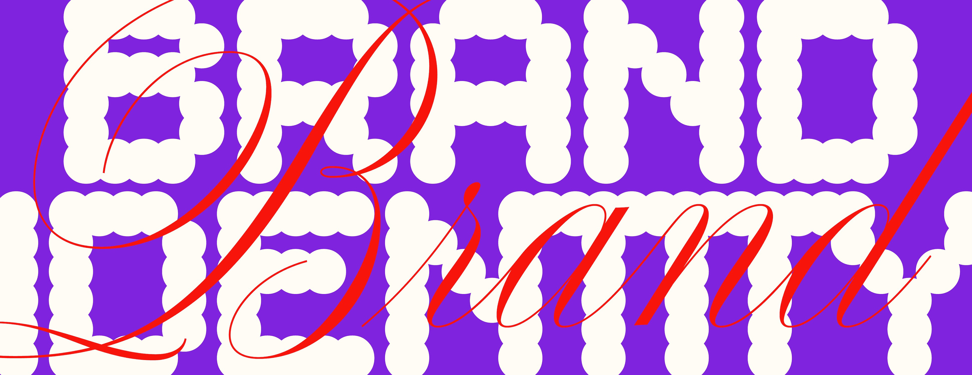
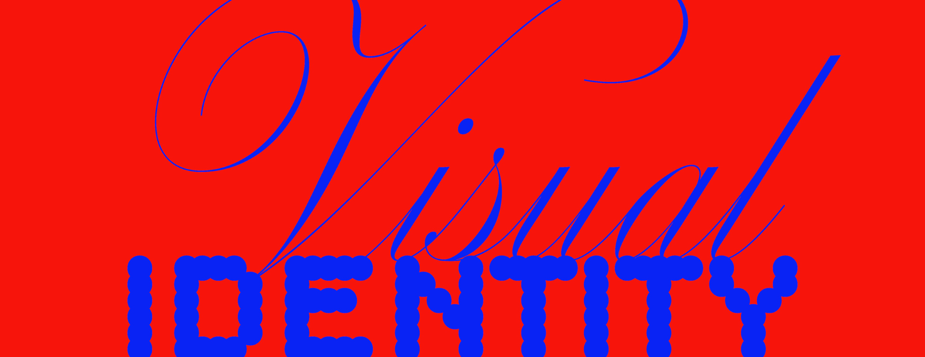
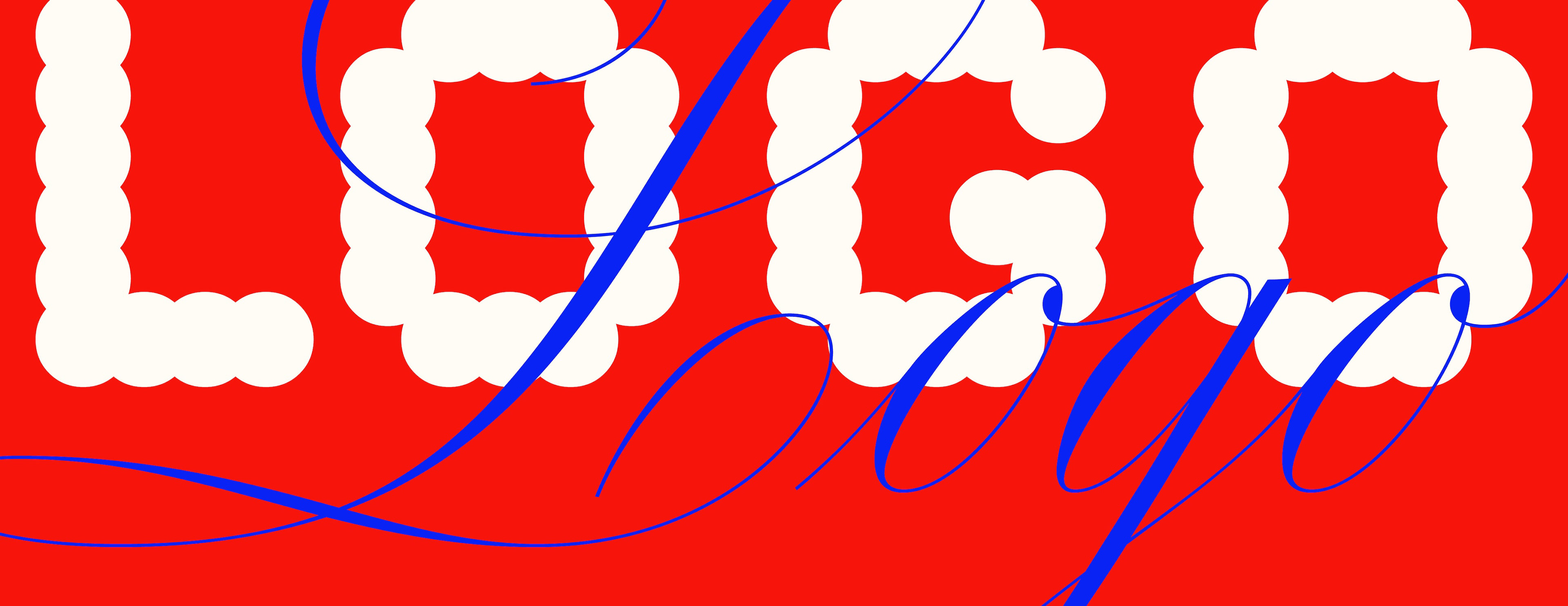
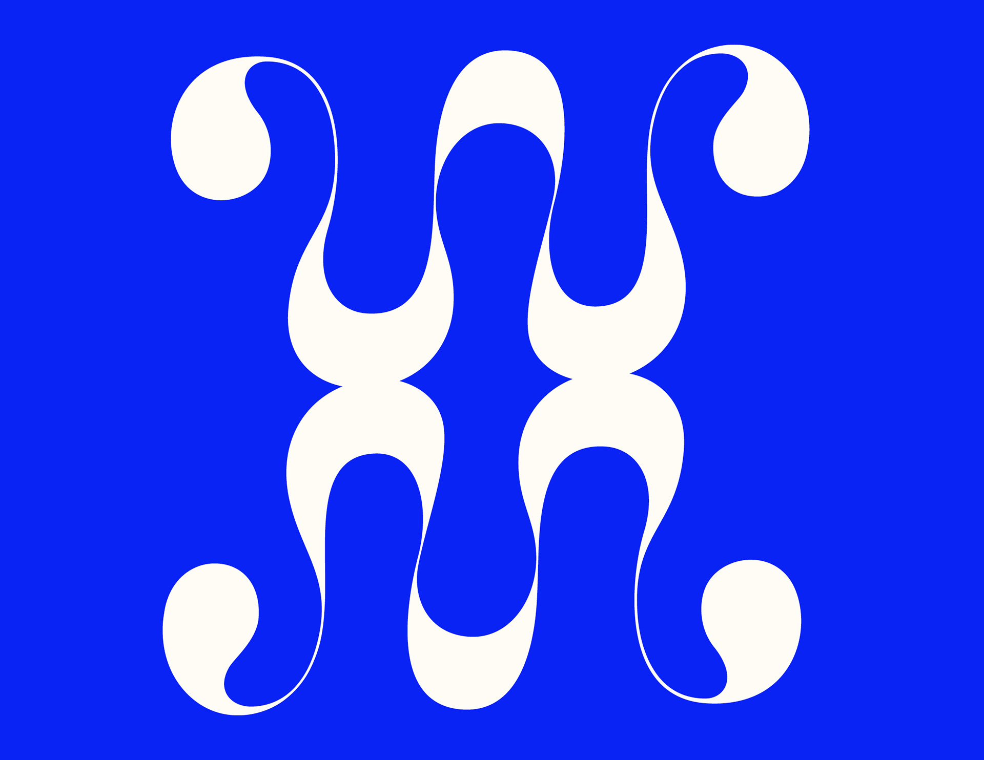
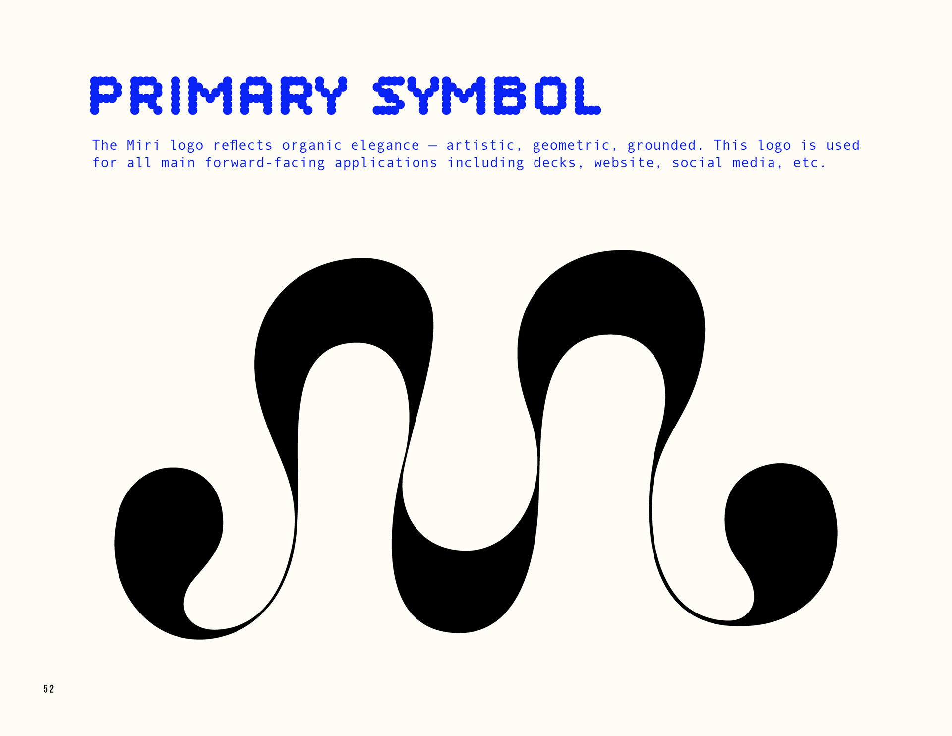
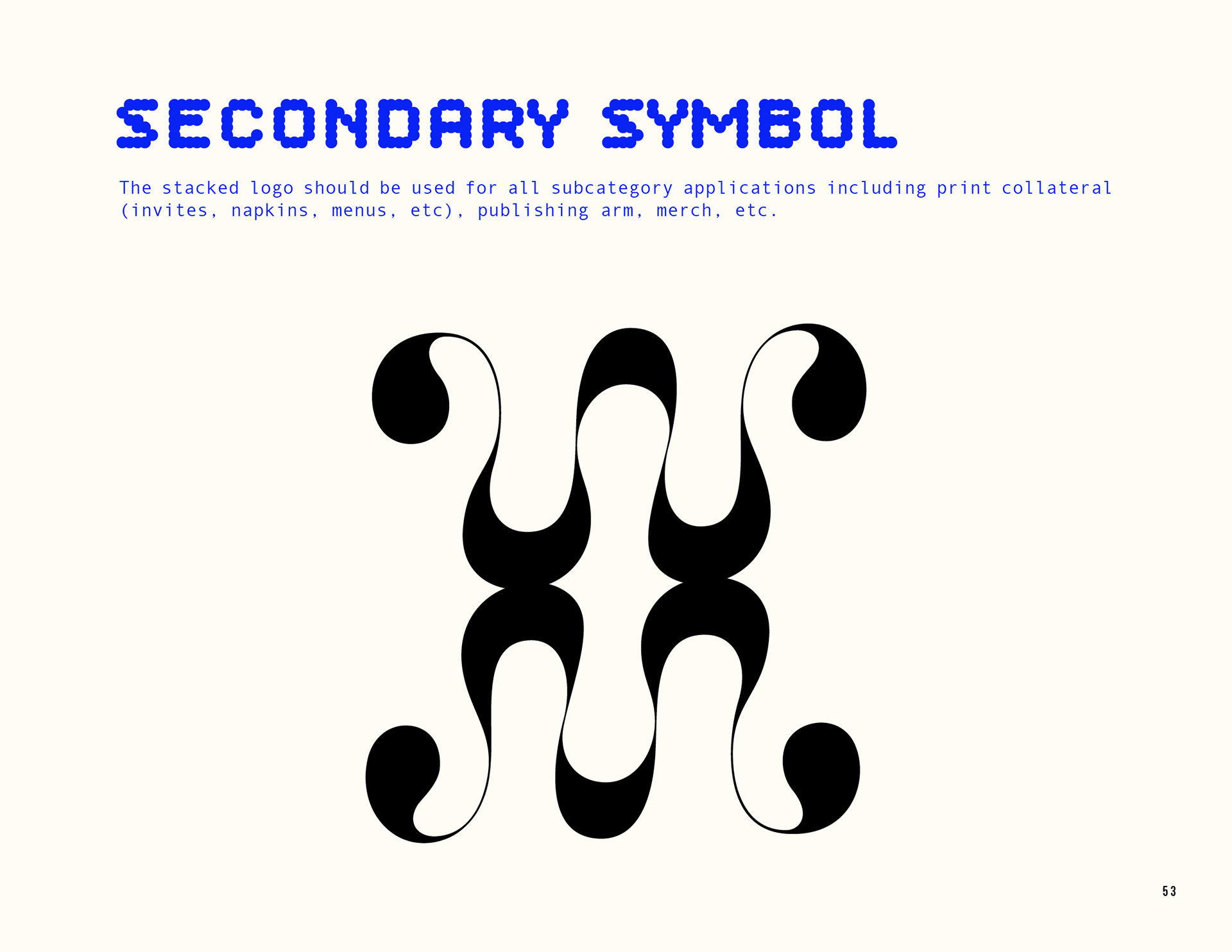
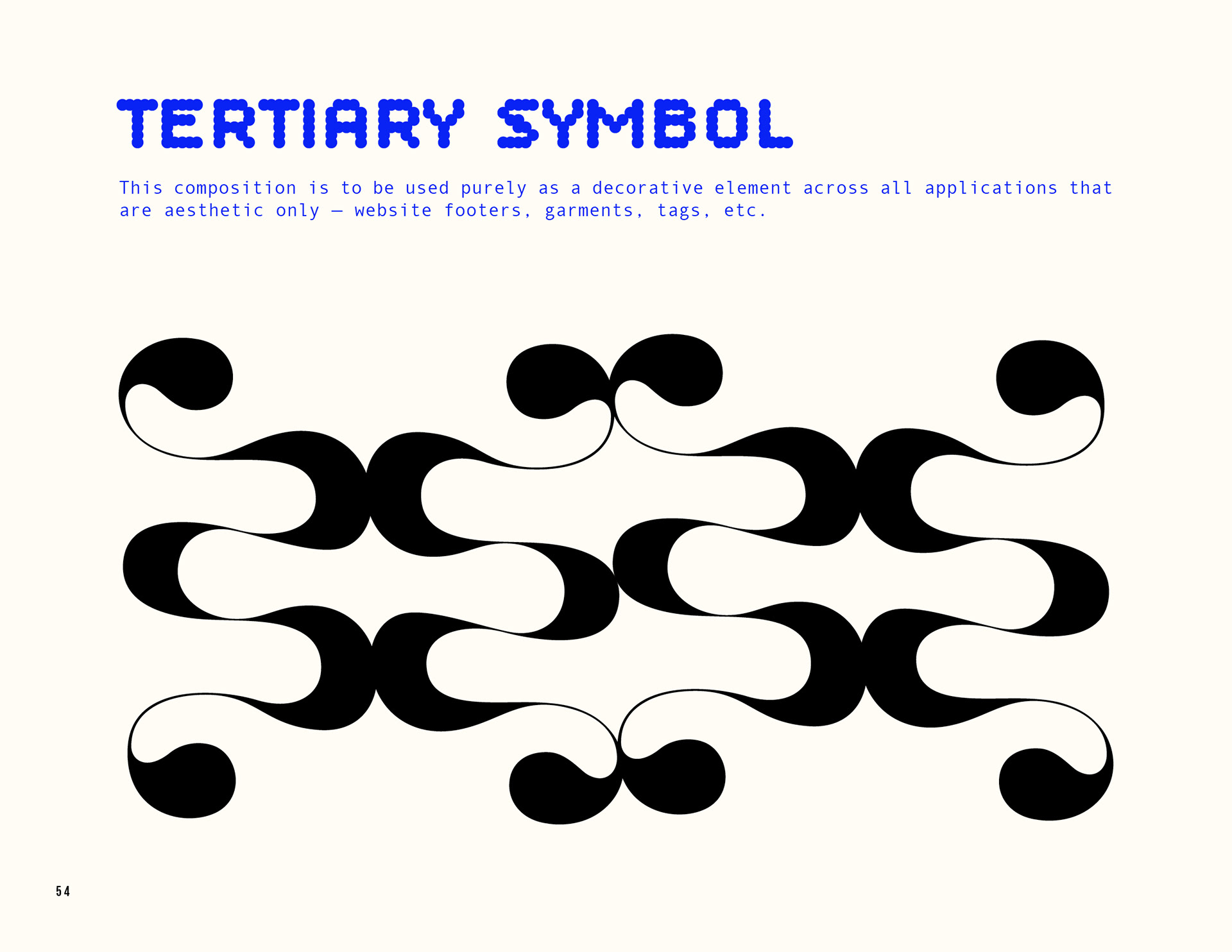
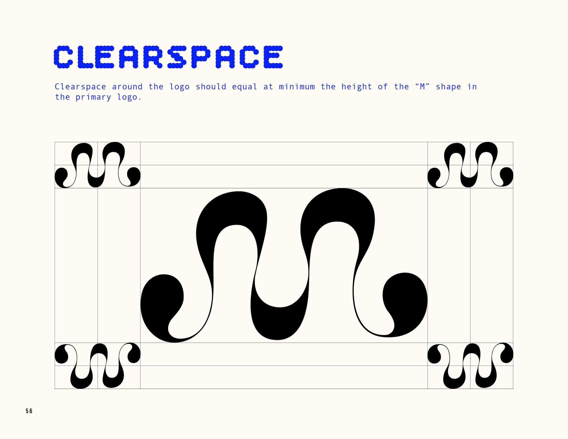
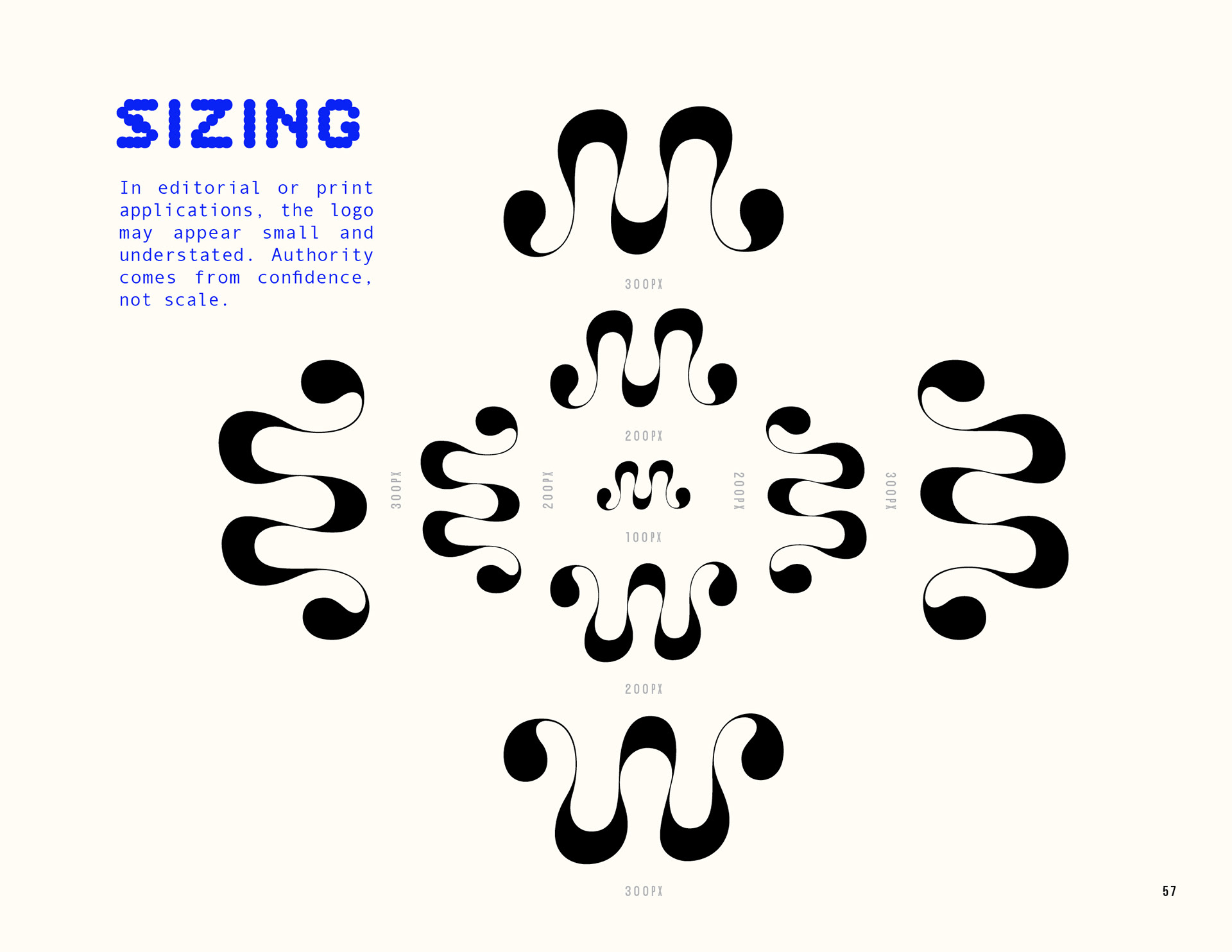
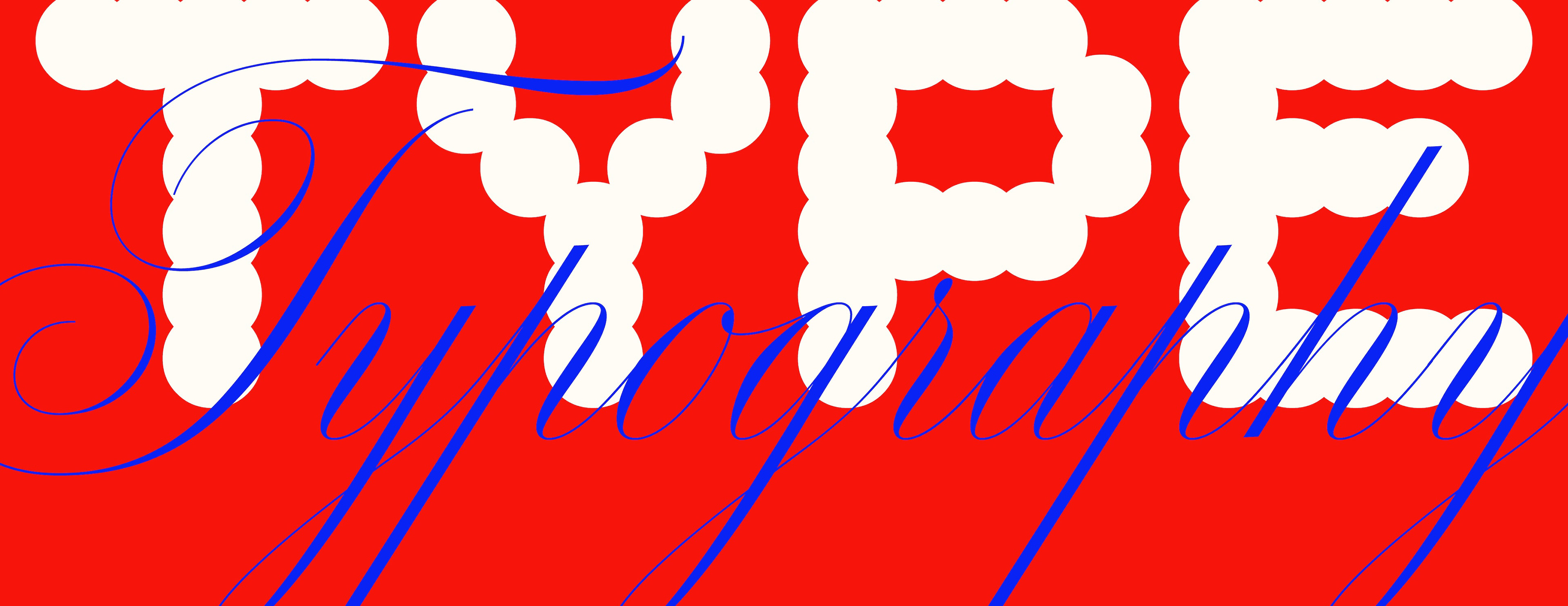
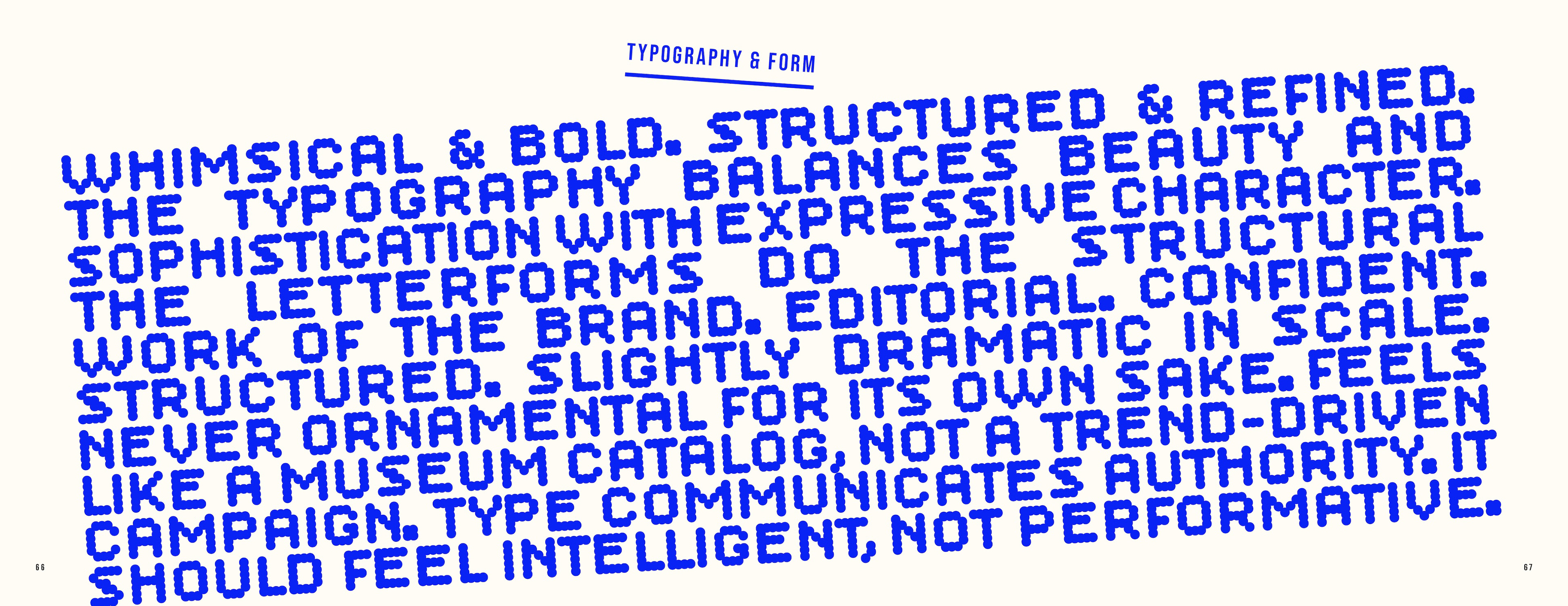
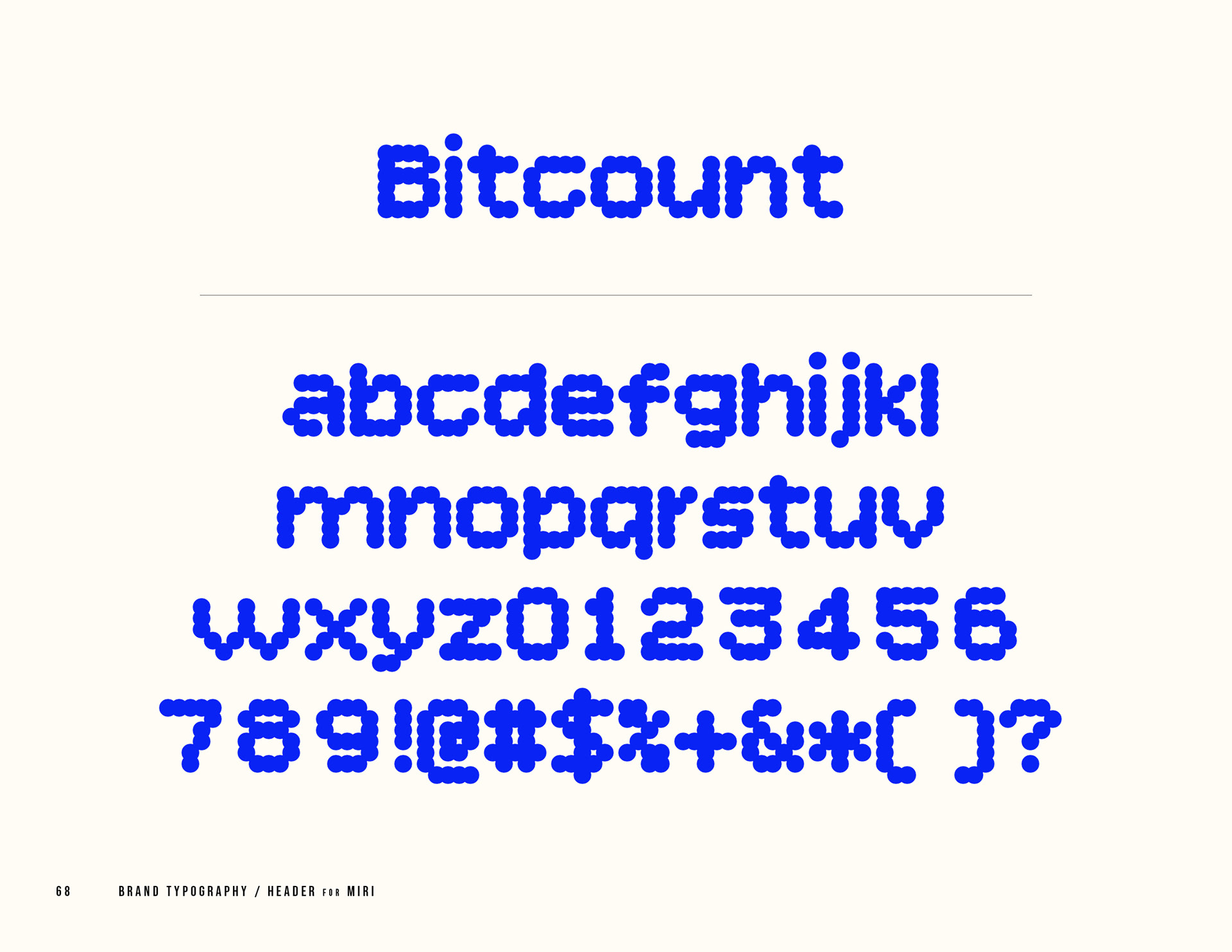
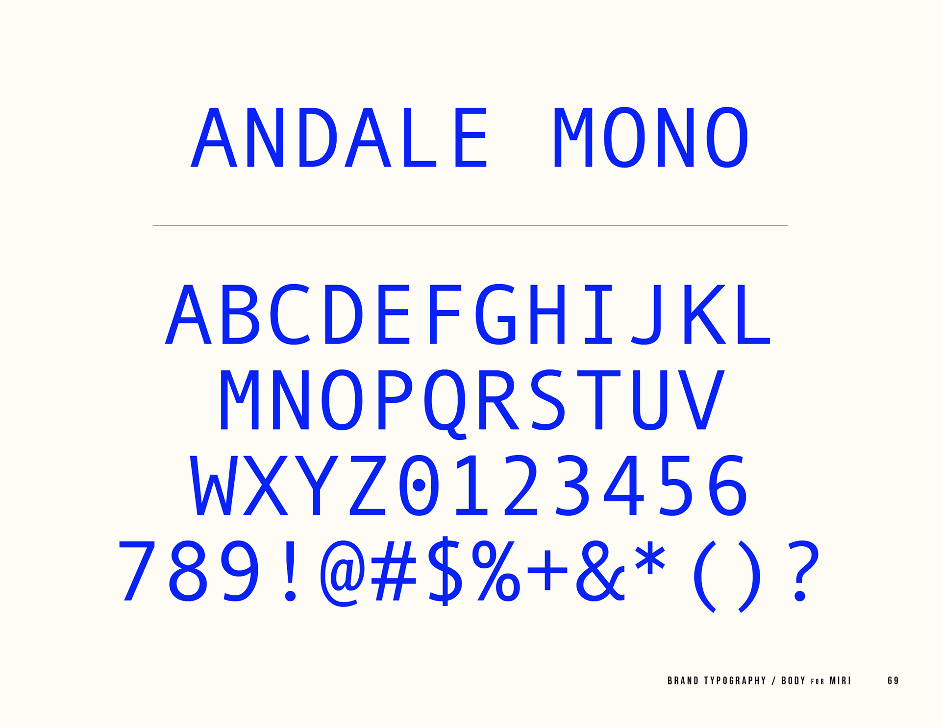
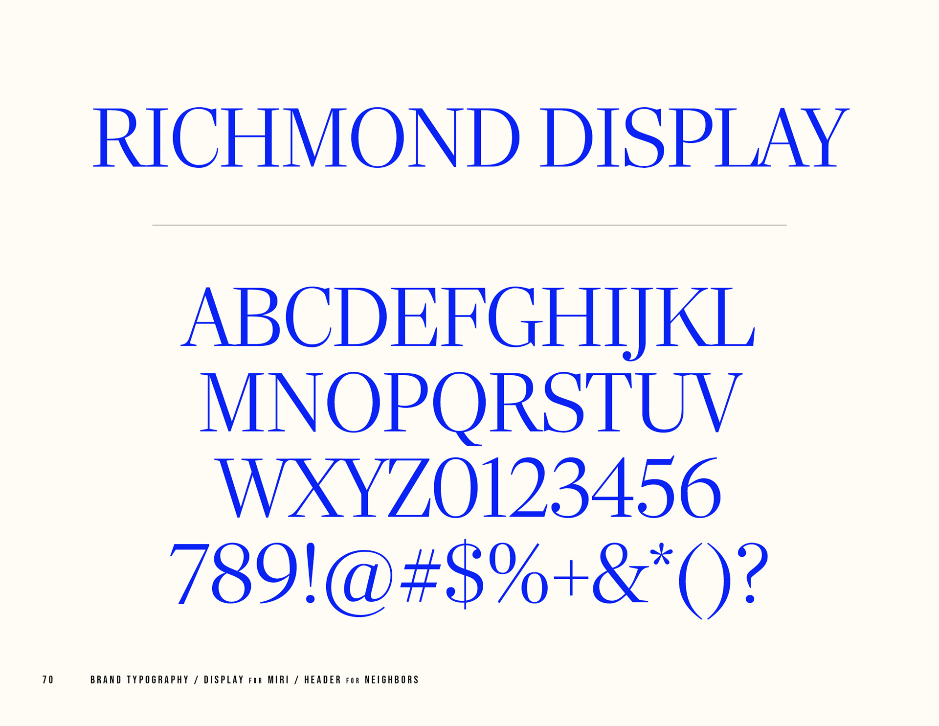
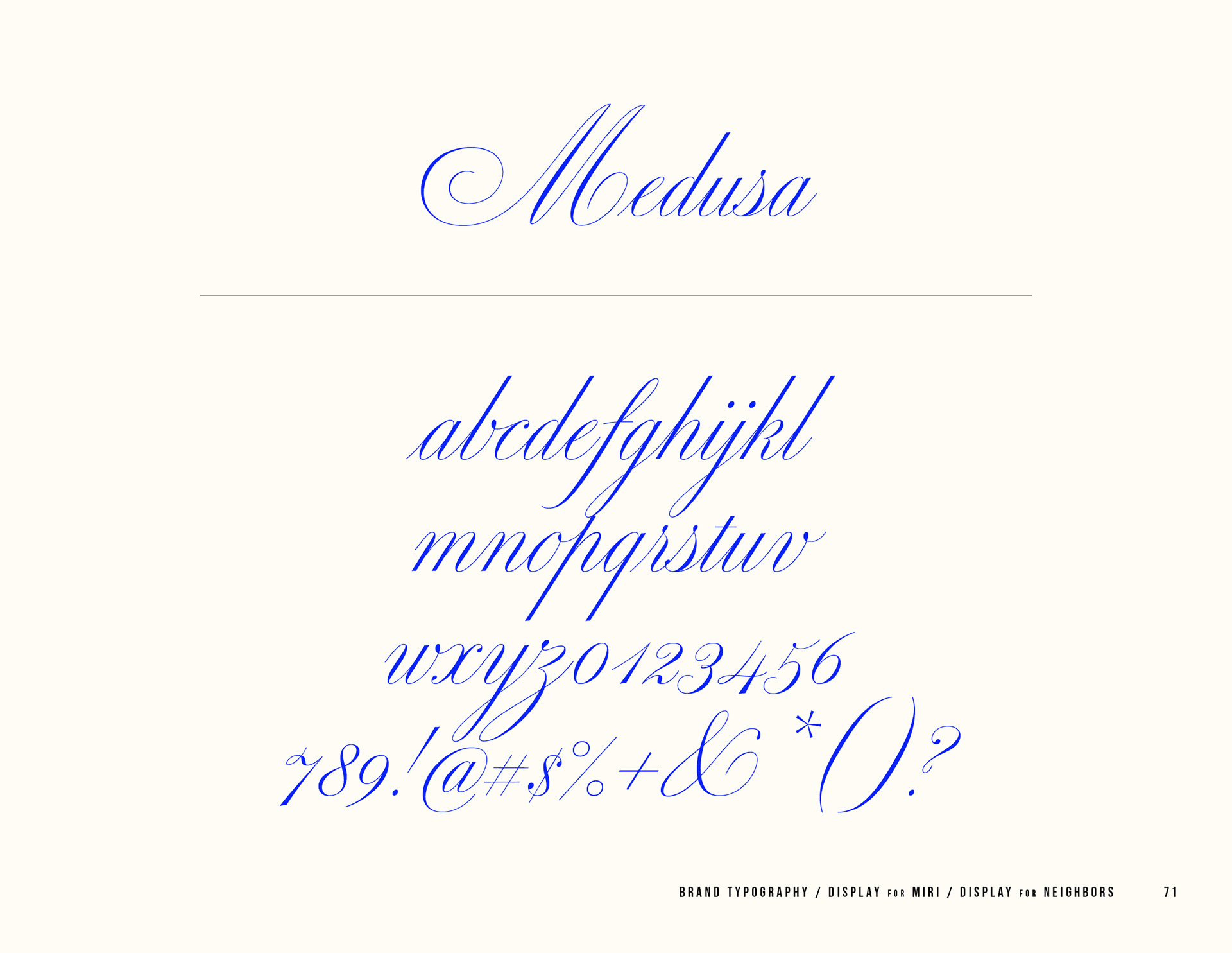
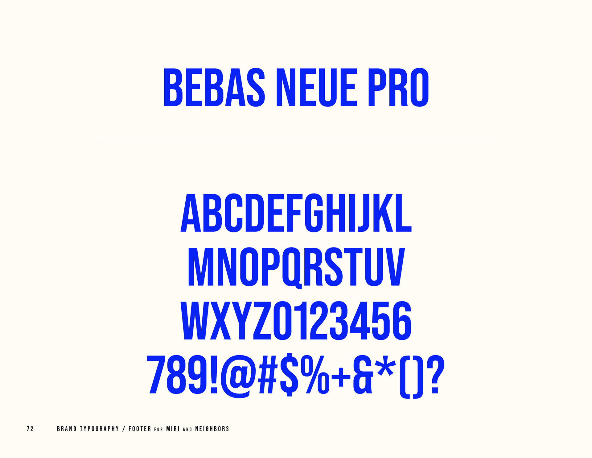
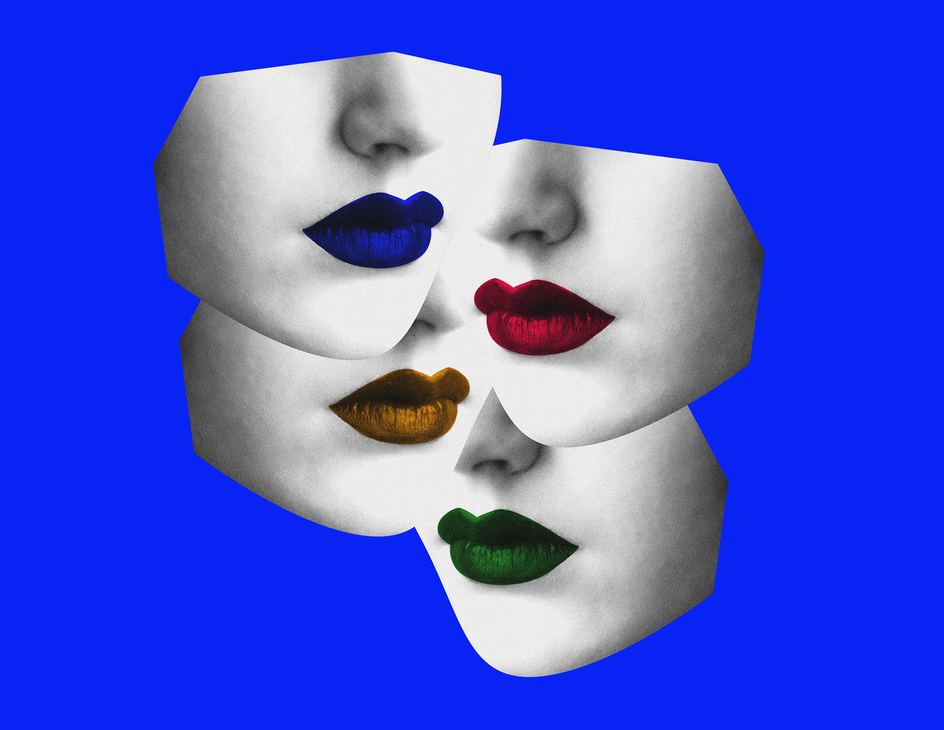
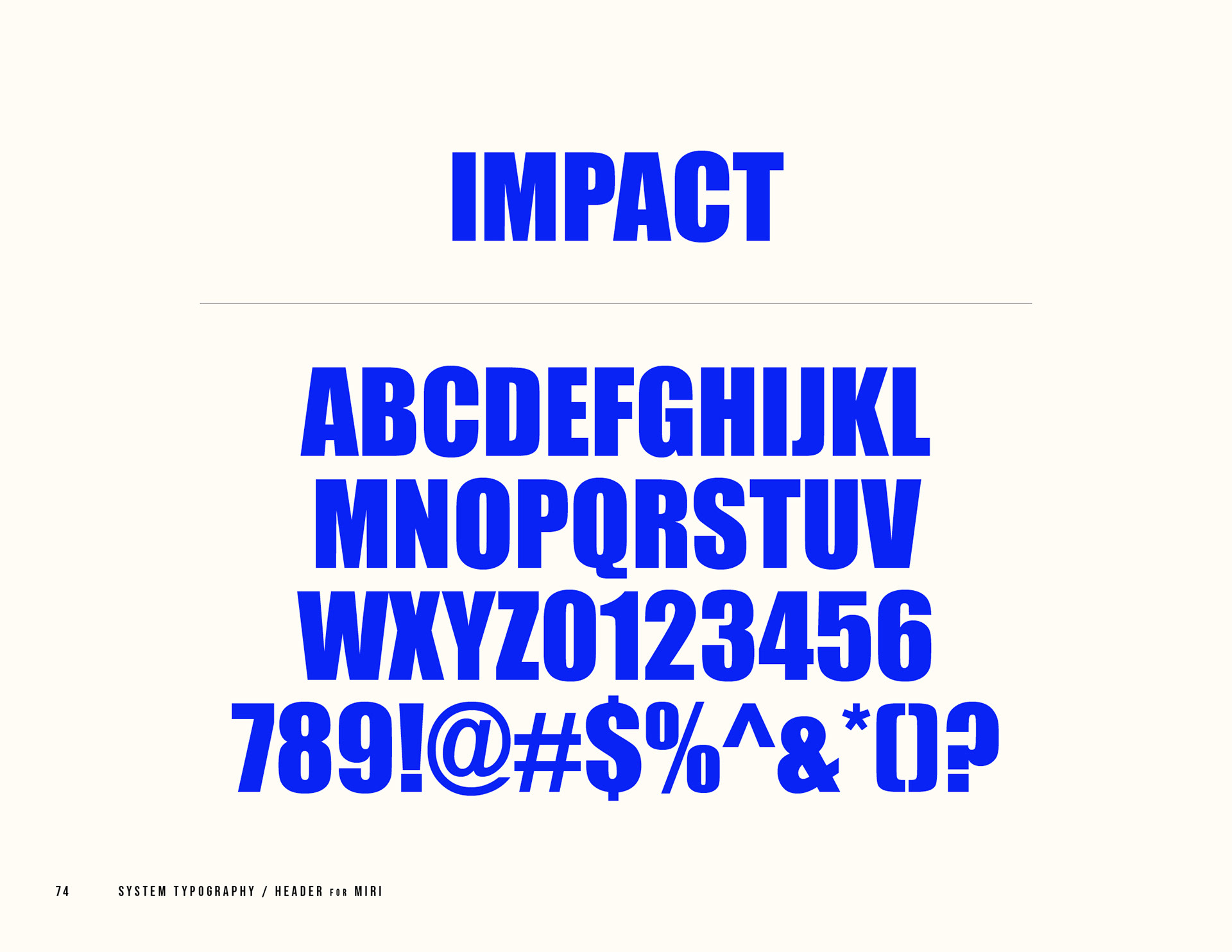
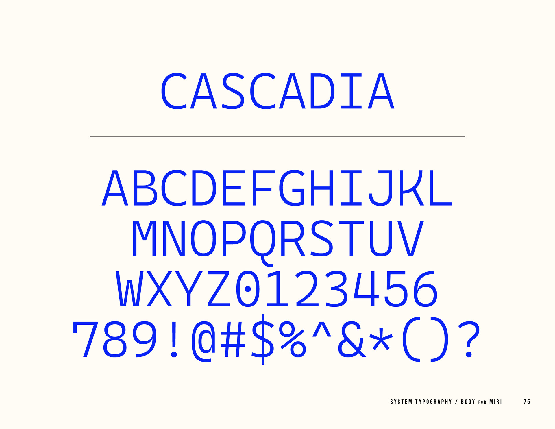
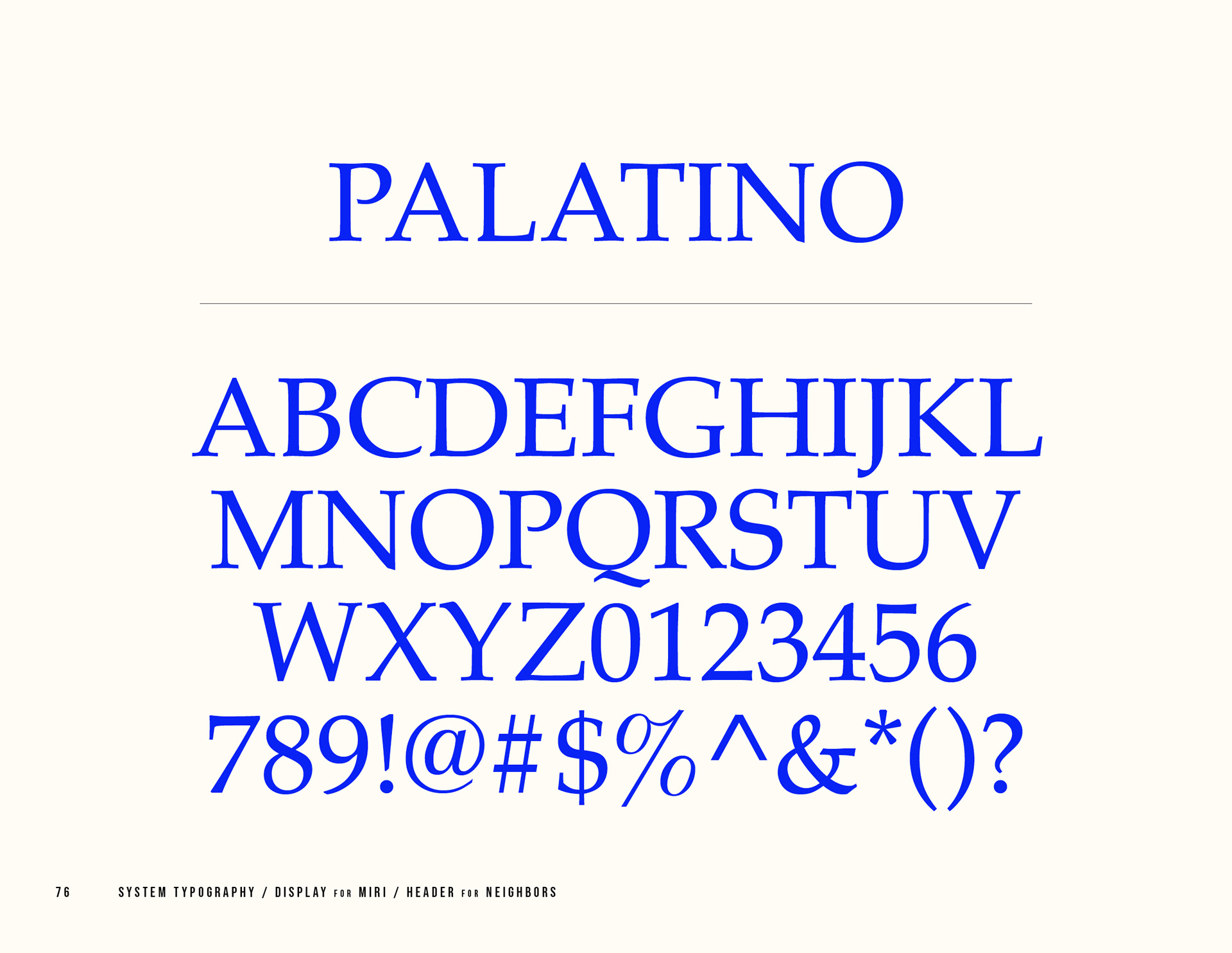
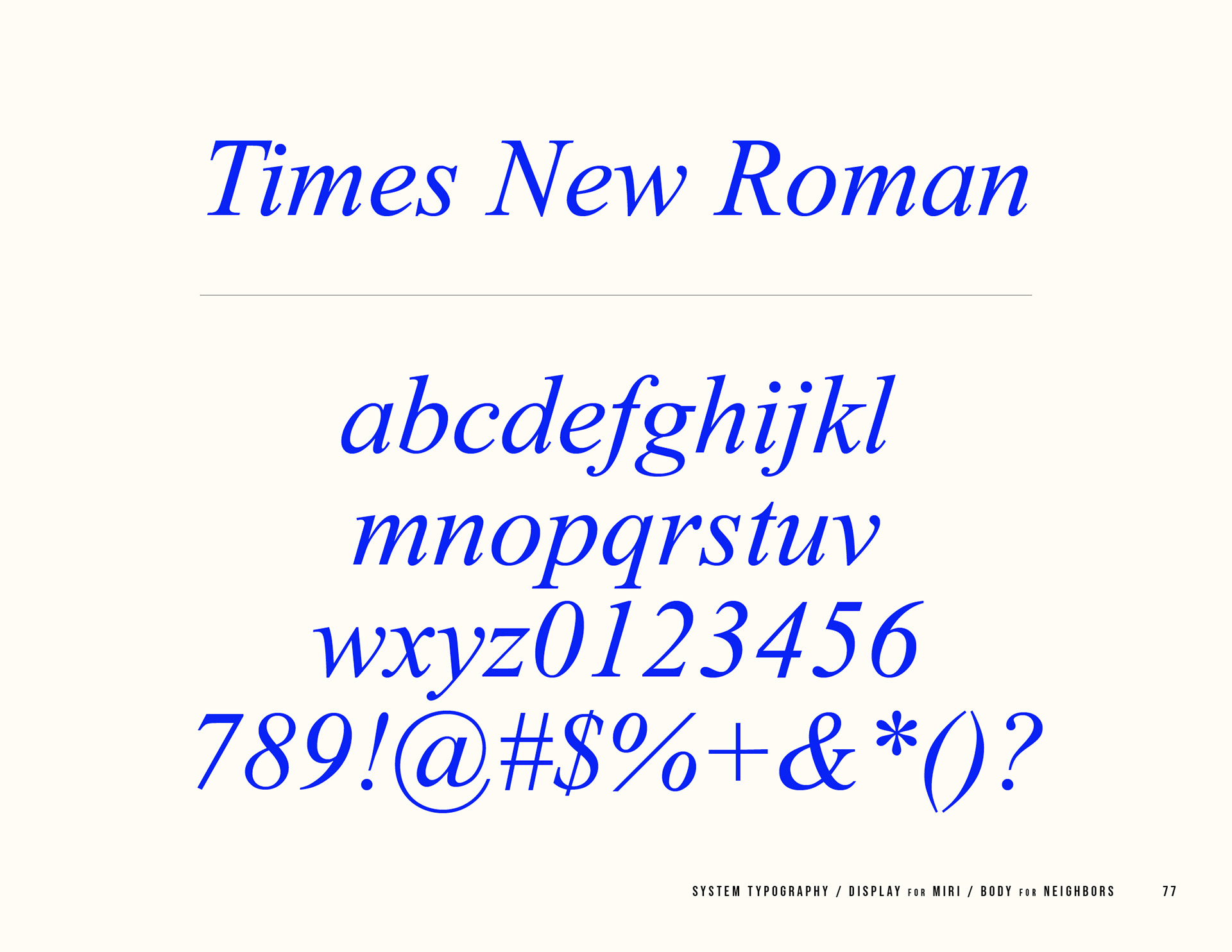
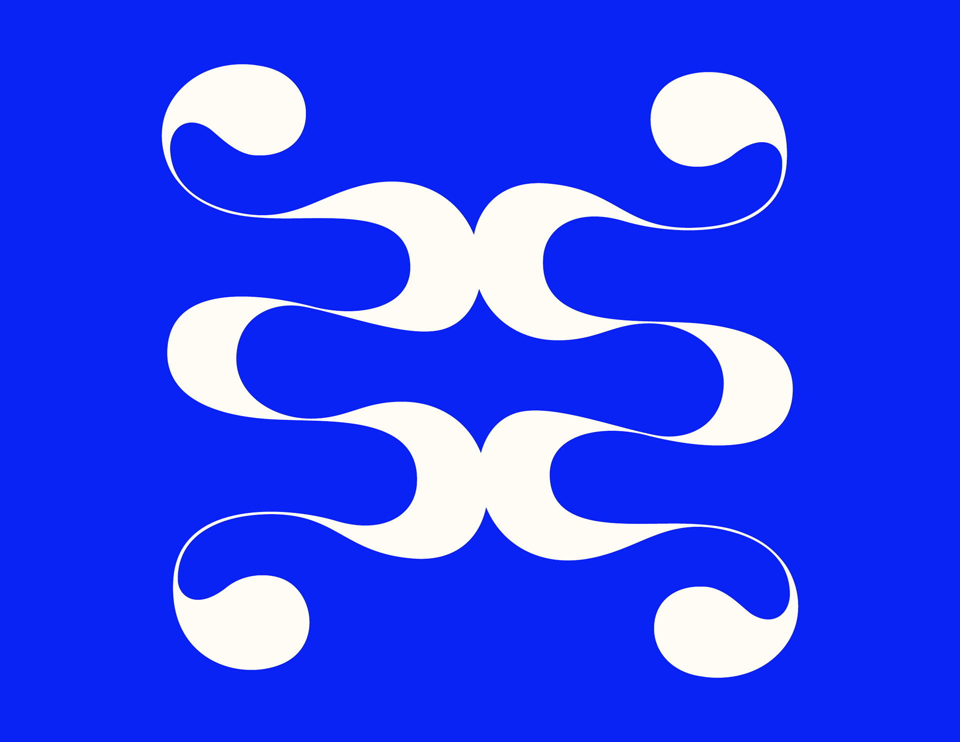
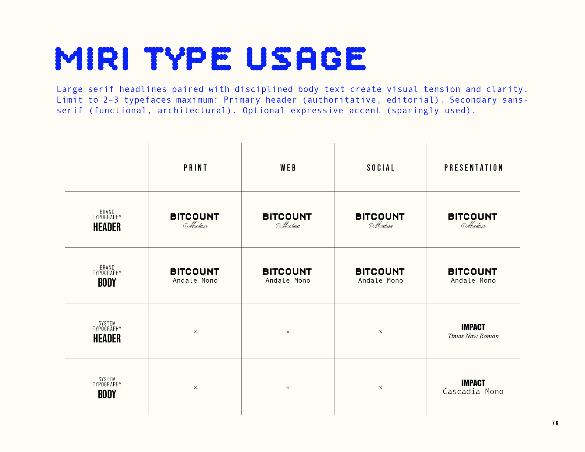
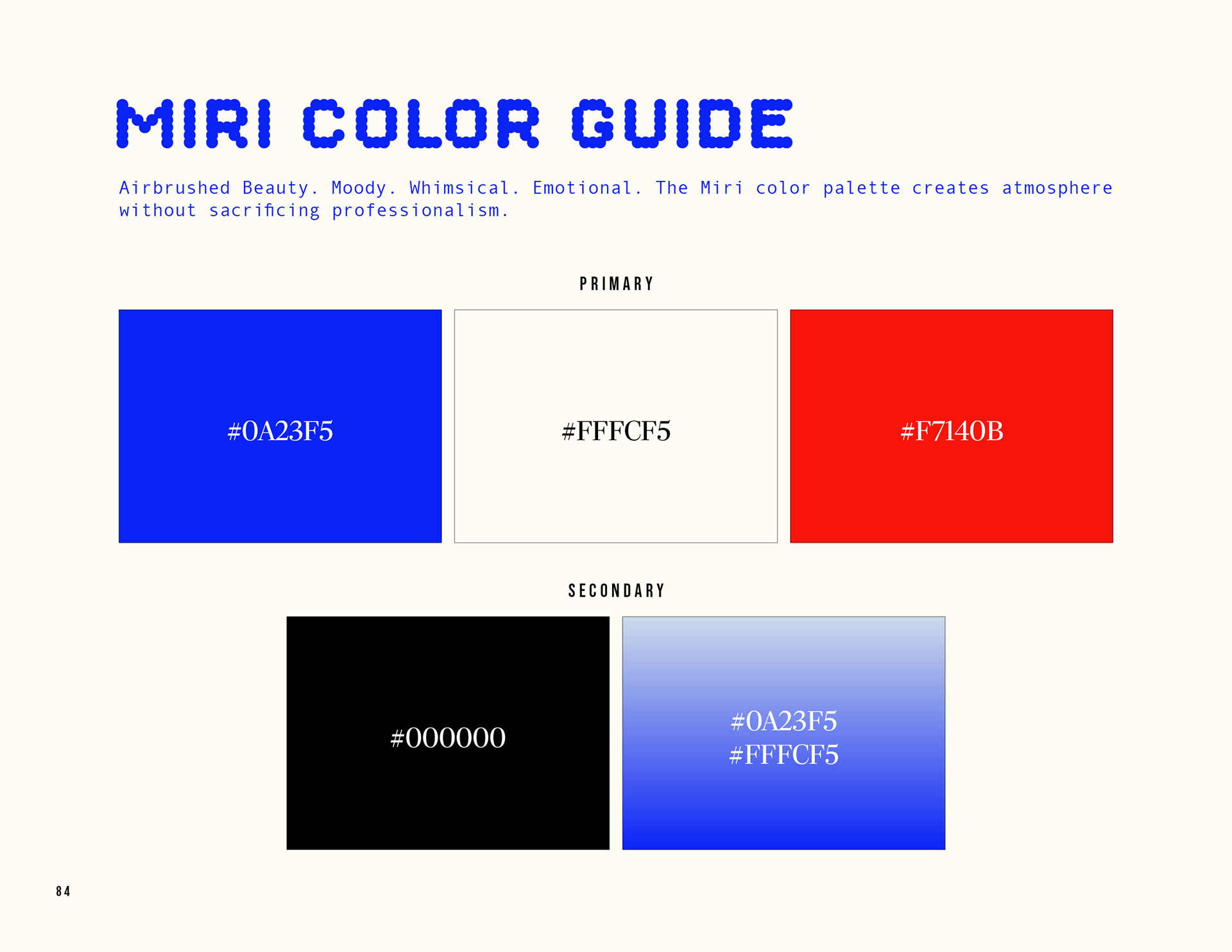
A custom, hand-crafted logo system. Future-forward, contemporary typography mixed with classical script. Collage. Historical imagery. Whimsical colors.
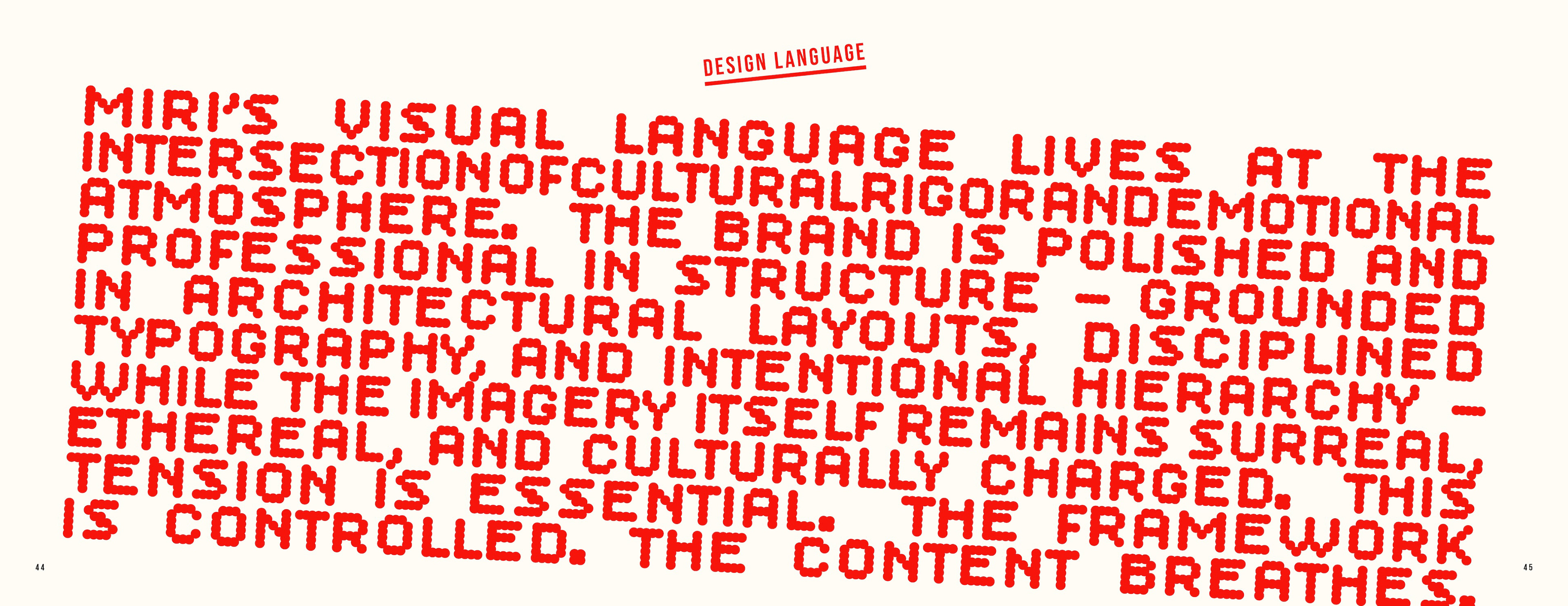
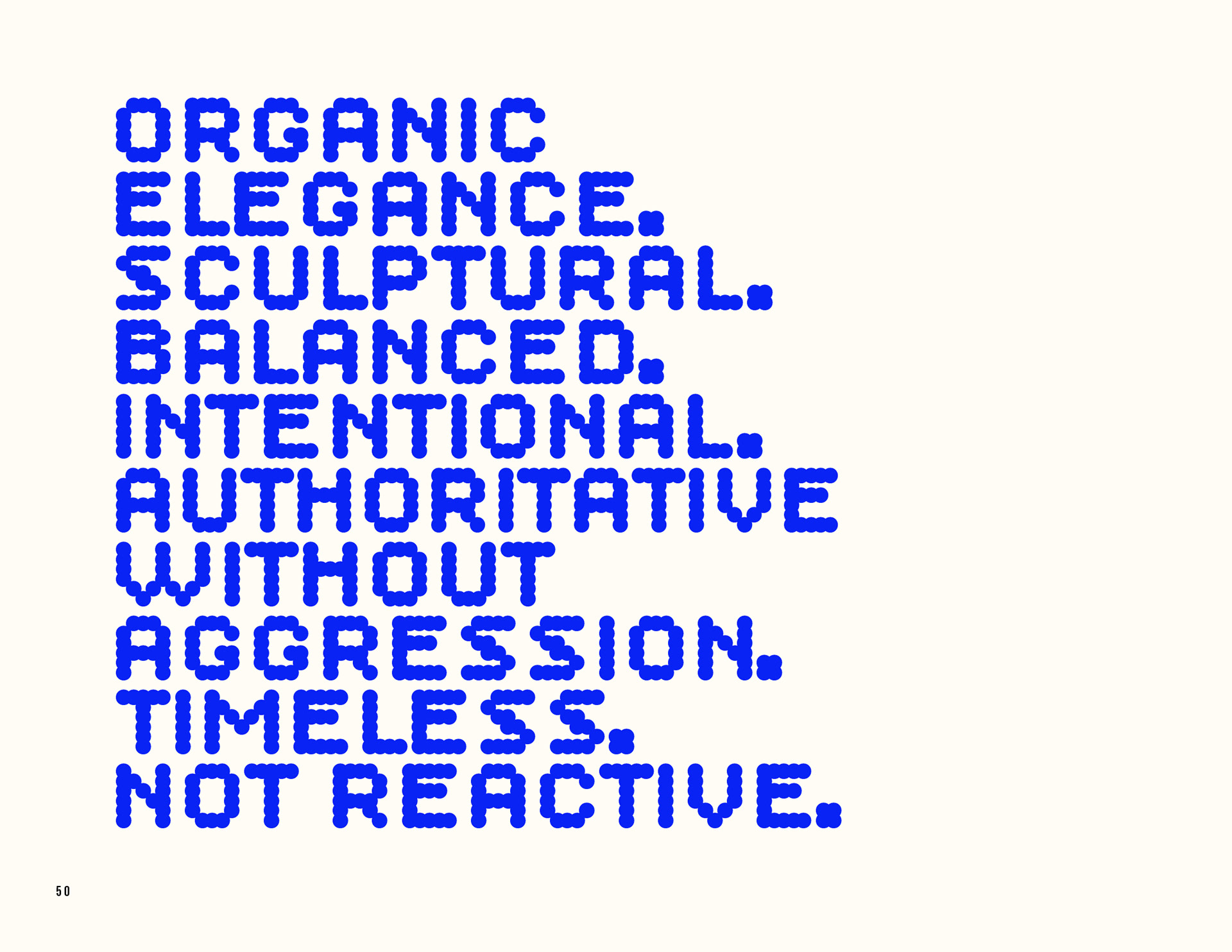
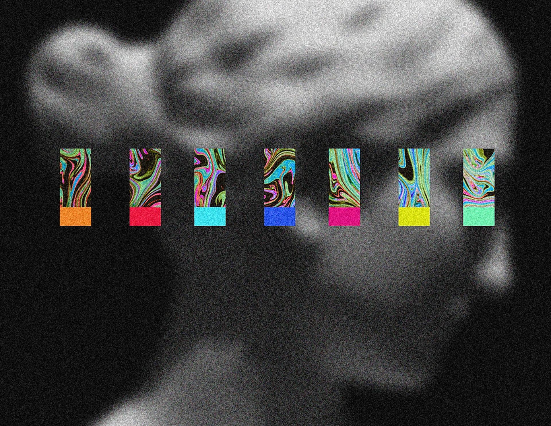
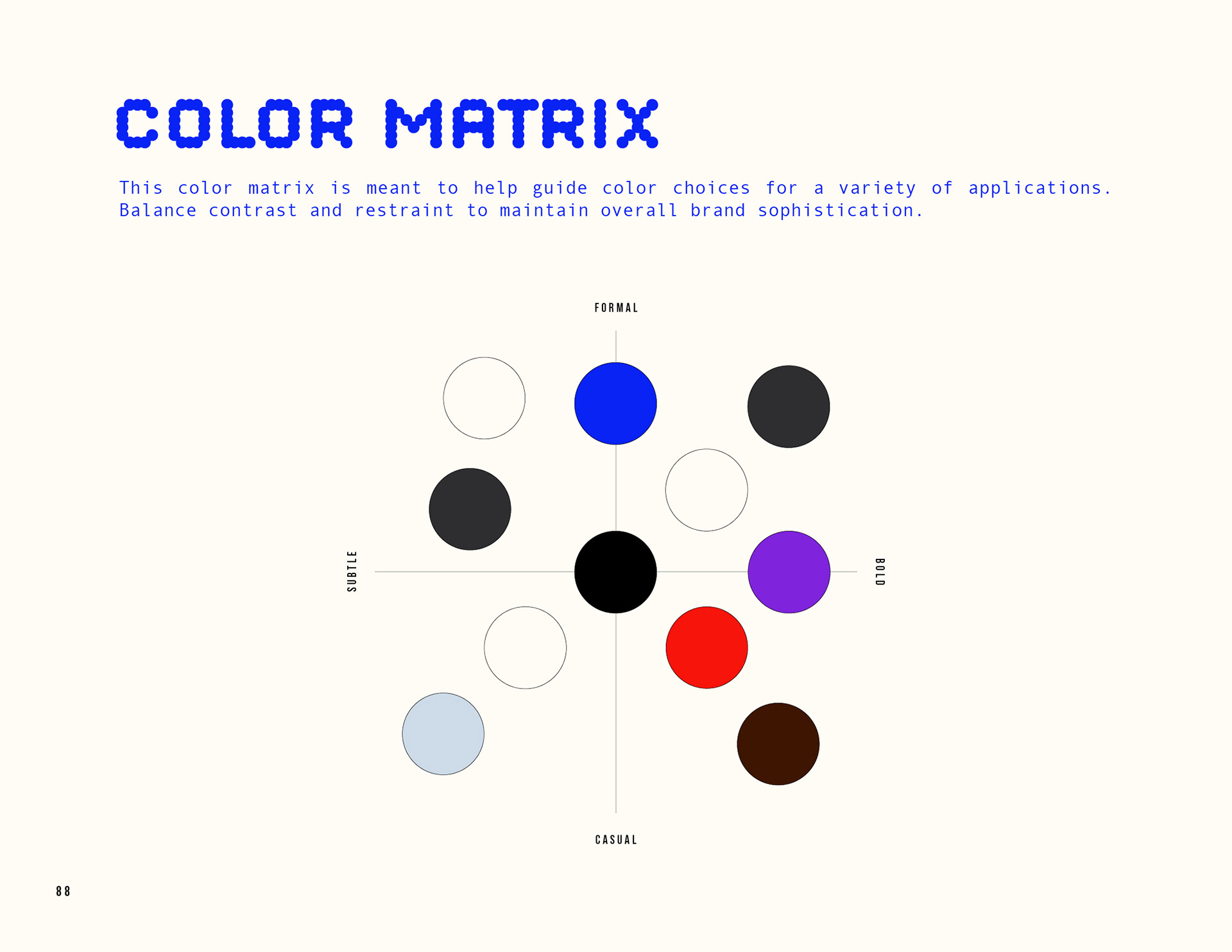
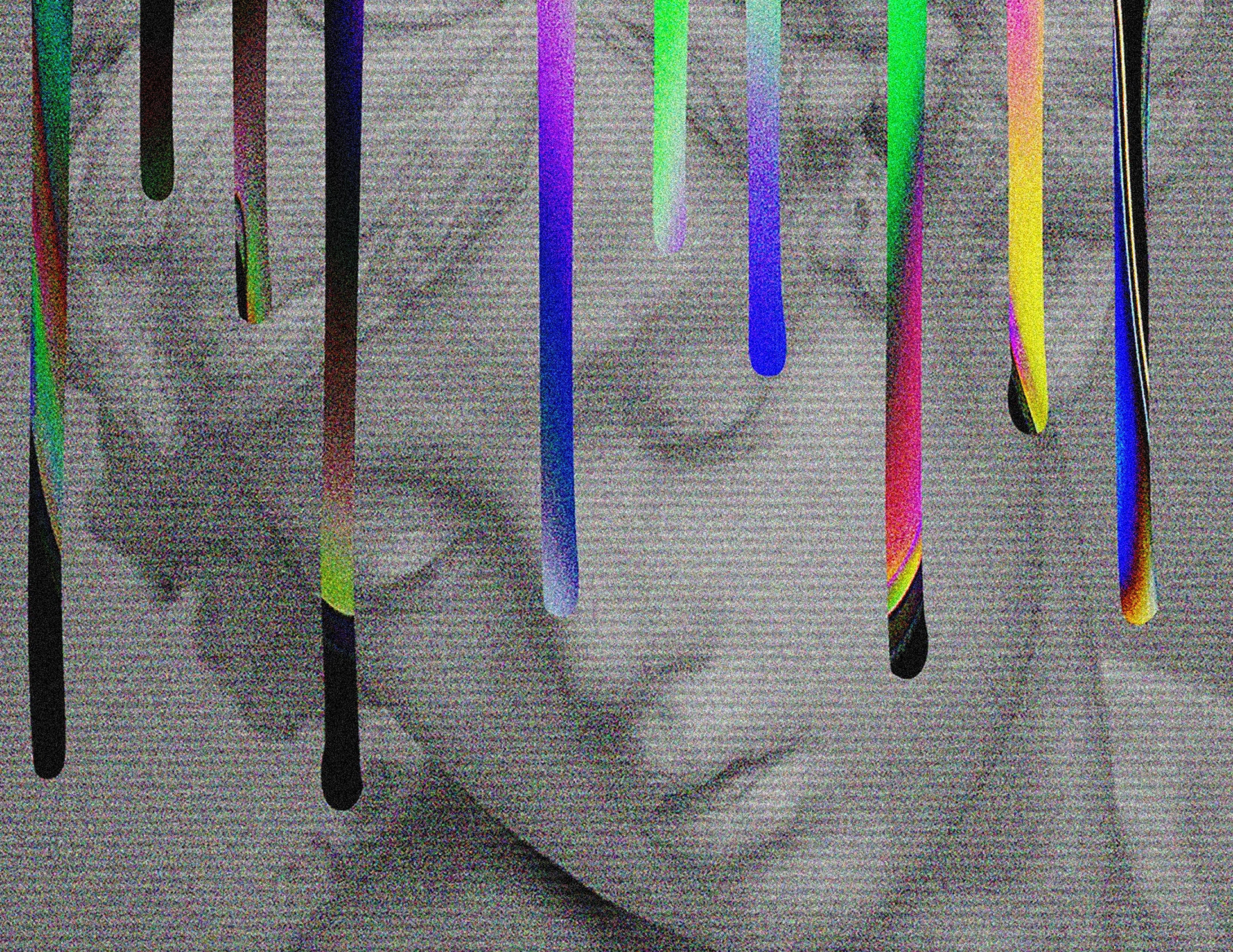
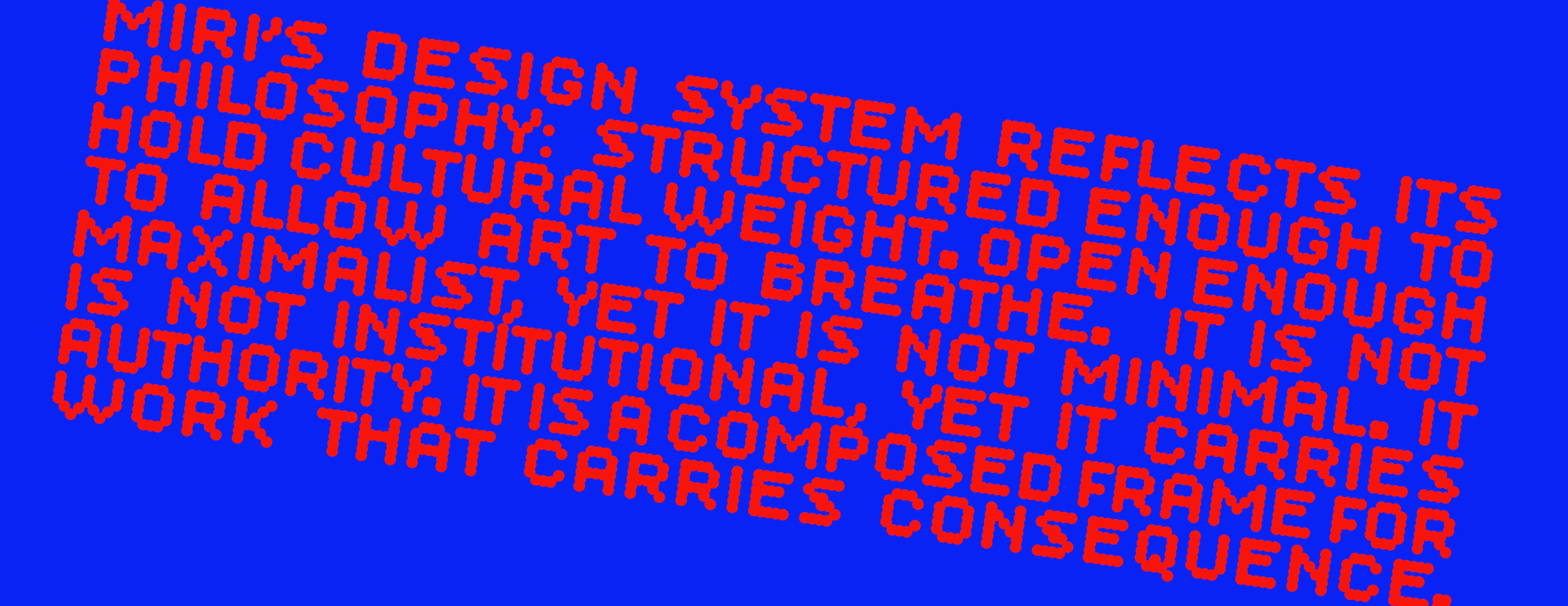
Miri’s visual language lives at the intersection of cultural rigor and emotional atmosphere. The brand is polished and professional in structure — grounded in architectural layouts, disciplined typography, and intentional hierarchy — while the imagery itself remains surreal, ethereal, and culturally charged. This tension is essential. The framework is controlled. The content breathes.
Serving
Creative Direction & Art Direction
Custom Logo Design
Brand Consultation
Brand Storyline Consultation & Writing
Graphic & Layout Design
Branding & Identity
Copywriting
Design Systems & Brand Identity Architecture
Credits
Founder & President
Mirka Serrato
Mirka Serrato
Brand Consultant, Illustrations & Creative Director
Mark Baker-Sanchez / BakerSanchez, Inc.
Mark Baker-Sanchez / BakerSanchez, Inc.