Not Known to Man is a human-centered enterprise creating new, real and elegant products to serve mankind. They are doing this by innovating possible solutions that help people live more present lives.
What Was Involved
Not Known to Man was in need of a written and visual identity that was new, real and elegant. Most competitors exhibited a typical formulaic aesthetic and uninspiring imagery. Not Known to Man is unique amongst other software development companies as they are solely focused on human-centered solutions that empower all from business to developer to user. This endeavor involved a great deal of strategy including discovery as well as data collection to effectively concept and execute an in-depth visual system that was right for the enterprise.
Who Is Not Known to Man?
Not Known to Man is just as focused on the individual experience as they are on the bigger picture. Through human-centered solutions, Not Known to Man is innovating a more present future. Ultimately, they aim to liberate individuals from binding devices — keyboards, hands-on tech, etc — so they may live more present lives and experience the elegance that is around them. We are putting humanity into technology to inspire interaction, emotion and trust.
The Problems
We’re progressively losing touch with our humanity — relying too much on robotic logic than our own and appreciating less and less the beauty that is around us. The tech industry relies too heavily on point solutions and is heading down a path that will only continue to saturate lives. Many producers aren’t focused on creating for people — they’re creating for themselves and not taking into account the needs or values of the individual.
The Objective
To craft a brand identity and web presence for Not Known to Man in an effort to position them favorably with human-centered businesses and developers. Through stunning and honest visual communication, Not Known to Man will stand out from other technology companies as true innovators of new, real as well as elegant products paving the way towards a more present future.
Visual Identity
The Not Known to Man mark is scientifically elegant and speaks to the unknown. The structural nature of the custom sans serif is elevated when paired with a modern superscript. The rounded terminals add a touch of friendliness, accessibility and humanity.
—
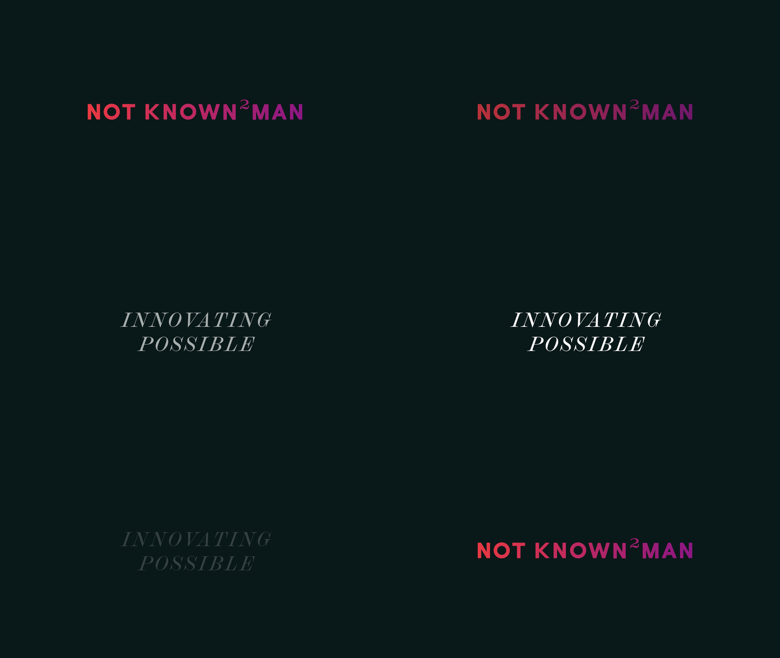
Innovating Possible
Not Known to Man always want to make known their drive and passion for innovating possible. That’s why it’s their tagline. These two words emulate their brand essence and greater mission of innovating a more present future.
Monogram
For smaller scale applications — e.g. social media, mobile devices, responsive site, etc — the main title “Not Known to Man” is alternatively referred to as “NK2M.”
Process Work & Planning
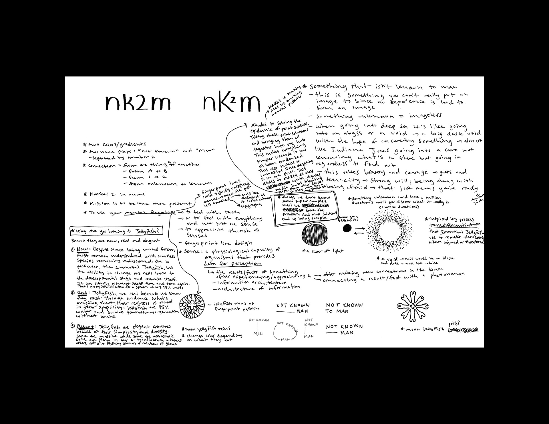
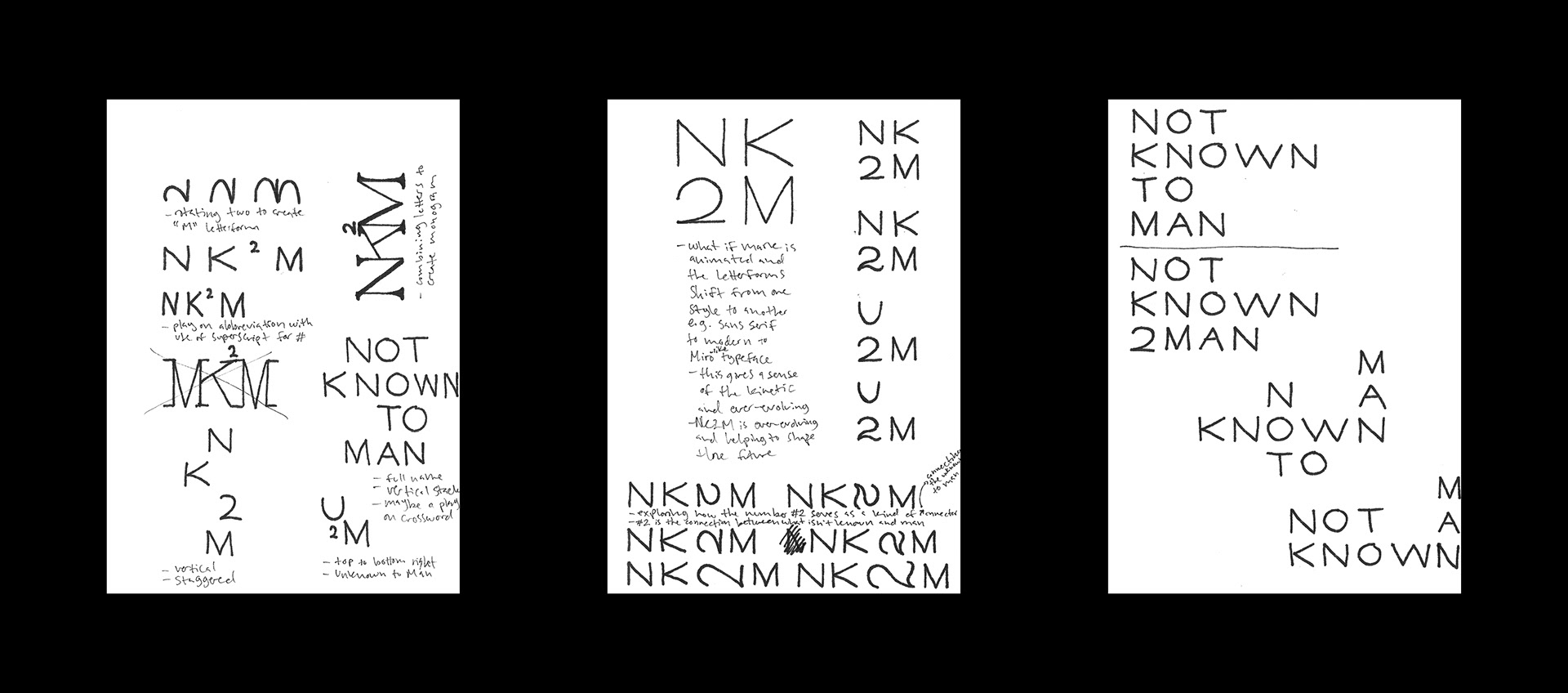
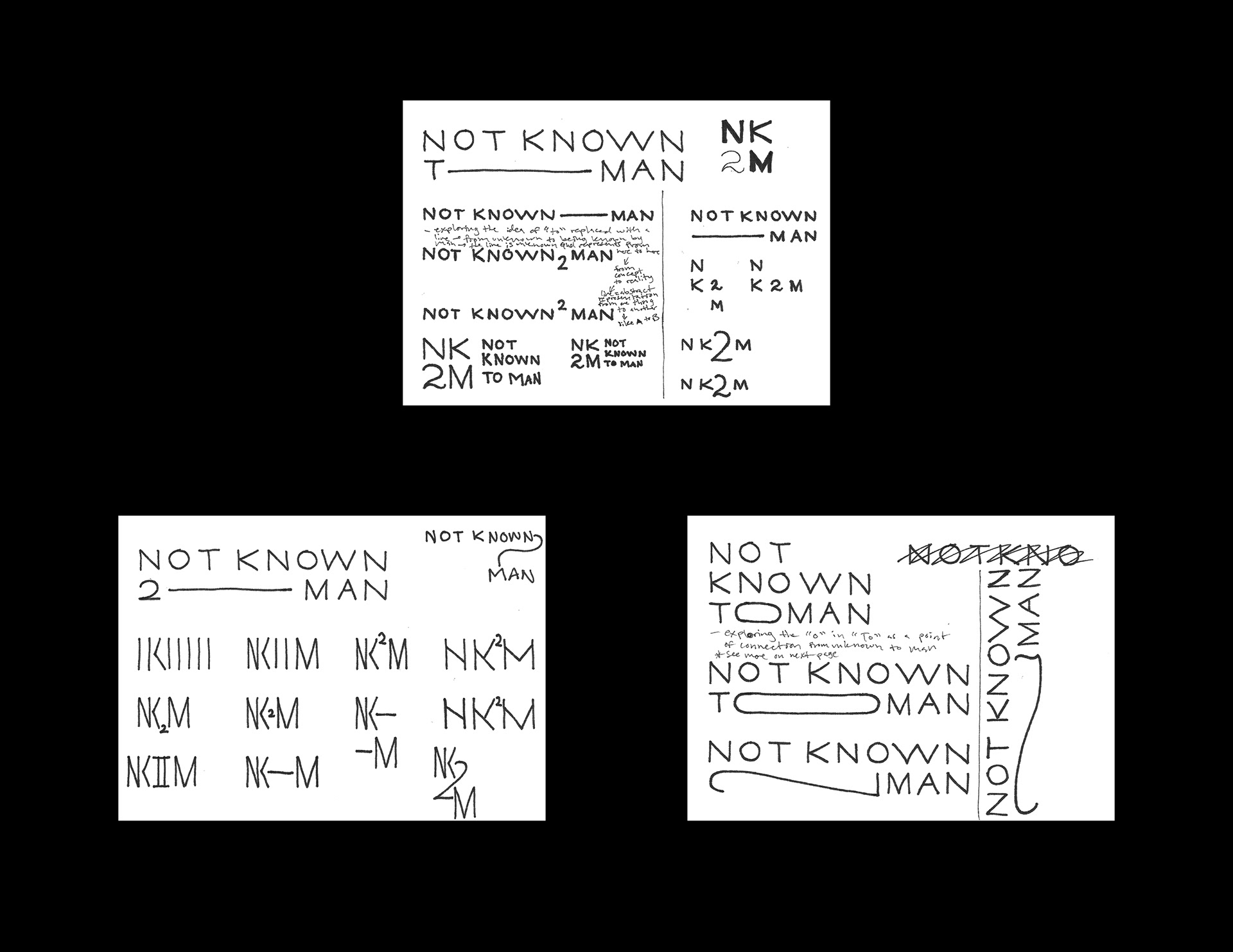
Not Known to Man takes what already exists and improves — innovates — upon it. The mark consists of preexisting typefaces that were tailored to achieve their image of scientific elegance. In-depth research and synthesis of ideas was involved — circular thinking, wordmapping, etc — to arrive at the right visual direction.
“We are just as focused on the individual experience as we are on the bigger picture.”
— David Kramer, Founder + CEO of Not Known to Man
Typography
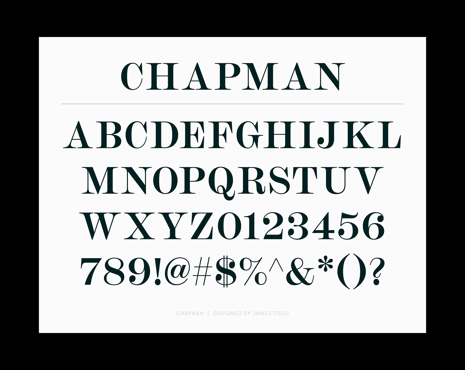
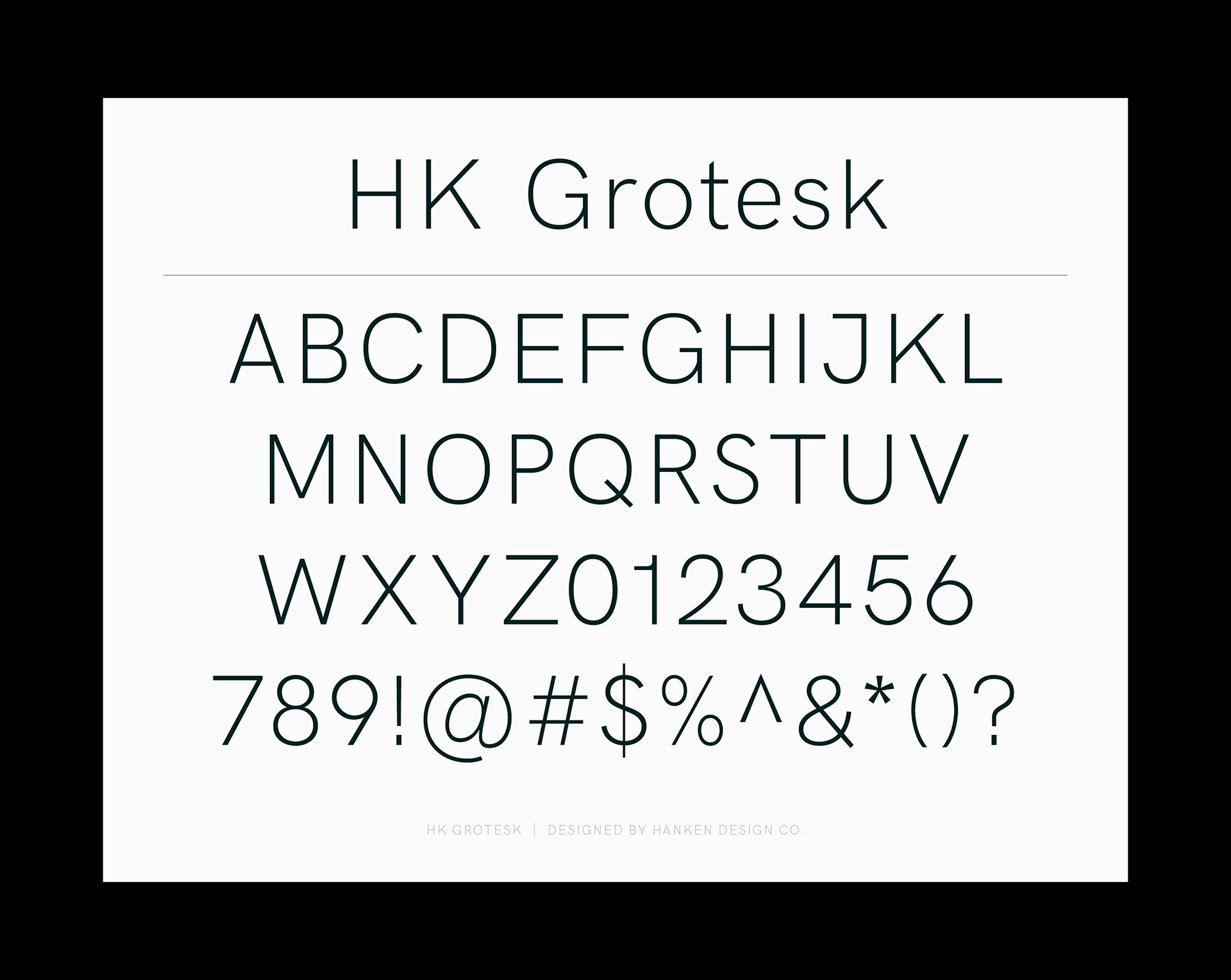
The typefaces are ambassadors of the NK2M image that establishes and distinguishes the company. A humble grotesque was paired with a bold modern to convey the company's passions for functionality and elegance. Chapman and HK Grotesk are the faces of Not Known to Man.
Typography Usage
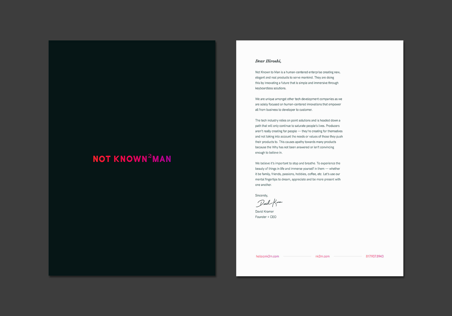
A guideline was developed for how our typefaces are used for different forms of communication. These guidelines are for reference and may be adjusted depending on the scenario.
Color
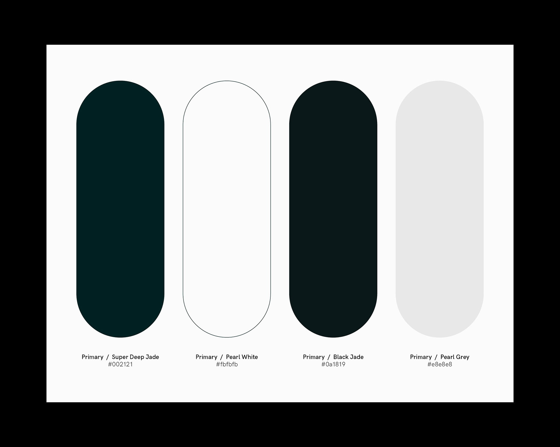
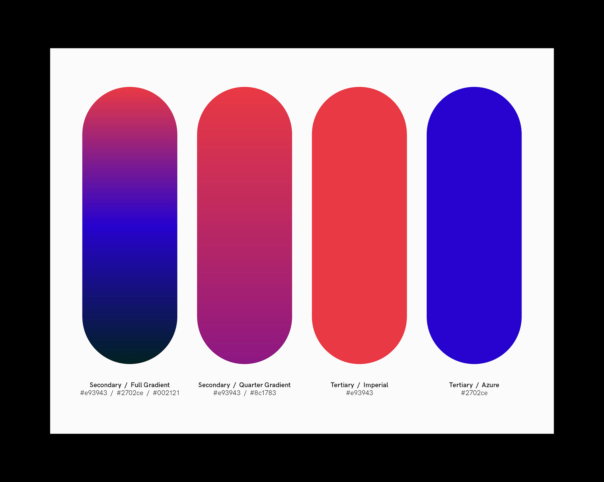
The colors are inspired by jellyfish as the species are widely not known to man. The palette is simple yet alluring to achieve an otherworldly sense. Gradients were used to convey a sense of the ocean depths and movement for a more kinetic identity.
Color Usage
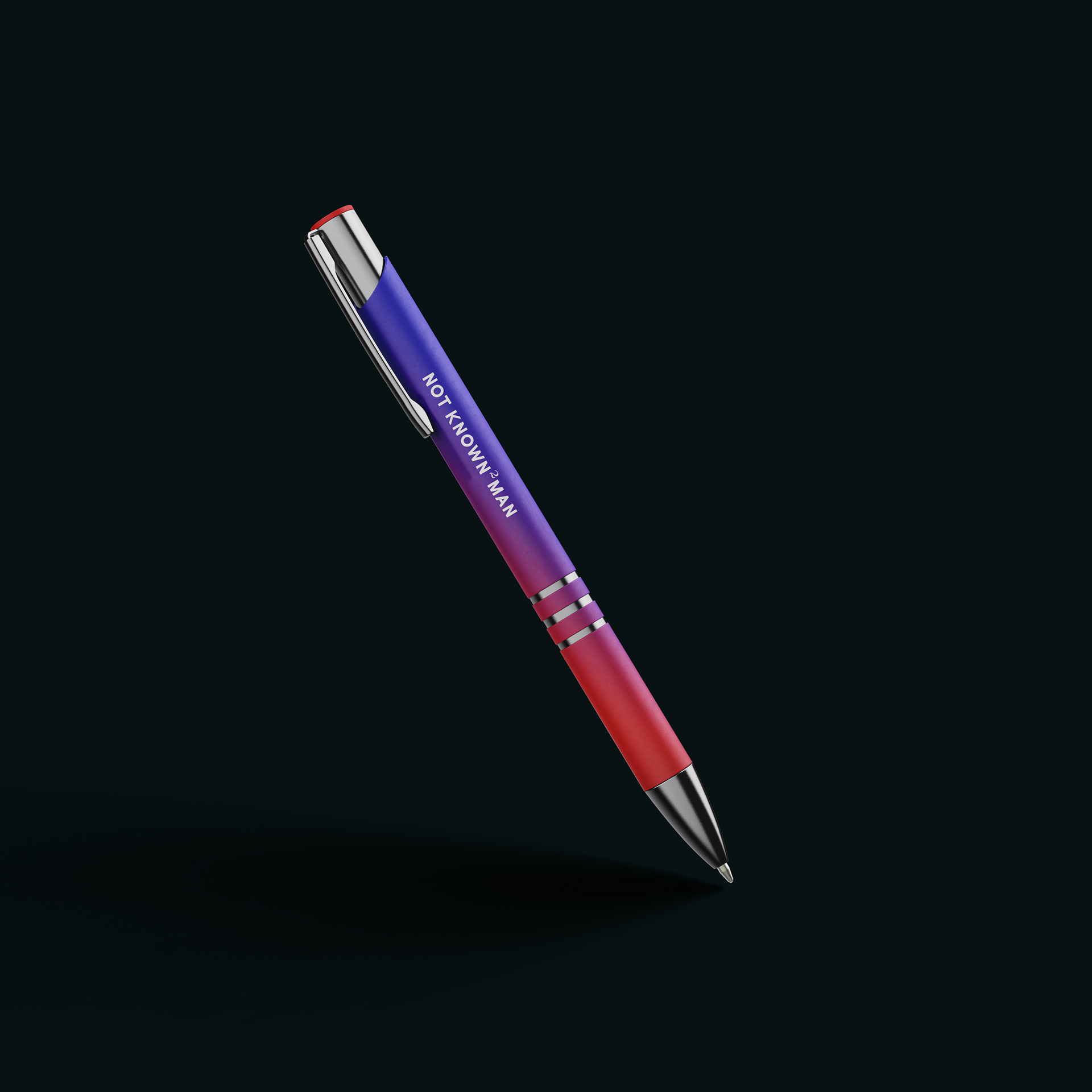
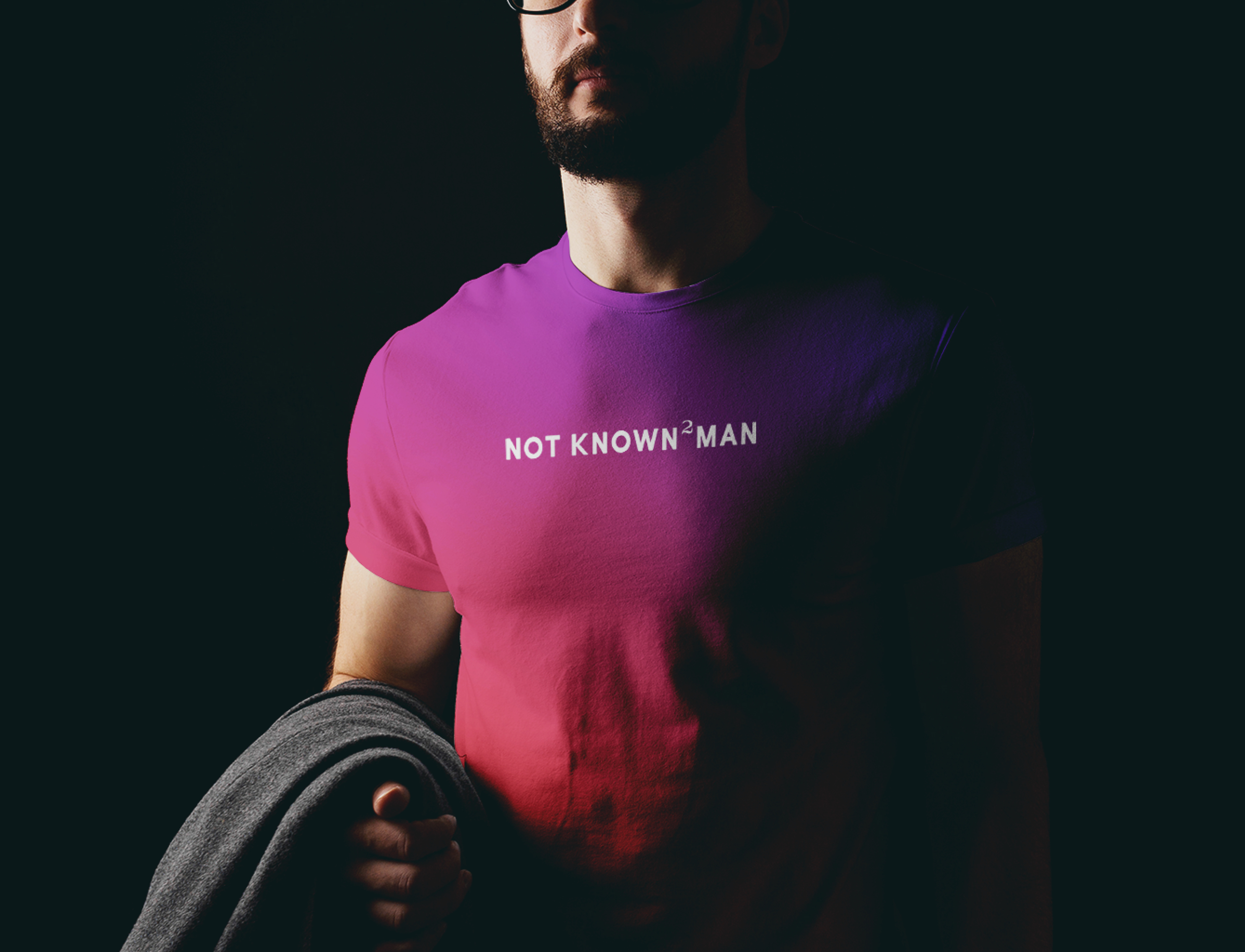
It is important to maintain a sense of hierarchy, balance and harmony with color. Below is a guide that was developed for how Not Known to Man uses colors depending on formal, casual, subtle or bold scenarios.
Primary Imagery — Jellyfish
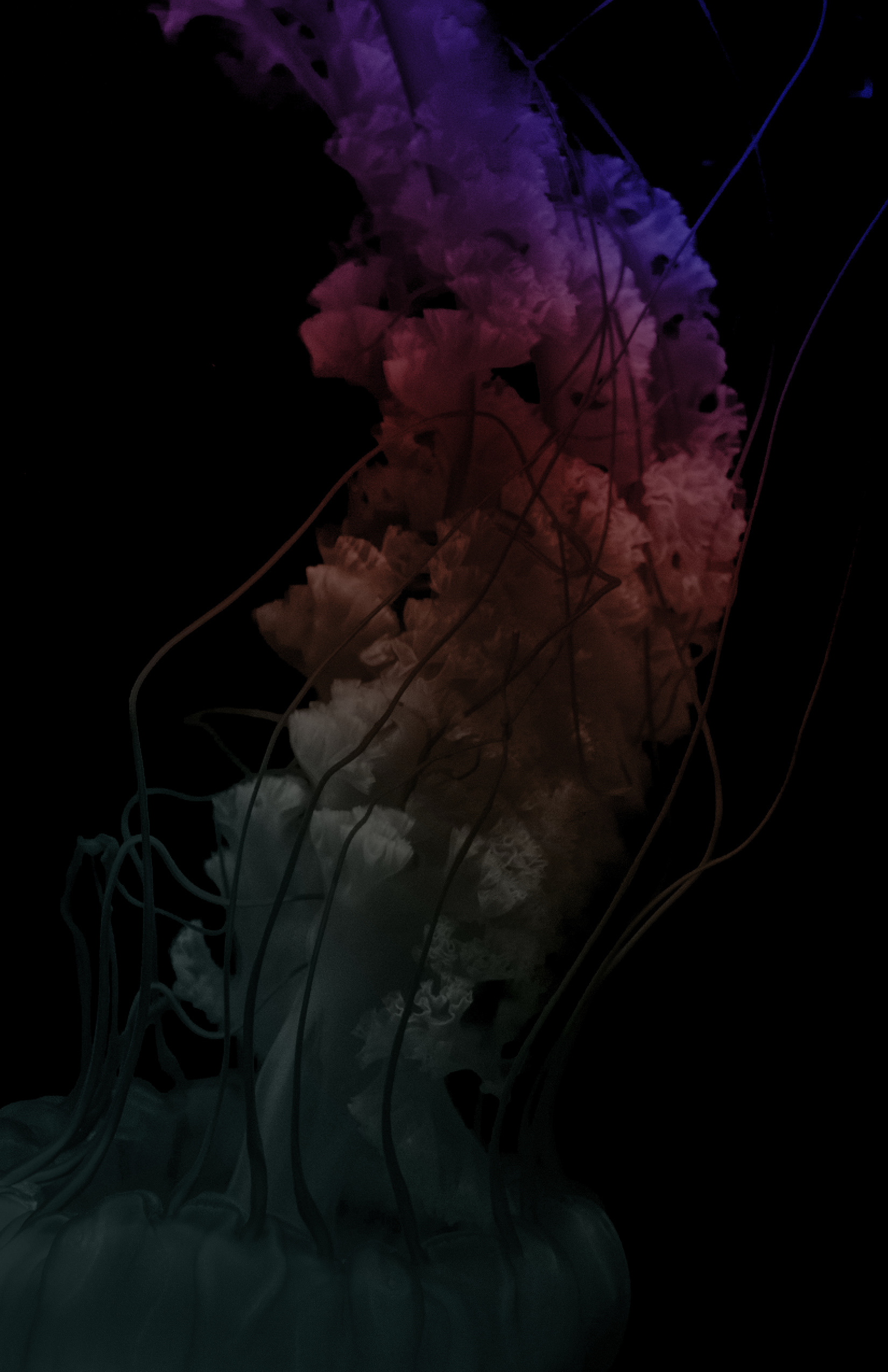
Dynamic and dramatic compositions of jellyfish against a dark background are centrally cropped, darkened by 55% – 60% with black and overlaid with the Full Gradient at 40%. These images are primary to the brand and are used for any front-end communication.

Secondary Imagery — People
Dramatically lit portraits always consist of calm and collected individuals. All of the darks are replaced with Black Jade. These images are primarily used for persona documents.


Online Presence
The website is an alluring and vibrant sensory experience. A deep sea aesthetic gives a sense of the otherworldly and moving jellyfish in the background not only brings the identity to life but invites viewers to discover more using their mental sentiments.
Information Architecture
The sitemap was designed before any concepting or execution. A multitude of research was conducted on the market aiding in the generation of a creative brief as well as necessary content. This content-first method allowed the information architecture to be much more effective and sensical.
Wireframe Sketches
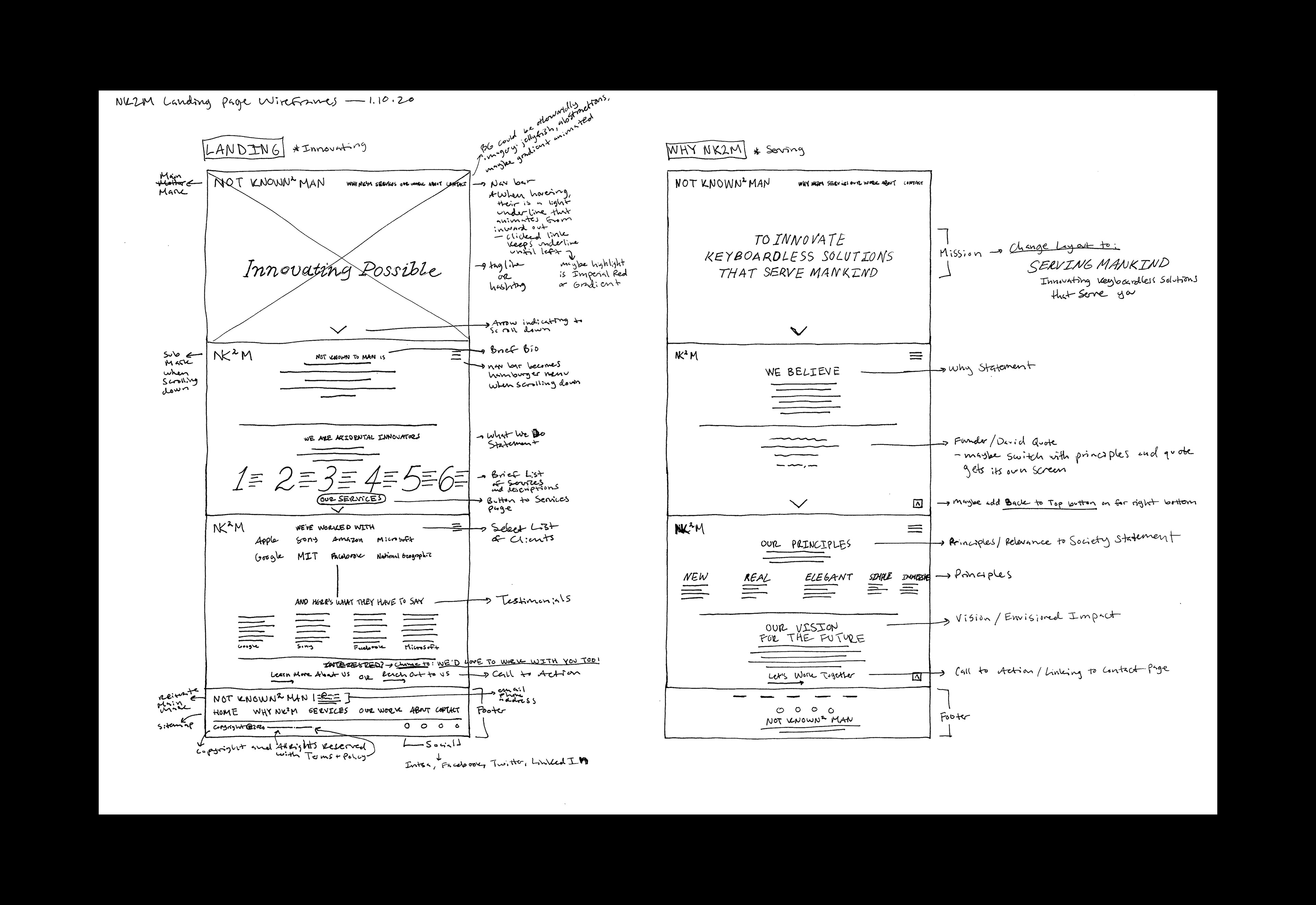
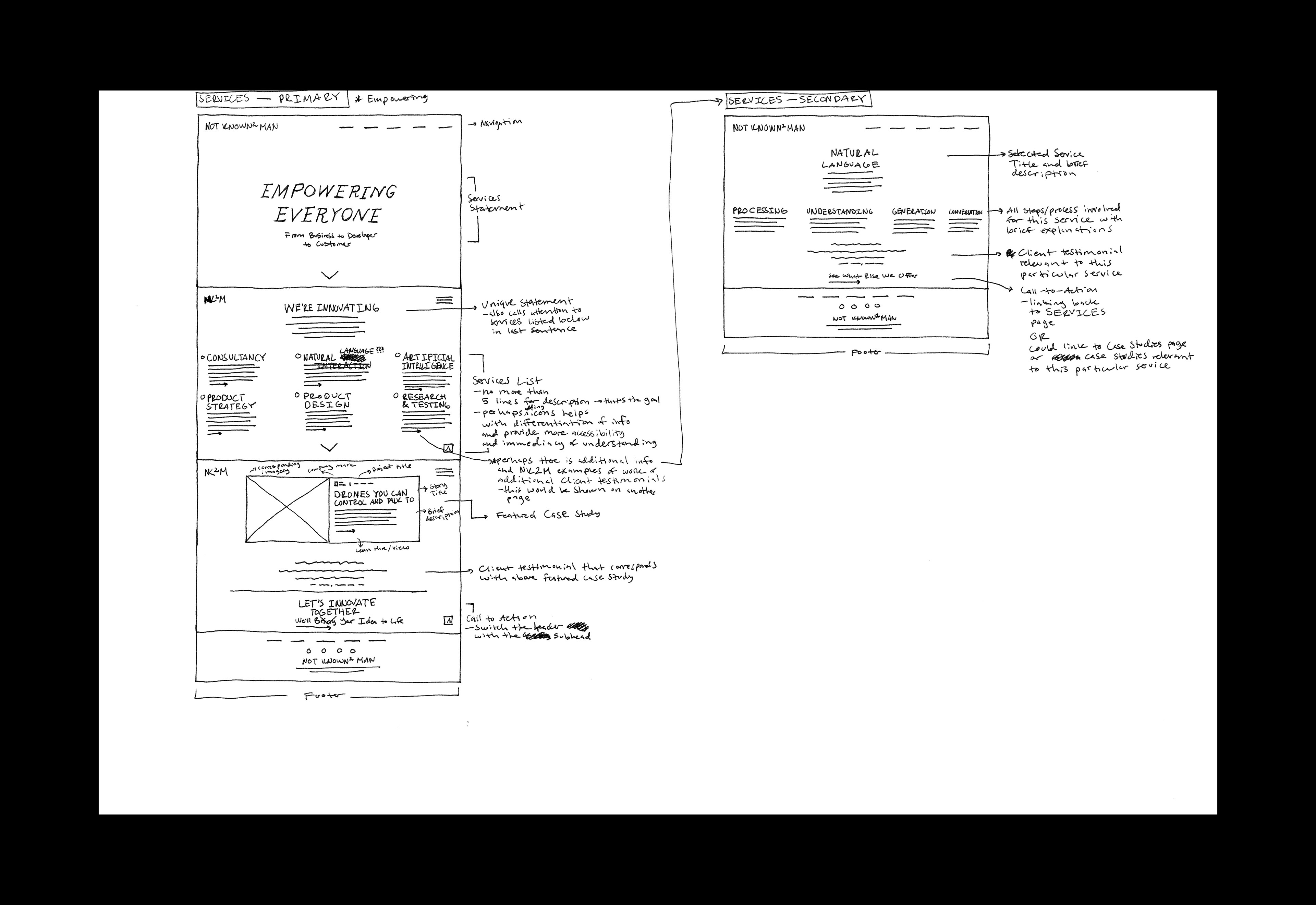
Once the sitemap was complete, wireframes were developed with detailed notes explaining the intended UI/UX direction. The goal was to create a visually stunning yet simple design that would get visitors to stop, breathe and immerse themselves in an otherworldly experience.
Pitch Deck
Great design means nothing without great presentation. Not Known to Man takes delivery just as seriously as their products. It’s crucial that every pitch tells a meaningful story that brings a product or an idea to life. The delivery system consists of a client deck and an investor deck. The slides were designed in Keynote as templates so they could be easily modified and used for any occasion.
Presentation Transitions
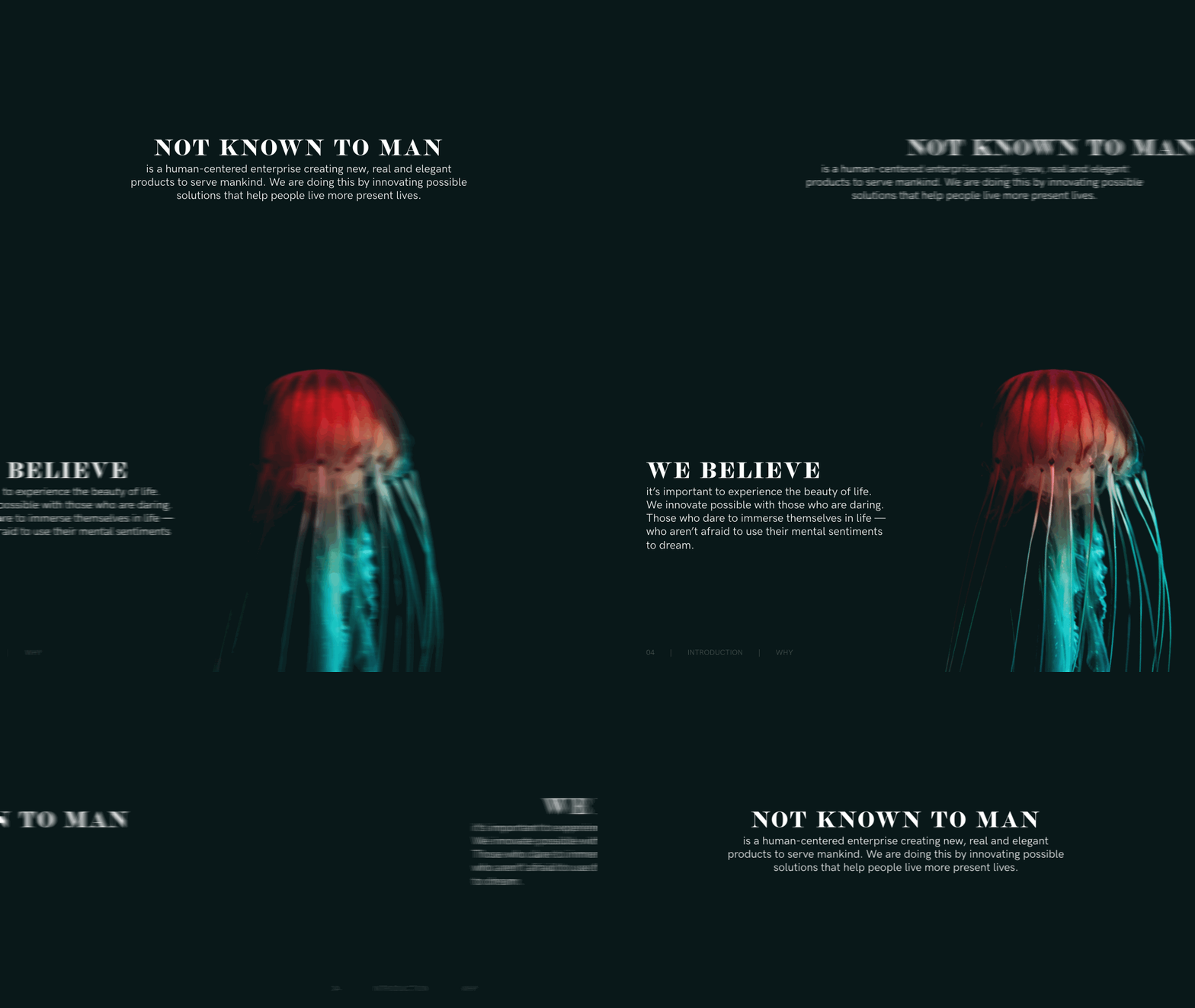
The pitch deck uses a Fade Through Color transition for cover slides and an Object Push transition for content slides.
Data Collection
Not Known to Man relies on data collected from real people to reveal their exact needs. We organized an interview process so the company would have a guideline as to how effectively collect data. To further understand this information, the most important data was curated into user personas to better understand customers and their evolving needs. This helps guide Not Known to Man in making better decisions to more effectively reason the best courses of action throughout all stages of development.
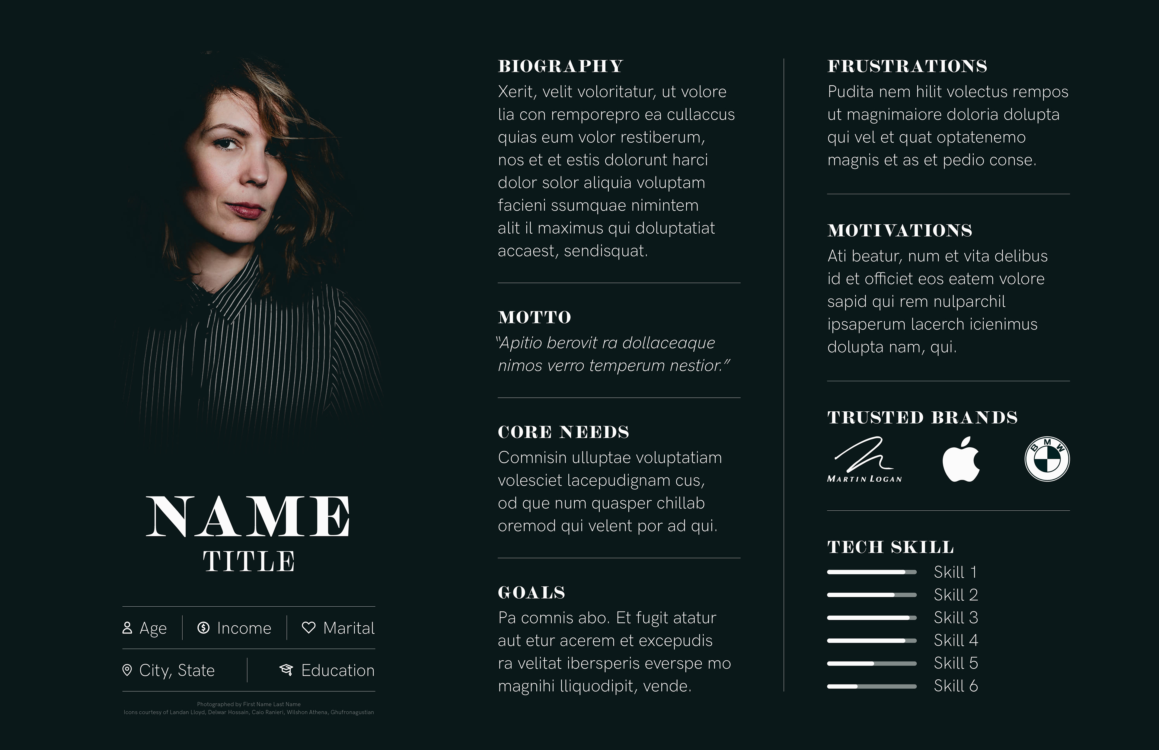
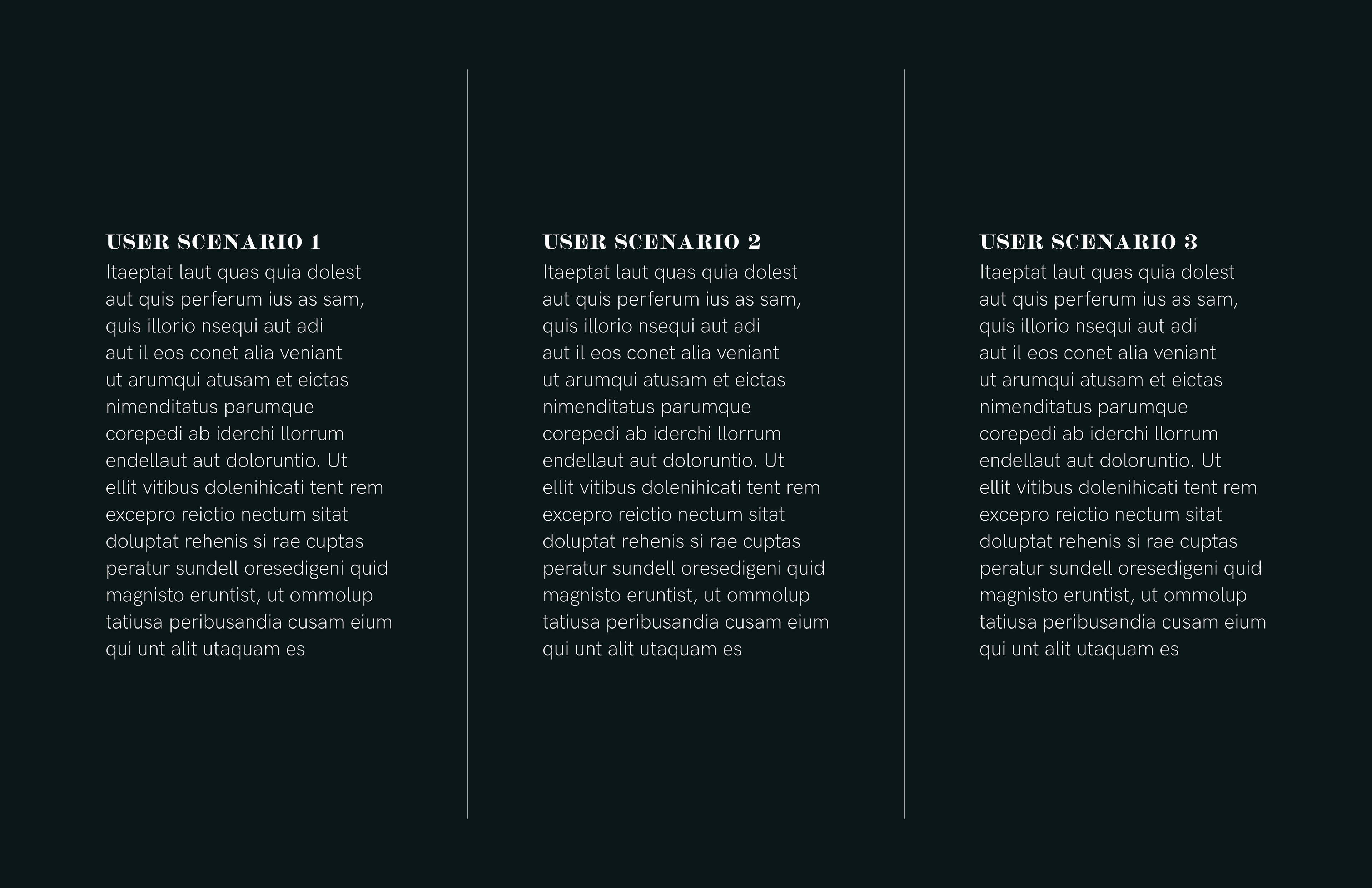
Persona Documents
The persona documents showcase a detailed character profile and information sheet. Each persona is accompanied with user scenarios for product proponents or reasons against for product opponents. All information is based on real user data that was obtained through quantitative and qualitative methods. The template above exhibits place holder text as actual NK2M personas are confidential and strictly for internal usage to protect interviewees. User data also provides extremely valuable insight into buyer decisions giving NK2M competitive advantages.
Brand Book
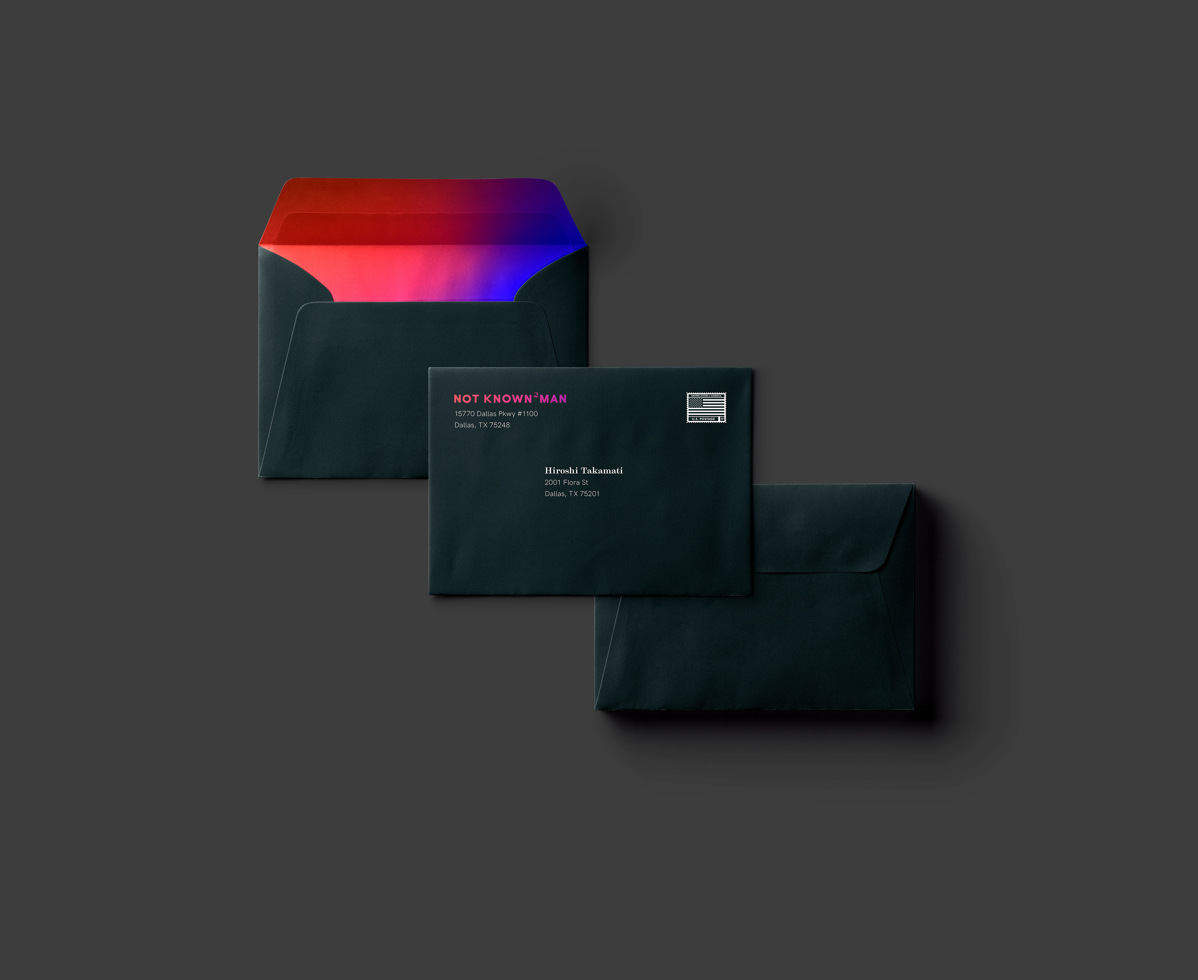
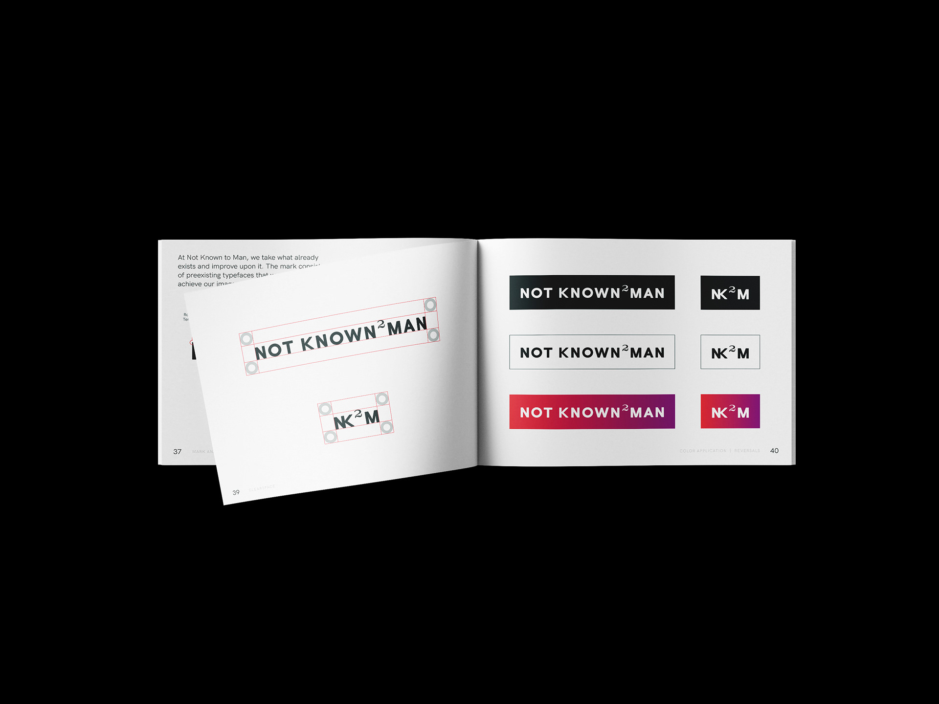
Various guides and templates were needed to maintain consistency in content, especially for the internal creative team as well as any future designers or developers hired by Nk2M. To ensure consistency, a brand book was developed. This in-depth guideline outlines official assets and how to utilize them — providing as much clarity as possible on the Not Known to Man brand aesthetic.
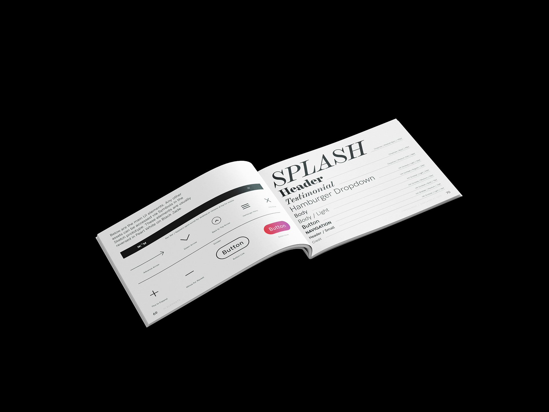

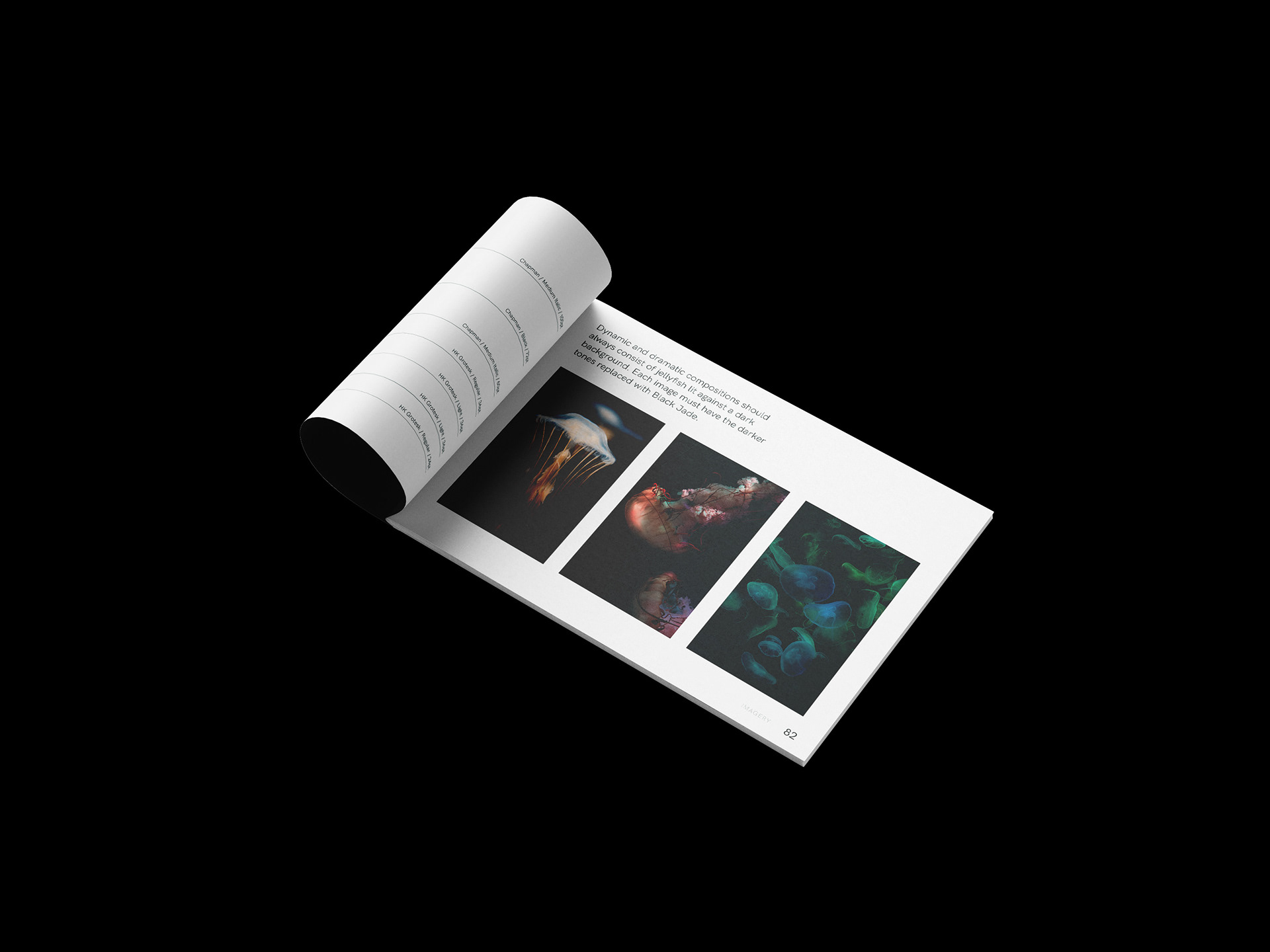
Social Media
Having a presence on social media was important for Not Known to Man not only to market their brand importance but to deliver meaningful storytelling to their audience. Instagram offers a variety of opportunities to bring immersive content to people through Stories, IGTV and Feed posts.
A Vision for the Future
Not Known to Man's vision is to innovate immersive experiences that inspire real interactions. Humanity shouldn’t be seen as a luxury and that’s why people are at the center of everything they do. With this honest mission in mind, we set out to visualize the passion of Not Known to Man so they may become known as the human-centered enterprise that can do it all — from visual and user experience design to research and development.
Credits
Completed in collaboration with David Kramer and Marco Fat-Diaz.
NK2M CEO/Stockholder: David "HT" Kramer
NK2M Creative Director/Art Director: Marco Fat-Diaz
Brand Strategist/Copywriter/Communication Designer: Mark Baker-Sanchez
